[go: up one dir, main page]

Next Issue
Volume 8, March
Previous Issue
Volume 8, January


Atmosphere, Volume 8, Issue 2 (February 2017) – 20 articles

Cover Story (view full-size image): 
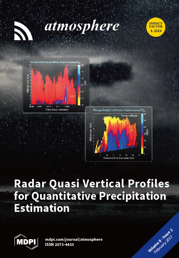
Classical radar range height indicators (top panels) reveal, in more detail, some of the specific properties of precipitating clouds along with the ray path. Quasi vertical profiles (bottom panels) are a synthesis of radar polar acquisitions and can be used to increase the spatial and temporal representation of radar products as well as to increase quantitative precipitation estimations. By Mario Montopoli. View the paper
  • Issues are regarded as officially published after their release is announced to the table of contents alert mailing list.
  • You may sign up for e-mail alerts to receive table of contents of newly released issues.
  • PDF is the official format for papers published in both, html and pdf forms. To view the papers in pdf format, click on the "PDF Full-text" link, and use the free Adobe Reader to open them.
Order results
Result details
Section
Select all
Export citation of selected articles as:
3723 KiB  
Article
An Integrated Convective Cloud Detection Method Using FY-2 VISSR Data
by Kuai Liang, Hanqing Shi, Pinglv Yang and Xiaoran Zhao
Atmosphere 2017, 8(2), 42; https://doi.org/10.3390/atmos8020042 - 20 Feb 2017
Cited by 6 | Viewed by 4576
Abstract
The characteristics of convective clouds on infrared brightness temperature (BTIR) and brightness temperature difference (BTD) image were analyzed using successive Infrared and Visible Spin-Scan Radiometer (VISSR) data of FY-2, and an integrated detection method of convective clouds using infrared multi-thresholds in [...] Read more.
The characteristics of convective clouds on infrared brightness temperature (BTIR) and brightness temperature difference (BTD) image were analyzed using successive Infrared and Visible Spin-Scan Radiometer (VISSR) data of FY-2, and an integrated detection method of convective clouds using infrared multi-thresholds in combination with tracking techniques was implemented. In this method, BT and BTD thresholds are used to detect severe convection and uncertain clouds, then the tracking technique including overlap ratio, minimum BT change and cross-correlation coefficient is used to detect convection activities in uncertain clouds. The Application test results show that our integrated detection method can effectively detect convective clouds in different life periods, which show a better performance than any single step in it. The statistical results show that the α-type clouds are mostly large-scale systems, and the β- and γ-type clouds have the highest proportion of general type. However, the proportion of weak convective cloud is higher than that of severe ones in γ-type cloud, and an opposite result is found in the β-type. Full article
Show Figures

Figure 1

Figure 1
<p>A case of convective cloud on brightness temperature (BT) and brightness temperature difference (BTD) images (/K): (<b>a</b>) infrared brightness temperature (BT<sub>IR1</sub>) image; (<b>b</b>) BTD<sub>IR1–IR2</sub> image; (<b>c</b>) BTD<sub>IR1–IR3</sub> image; (<b>d</b>) BTD<sub>IR1–IR4</sub> image. The deep blue areas indicate the convection activeties.</p>
Full article ">Figure 2
<p>(<b>a</b>–<b>i</b>) Results of convective cloud detection by Infrared BT<sub>IR1</sub> thresholds.</p>
Full article ">Figure 3
<p>Results of convective cloud detection by infrared BTD thresholds.</p>
Full article ">Figure 4
<p>Integrated detection result of convective cloud: (<b>a</b>) Before the removal of “broken cloud”; (<b>b</b>) After the removal of “broken cloud”.</p>
Full article ">Figure 5
<p>Convective cloud detection process. The detection process goes from the BT threshold method and ends with cloud classification.</p>
Full article ">Figure 6
<p>(<b>a</b>–<b>i</b>) FY-2F BT<sub>IR1</sub> image at every half hour on 14 June 2016, 08:30–12:30. The image at 10:30 is the object to test our detection process in this paper.</p>
Full article ">Figure 7
<p>(<b>a</b>–<b>f</b>) Results after each detection step. The pink area on the image is the detection result.</p>
Full article ">Figure 7 Cont.
<p>(<b>a</b>–<b>f</b>) Results after each detection step. The pink area on the image is the detection result.</p>
Full article ">Figure 8
<p>Classification of convective cloud clusters (<b>a</b>) and its statistical result (<b>b</b>).</p>
Full article ">
10841 KiB  
Article
Spatial and Temporal Variation of the Extreme Saharan Dust Event over Turkey in March 2016
by Hakki Baltaci
Atmosphere 2017, 8(2), 41; https://doi.org/10.3390/atmos8020041 - 17 Feb 2017
Cited by 30 | Viewed by 4677
Abstract
In this study, the influence of an extraordinary Saharan dust episode over Turkey on 23–24 March 2016 and the atmospheric conditions that triggered this event were evaluated in detail. PM10 (particulate matter less than 10 μm) observations from 97 air quality stations, [...] Read more.
In this study, the influence of an extraordinary Saharan dust episode over Turkey on 23–24 March 2016 and the atmospheric conditions that triggered this event were evaluated in detail. PM10 (particulate matter less than 10 μm) observations from 97 air quality stations, METAR (Meteorological Terminal Aviation Routine Weather Report) observations at 64 airports, atmospheric soundings, and satellite products were used for the analysis. To determine the surface and upper levels of atmospheric circulation, National Centers of Environmental Prediction (NCEP)/National Center for Atmospheric Research (NCAR) Reanalysis data were applied to the extreme dust episodes. On 23 March 2016, high southwesterly winds due to the interaction between surface low- and high-pressure centers over Italy and Levant basin brought thick dust particles from Libya to Turkey. The daily PM10 data from 43 stations exceeded their long-term spring means over Turkey (especially at the northern and western stations). As a consequence of the longitudinal movement of the surface low from Italy to the Balkan Peninsula, and the quasi-stationary conditions of the surface high-pressure center allowed for the penetration of strong south and southwesterly winds to inner parts of the country on the following day. As a consequence, 100%, 90%, 88%, and 87% of the monitoring stations in Marmara (NW Turkey), central Anatolia, western (Aegean) and northern (Black Sea) regions of Turkey, respectively, exhibited above-normal daily PM10 values. In addition, while strong subsidence at the low levels of the atmosphere plays a significant role in having excessive daily PM10 values in Black Sea, dry atmospheric conditions and thick inversion level near the ground surface of Marmara ensured this region to have peak PM10 values ~00 Local Time (LT). Full article
Show Figures

Figure 1

Figure 1
<p>The distribution of PM<sub>10</sub> observations at 97 air quality monitoring stations (brown points) and visibility observations (METARs, blue square) at 64 airports in Turkey. The detail explanations (i.e., geographic coordinates and daily averaged PM<sub>10</sub> values of the stations during the dust storm days) of the numbers of the stations are described in <a href="#atmosphere-08-00041-t001" class="html-table">Table 1</a>. The borders of the seven geographic regions with its abbreviated names are also shown in the figure. MR: Marmara Region, AR: Aegean Region, MeR: Mediterranean Region, CAR: Central Anatolian Region, BSR: Black Sea Region, EAR: Eastern Anatolian Region, SEAR: Southeastern Anatolian Region.</p>
Full article ">Figure 2
<p>The long-term (2010–2015) mean of the seasonal PM<sub>10</sub> concentrations (μg·m<sup>−3</sup>) related to 97 air quality stations. (<b>a</b>) Winter, (<b>b</b>) Spring, (<b>c</b>) Summer, and (<b>d</b>) Fall seasons, respectively.</p>
Full article ">Figure 3
<p>Anomaly values of the (<b>a</b>) March 23, 2016 and (<b>b</b>) March 24, 2016 daily PM<sub>10</sub> observations (μg·m<sup>−3</sup>) of the stations when compared with its long-term spring mean PM<sub>10</sub> values.</p>
Full article ">Figure 4
<p>(<b>a</b>) Temporal behavior of the hourly PM<sub>10</sub> values (μg·m<sup>−3</sup>) of the seven geographical regions of Turkey for 23 March, 2016. (<b>b</b>) same as (<b>a</b>) but for 24 March, 2016. (<b>c</b>) same as (<b>a</b>), and (<b>d</b>) same as (<b>b</b>) but denote the four urban settlements of Istanbul.</p>
Full article ">Figure 5
<p>(<b>a</b>) Spatial distribution of the horizontal visibility conditions of the METAR observations belonging to 64 airports at 06:00 UTC of 24 March. (<b>b</b>) Same as (<b>a</b>) but for 09:00 UTC. (<b>c</b>) same as (<b>a</b>) but for 12:00 UTC.</p>
Full article ">Figure 6
<p>The evolution of the first dust storm event over Turkey at 00:00 UTC 23 March 2016. (<b>a</b>) sea level pressures (solid lines, every 5-hPa), and total cloud cover (shaded, %) at surface. (<b>b</b>) Height (solid lines, dam) and winds (m·s<sup>−1</sup>) at 850-hPa. (<b>c</b>) same as (<b>a</b>), and (<b>d</b>) same as (<b>b</b>) but for 12:00 UTC of the 23 March.</p>
Full article ">Figure 7
<p>Dust product for (<b>a</b>) 12:00 UTC and (<b>b</b>) 18:00 UTC on 23 March 2016, derived from three infrared channels of the SEVIRI imager on Meteosat-10, with center wavelengths at 12.0, 10.8, and 8.7 µm. This false-color image was created using an algorithm from EUMETSAT, which colors red the difference between the 12.0 and 10.8 µm channels, green the difference between the 10.8 and 8.7 µm channels and blue the 10.8 µm channel. Dust appears pink or magenta, water vapor dark blue, thick high-level clouds red-brown, thin high-level clouds almost black and surface features pale blue or purple.</p>
Full article ">Figure 8
<p>The evolution of the second dust storm event over Turkey at 00:00 UTC 24 March 2016. (<b>a</b>) sea level pressures (solid lines, every 5-hPa), and total cloud cover (shaded, %) at surface. (<b>b</b>) Height (solid lines, dam) and winds (m·s<sup>−1</sup>) at 850-hPa. (<b>c</b>) same as (<b>a</b>) and (<b>d</b>) same as (<b>b</b>) but for 12:00 UTC of the 24 March.</p>
Full article ">Figure 9
<p>Omega map (Pa·s<sup>−1</sup>) at 1000-hPa for 24 March 00:00 UTC. Red-to-yellow area corresponds to a sink area, while negative values show upward movement of air.</p>
Full article ">Figure 10
<p>(<b>a</b>) Attenuated backscatter quicklook derived from CALIOP (CALIPSO satellite on 23 March 2016 at night during the over passes over the dust source region. (<b>b</b>) Skew T-logp diagram of Izmir (western station, WMO number: 17220) at 00:00 UTC of 24 March, 2016. The solid thick lines represent temperature and dewpoint observations. Temperature in °C and pressure levels in hPa. (<b>c</b>) same as (<b>b</b>) but for Kartal (northern station, WMO number: 17064)</p>
Full article ">
3367 KiB  
Article
Variability of Black Carbon and Ultrafine Particle Concentration on Urban Bike Routes in a Mid-Sized City in the Po Valley (Northern Italy)
by Giovanni Lonati, Senem Ozgen, Giovanna Ripamonti and Stefano Signorini
Atmosphere 2017, 8(2), 40; https://doi.org/10.3390/atmos8020040 - 16 Feb 2017
Cited by 23 | Viewed by 6377
Abstract
Cyclists might experience increased air pollution exposure, due to the proximity to traffic, and higher intake, due to their active travel mode and higher ventilation. Several local factors, like meteorology, road and traffic features, and bike lanes features, affect cyclists’ exposure to traffic-related [...] Read more.
Cyclists might experience increased air pollution exposure, due to the proximity to traffic, and higher intake, due to their active travel mode and higher ventilation. Several local factors, like meteorology, road and traffic features, and bike lanes features, affect cyclists’ exposure to traffic-related pollutants. This paper investigates the concentration levels and the effect of the features of the bike lanes on cyclists’ exposure to airborne ultrafine particulate matter (UFP) and black carbon (BC) in the mid-sized city of Piacenza, located in the middle of the Po Valley, Northern Italy. Monitoring campaigns were performed by means of portable instruments along different urban bike routes with bike lanes, characterized by different distances from the traffic source (on-road cycle lane, separated cycle lane, green cycle path), during morning (9:00 am–10:00 am) and evening (17:30 pm–18:30 pm) workday rush hours in both cold and warm seasons. The proximity to traffic significantly affected cyclists’ exposure to UFP and BC: exposure concentrations measured for the separated lane and for the green path were 1–2 times and 2–4 times lower than for the on-road lane. Concurrent measurements showed that exposure concentrations to PM10, PM2.5, and PM1 were not influenced by traffic proximity, without any significant variation between on-road cycle lane, separated lane, or green cycle path. Thus, for the location of this study PM mass-based metrics were not able to capture local scale concentration gradients in the urban area as a consequence of the rather high urban and regional background that hides the contribution of local scale sources, such as road traffic. The impact of route choice on cyclists’ exposure to UFPs and BC during commuting trips back and forth from a residential area to the train station has been also estimated through a probabilistic approach through an iterative Monte Carlo technique, based on the measured data. Compared to the best choice, a worst-route choice can result in an increased cumulative exposure up to about 50% for UFPs, without any relevant difference between cold and warm season, and from 20% in the cold season up to 90% in the warm season for equivalent black carbon concentration (EBC). Full article
(This article belongs to the Special Issue Ultrafine Particles: Determination, Behavior and Human Health Effects)
Show Figures

Figure 1

Figure 1
<p>Location of Piacenza in the Po valley.</p>
Full article ">Figure 2
<p>Selected route sectors.</p>
Full article ">Figure 3
<p>Box-plots of 1-min concentration data for UFP in the cold season (mean values: dots; min-max range: whiskers: median and interquartile range: boxes).</p>
Full article ">Figure 4
<p>Box-plots of 1-min concentration data for EBC in the cold season (mean values: dots; min-max range: whiskers: median and interquartile range: boxes).</p>
Full article ">Figure 5
<p>Box-plots of 1-min concentration data for UFP in the warm season (mean values: dots; min-max range: whiskers: median and interquartile range: boxes).</p>
Full article ">Figure 6
<p>Box-plots of 1-min concentration data for EBC in the warm season (mean values: dots; min-max range: whiskers: median and interquartile range: boxes).</p>
Full article ">Figure 7
<p>Scatter plot for sector-related EBC and UFP concentration levels (mean and 95% confidence intervals for the mean). Dark symbols: morning data; white symbols: evening data.</p>
Full article ">Figure 8
<p>Box-plots of computed cumulative exposure to UFPs and EBC for best- and worst-case route choice for a commuter’s ride in the urban area (mean values: dots; min-max range: whiskers: median and interquartile range: boxes).</p>
Full article ">
13398 KiB  
Article
Profiling Radar Observations and Numerical Simulations of a Downslope Wind Storm and Rotor on the Lee of the Medicine Bow Mountains in Wyoming
by Binod Pokharel, Bart Geerts, Xia Chu and Philip Bergmaier
Atmosphere 2017, 8(2), 39; https://doi.org/10.3390/atmos8020039 - 15 Feb 2017
Cited by 10 | Viewed by 6066
Abstract
This study describes a downslope wind storm event observed over the Medicine Bow range (Wyoming, USA) on 11 January 2013. The University of Wyoming King Air (UWKA) made four along-wind passes over a five-hour period over the mountain of interest. These passes were [...] Read more.
This study describes a downslope wind storm event observed over the Medicine Bow range (Wyoming, USA) on 11 January 2013. The University of Wyoming King Air (UWKA) made four along-wind passes over a five-hour period over the mountain of interest. These passes were recognized as among the most turbulent ones encountered in many years by crew members. The MacCready turbulence meter aboard the UWKA measured moderate to severe turbulence conditions on each pass in the lee of the mountain range, with eddy dissipation rate values over 0.5 m2/3 s−1. Three rawinsondes were released from an upstream location at different times. This event is simulated using the non-hydrostatic Weather Research and Forecast (WRF) model at an inner- domain resolution of 1 km. The model produces a downslope wind storm, notwithstanding some discrepancies between model and rawinsonde data in terms of upstream atmospheric conditions. Airborne Wyoming Cloud Radar (WCR) vertical-plane Doppler velocity data from two beams, one pointing to the nadir and one pointing slant forward, are synthesized to obtain a two-dimensional velocity field in the vertical plane below flight level. This synthesis reveals the fine-scale details of an orographic wave breaking event, including strong, persistent downslope acceleration, a strong leeside updraft (up to 10 m·s−1) flanked by counter-rotating vortices, and deep turbulence, extending well above flight level. The analysis of WCR-derived cross-mountain flow in 19 winter storms over the same mountain reveals that cross-mountain flow acceleration and downslope wind formation are difficult to predict from upstream wind and stability profiles. Full article
(This article belongs to the Special Issue Atmospheric Gravity Waves)
Show Figures

Figure 1

Figure 1
<p>Terrain maps showing (<b>a</b>) the three WRF model domains (with coastline and state boundaries within the USA, and (<b>b</b>) the inner domain showing the model cross section and surface sites. The four UWKA flight tracks were along the model cross-section, but were shorter, ranging from 30 to 60 km in length.</p>
Full article ">Figure 2
<p>Synoptic condition from the 12 km NAM data at 0000 UTC on 12 January 2013. Wind barbs (full barb = 10 knots) are shown at each level, including at the surface (10 m) in (<b>d</b>). The white box in each panel shows the location of the Medicine Bow Mountains.</p>
Full article ">Figure 3
<p>Vertical profile of the upstream atmosphere, at Saratoga, according to radiosonde data (solid lines) and the inner-domain WRF model (dashed lines). The first three panels (<b>a</b>–<b>c</b>) show temperature (red lines) and dewpoint (blue lines) on a skew T diagram, with wind barbs on the side (full barb = 5 m·s<sup>−1</sup> and flag = 25 m·s<sup>−1</sup>), at three different times. Panels (<b>d</b>–<b>f</b>) show the vertical profiles of potential temperature, zonal wind speed, and wind direction, respectively. The height of Medicine Bow Peak is marked by a black arrow in the last three panels.</p>
Full article ">Figure 4
<p>Comparison of surface observations (<b>black</b>) against WRF model (<b>red</b>) for (<b>a</b>) potential temperature and (<b>b</b>) wind. The model is compared against observations from the Laramie Regional Airport weather station during a 10-hour period on 11–12 January 2013.</p>
Full article ">Figure 5
<p>Model vertical cross sections of vertical velocity (color filled), potential temperature (black lines), and wind vectors along the transect line shown in <a href="#atmosphere-08-00039-f001" class="html-fig">Figure 1</a>, from west to east, at two-hour increments starting in panel (<b>a</b>) at 18:00 UTC on 11 January. Two counter-rotating vortices (yellow dashed lines) are shown schematically in panel (<b>c</b>).</p>
Full article ">Figure 6
<p>As in <a href="#atmosphere-08-00039-f005" class="html-fig">Figure 5</a>, but showing zonal wind speed.</p>
Full article ">Figure 7
<p>Model vertical cross sections of (<b>a</b>) TKE and (<b>b</b>) the EDR at 20:00 UTC on 11 January 2013. The black lines in both panels are the potential temperature.</p>
Full article ">Figure 8
<p>WCR-measured radar reflectivity for the four along-wind transects over the MBM flown over a five-hour period starting, in panel (<b>a</b>), at 22:30 UTC on 11 January 2013. The actual flight times are shown in the plots. The dashed line and arrow in all panels show the flight level and flight direction, respectively. The black belt centered at flight level is the radar blind zone. Distance 0 km in all panels corresponds with the crest of the MBM and the largest distance from panel (<b>d</b>) is kept in all panels.</p>
Full article ">Figure 9
<p>Flight-level atmospheric variables for the same four along-wind flight tracks shown in <a href="#atmosphere-08-00039-f008" class="html-fig">Figure 8</a>. The vertical dotted line in all panels (x = 0) corresponds with the crest of the MBM. (<b>a</b>) Potential temperature; (<b>b</b>) vertical air velocity (the dashed line represents 0 m·s<sup>−1</sup>); (<b>c</b>) zonal wind; (<b>d</b>) eddy dissipation rate (EDR) measured by the MacCready turbulence meter, with colored layers indicating turbulence severity based on the classification of Strauss et al. [<a href="#B23-atmosphere-08-00039" class="html-bibr">23</a>]; and (<b>e</b>) underlying terrain profile (the dashed line in (<b>e</b>) represents the flight level).</p>
Full article ">Figure 10
<p>Power spectra of WCR vertical velocity (color lines, representing heights ranging from 100 to 500 m AGL) and flight-level vertical velocity (black line) for along-wind transect (<b>a</b>) #1, (<b>b</b>) #2, and (<b>c</b>) #4. Only the lee-side portion is included, a total distance of ~30 km. Frequency is converted to distance using the average ground-relative speed of the aircraft. The dashed lines show the –5/3 inertial subrange slope at increasing levels of TKE.</p>
Full article ">Figure 11
<p>As in <a href="#atmosphere-08-00039-f008" class="html-fig">Figure 8</a>, but for WCR measured hydrometeor vertical velocity. Also shown, at flight level, is the gust probe vertical air velocity. Note that the color bar is centered at 0 m·s<sup>−1</sup> for the gust probe, yet at –1 m·s<sup>−1</sup> for the WCR. This is intended to allow for interpretation of WCR data as air vertical motion.</p>
Full article ">Figure 12
<p>As in <a href="#atmosphere-08-00039-f008" class="html-fig">Figure 8</a>, but for along-track (zonal) wind speed and hydrometeor streamlines, derived from WCR dual-Doppler synthesis. The gust probe zonal wind speed is shown at flight level.</p>
Full article ">Figure 13
<p>Zoomed-in view of the lee portion of the last WCR transect (distance matches with <a href="#atmosphere-08-00039-f012" class="html-fig">Figure 12</a>d) highlighting the hydraulic jump and rotors. (<b>a</b>) Radar reflectivity; (<b>b</b>) hydrometeor vertical velocity; and (<b>c</b>) along-track wind speed with hydrometeor streamlines (solid lines) and schematically drawn counter-rotating vortices (dashed lines). The flight level is shown as a dashed line in (<b>a</b>), and flight-level vertical velocity and zonal wind speed are shown in (<b>b</b>) and (<b>c</b>), respectively.</p>
Full article ">
6211 KiB  
Article
The Niger River Basin Moisture Sources: A Lagrangian Analysis
by Rogert Sorí, Raquel Nieto, Anita Drumond and Luis Gimeno
Atmosphere 2017, 8(2), 38; https://doi.org/10.3390/atmos8020038 - 14 Feb 2017
Cited by 10 | Viewed by 6097
Abstract
The Niger River basin (NRB) is located in the important climatic region of the African Sahel. In this study we use the Lagrangian tridimensional model FLEXPART v9.0 to identify and characterise the moisture sources for the NRB. This method allows the integration of [...] Read more.
The Niger River basin (NRB) is located in the important climatic region of the African Sahel. In this study we use the Lagrangian tridimensional model FLEXPART v9.0 to identify and characterise the moisture sources for the NRB. This method allows the integration of the budget of evaporation minus precipitation over 10-day backward trajectories, thereby identifying the origins of the air masses residing over the NRB. The analysis was performed for the 35-year period from 1980 to 2014, which allowed us to identify the main semi-annual climatological moisture sources of the NRB, for November–April (NDJFMA) (dry season) and May–October (MJJASO) (wet season), and to quantify the respective moisture uptakes. Throughout the year, the NRB main moisture sources are located on the tropical eastern North Atlantic Ocean near Africa, the tropical eastern South Atlantic Ocean in the Gulf of Guinea, in the regions surrounding the Sahel and in the Mediterranean Sea. The extents of these sources vary between dry and wet seasons. In NDJFMA two regions appear in the east of the basin, which then join up, forming a larger source to the northeast of the basin in MJJASO, when three other less important moisture sources can be seen in central-equatorial Africa, the tropical western Indian Ocean and the Persian Gulf. In NDJFMA the majority of the moisture uptake comes from the NRB itself but then, later in MJJASO, when the precipitation increases over the basin the greatest uptake of moisture occurs over the tropical eastern South Atlantic Ocean, northeast Africa and the NRB, which suggests that these are the effective sources of precipitation in the basin in overall terms. The seasonal moisture uptake quantification over the moisture sources of the NRB, reveals that largest fraction of moisture income to the basin from outside its boundaries. Despite providing moisture to the NRB the source located in the tropical eastern North Atlantic Ocean does not contribute that much to precipitation in the basin. A daily (ten-day) backward analysis shows the importance of the moisture uptake within the NRB and from near moisture sources during the first few (backward) days, while the Atlantic Ocean sources and the Mediterranean became more important during the last five (backward) days of the analysis. Full article
Show Figures

Figure 1

Figure 1
<p>Geographical location of the Niger River Basin (green area) in West Africa.</p>
Full article ">Figure 2
<p>Climatological schematic diagram of mean sea level pressure (colour contours, in mb) and winds (arrows, in m/s) at 1000 mb from ERA-Interim, for the period 1980–2014 during NDJFMA (<b>a</b>) and MJJASO (<b>b</b>). The discontinued magenta line represents the confluence of winds and the black contour in West Africa indicates the boundary of the NRB.</p>
Full article ">Figure 3
<p>Seasonal pattern of <span class="html-italic">(E – P)</span> backward-integrated from the Niger River Basin for days −1 to −10, for dry (NDJFMA) and wet (MJJASO) seasons.</p>
Full article ">Figure 4
<p>Average pattern of <span class="html-italic">(E – P)</span> backward results integrated from the Niger River Basin for all 10 days for the dry (<b>a</b>) and wet season (<b>b</b>). The magenta line represents the 90th percentile of the <span class="html-italic">(E – P)i10</span> &gt; 0 values: (a) p90 = 0.13 mm/day, and (b) p90 = 0.10 mm/day.</p>
Full article ">Figure 5
<p>Schematic representation of moisture sources for the NRB (colour shaded areas) and average vertically integrated moisture flux (VIMF) (arrows) from ERA-Interim, for the period 1980–2014 during the dry (<b>a</b>) and wet (<b>b</b>) seasons.</p>
Full article ">Figure 6
<p>Climatological absolute daily (1–10 days) values of <span class="html-italic">(E – P)</span> integrated using a backward analysis from the NRB considering moisture sources for NDJFMA (<b>a</b>) and MJJASO (<b>b</b>) for the period 1980–2014. The acronyms of the sources regions correspond with those given in <a href="#atmosphere-08-00038-f005" class="html-fig">Figure 5</a>.</p>
Full article ">Figure 7
<p>Climatological monthly <span class="html-italic">(E – P)i10</span> values backward integrated from the Niger River Basin over the sources in NDJFMA–MJJASO (bar columns in orange and green, respectively) and precipitation over the NRB (blue line). The acronyms of the sources regions correspond with those given in <a href="#atmosphere-08-00038-f005" class="html-fig">Figure 5</a>, in the order from (<b>a</b>) to (<b>l</b>). (<span class="html-italic">E – P)i10</span> from FLEXPART running and precipitation from CRU, for the period 1980–2014.</p>
Full article ">Figure 8
<p>Vertically integrated moisture flux (VIMF) climatology for January (<b>a</b>) and August (<b>b</b>). Data from ERA-Interim Reanalysis for 1980–2014.</p>
Full article ">Figure 9
<p>Percentage moisture uptake (<span class="html-italic">(E – P)</span> &gt; 0) by the NRB over the climatological sources during NDJFMA (<b>a</b>) and MJJASO (<b>b</b>). The colour contours indicates the boundaries of the moisture sources in both seasons.</p>
Full article ">
5127 KiB  
Article
Trends of Heat Waves and Cold Spells over 1951–2015 in Guangzhou, China
by Rong Zhang, Zhao-Yue Chen, Chun-Quan Ou and Yan Zhuang
Atmosphere 2017, 8(2), 37; https://doi.org/10.3390/atmos8020037 - 14 Feb 2017
Cited by 26 | Viewed by 6312
Abstract
The global climate has changed significantly, characterized by the warming of the surface air temperature, which seriously affects public health. We examined the trends of extreme temperatures, heat waves and cold spells in a subtropical city of Guangzhou, China, during 1951–2015. Specifically, the [...] Read more.
The global climate has changed significantly, characterized by the warming of the surface air temperature, which seriously affects public health. We examined the trends of extreme temperatures, heat waves and cold spells in a subtropical city of Guangzhou, China, during 1951–2015. Specifically, the relationship between ENSO (El Niño–Southern Oscillation) events and heat waves/cold spells was discussed. The results of linear regression showed the annual mean temperature and extreme warm days increased (0.14 °C/decade and 6.26 days/decade) while extreme cold days decreased significantly (1.77 days/decade). Heat waves were more frequent, longer lasting and had stronger intensity over the past 65 years. In addition, the frequency, duration and intensity of heat waves were correlated with annual Atlantic Multi-decadal Oscillation (AMO) and Indian Ocean Basin-wide Warming (IOBW), while there were no significant differences in the characteristics of heat waves among an El Niño year, a La Niña year and a Neutral year. In contrast, neither significant trend nor association with ENSO events was observed for cold spells. In conclusion, our study indicated an obvious increasing trend for all aspects of heat waves in Guangzhou, China. Full article
(This article belongs to the Special Issue Temperature Extremes and Heat/Cold Waves)
Show Figures

Figure 1

Figure 1
<p>Variations of annual mean temperature anomalies in Guangzhou during 1951–2015. The line of 0 °C indicates that the annual mean temperature equals the average (22.07 °C) during the whole study period.</p>
Full article ">Figure 2
<p>The number of extreme warm/cold days in Guangzhou over 1951–2015. The black lines indicate the linear trend.</p>
Full article ">Figure 3
<p>Annual time series of frequency and duration of heat waves in Guangzhou during 1951–2015. (<b>A</b>) Frequency; (<b>B</b>) total duration; (<b>C</b>) maximum duration and (<b>D</b>) mean duration. The linear trend line (black line) and the corresponding 95% confidence intervals (the shaded areas) are also shown. The solid dots in different colors show the occurrence of El Niño years, La Niña years and Neutral years.</p>
Full article ">Figure 4
<p>The intensity of heat waves in Guangzhou during 1951–2015. Annual intensity indicates the maximum value of daily maximum temperature during all heat waves in the year. The color of each bar shows the occurrence of El Niño years, La Niña years or Neutral years.</p>
Full article ">Figure 5
<p>The time series of annual Atlantic Multi-decadal Oscillation (AMO) and annual frequency (<b>A</b>), total duration (<b>B</b>), maximum duration (<b>C</b>), mean duration (<b>D</b>) and intensity (<b>E</b>) of heat waves.</p>
Full article ">Figure 5 Cont.
<p>The time series of annual Atlantic Multi-decadal Oscillation (AMO) and annual frequency (<b>A</b>), total duration (<b>B</b>), maximum duration (<b>C</b>), mean duration (<b>D</b>) and intensity (<b>E</b>) of heat waves.</p>
Full article ">Figure 6
<p>Time series of (<b>A</b>) frequency (<b>B</b>) mean duration (days) of Cold Spells in Guangzhou during 1951–2015. The solid dots in different colors show the occurrence of El Niño years, La Niña years and Neutral years. The index of total duration and maximum duration of cold spells was ignored due to only one or two cold spells per year.</p>
Full article ">Figure 6 Cont.
<p>Time series of (<b>A</b>) frequency (<b>B</b>) mean duration (days) of Cold Spells in Guangzhou during 1951–2015. The solid dots in different colors show the occurrence of El Niño years, La Niña years and Neutral years. The index of total duration and maximum duration of cold spells was ignored due to only one or two cold spells per year.</p>
Full article ">Figure 7
<p>The intensity of cold spells in Guangzhou during 1951–2015. Annual intensity indicates the minimum value of daily minimum temperature during all cold spells in the year. The color of each bar shows the occurrence of El Niño years, La Niña years or Neutral years.</p>
Full article ">
5067 KiB  
Article
Lightning and Rainfall Characteristics in Elevated vs. Surface Based Convection in the Midwest that Produce Heavy Rainfall
by Joshua S. Kastman, Patrick S. Market, Neil I. Fox, Alzina L. Foscato and Anthony R. Lupo
Atmosphere 2017, 8(2), 36; https://doi.org/10.3390/atmos8020036 - 14 Feb 2017
Cited by 15 | Viewed by 7059
Abstract
There are differences in the character of surface-based and elevated convection, and one type may pose a greater threat to life or property. The lightning and rainfall characteristics of eight elevated and eight surface-based thunderstorm cases that occurred between 2007 and 2010 over [...] Read more.
There are differences in the character of surface-based and elevated convection, and one type may pose a greater threat to life or property. The lightning and rainfall characteristics of eight elevated and eight surface-based thunderstorm cases that occurred between 2007 and 2010 over the central Continental United States were tested for statistical differences. Only events that produced heavy rain (>50.8 mm·day−1) were investigated. The nonparametric Mann–Whitney test was used to determine if the characteristics of elevated thunderstorm events were significantly different than the surface based events. Observations taken from these cases include: rainfall–lightning ratios (RLR) within the heavy rain area, the extent of the heavy rainfall area, cloud-to-ground (CG) lightning flashes, CG flashes·h−1, positive CG flashes, positive CG flashes·h−1, percentage of positive CG flashes within the heavy rainfall area, and maximum and mean rainfall amounts within the heavy rain area. Results show that elevated convection cases produced more rainfall, total CG lightning flashes, and positive CG lightning flashes than surface based thunderstorms. More available moisture and storm morphology explain these differences, suggesting elevated convection is a greater lightning and heavy rainfall threat than surface based convection. Full article
Show Figures

Figure 1

Figure 1
<p>Map showing the study area for this project.</p>
Full article ">Figure 2
<p>An example of kriging interpolation method for 24-h precipitation (mm) that ended at 12:00 UTC 12 May 2010.</p>
Full article ">Figure 3
<p>Example of the heavy rainfall area for an elevated thunderstorm case (<b>left</b>); and surface based thunderstorm case (<b>right</b>). The elevated thunderstorm case occurred 11 September 2010. The surface based thunderstorm case occurred 16 September 2010.</p>
Full article ">Figure 4
<p>The 500-hPa geopotential heights (dkm) every 30 dkm from 5500 to 6000: (<b>a</b>) composites for elevated convection; and (<b>b</b>) composites for surface based convection.</p>
Full article ">Figure 5
<p>The 700-hPa vertical motion (ω) (Pa·s<sup>−1</sup>) (shaded; every 0.02 Pa·s<sup>−1</sup>) from −0.2 to 0.2: (<b>a</b>) composites for elevated convection; and (<b>b</b>) composites for surface based convection.</p>
Full article ">Figure 6
<p>The 850-hPa isotach wind (shaded; every m·s<sup>−1</sup>) from 0 to 12: (<b>a</b>) composites for elevated convection; and (<b>b</b>) composites for surface based convection.</p>
Full article ">Figure 7
<p>Precipitable water (shaded; every 2 kg·m<sup>−2</sup> from) 20 to 50: (<b>a</b>) composites for elevated convection; and (<b>b</b>) composites for surface based convection.</p>
Full article ">Figure 8
<p>The 2-m temperature (K) every 3 K from 270 to 320: (<b>a</b>) composites for elevated convection; and (<b>b</b>) composites for surface based convection.</p>
Full article ">Figure 9
<p>Pressure reduced to mean sea level; every 200 Pa from 100,000 to 10,300: (<b>a</b>) composites for elevated convection; and (<b>b</b>) composites for surface based convection.</p>
Full article ">Figure 10
<p>Composite sounding profiles for surface-based convection (red) and elevated convection (blue) on a standard skew-T log p diagram. Temperature traces (°C; solid) and dew point traces (°C; dashed) are accompanied by standard wind plots (right) with speeds in represented in knots.</p>
Full article ">
4592 KiB  
Article
A Simple Two-Dimensional Ray-Tracing Visual Tool in the Complex Tropospheric Environment
by Xiaofeng Zhao and Pinglv Yang
Atmosphere 2017, 8(2), 35; https://doi.org/10.3390/atmos8020035 - 13 Feb 2017
Cited by 8 | Viewed by 6381
Abstract
This paper introduces a simple two-dimensional ray-tracing visual tool, Ray-VT, for simulating propagations in the tropospheric environment. It is capable of tracing ray paths through range-dependent refractive conditions as well as arbitrary terrain cases. The fundamental computations are based on the piece-wise application [...] Read more.
This paper introduces a simple two-dimensional ray-tracing visual tool, Ray-VT, for simulating propagations in the tropospheric environment. It is capable of tracing ray paths through range-dependent refractive conditions as well as arbitrary terrain cases. The fundamental computations are based on the piece-wise application of Snell’s law including a small angle approximation. The Ray-VT can be used to investigate the effects of ducting propagations and to assess the performances of radar systems. It can also be used as an educational aid for understanding the propagation characteristics in complex environments. Full article
Show Figures

Figure 1

Figure 1
<p>The sketch map of ray tracing for one tracing step.</p>
Full article ">Figure 2
<p>GUI (graphical user interface) of the Ray-VT for rays propagating through a standard refractive environment on a flat terrain.</p>
Full article ">Figure 3
<p>GUI of refractivity information.</p>
Full article ">Figure 4
<p>GUI of the Ray-VT for rays propagating through a 300 m surface-based duct on a flat terrain.</p>
Full article ">Figure 5
<p>GUI of the Ray-VT for rays propagating through a 300 m surface-based duct on a smooth wedge-shaped terrain.</p>
Full article ">Figure 6
<p>GUI of the Ray-VT for rays propagating through the refractivity fields measured between a Pt. Loma and Guadalupe Island of 12 March 1948.</p>
Full article ">Figure 7
<p>The coverage diagrams of the field strength computed by TPEM, (<b>a</b>) for a range-independent 300 m surface-based duct environment; and (<b>b</b>) for a range-dependent refractive environment measured between Pt. Loma and Guadalupe Island on 12 March 1948.</p>
Full article ">Figure 8
<p>Comparison of the ray paths between the Ray-VT and Sevgi’s tool for the surface-based duct propagation with elevation angle of 0.01°.</p>
Full article ">
10216 KiB  
Article
Investigation of Weather Radar Quantitative Precipitation Estimation Methodologies in Complex Orography
by Mario Montopoli, Nicoletta Roberto, Elisa Adirosi, Eugenio Gorgucci and Luca Baldini
Atmosphere 2017, 8(2), 34; https://doi.org/10.3390/atmos8020034 - 10 Feb 2017
Cited by 31 | Viewed by 6004
Abstract
Near surface quantitative precipitation estimation (QPE) from weather radar measurements is an important task for feeding hydrological models, limiting the impact of severe rain events at the ground as well as aiding validation studies of satellite-based rain products. To date, several works have [...] Read more.
Near surface quantitative precipitation estimation (QPE) from weather radar measurements is an important task for feeding hydrological models, limiting the impact of severe rain events at the ground as well as aiding validation studies of satellite-based rain products. To date, several works have analyzed the performance of various QPE algorithms using actual and synthetic experiments, possibly trained by measurement of particle size distributions and electromagnetic models. Most of these studies support the use of dual polarization radar variables not only to ensure a good level of data quality but also as a direct input to rain estimation equations. One of the most important limiting factors in radar QPE accuracy is the vertical variability of particle size distribution, which affects all the acquired radar variables as well as estimated rain rates at different levels. This is particularly impactful in mountainous areas, where the sampled altitudes are likely several hundred meters above the surface. In this work, we analyze the impact of the vertical profile variations of rain precipitation on several dual polarization radar QPE algorithms when they are tested in a complex orography scenario. So far, in weather radar studies, more emphasis has been given to the extrapolation strategies that use the signature of the vertical profiles in terms of radar co-polar reflectivity. This may limit the use of the radar vertical profiles when dual polarization QPE algorithms are considered. In that case, all the radar variables used in the rain estimation process should be consistently extrapolated at the surface to try and maintain the correlations among them. To avoid facing such a complexity, especially with a view to operational implementation, we propose looking at the features of the vertical profile of rain (VPR), i.e., after performing the rain estimation. This procedure allows characterization of a single variable (i.e., rain) when dealing with vertical extrapolations. In this work, a definition of complex orography is also given, introducing a radar orography index to objectively quantify the degree of terrain complexity when dealing with radar QPE in heterogeneous environmental scenarios. Three case studies observed by the research C-band polarization agility Doppler radar named Polar 55C, managed by the Institute of Atmospheric Sciences and Climate (ISAC) at the National Research Council of Italy (CNR), were used to prove the concept of VPR. Our results indicate that the combined algorithm, which merges together differential phase shift (Kdp), single polarization reflectivity factor (Zhh), and differential reflectivity (Zdr), once accurately processed, in most cases performs better among those tested and those that make use of Zhh alone, Kdp alone, and Zhh, and Zdr. Improvements greater than 25% are found for the total rain accumulations in terms of normalized bias when the VPR extrapolation is applied. Full article
(This article belongs to the Special Issue Radar Meteorology)
Show Figures

Figure 1

Figure 1
<p>From left to right: 24 h rain accumulations for the case of studies on 12 October 2012, 15 October 2012 and 14 October 2015 registered by the Italian rain gauge network. See main text for details.</p>
Full article ">Figure 2
<p>From left to right: time series of quasi vertical profiles of <span class="html-italic">Z<sub>hh</sub></span> (dBZ), <span class="html-italic">Z<sub>dr</sub></span> (dB), and <span class="html-italic">K<sub>dp</sub></span> (deg·km<sup>−1</sup>), respectively, calculated using Equation (5). From top to bottom case studies on 12 October 2012, 15 October 2012 and 14 October 2015, respectively. The horizontal dotted lines indicate the value of zero thermal altitude as registered by the local radiosoundings in Pratica di Mare (id station 16245 LIRE) at 00 UTC and 12 UTC.</p>
Full article ">Figure 3
<p>From left to right: average quasi vertical profiles of <span class="html-italic">Z<sub>hh</sub></span> (dBZ), <span class="html-italic">Z<sub>dr</sub></span> (dB), and <span class="html-italic">K<sub>dp</sub></span> (deg·km<sup>−1</sup>), extracted from three time windows as specified in each panel’s legend and indicated in the left panels of <a href="#atmosphere-08-00034-f002" class="html-fig">Figure 2</a>. The bi-dimensional histogram of the occurrences of each radar variable is overplayed as well. The horizontal dotted lines indicate the value of zero thermal altitude as registered by the local radiosoundings in Pratica di Mare (id station 16245 LIRE) at 00 UTC and 12 UTC. From top to bottom: case studies on 12 October 2012, 15 October 2012, and 14 October 2015, respectively.</p>
Full article ">Figure 4
<p>(<b>a</b>) Map of the Radar Orography Index (ROI) in the P55C radar domain when lowest beams are considered; (<b>b</b>) radar mask where position having ROI &gt; 0.6 are equal to 0 and 1 otherwise; (<b>c</b>) distribution of the ROI values in (<b>a</b>); (<b>d</b>) average ROI as a function of the distance from the radar for radar altitudes at 200 m and 102 m and the curve of the Terrain Altitude Index TAI (Equation (9) using <span class="html-italic">G<sub>TA</sub></span> instead of <span class="html-italic">G<sub>RO</sub></span>).</p>
Full article ">Figure 5
<p>(<b>a</b>,<b>d</b>,<b>g</b>) Examples of quasi Vertical Profiles of rain rate intensity (VPR) as a function of altitude (<b>h</b>) at the time specified in the panel’s legend for the case studies on 12 October 2012, 15 October 2012 and 14 October 2015, respectively. In this figure <span class="html-italic">R<sub>KZ</sub></span> is used to calculate VPR. The dotted straight lines refer to linear regressions in the form <span class="html-italic">VPR<sup>m</sup><sup>od</sup></span>(dB) = <span class="html-italic">p</span><sub>1</sub>·<span class="html-italic">h</span>(km) + <span class="html-italic">p</span><sub>2</sub>; (<b>b</b>,<b>c</b>,<b>e</b>,<b>f</b>,<b>h</b>,<b>i</b>): statistical distribution of the parameters <span class="html-italic">p</span><sub>1</sub> and <span class="html-italic">p</span><sub>2</sub>, respectively, extracted from the P55C in each of the three case studies considered. The values of average and standard deviation for <span class="html-italic">p</span><sub>1</sub> and <span class="html-italic">p</span><sub>2</sub> are also shown in the panel’s legend.</p>
Full article ">Figure 6
<p>Qualitative comparison between rain gauge accumulations within 24 h (top left) and rain P55C-radar accumulations using various rain estimators as specified in each of the panel’s title. Panels in the middle column refer to the implementation of Equations (1)–(4) whereas panels on the right side refer to the use of Equation (7). The rain accumulations are obtained summing those registered on 12 October 2012, 15 October 2012, and 14 October 2015 at each gauge position. To improve the qualitative comparison among the various estimators implemented, in each panel a spatial interpolation is applied starting from the rain accumulations extracted at the positions of the rain gauges.</p>
Full article ">Figure 7
<p>Zoomed rain accumulation map within 24 h from Polar 55C radar using <span class="html-italic">R<sub>KZ</sub></span>(<b>p</b><span class="html-italic"><sub>LBM</sub></span>) (<b>a</b>); and <span class="html-italic">R<sub>KZ</sub></span>(<b>p</b><span class="html-italic"><sub>GRD</sub></span>) (<b>b</b>) on 14 October 2015.</p>
Full article ">Figure 8
<p>Scatterplots of total rain accumulation over the three case studies on 12 October 2012, 15 October 2015 and 14 October 2015 of rain gauges and radar estimates as specified in each panel’s title. Left column: implementation of Equations (1)–(4) in the main text. Right panels: the same as in the left panel after implementing Equation (7) in the main text.</p>
Full article ">Figure 9
<p>Spatial average of time accumulations of rain precipitation from rain gauges measurements and the analyzed radar estimates sampled at the rain gauge positions. (<b>a</b>–<b>c</b>) Radar and rain gauge comparison for the case studies specified in each panel’s title when the <span class="html-italic">K<sub>dp</sub></span> minimum threshold filtering parameter (<span class="html-italic">K<sub>dp_</sub></span><sub>min</sub>) is set to −1.5 deg/km for all rain estimators as in the panel’s legend; (<b>d</b>) radar and rain gauge comparison in terms of <span class="html-italic">R<sub>KZ</sub></span>(<b>p</b><span class="html-italic"><sub>LBM</sub></span>) radar estimator as a function <span class="html-italic">K<sub>dp_</sub></span><sub>min</sub>.</p>
Full article ">Figure 10
<p>Example of the outcome of the clutter filtering procedure on 14 October 2015 at 12:10 UTC for a Plan Position Indicator (PPI) at 1.59 deg radar antenna elevation. (<b>a</b>) Raw reflectivity factor, <span class="html-italic">Z<sub>hh</sub></span>, (dBZ); (<b>b</b>) filtered version of <span class="html-italic">Z<sub>hh</sub></span> after the clutter filtering. Contours of terrain altitudes at 500 and 1500 m asl. (grey contours) and constant range circles at 65 and 120 km from the radar are overlaid.</p>
Full article ">Figure 11
<p>Example of the outcome of the radar processing chain in terms of specifically arranged Range Height Indicator (RHI), acquired by P55C radar on 14 October 2015, 13:17 UTC at 66 deg azimuth (<b>a</b>); after performing the <span class="html-italic">Z<sub>hh</sub></span> (dB) bias compensation and clutter suppression (<b>b</b>); partial beam blocking compensation (<b>c</b>); and single polarization path attenuation compensation (<b>d</b>).</p>
Full article ">Figure 12
<p>Example of differential phase shift (<span class="html-italic">φ<sub>dp</sub></span>) and estimated <span class="html-italic">K<sub>dp</sub></span> on 14 October 2015 taken at 6.2 deg elevation angle and 107 deg azimuth. (<b>a</b>) Raw <span class="html-italic">φ<sub>dp</sub></span> (black line) and four <span class="html-italic">φ<sub>dp</sub></span> filtered versions (colored lines) using several <span class="html-italic">K<sub>dp</sub></span> minimum thresholds (<span class="html-italic">K<sub>dp_</sub></span><sub>min</sub>) as specified in the panel’s legend; (<b>b</b>) Estimates of <span class="html-italic">K<sub>dp</sub></span> for the values of <span class="html-italic">K<sub>dp_</sub></span><sub>min</sub> specified in the panel’s legend.</p>
Full article ">
7084 KiB  
Article
The Urban Heat Island Effect and the Role of Vegetation to Address the Negative Impacts of Local Climate Changes in a Small Brazilian City
by Elis Dener Lima Alves and António Lopes
Atmosphere 2017, 8(2), 18; https://doi.org/10.3390/atmos8020018 - 9 Feb 2017
Cited by 43 | Viewed by 9616
Abstract
This study analyzes the influence of urban-geographical variables on determining heat islands and proposes a model to estimate and spatialize the maximum intensity of urban heat islands (UHI). Simulations of the UHI based on the increase of normalized difference vegetation index (NDVI), using [...] Read more.
This study analyzes the influence of urban-geographical variables on determining heat islands and proposes a model to estimate and spatialize the maximum intensity of urban heat islands (UHI). Simulations of the UHI based on the increase of normalized difference vegetation index (NDVI), using multiple linear regression, in Iporá (Brazil) are also presented. The results showed that the UHI intensity of this small city tended to be lower than that of bigger cities. Urban geometry and vegetation (UI and NDVI) were the variables that contributed the most to explain the variability of the maximum UHI intensity. It was observed that areas located in valleys had lower thermal values, suggesting a cool island effect. With the increase in NDVI in the central area of a maximum UHI, there was a significant decrease in its intensity and size (a 45% area reduction). It is noteworthy that it was possible to spatialize the UHI to the whole urban area by using multiple linear regression, providing an analysis of the urban set from urban-geographical variables and thus performing prognostic simulations that can be adapted to other small tropical cities. Full article
Show Figures

Graphical abstract

Graphical abstract
Full article ">Figure 1
<p>Location of the city of Iporá and the measurement sites.</p>
Full article ">Figure 2
<p>Measurement sites and method for obtaining urban-geographical variables.</p>
Full article ">Figure 3
<p>Weather data from the Brazilian National Institute of Meteorology (INMET) station on 21 October 2014.</p>
Full article ">Figure 4
<p>Semi-variograms used for the kriging of the maximum UHI intensities at 20:30 (<b>A</b>); 21:00 (<b>B</b>); and 21:30 (<b>C</b>).</p>
Full article ">Figure 5
<p>Thermal patterns estimated on the 21 October 2014, at 20:30 (<b>A</b>); 21:00 (<b>B</b>); and 21:30 (<b>C</b>).</p>
Full article ">Figure 6
<p>Boxplots of UHIs at 20:30, 21:00, and 21:30.</p>
Full article ">Figure 7
<p>Maximum UHI intensities.</p>
Full article ">Figure 8
<p>Areas of UHI and cool island classes.</p>
Full article ">Figure 9
<p>Simulations of spatial patterns of heat islands with increases in NDVI.</p>
Full article ">Figure 10
<p>Relative frequency of simulated UHI classes.</p>
Full article ">Figure 11
<p>(<b>A</b>)—Effective UHI; (<b>B</b>)—Simulated UHI; (<b>C</b>)—Observed NDVI; (<b>D</b>)—Simulated NDVI.</p>
Full article ">Figure 12
<p>Maximum UHI and maximum simulated UHI with NDVI increased by 100%.</p>
Full article ">
6703 KiB  
Article
Temporal Variability of Source-Specific Solvent-Extractable Organic Compounds in Coastal Aerosols over Xiamen, China
by Shuqin Tao, Xijie Yin, Liping Jiao, Shuhui Zhao and Liqi Chen
Atmosphere 2017, 8(2), 33; https://doi.org/10.3390/atmos8020033 - 8 Feb 2017
Cited by 13 | Viewed by 3963
Abstract
This study describes an analysis of ambient aerosols in a southeastern coastal city of China (Xiamen) in order to assess the temporal variability in the concentrations and sources of organic aerosols (OA). Molecular-level measurements based on a series of solvent extractable lipid compounds [...] Read more.
This study describes an analysis of ambient aerosols in a southeastern coastal city of China (Xiamen) in order to assess the temporal variability in the concentrations and sources of organic aerosols (OA). Molecular-level measurements based on a series of solvent extractable lipid compounds reveal inherent heterogeneity in OA, in which the concentration and relative contribution of at least three distinct components (terrestrial plant wax derived, marine/microbial and fossil fuel derived organic matter (OM)) exhibited distinct and systematic temporal variability. Plant wax lipids and associated terrestrial OM are influenced by seasonal variability in plant growth; marine/microbial lipids and associated marine OM are modulated by sea spill and temperature change, whereas fossil fuel derived OM reflects the anthropogenic utilization of fossil fuels originated from petroleum-derived sources and its temporal variation is strongly controlled by meteorological conditions (e.g., the thermal inversion layer), which is analogous to other air organic pollutions. A comparative study among different coastal cities was applied to estimate the supply of different sources of OM to ambient aerosols in different regions, where it was found that biogenic OM in aerosols over Xiamen was much lower than that of other cities; however, petroleum-derived OM exhibited a high level of contribution with a higher concentration of unresolved complex matters (UCM) and higher a ratio between UCM and resolved alkanes (UCM/R). Full article
Show Figures

Figure 1

Figure 1
<p>Six-hour wind direction variations in Xiamen during the period from May 2015 to April 2016. (<b>a</b>) May 2015; (<b>b</b>) June 2015; (<b>c</b>) July 2015; (<b>d</b>) August 2015; (<b>e</b>) September 2015; (<b>f</b>) October 2015; (<b>g</b>) November 2015; (<b>h</b>) December 2015; (<b>i</b>) January 2016; (<b>j</b>) February 2016; (<b>k</b>) March 2016; (<b>l</b>) April 2016.</p>
Full article ">Figure 1 Cont.
<p>Six-hour wind direction variations in Xiamen during the period from May 2015 to April 2016. (<b>a</b>) May 2015; (<b>b</b>) June 2015; (<b>c</b>) July 2015; (<b>d</b>) August 2015; (<b>e</b>) September 2015; (<b>f</b>) October 2015; (<b>g</b>) November 2015; (<b>h</b>) December 2015; (<b>i</b>) January 2016; (<b>j</b>) February 2016; (<b>k</b>) March 2016; (<b>l</b>) April 2016.</p>
Full article ">Figure 2
<p>Temporal variations in bulk characteristics of ambient air aerosols in south coastal Xiamen. (<b>a</b>) Total suspended particulate (TSP) and total organic carbon (TOC) concentrations; (<b>b</b>) TOC contents (dry weight relative to TSP) and their stable carbon isotopic composition.</p>
Full article ">Figure 3
<p>Temporal variations in individual hydrocarbon concentrations of ambient air aerosols in south coastal Xiame. (<b>a</b>) short-chain homologs; (<b>b</b>) long-chain homologs; (<b>c</b>) middle-chain homologs plus unresolved complex matters (UCM); and (<b>d</b>) mixture-chain homolgs.</p>
Full article ">Figure 4
<p>Temporal variations in individual <span class="html-italic">n</span>-FA concentrations of ambient air aerosols in south coastal Xiamen. (<b>a</b>) short-chain saturated homologs; (<b>b</b>) long-chain saturated homologs; and (<b>c</b>) unsaturated homologs.</p>
Full article ">Figure 5
<p>Temporal variations in individual alkanol concentrations of ambient air aerosols in south coastal Xiamen. (<b>a</b>) short-chain <span class="html-italic">n</span>-alkanols; (<b>b</b>) long-chain n-alkanols; and (<b>c</b>) cholesterols.</p>
Full article ">Figure 6
<p>Temporal variations in plant wax contributions (ratios between concentration of plant wax lipids relative to that of total lipids) of different types of lipids (<span class="html-italic">n</span>-alkanes: square; <span class="html-italic">n</span>-FAs: triangle; <span class="html-italic">n</span>-alkanols: cycle) in south coastal Xiamen. Wax in <span class="html-italic">n</span>-FAs and <span class="html-italic">n</span>-alkanols is the sum of ≥C<sub>22</sub> homologs. Wax in <span class="html-italic">n</span>-alkanes is the sum of ≥C<sub>27</sub> homologs corrected for fossil source contribution.</p>
Full article ">Figure 7
<p>Temporal variations in C<sub>29</sub>/C<sub>31</sub> <span class="html-italic">n</span>-alkane ratios of air ambient aerosols (the solid line) and monthly average wind speeds (the dash line) in south coastal Xiamen.</p>
Full article ">Figure 8
<p>Temporal variations in the saturation of <span class="html-italic">n</span>-C<sub>18</sub> FA homologs (Ω<sub>18</sub>) of ambient air aerosols (the solid line) and the monthly average air temperature (the dashed line) in south coastal Xiamen. Ω<sub>18</sub> = [C<sub>18:1</sub> − C<sub>18:3</sub>]/[C<sub>18:1</sub> + C<sub>18:2</sub> + C<sub>18:3</sub>].</p>
Full article ">Figure 9
<p>Temporal variations in individual hydrocarbon TOC normalized contents of ambient air aerosols in south coastal Xiamen. (<b>a</b>) short-chain homologs; (<b>b</b>) long-chain homologs; (<b>c</b>) middle-chain homologs plus UCM; and (<b>d</b>) Mixture-chain homologs.</p>
Full article ">Figure 10
<p>Temporal variations in individual <span class="html-italic">n</span>-FA TOC normalized contents of ambient air aerosols in south coastal Xiamen. (<b>a</b>) short-chain saturated homologs; (<b>b</b>) long-chain saturated homologs; and (<b>c</b>) unsaturated homologs.</p>
Full article ">Figure 11
<p>Temporal variations in individual alkanol TOC normalized contents of ambient air aerosols in south coastal Xiamen. (<b>a</b>) short-chain <span class="html-italic">n</span>-alkanols; (<b>b</b>) long-chain <span class="html-italic">n</span>-alkanols; and (<b>c</b>) cholesterols.</p>
Full article ">
8781 KiB  
Article
Extreme Sea Ice Loss over the Arctic: An Analysis Based on Anomalous Moisture Transport
by Marta Vázquez, Raquel Nieto, Anita Drumond and Luis Gimeno
Atmosphere 2017, 8(2), 32; https://doi.org/10.3390/atmos8020032 - 7 Feb 2017
Cited by 10 | Viewed by 5656
Abstract
The Arctic system has experienced in recent times an extreme reduction in the extent of its sea ice. The years 2007 and 2012 in particular showed maxima in the loss of sea ice. It has been suggested that such a rapid decrease has [...] Read more.
The Arctic system has experienced in recent times an extreme reduction in the extent of its sea ice. The years 2007 and 2012 in particular showed maxima in the loss of sea ice. It has been suggested that such a rapid decrease has important implications for climate not only over the system itself but also globally. Understanding the causes of this sea ice loss is key to analysing how future changes related to climate change can affect the Arctic system. For this purpose, we applied the Lagrangian FLEXible PARTicle dispersion (FLEXPART) model to study the anomalous transport of moisture for 2006/2007 and 2011/2012 in order to assess the implications for the sea ice. We used the model results to analyse the variation in the sources of moisture for the system (backward analysis), as well as how the moisture supply from these sources differs (forward analysis) during these years. The results indicate an anomalous transport of moisture for both years. However, the pattern differs between events, and the anomalous moisture supply varies both in intensity and spatial distribution for all sources. Full article
Show Figures

Figure 1

Figure 1
<p>September minimum sea ice extent for the years 2007 (green) and 2012 (dark blue), with climatological 1981–2010 mean (red contour). Data obtained from National Snow and Ice Data Center (NSIDC).</p>
Full article ">Figure 2
<p>Main regions of study. The total solid colour-filled area (dark and light blue, red and pink) represents the Arctic domain as defined by Roberts et al. [<a href="#B42-atmosphere-08-00032" class="html-bibr">42</a>]. The red and pink regions represent the Eurasian and Canadian river basins respectively as considered in this study. Yellow contour areas represent the sources of moisture for the Arctic system used in the forward experiment developed by Vázquez et al. [<a href="#B47-atmosphere-08-00032" class="html-bibr">47</a>] in annual climatology from 1980–2012.</p>
Full article ">Figure 3
<p>Seasonal evaporation–precipitation (E–P) &gt; 0 anomalies for (<b>a</b>) 2006/2007 and (<b>b</b>) 2011/2012 compared with the 1980–2012 climatology. The reddish colours represent areas over which moisture uptake is greater that year (positive anomalies) and the bluish colours represent areas where moisture uptake is lower that year (negative anomalies). Contour magenta lines represent the main climatological moisture sources for the Arctic system based on the results of Vázquez et al. [<a href="#B47-atmosphere-08-00032" class="html-bibr">47</a>].</p>
Full article ">Figure 4
<p>Climatological seasonal 10-day integrated (E–P) values observed for the period 2006/2007 (<b>a</b>) and for the period 2011/2012 (<b>b</b>), for all the particles bound for the Arctic domain, determined from backward tracking. Red colours represent moisture sources and blue colours represent moisture sinks.</p>
Full article ">Figure 5
<p>Total seasonal moisture uptake (E–P) &gt; 0 for 1980–2012 (yellow bar), 2006/2007 (blue bar) and 2011/2012 (green bar) over each source of moisture: (<b>a</b>) Pacific Ocean; (<b>b</b>) Atlantic Ocean; (<b>c</b>) North America and (<b>d</b>) Siberia.</p>
Full article ">Figure 6
<p>Seasonal (E–P) &lt; 0 anomalies for 2006/2007 in the forward experiment from (<b>a</b>) the Pacific Ocean (<b>b</b>) the Atlantic Ocean (<b>c</b>) North America and (<b>d</b>) Siberia. Reddish colours represent areas over which the moisture supply is greater that year from the selected source (positive anomalies) and bluish colours represent areas where the moisture uptake is lower that year (negative anomalies). Red contour lines represent climatological moisture sources for the Arctic system. Purple contour lines represent the sea ice extent at the end of every season.</p>
Full article ">Figure 7
<p>Seasonal (E–P) &lt; 0 anomalies for 2011/2012 in the forward experiment from (<b>a</b>) the Pacific Ocean (<b>b</b>) the Atlantic Ocean (<b>c</b>) North America and (<b>d</b>) Siberia. Reddish colours represent areas over which the moisture supply is greater in that year from the selected source (positive anomalies) and bluish colours represent areas where the moisture uptake is lower (negative anomalies). Red contour lines represent climatological moisture sources for the Arctic system. Purple contour lines represent the sea ice extent at the end of every season.</p>
Full article ">Figure 8
<p>Seasonal mean moisture contribution over the total Arctic domain for 1980–2012 (yellow bar), 2006/2007 (blue bar) and 2011/2012 (green bar) from (<b>a</b>) Pacific Ocean; (<b>b</b>) Atlantic Ocean; (<b>c</b>) North America and (<b>d</b>) Siberia.</p>
Full article ">Figure 9
<p>September minimum sea ice extent for 1996 and the climatological 1981–2010 mean (red contour). Data obtained from National Snow and Ice Data Center (NSIDC).</p>
Full article ">Figure 10
<p>Summer (E–P) &lt; 0 anomalies for 1996 in the forward experiment from (<b>a</b>) the Pacific Ocean (<b>b</b>) the Atlantic Ocean (<b>c</b>) North America and (<b>d</b>) Siberia. Reddish colours represent areas over which the moisture supply is greater that year from the selected source (positive anomalies) and bluish colours represent areas where the moisture uptake is lower that year (negative anomalies). Contour red lines represent climatological moisture sources for the Arctic system.</p>
Full article ">Figure 11
<p>Mean moisture contribution over Eurasian (left-hand column) and Canadian (right-hand column) river basins from Pacific Ocean (first row) and Atlantic Ocean (second row) for 1980–2012 (yellow bar), 2007 (blue bar) and 2012 (green bar).</p>
Full article ">
10670 KiB  
Article
Circulation Conditions’ Effect on the Occurrence of Heat Waves in Western and Southwestern Europe
by Arkadiusz M. Tomczyk, Marek Półrolniczak and Ewa Bednorz
Atmosphere 2017, 8(2), 31; https://doi.org/10.3390/atmos8020031 - 7 Feb 2017
Cited by 36 | Viewed by 6735
Abstract
This article aims to describe the occurrence of heat waves in Western and Southwestern Europe in the period 1976–2015 and determining pressure patterns that cause a persistence of hot days. A hot day was defined as a day on which the daily maximum [...] Read more.
This article aims to describe the occurrence of heat waves in Western and Southwestern Europe in the period 1976–2015 and determining pressure patterns that cause a persistence of hot days. A hot day was defined as a day on which the daily maximum air temperature was higher than the 95th annual percentile; and a heat wave was recognised as a sequence of at least five days of the abovementioned category. In the discussed multiannual period, this threshold ranged from 23.5 °C in Brest to 38.9 °C in Seville. Within the analysed area, there were from 14 (Bilbao) to 54 (Montélimar) heat waves observed. The longest heat wave took place in 2003 in Nice and lasted 49 days (14 July–31 August). The occurrence of heat waves within the analysed area was related to the ridge of high pressure located over the area of the study, providing strong solar radiation flux due to cloudlessness or a small cloud cover. Positive SLP, z500 hPa and T850 anomalies occurred over the majority of the research area. Full article
(This article belongs to the Special Issue Temperature Extremes and Heat/Cold Waves)
Show Figures

Figure 1

Figure 1
<p>Locations of the meteorological stations.</p>
Full article ">Figure 2
<p>The value of the 95th annual percentile of Tmax between 1976 and 2015.</p>
Full article ">Figure 3
<p>Examples of time series of hot days (with trend lines and equations) and HW days.</p>
Full article ">Figure 4
<p>Spatial pattern of the total number of HWs (black solid lines) and the total duration of HWs (red dashed lines) in 1976–2015.</p>
Full article ">Figure 5
<p>Mean summer (June–August) (<b>a</b>) SLP in hPa (colour scale) and z500 hPa in gpm (dashed lines) and (<b>b</b>) T850 in °C.</p>
Full article ">Figure 6
<p>Composites of SLP in hPa (colour scale) and z500 hPa in gpm (dashed lines) (<b>a</b>); anomalies of SLP in hPa (colour scale) and z500 hPa in m (dashed lines) (<b>b</b>); anomalies of T850 in °C (<b>c</b>) for the HW days.</p>
Full article ">Figure 7
<p>Composites of SLP in hPa (colour scale) and z500 hPa in gpm (dashed lines) (<b>a</b>); anomalies of SLP in hPa (colour scale) and z500 hPa in m (dashed lines) (<b>b</b>); anomalies of T850 in °C (<b>c</b>) for the synoptic type 1 causing HWs.</p>
Full article ">Figure 8
<p>Composites of SLP in hPa (colour scale) and z500 hPa in gpm (dashed lines) (<b>a</b>); anomalies of SLP in hPa (colour scale) and z500 hPa in m (dashed lines) (<b>b</b>); anomalies of T850 in °C (<b>c</b>) for the synoptic type 2 causing HWs.</p>
Full article ">Figure 9
<p>The mean Tmax and Tmax anomalies during the HW of 29 July–14 August 2003.</p>
Full article ">Figure 10
<p>Composites of SLP in hPa (colour scale) and z500 hPa in gpm (dashed lines) (<b>a</b>); anomalies of SLP in hPa (colour scale) and z500 hPa in m (dashed lines) (<b>b</b>); anomalies of T850 in °C (<b>c</b>) for the HW of 29 July–14 August 2003.</p>
Full article ">Figure 11
<p>Map of air temperature at 2 m (°C) (upper map); air temperature anomalies (°C) (colour scale) and geopotential height anomalies (m) (dotted lines) in troposphere alongside 5° W (<b>a</b>) and 2.5° E (<b>b</b>) meridians, and 47.5° N (<b>c</b>) and 40° N (<b>d</b>) parallels, 12 August 2003.</p>
Full article ">Figure 12
<p>The mean Tmax and Tmax anomalies in the period between 10 and 28 July 2006.</p>
Full article ">Figure 13
<p>Composites of SLP in hPa (colour scale) and z500 hPa in gpm (dashed lines) (<b>a</b>); anomalies of SLP in hPa (colour scale) and z500 hPa in m (dashed lines) (<b>b</b>); anomalies of T850 in °C (<b>c</b>) for the HW of 10–28 July 2006.</p>
Full article ">Figure 14
<p>Map of air temperature at 2 m (°C) (upper map); air temperature anomalies (°C) (colourful scale) and geopotential height anomalies (m) (dotted lines) in troposphere alongside 5° W (<b>a</b>) and 2.5° E (<b>b</b>) meridians, and 47.5° N (<b>c</b>) and 40° N (<b>d</b>) parallels, 17 July 2006.</p>
Full article ">
4668 KiB  
Article
Observations of a Cold Front at High Spatiotemporal Resolution Using an X-Band Phased Array Imaging Radar
by Andrew Mahre, Tian-You Yu, Robert D. Palmer and James M. Kurdzo
Atmosphere 2017, 8(2), 30; https://doi.org/10.3390/atmos8020030 - 6 Feb 2017
Cited by 5 | Viewed by 5300
Abstract
While the vertical structure of cold fronts has been studied using various methods, previous research has shown that traditional methods of observing meteorological phenomena (such as pencil-beam radars in PPI/volumetric mode) are not well-suited for resolving small-scale cold front phenomena, due to relatively [...] Read more.
While the vertical structure of cold fronts has been studied using various methods, previous research has shown that traditional methods of observing meteorological phenomena (such as pencil-beam radars in PPI/volumetric mode) are not well-suited for resolving small-scale cold front phenomena, due to relatively low spatiotemporal resolution. Additionally, non-simultaneous elevation sampling within a vertical cross-section can lead to errors in analysis, as differential vertical advection cannot be distinguished from temporal evolution. In this study, a cold front from 19 September 2015 is analyzed using the Atmospheric Imaging Radar (AIR). The AIR transmits a 20-degree fan beam in elevation, and digital beamforming is used on receive to generate simultaneous receive beams. This mobile, X-band, phased-array radar offers temporal sampling on the order of 1 s (while in RHI mode), range sampling of 30 m (37.5 m native resolution), and continuous, arbitrarily oversampled data in the vertical dimension. Here, 0.5-degree sampling is used in elevation (1-degree native resolution). This study is the first in which a cold front has been studied via imaging radar. The ability of the AIR to obtain simultaneous RHIs at high temporal sampling rates without mechanical steering allows for analysis of features such as Kelvin-Helmholtz instabilities and feeder flow. Full article
(This article belongs to the Special Issue Radar Meteorology)
Show Figures

Figure 1

Figure 1
<p>A PPI from the KTLX WSR-88D at 0303 UTC at 0.5° elevation. The red star represents the AIR location, and the white line shows the radial along which the AIR collected data. Scale in top right corner represents 10 km. Cold front propagation is to the SSE at approximately 7.5 m·s<math display="inline"> <semantics> <msup> <mrow/> <mrow> <mo>−</mo> <mn>1</mn> </mrow> </msup> </semantics> </math>. Reflectivity factor values along the leading edge of the cold front as measured by KTLX range from 20 to 35 dBZ, which is most likely indicative of aerosols and small raindrops.</p>
Full article ">Figure 2
<p>A vertical profile of potential temperature. The blue line indicates data from the RAP analysis at 0300 UTC, and the red line indicates data from a displaced sounding, taken in Lamont, Oklahoma at 0000 UTC.</p>
Full article ">Figure 3
<p>A demonstration of the shape and appearance of each observed KHI in range-corrected power return (dB) and in manually dealiased radial velocity (m·s<math display="inline"> <semantics> <msup> <mrow/> <mrow> <mo>−</mo> <mn>1</mn> </mrow> </msup> </semantics> </math>). The black circles in the top panels show a decaying KHI at 7.5 km in range. The red circles in all four panels represents a KHI at 5.75 km in range, and the blue circles in the bottom 2 panels represent a newly formed KHI at 4 km in range. The time elapsed between the two sets of panels is 139 s. The cold front motion is from right to left. A 3 × 3 Gaussian smoothing filter has been applied to power for noise reduction purposes.</p>
Full article ">Figure 4
<p>Richardson number estimation by using displaced sounding data (top panel) and RAP model output (bottom panel).</p>
Full article ">Figure 5
<p>Range-corrected power return showing feeder flow cutoff and subsequent mass buildup. Feeder flow is fully intact in the top left panel; 14 s later (top right panel), the feeder flow is mostly broken up, and has been fully severed by the KHI at 4 km in range in the bottom left panel. In the bottom right panel, a mass buildup is observed at 5.25 km in range. Note that time elapsed between frames is not constant.</p>
Full article ">Figure 6
<p>Relative velocity (with respect to the cold front motion) behind the leading edge of the cold front at various times. Note the connected inflow region, showing the relative rear-to-front flow. Triangles represent protrusion points where new KHIs form, and circles represent fully grown KHIs where shear layer tilting is occurring.</p>
Full article ">Figure 7
<p>16 panels of range-corrected power return showing the formation of a protrusion and the beginning stages of KHI initiation at 5.75 km in range. Between successive frames, 6 s passes.</p>
Full article ">Figure 8
<p>An example of the oscillatory nature of the relative forward flow. The wavelength of this oscillation is approximately 1 to 1.5 km, which is somewhat similar to the spacing of the KHIs.</p>
Full article ">
1220 KiB  
Article
On the Possible Origin of Chaotic Pulse Trains in Lightning Flashes
by Mohd Muzafar Ismail, Mahbubur Rahman, Vernon Cooray, Mahendra Fernando, Pasan Hettiarachchi and Dalina Johari
Atmosphere 2017, 8(2), 29; https://doi.org/10.3390/atmos8020029 - 5 Feb 2017
Cited by 7 | Viewed by 4765
Abstract
In this study, electromagnetic field radiation bursts known as chaotic pulse trains (CPTs) and regular pulse trains (RPTs) generated by lightning flashes were analyzed. Through a numerical analysis it was found that a typical CPT could be generated by superimposing several RPTs onto [...] Read more.
In this study, electromagnetic field radiation bursts known as chaotic pulse trains (CPTs) and regular pulse trains (RPTs) generated by lightning flashes were analyzed. Through a numerical analysis it was found that a typical CPT could be generated by superimposing several RPTs onto each other. It is suggested that the chaotic pulse trains are created by a superposition of several regular pulse trains. Since regular pulse trains are probably created by dart or dart-stepped leaders or K-changes inside the cloud, chaotic pulse trains are caused by the superposition of electric fields caused by more than one of these leaders or K-changes propagating simultaneously. The hypothesis is supported by the fact that one can find regular pulse trains either in the beginning, middle or later stages of chaotic pulse trains. Full article
Show Figures

Graphical abstract

Graphical abstract
Full article ">Figure 1
<p>Several examples of wideband and HF radiation associated with mixed chaotic pulse trains (CPT) and regular pulse trains (RPT). (<b>a</b>) CPT that starts as a positive RPT; (<b>b</b>) CPT that ends as a negative RPT; (<b>c</b>) CPT that occurred in the middle of a positive RPT (preceding) and a negative RPT (following); (<b>d</b>) RPT in the middle of CPT.</p>
Full article ">Figure 1 Cont.
<p>Several examples of wideband and HF radiation associated with mixed chaotic pulse trains (CPT) and regular pulse trains (RPT). (<b>a</b>) CPT that starts as a positive RPT; (<b>b</b>) CPT that ends as a negative RPT; (<b>c</b>) CPT that occurred in the middle of a positive RPT (preceding) and a negative RPT (following); (<b>d</b>) RPT in the middle of CPT.</p>
Full article ">Figure 2
<p>A sample of RPT. (<b>a</b>) RPT preceded the CPT located between the first and the second RS. The distance of the first RS was about 20 km from measuring system; (<b>b</b>) An RPT after expanded from <a href="#atmosphere-08-00029-f001" class="html-fig">Figure 1</a>a; (<b>c</b>) A single pulse from the RPT in <a href="#atmosphere-08-00029-f001" class="html-fig">Figure 1</a>b; (<b>d</b>) A section of several regular pulses with inter-pulse duration of about 9 µs; (<b>e</b>) HF radiation associated with the RPT in <a href="#atmosphere-08-00029-f001" class="html-fig">Figure 1</a>b.</p>
Full article ">Figure 2 Cont.
<p>A sample of RPT. (<b>a</b>) RPT preceded the CPT located between the first and the second RS. The distance of the first RS was about 20 km from measuring system; (<b>b</b>) An RPT after expanded from <a href="#atmosphere-08-00029-f001" class="html-fig">Figure 1</a>a; (<b>c</b>) A single pulse from the RPT in <a href="#atmosphere-08-00029-f001" class="html-fig">Figure 1</a>b; (<b>d</b>) A section of several regular pulses with inter-pulse duration of about 9 µs; (<b>e</b>) HF radiation associated with the RPT in <a href="#atmosphere-08-00029-f001" class="html-fig">Figure 1</a>b.</p>
Full article ">Figure 3
<p>A sample of CPT. (<b>a</b>) A CPT expanded from <a href="#atmosphere-08-00029-f001" class="html-fig">Figure 1</a>a; (<b>b</b>) A section of CPT expanded from <a href="#atmosphere-08-00029-f002" class="html-fig">Figure 2</a>a with pulse duration (PD) and inter-pulse duration (IPD) indicated; (<b>c</b>) HF radiation associated with CPT in <a href="#atmosphere-08-00029-f003" class="html-fig">Figure 3</a>a.</p>
Full article ">Figure 4
<p>Chaotic pulse burst produced by numerical superposition of RPTs. (<b>a</b>) Superposition of three RPTs; (<b>b</b>) Superposition of four RPTs.</p>
Full article ">Figure 5
<p>Comparison of the Fourier spectrums of simulated and measured CPT. (<b>a</b>) Superposition of three RPTs; (<b>b</b>) Superposition of four RPTs.</p>
Full article ">
5512 KiB  
Article
Windthrow Variability in Central Amazonia
by Robinson I. Negrón-Juárez, Hillary S. Jenkins, Carlos F. M. Raupp, William J. Riley, Lara M. Kueppers, Daniel Magnabosco Marra, Gabriel H. P. M. Ribeiro, Maria Terezinha F. Monteiro, Luis A. Candido, Jeffrey Q. Chambers and Niro Higuchi
Atmosphere 2017, 8(2), 28; https://doi.org/10.3390/atmos8020028 - 4 Feb 2017
Cited by 33 | Viewed by 9002
Abstract
Windthrows are a recurrent disturbance in Amazonia and are an important driver of forest dynamics and carbon storage. In this study, we present for the first time the seasonal and interannual variability of windthrows, focusing on Central Amazonia, and discuss the potential meteorological [...] Read more.
Windthrows are a recurrent disturbance in Amazonia and are an important driver of forest dynamics and carbon storage. In this study, we present for the first time the seasonal and interannual variability of windthrows, focusing on Central Amazonia, and discuss the potential meteorological factors associated with this variability. Landsat images over the 1998–2010 time period were used to detect the occurrence of windthrows, which were identified based on their spectral characteristics and shape. Here, we found that windthrows occurred every year but were more frequent between September and February. Organized convective activity associated with multicell storms embedded in mesoscale convective systems, such as northerly squall lines (that move from northeast to southwest) and southerly squall lines (that move from southwest to northeast) can cause windthrows. We also found that southerly squall lines occurred more frequently than their previously reported ~50 year interval. At the interannual scale, we did not find an association between El Niño-Southern Oscillation (ENSO) and windthrows. Full article
Show Figures

Figure 1

Figure 1
<p>Study area. (<b>a</b>) Landsat scene (P231R062) of our study area—a 3.4 × 10<sup>4</sup> km<sup>2</sup> region in Central Amazon; (<b>b</b>) climatology (base period 1971–2000) of rainfall and temperature over our study area. The climatology was obtained using rainfall data from the Global Precipitation Climatological Centre and temperature data from the Climatic Research Unit (see text for details).</p>
Full article ">Figure 2
<p>Percent of images with less than 30% cloud cover analyzed per month from September 1998 to August 2010.</p>
Full article ">Figure 3
<p>The spatial occurrence of windthrows in the study region over the period 1998–2010. The histogram of size frequency is shown in the top inset. The background image (L5 from 4 August 2007 was selected due to its free cloud cover condition) is shown for spatial context: blue represents water bodies, pink and light green represent anthropogenic areas, and dark green represents old- growth forest. Squares represent the centroid of windthrows with the color representing the year of their occurrence as defined in the figure legend.</p>
Full article ">Figure 4
<p>Seasonal occurrence of windthrows in the study area. La Niña years highlighted in blue, El Niño years highlighted in red. Bars in black represent the September to February time period and bars in gray represents the March to July time period.</p>
Full article ">Figure 5
<p>Annual occurrence of windthrow events (solid and dashed lines) over hydrological years 1998–1999 to 2009–2010 plotted against annual rainfall (gray bars). Rainfall data taken from Tropical Rainfall Measuring Mission 3B43 (TRMMmo) as described in <a href="#sec2dot2-atmosphere-08-00028" class="html-sec">Section 2.2</a>. Rainfall data and windthrows correspond to the area covered by the Landsat tile P231/R062 as described in <a href="#sec2dot1-atmosphere-08-00028" class="html-sec">Section 2.1</a>. HY (Hydrological year) case plotted in the solid line and HYb plotted in the dashed line. La Niña years highlighted in blue, El Niño years highlighted in red.</p>
Full article ">Figure 6
<p>The position of southerly squall lines in the Amazon at different times obtained using TRMM3h data. The Landsat tile of the study area is also shown. The numbers in the Figures (e.g., 6, 18 Z) indicate the day of the month, and the hour (in Coordinate Universal Time, Z).</p>
Full article ">Figure 7
<p>(<b>a</b>) Reduced sea level pressure (shaded, in millibars) and horizontal wind fields (arrows) at the 850hPa pressure level. (<b>b</b>) Zonal wind field (m/s) at 200 hPa pressure level. The date corresponds to the onset of the SSL on 30 November 1998 at 18 UTC. Data is from the The National Centers for Environmental Prediction (NCEP) Reanalysis data [<a href="#B44-atmosphere-08-00028" class="html-bibr">44</a>].</p>
Full article ">Figure 8
<p>(<b>a</b>) Lower troposphere horizontal wind vertical shear estimated from the difference between the horizontal wind at 600 hPa and 850 hPa pressure levels. The shaded areas indicate the wind shear magnitude (m/s). (<b>b</b>) Horizontal wind field at the 600 hPa pressure level. The shaded areas indicate the wind magnitude (m/s). The date corresponds to the onset time of the November 1998 SSL. The National Centers for Environmental Prediction (NCEP) Reanalysis data [<a href="#B44-atmosphere-08-00028" class="html-bibr">44</a>] were used to plot the displayed meteorological fields.</p>
Full article ">
11835 KiB  
Article
Role of Wind Filtering and Unbalanced Flow Generation in Middle Atmosphere Gravity Wave Activity at Chatanika Alaska
by Colin C. Triplett, Richard L. Collins, Kim Nielsen, V. Lynn Harvey and Kohei Mizutani
Atmosphere 2017, 8(2), 27; https://doi.org/10.3390/atmos8020027 - 26 Jan 2017
Cited by 9 | Viewed by 5468
Abstract
The meteorological control of gravity wave activity through filtering by winds and generation by spontaneous adjustment of unbalanced flows is investigated. This investigation is based on a new analysis of Rayleigh LiDAR measurements of gravity wave activity in the upper stratosphere-lower mesosphere (USLM,40–50km)on [...] Read more.
The meteorological control of gravity wave activity through filtering by winds and generation by spontaneous adjustment of unbalanced flows is investigated. This investigation is based on a new analysis of Rayleigh LiDAR measurements of gravity wave activity in the upper stratosphere-lower mesosphere (USLM,40–50km)on 152 nights at Poker Flat Research Range (PFRR), Chatanika, Alaska (65◦ N, 147◦ W), over 13 years between 1998 and 2014. The LiDAR measurements resolve inertia-gravity waves with observed periods between 1 h and 4 h and vertical wavelengths between 2 km and 10 km. The meteorological conditions are defined by reanalysis data from the Modern-Era Retrospective Analysis for Research and Applications (MERRA). The gravity wave activity shows large night-to-night variability, but a clear annual cycle with a maximum in winter,and systematic interannual variability associated with stratospheric sudden warming events. The USLM gravity wave activity is correlated with the MERRA winds and is controlled by the winds in the lower stratosphere through filtering by critical layer filtering. The USLM gravity wave activity is also correlated with MERRA unbalanced flow as characterized by the residual of the nonlinear balance equation. This correlation with unbalanced flow only appears when the wind conditions are taken into account, indicating that wind filtering is the primary control of the gravity wave activity. Full article
(This article belongs to the Special Issue Atmospheric Gravity Waves)
Show Figures

Figure 1

Figure 1
<p>Histogram by month of Rayleigh LiDAR observations at Chatanika, Alaska, between March 1998 and April 2014.</p>
Full article ">Figure 2
<p>Buoyancy periods measured by Rayleigh LiDAR on 152 nights at Chatanika, Alaska. The data are plotted as the day of year from August to April. The day of year counts from 1 on 1 January, day of year 30 corresponds to 30 January, and day of year -30 corresponds to 1 December. Solid squares represent the monthly average values.</p>
Full article ">Figure 3
<p>Gravity wave activity measured by Rayleigh LiDAR on 152 nights at Chatanika, Alaska. The data are plotted as the day of year from August to April. The day of year counts from 1 on 1 January, day of year 30 corresponds to 30 January, and day of year -30 corresponds to 1 December. (<b>a</b>) RMS density fluctuations with monthly average values as solid diamonds; (<b>b</b>) specific potential energies with monthly average values as solid circles.</p>
Full article ">Figure 4
<p>Growth ratio of gravity wave specific potential energy ((47.5–55 km)/(40–47.5 km) as a function of specific potential energy (40.0–47.5 km). The dashed line is plotted at a value of 2.9 and represents the ratio for freely propagating gravity waves that are conserving their energy.</p>
Full article ">Figure 5
<p>Rayleigh LiDAR temperature profiles for the seven nights of Rayleigh LiDAR data in January–February 2009. The dates are indicated, where “6 Jan” corresponds to the UT day 6 January 2009.</p>
Full article ">Figure 6
<p>3D structure of the stratospheric vortex and anticyclones plotted for four days in January–February 2009. The altitude is given in terms of potential temperature, theta, on the left and corresponding altitude on the right. (<b>a</b>) The vortex and anticyclone(s) before an SSW; (<b>b</b>) the vortex and anticyclone(s) at the beginning of the SSW; (<b>c</b>) the vortex and anticyclone(s) a week later; (<b>d</b>) the vortex and anticyclone(s) after the reformation of the vortex. The red vertical line marks the location of Poker Flat Research Range (PFRR), Chatanika, Alaska.</p>
Full article ">Figure 7
<p>MERRA horizontal wind speed plotted in false color for four days in January and February 2009 at (<b>a</b>) 300 hPa (~9 km) and (<b>b</b>) 10 hPa (~31 km). The solid line is the 15 m/s contour.</p>
Full article ">Figure 8
<p>MERRA nonlinear balance equation (<span class="html-italic">ΔNBE</span>) plotted in false color for four days in January and February 2009 at (<b>a</b>) 300 hPa (~9 km) and (<b>b</b>) 10 hPa (~31 km). The solid line is the 0.4 × 10<sup>−8</sup> s<sup>−2</sup> contour.</p>
Full article ">Figure 9
<p>MERRA unfiltered <span class="html-italic">∆NBE</span> plotted in false color for four days in January and February 2009 at (<b>a</b>) 300 hPa (~9 km) and (<b>b</b>) 10 hPa (~31 km). The solid line is the 0.4 × 10<sup>−8</sup> s<sup>−2</sup> contour.</p>
Full article ">Figure 10
<p>MERRA wind profiles for the seven nights plotted in <a href="#atmosphere-08-00027-f005" class="html-fig">Figure 5</a>. The dates are indicated where “6 Jan” corresponds to corresponds to the UT day 6 January 2009. (<b>a</b>) Winds over Chatanika; (<b>b</b>) RMS winds speed over an 800 km in radius circle centered at Chatanika.</p>
Full article ">Figure 11
<p>MERRA-derived <span class="html-italic">∆NBE</span> profiles for the seven nights in <a href="#atmosphere-08-00027-f005" class="html-fig">Figure 5</a>. (<b>a</b>) Areal average of total ΔNBE poleward of 50° N; (<b>b</b>) areal average of total <span class="html-italic">ΔNBE</span> over the 800 km in radius circle centered on Chatanika; (<b>c</b>) areal average of unfiltered <span class="html-italic">ΔNBE</span> poleward of 50° N; (<b>d</b>) areal average of unfiltered <span class="html-italic">ΔNBE</span> over the 800 km in radius circle centered on Chatanika.</p>
Full article ">Figure 12
<p>(<b>a</b>) Specific potential energy (SPE) and horizontal wind speed in January–February 2009 for the day of year; (<b>b</b>) SPE and ageostrophy plotted in January–February 2009 as the day of year. The day of year counts from 1 on 1 January and day of year 30 corresponds to 30 January. Regional <span class="html-italic">ΔNBE</span> represents the areal average poleward of 50° N. Local <span class="html-italic">ΔNBE</span> represents the areal average over the 800-km circle centered on Chatanika.</p>
Full article ">Figure 13
<p>Spearman correlations of gravity wave-specific potential energy and horizontal wind speed in altitude at Chatanika. “All“ represents all 152 nights. “DJF” represents all winter nights (December, January, February). “DJF-DW” represents all winter nights in disturbed winters. “DJF-QW” is all winter nights in quiet winters.</p>
Full article ">Figure 14
<p>(<b>a</b>) Wintertime averaged values of specific potential energy plotted as a function of year. Values for 2005–2006, 2006–2007 and 2009–2010 are omitted because no LiDAR measurements were made during those winters. (<b>b</b>) Wintertime median horizontal wind speed over Poker Flat Research Range. Disturbed winters with low wind speeds are plotted in blue. Quiet winters with high wind speeds are plotted in red. The corresponding gravity wave energies are also plotted in blue and red.</p>
Full article ">Figure 15
<p>Spearman correlation of gravity wave-specific potential energy and <span class="html-italic">∆NBE</span> in altitude at Chatanika. “Local unfiltered” represents the correlation with <span class="html-italic">∆NBE</span> averaged over all of the area within 800 km of Chatanika with winds greater than 15 m/s (red solid). “Regional unfiltered” represents the correlation with <span class="html-italic">∆NBE</span> averaged over all of the area poleward of 50° N with winds greater than 15 m/s (blue solid). “Local total” represents the correlation with <span class="html-italic">∆NBE</span> averaged over all of the area within 800 km of Chatanika (red dashed). “Regional total” represents the correlation with <span class="html-italic">ΔNBE</span> averaged over all of the area poleward of 50° N (blue dashed).</p>
Full article ">
4166 KiB  
Article
Total Lightning Flash Activity Response to Aerosol over China Area
by Pengguo Zhao, Yunjun Zhou, Hui Xiao, Jia Liu, Jinhui Gao and Fei Ge
Atmosphere 2017, 8(2), 26; https://doi.org/10.3390/atmos8020026 - 26 Jan 2017
Cited by 11 | Viewed by 6162
Abstract
Twelve years of measurements of aerosol optical depth (AOD), cloud fraction, cloud top height, ice cloud optical thickness and lightning flash density from 2001 to 2012 have been analyzed to investigate the effect of aerosols on electrical activity over an area of China. [...] Read more.
Twelve years of measurements of aerosol optical depth (AOD), cloud fraction, cloud top height, ice cloud optical thickness and lightning flash density from 2001 to 2012 have been analyzed to investigate the effect of aerosols on electrical activity over an area of China. The results show that increasing aerosol loading inspires the convective intensity, and then increases the lightning flash density. The spatial distribution of the correlation between aerosol loading and electrical activity shows a remarkable regional difference over China. The high-correlation regions embody the positive aerosol microphysical effect on the intensity of the electrical activity, while the large-scale processes may play the main role in convection development and producing lightning in low-correlation regions. Full article
Show Figures

Figure 1

Figure 1
<p>Annual mean (<b>a</b>) aerosol optical depth at 550 nm (AOD) and (<b>b</b>) lightning flash density (flashes km<sup>−2</sup>·year<sup>−1</sup>) over China calculated from 2001 to 2012.</p>
Full article ">Figure 2
<p>Variation of regional annual mean AOD and lightning flash density (flashes km<sup>−2</sup>·year<sup>−1</sup>) over China from 2001 to 2012.</p>
Full article ">Figure 3
<p>Correlation between lightning flash density (flashes km<sup>−2</sup>·year<sup>−1</sup>) and cloud fraction for June to September over China. (<b>a</b>) June; (<b>b</b>) July; (<b>c</b>) August; (<b>d</b>) September.</p>
Full article ">Figure 4
<p>Correlation between lightning flash density (flashes km<sup>−2</sup>·year<sup>−1</sup>) and cloud top height (m) for June to September over China area. (<b>a</b>) June; (<b>b</b>) July; (<b>c</b>) August; (<b>d</b>) September.</p>
Full article ">Figure 4 Cont.
<p>Correlation between lightning flash density (flashes km<sup>−2</sup>·year<sup>−1</sup>) and cloud top height (m) for June to September over China area. (<b>a</b>) June; (<b>b</b>) July; (<b>c</b>) August; (<b>d</b>) September.</p>
Full article ">Figure 5
<p>Correlation between lightning flash density (flashes km<sup>–2</sup>·year<sup>–1</sup>) and ice cloud optical thickness for June to September over China. (<b>a</b>) June; (<b>b</b>) July; (<b>c</b>) August; (<b>d</b>) September.</p>
Full article ">Figure 6
<p>Correlation between lightning flash density (flashes km<sup>−2</sup>·year<sup>−1</sup>) and AOD for June to September over China. (<b>a</b>) June; (<b>b</b>) July; (<b>c</b>) August; (<b>d</b>) September.</p>
Full article ">Figure 6 Cont.
<p>Correlation between lightning flash density (flashes km<sup>−2</sup>·year<sup>−1</sup>) and AOD for June to September over China. (<b>a</b>) June; (<b>b</b>) July; (<b>c</b>) August; (<b>d</b>) September.</p>
Full article ">Figure 7
<p>Spatial distribution of Pearson correlation coefficient between lightning flash density and AOD over China.</p>
Full article ">
4523 KiB  
Article
On the Implementation of a Regional X-Band Weather Radar Network
by Andrea Antonini, Samantha Melani, Manuela Corongiu, Stefano Romanelli, Alessandro Mazza, Alberto Ortolani and Bernardo Gozzini
Atmosphere 2017, 8(2), 25; https://doi.org/10.3390/atmos8020025 - 26 Jan 2017
Cited by 18 | Viewed by 7039
Abstract
In the last few years, the number of worldwide operational X-band weather radars has rapidly been growing, thanks to an established technology that offers reliability, high performance, and reduced efforts and costs for installation and maintenance, with respect to the more widespread C- [...] Read more.
In the last few years, the number of worldwide operational X-band weather radars has rapidly been growing, thanks to an established technology that offers reliability, high performance, and reduced efforts and costs for installation and maintenance, with respect to the more widespread C- and S-band systems. X-band radars are particularly suitable for nowcasting activities, as those operated by the LaMMA (Laboratory of Monitoring and Environmental Modelling for the sustainable development) Consortium in the framework of its institutional duties of operational meteorological surveillance. In fact, they have the capability to monitor precipitation, resolving very local scales, with good spatial and temporal details, although with a reduced scanning range. The Consortium has recently installed a small network of X-band weather radars that partially overlaps and completes the existing national radar network over the north Tyrrhenian area. This paper describes the implementation of this regional network, detailing the aspects related with the radar signal processing chain that provides the final reflectivity composite, starting from the acquisition of the signal power data. The network performances are then qualitatively assessed for three case studies characterised by different precipitation regimes and different seasons. Results are satisfactory especially during intense precipitations, particularly regarding what concerns their spatial and temporal characterisation. Full article
(This article belongs to the Special Issue Radar Meteorology)
Show Figures

Figure 1

Figure 1
<p>Simulated visibility map of the Tuscan X-band weather radar network over the whole coverage area considering a scan elevation angle of 1.5° (Livo: Livorno, Elba, and Casti: Castiglione della Pescaia radars).</p>
Full article ">Figure 2
<p>Different overviews of the 3D geolocation of the Plan Position Indicator (PPI) conical scans geometry for the three X-band radars. Elevation is 5°.</p>
Full article ">Figure 3
<p>Flow chart of the clutter removal scheme: (<b>a</b>) Set-up in clear air conditions; (<b>b</b>) Operational sea and ground clutter identification algorithm.</p>
Full article ">Figure 4
<p>Example of values computed during clear air conditions for the 5 February 2016, 15:00 UTC: (<b>a</b>) Histogram of standard deviation of reflectivity for 1° cells; (<b>b</b>) Resulting cumulative distribution function.</p>
Full article ">Figure 5
<p>PPI radar scans at an elevation of 1.5° for 23 May 2016, 09:00 UTC, without (<b>left</b> panels) and with (<b>right</b> panels) the application of the sea and ground clutter removal algorithms for the radars of Livorno (<b>a</b>,<b>b</b>); Elba (<b>c</b>,<b>d</b>); and Castiglione della Pescaia (<b>e</b>,<b>f</b>).</p>
Full article ">Figure 5 Cont.
<p>PPI radar scans at an elevation of 1.5° for 23 May 2016, 09:00 UTC, without (<b>left</b> panels) and with (<b>right</b> panels) the application of the sea and ground clutter removal algorithms for the radars of Livorno (<b>a</b>,<b>b</b>); Elba (<b>c</b>,<b>d</b>); and Castiglione della Pescaia (<b>e</b>,<b>f</b>).</p>
Full article ">Figure 6
<p>Case study of 23 May 2016, 09:00 UTC: (<b>a</b>) Mosaic of VMI (Vertical Maximum Indicator) reflectivity for the regional X-band radar network; (<b>b</b>) Mosaic of VMI reflectivity for the Italian National weather radar network; (<b>c</b>) 1-h (09:00–10:00 UTC) cumulated precipitation obtained from measurements of the regional rain gauge network.</p>
Full article ">Figure 7
<p>For the case study of 13 September 2016, 12:00 UTC: (<b>a</b>) Mosaic of VMI reflectivity for the regional X-band radar network, only for the Livorno and Castiglione della Pescaia radars, superimposed to the MSG (Meteosat second Generation) HRV (High Resolution Visible) channel; (<b>b</b>) Mosaic of VMI reflectivity for the Italian National weather radar network; (<b>c</b>) 1-h (12:00–13:00 UTC) cumulated precipitation obtained from measurements of the regional rain gauge network.</p>
Full article ">Figure 8
<p>For the case study of 8 June 2016: (<b>a</b>) Mosaic of VMI reflectivity for the regional X-band radar network (12:45 UTC); (<b>b</b>) Mosaic of VMI reflectivity for the Italian National weather radar network (12:50 UTC); (<b>c</b>) MSG HRV channel (12:45 UTC); (<b>d</b>) 1-h (12:00–13:00 UTC) cumulated precipitation obtained from measurements of the regional rain gauge network.</p>
Full article ">Figure 9
<p>For the case study of 23 May 2016, 09:00 UTC, different overviews of the 3D reflectivity mosaic for an elevation of 2°, merging the radars of Livorno, Elba Island, and Castiglione della Pescaia: (<b>a</b>) northern perspective drawing, (<b>b</b>) southeastern perspective drawing, (<b>c</b>) southwestern perspective drawing.</p>
Full article ">
4349 KiB  
Article
Use of Combined Observational- and Model-Derived Photochemical Indicators to Assess the O3-NOx-VOC System Sensitivity in Urban Areas
by Edson R. Carrillo-Torres, Iván Y. Hernández-Paniagua and Alberto Mendoza
Atmosphere 2017, 8(2), 22; https://doi.org/10.3390/atmos8020022 - 26 Jan 2017
Cited by 30 | Viewed by 5837
Abstract
Tropospheric levels of O3 have historically exceeded the official annual Mexican standards within the Monterrey Metropolitan Area (MMA) in NE Mexico. High-frequency and high-precision measurements of tropospheric O3, NOy, NO2, NO, CO, SO2, PM [...] Read more.
Tropospheric levels of O3 have historically exceeded the official annual Mexican standards within the Monterrey Metropolitan Area (MMA) in NE Mexico. High-frequency and high-precision measurements of tropospheric O3, NOy, NO2, NO, CO, SO2, PM10 and PM2.5 were made at the Obispado monitoring site near the downtown MMA from September 2012 to August 2013. The seasonal cycles of O3 and NOy are driven by changes in meteorology and to a lesser extent by variations in primary emissions. The NOy levels were positively correlated with O3 precursors and inversely correlated with O3 and wind speed. Recorded data were used to assess the O3-Volatile Organic Compounds (VOC)-NOx system’s sensitivity through an observational-based approach. The photochemical indicator O3/NOy was derived from measured data during the enhanced O3 production period (12:00–18:00 Central Daylight Time (CDT), GMT-0500). The O3/NOy ratios calculated for this time period showed that the O3 production within the MMA is VOC sensitive. A box model simulation of production rates of HNO3 (PHNO3) and total peroxides (Pperox) carried out for O3 episodes in fall and spring confirmed the VOC sensitivity within the MMA environment. No significant differences were observed in O3/NOy from weekdays to weekends or for PHNO3/Pperox ratios, confirming the limiting role of VOCs in O3 production within the MMA. The ratified photochemical regime observed may allow the environmental authorities to revise and verify the current policies for air quality control within the MMA. Full article
(This article belongs to the Special Issue Tropospheric Ozone and Its Precursors)
Show Figures

Figure 1

Figure 1
<p>The Monterrey Metropolitan Area (MMA) in the national context in northeast Mexico and the location of the Obispado (OBI) site within the MMA. The shadowed white square surrounding the OBI site represents the 4 km × 4 km domain used for modeling purposes.</p>
Full article ">Figure 2
<p>Data capture of 1 h averages for air pollutants and meteorological parameters recorded at the OBI site from September 2012 to August 2013.</p>
Full article ">Figure 3
<p>(<b>a</b>) Annual profile of the temperature, solar radiation (SR) and relative humidity (RH); (<b>b</b>) frequency of the counts of recorded wind direction occurrences at the OBI site during September 2012–August 2013. The horizontal black line shows monthly medians, and the red dots show monthly averages.</p>
Full article ">Figure 4
<p>Annual profile of air pollutants recorded at the OBI site during September 2012 to August 2013. The horizontal black line shows monthly medians, and the red dots show monthly averages.</p>
Full article ">Figure 5
<p>(<b>a</b>) Annual profile of the difference NO<sub>y</sub>–NO for data recorded at the OBI site from September 2012–August 2013; (<b>b</b>) NO<sub>x</sub>/NO<sub>y</sub> ratios during the same period. The horizontal black line shows monthly medians, and the red dots show monthly averages.</p>
Full article ">Figure 6
<p>(<b>a</b>) Pollution roses of 1-h O<sub>3</sub> averages and (<b>b</b>) pollution roses of NO<sub>z</sub> by wind speed (WS) recorded at the OBI site from September 2012–September 2013.</p>
Full article ">Figure 7
<p>Dendrogram derived from the cluster analysis (CA) performed for 1-h averages of O<sub>3</sub> and SR data recorded at the OBI site from September 2012 to August 2013. The red cluster shows the period of enhanced photochemical activity.</p>
Full article ">Figure 8
<p>O<sub>3</sub>/NO<sub>y</sub> ratios by season derived from observations made at the OBI site during September 2012–August 2013. Ratios below six are typical of VOC-sensitive regimes.</p>
Full article ">Figure 9
<p>Pollution roses by WS of 1 h O<sub>3</sub>/NOy ratios calculated between 12:00 and 18:00 Central Daylight Time (CDT, GMT-0500) at the OBI site from September 2012 to August 2013.</p>
Full article ">Figure 10
<p>Average daily cycles for O<sub>3</sub> and NOx mixing ratios and O<sub>3</sub>/NO<sub>y</sub> ratios during weekdays and weekends from September 2012 to August 2013. The shading represents the 95% confidence intervals estimated through the bootstrap resampling.</p>
Full article ">Figure 11
<p>(<b>a</b>) <span class="html-italic">P<sub>HNO</sub></span><sub>3</sub>/<span class="html-italic">P<sub>perox</sub></span> ratios derived from box modeling for periods of O<sub>3</sub> mixing ratios exceeding the 110 ppb 1 h official Mexican standard in early-fall 2012 and spring 2013. Ratios greater than two, indicated by the horizontal dotted line, are typical of VOC-sensitive regimes; (<b>b</b>) O<sub>3</sub>/NO<sub>y</sub> ratios derived from observations made at the OBI site during the same periods. O<sub>3</sub>/NO<sub>y</sub> ratios lower than six are typically observed in VOC-sensitive regimes.</p>
Full article ">
Previous Issue
Next Issue
Back to TopTop