[go: up one dir, main page]

Next Issue
Volume 7, September
Previous Issue
Volume 7, July


ISPRS Int. J. Geo-Inf., Volume 7, Issue 8 (August 2018) – 45 articles

Cover Story (view full-size image): 
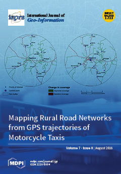
Rural areas in Africa are largely characterized by poor road networks. This poor state of rural roads contributes to the vulnerability of communities in developing countries by hampering access to vital social services and opportunities. In addition, maps of the road networks are largely incomplete and not up-to-date. In this paper, motorcycle taxis, which are a dominant mode of transport in rural areas in Africa, were tracked using affordable GPS data loggers. The resulting GPS trajectories revealed the village-level road networks that are used by rural residents. The results showed that GPS trajectories from motorcycle taxis can improve the map coverage of rural road networks and boost other mapping initiatives like OpenStreetMap (OSM). Specifically, GPS-derived data can improve the coverage of official road maps in rural areas by up to 70% and OSM data by up to 60%. View the paper here.
  • Issues are regarded as officially published after their release is announced to the table of contents alert mailing list.
  • You may sign up for e-mail alerts to receive table of contents of newly released issues.
  • PDF is the official format for papers published in both, html and pdf forms. To view the papers in pdf format, click on the "PDF Full-text" link, and use the free Adobe Reader to open them.
Order results
Result details
Select all
Export citation of selected articles as:
17 pages, 13278 KiB  
Article
Using the Spatial Knowledge of Map Users to Personalize City Maps: A Case Study with Tourists in Madrid, Spain
by María-Teresa Manrique-Sancho, Silvania Avelar, Teresa Iturrioz-Aguirre and Miguel-Ángel Manso-Callejo
ISPRS Int. J. Geo-Inf. 2018, 7(8), 332; https://doi.org/10.3390/ijgi7080332 - 20 Aug 2018
Cited by 16 | Viewed by 4904
Abstract
The aim of personalized maps is to help individual users to read maps and focus on the most task-relevant information. Several approaches have been suggested to develop personalized maps for cities, but few consider the spatial knowledge of its users. We propose the [...] Read more.
The aim of personalized maps is to help individual users to read maps and focus on the most task-relevant information. Several approaches have been suggested to develop personalized maps for cities, but few consider the spatial knowledge of its users. We propose the design of “cognitively-aware” personalized maps, which take into account the previous experience of users in the city and how the urban space is configured in their minds. Our aim is to facilitate users’ mental links between maps and city places, stimulating users to recall features of the urban space and to assimilate new spatial knowledge. To achieve this goal, we propose the personalization of maps through a map design process based on user modeling and on inferring personalization guidelines from hand-drawn sketches of urban spaces. We applied this process in an experiment with tourists in Madrid, Spain. We categorized the participants into three types of tourists—“Guided”, “Explorer”, and “Conditioned”—according to individual and contextual factors that can influence their spatial knowledge of the city. We also extracted design guidelines from tourists’ sketches and developed map prototypes. The empirical results seem to be promising for developing personalized city maps that could be produced on-the-fly in the future. Full article
Show Figures

Figure 1

Figure 1
<p>The three reference systems of cognitive maps, as defined by Moore [<a href="#B33-ijgi-07-00332" class="html-bibr">33</a>] and identified in the sketches drawn by tourists of Madrid.</p>
Full article ">Figure 2
<p>The conceptual framework to developing cognitively aware personalized maps.</p>
Full article ">Figure 3
<p>Sketch of Madrid drawn by a tourist. It shows: (<b>a</b>) Plaza Mayor; (<b>b</b>) Gran Vía street; (<b>c</b>) Chamberí zone; and (<b>d</b>) the Atocha train station and subway.</p>
Full article ">Figure 4
<p>Collective conception of Madrid, with the features most frequently identified by tourists.</p>
Full article ">Figure 5
<p>Features portrayed in the sketches: (<b>a</b>) POIs in 2D (Atocha train station) and 2.5D (Reina Sofía museum); (<b>b</b>) POIs structured around the metro lines; (<b>c</b>) zones related to spatial tasks.</p>
Full article ">Figure 6
<p>Different anchor points in the sketches: (<b>a</b>) POI close to the tourist’s accommodation; (<b>b</b>) the most-used public transport stop; (<b>c</b>) no anchor point.</p>
Full article ">Figure 7
<p>Decision diagram for determining the type of a tourist, according to the five main factors impacting the travel experience.</p>
Full article ">Figure 8
<p>Number of POIs, hubs, and zones in the sketch of each tourist, by tourist type.</p>
Full article ">Figure 9
<p>Sketches classified by type of tourist and reference system.</p>
Full article ">Figure 10
<p>Evolution of sketches of an Explorer tourist throughout the stay (T5 in <a href="#ijgi-07-00332-f004" class="html-fig">Figure 4</a>). The number of features is shown to increase, while the coordinated reference system stays the same.</p>
Full article ">Figure 11
<p>Maps created for tourist T1 (Guided), illustrating the places to visit daily in Madrid. The pink circle shows the POIs reachable within a 20-min walk from the tourist’s accommodation, located in the city’s “Centro” zone. Maps in (<b>a</b>–<b>d</b>) take into account the average number of features and the differentiated reference system of the Guided participant’s sketches (cluster of elements organized around a fixed feature, the hotel). The map in (<b>e</b>) summarizes the information on the four previous maps in a coordinated reference system, in order to help user T1 to integrate the information of the daily experiences in a single map. During the stay in Madrid, the maps will evolve to distinguish the POIs and streets already visited, from the ones yet to be seen. If tourist T1 takes photos, they will replace the generic images. Places visited instead of or in addition to the initial plan will also be included.</p>
Full article ">Figure 12
<p>Map created for tourist T2 (Explorer), presenting a summary of places visited during the stay in Madrid. Drawn upon the sketch maps of the Explorers, the map design includes a large number of features, with hubs and zones (colored circles), and applies a coordinated reference system. If tourist T2 selects the suggestions button, several recommendations will be shown on the same map, changing the previous content to grey, and displaying the new one in color. The suggestions will consider the interests of tourist T2, as well as public transport lines, timetables, and weather forecasts.</p>
Full article ">
19 pages, 5265 KiB  
Article
Use of Unmanned Aerial Vehicles (UAVs) for Updating Farmland Cadastral Data in Areas Subject to Landslides
by Edyta Puniach, Agnieszka Bieda, Paweł Ćwiąkała, Anita Kwartnik-Pruc and Piotr Parzych
ISPRS Int. J. Geo-Inf. 2018, 7(8), 331; https://doi.org/10.3390/ijgi7080331 - 19 Aug 2018
Cited by 35 | Viewed by 5774
Abstract
The purpose of this study was to verify the applicability of unmanned aerial vehicles (UAVs) to update cadastral records in areas affected by landslides. Its authors intended to compare the accuracy of coordinates determined using different UAV data processing methods for points which [...] Read more.
The purpose of this study was to verify the applicability of unmanned aerial vehicles (UAVs) to update cadastral records in areas affected by landslides. Its authors intended to compare the accuracy of coordinates determined using different UAV data processing methods for points which form the framework of a cadastral database, and to find out whether products obtained as a result of such UAV data processing are sufficient to define the extent of changes in the cadastral objects. To achieve this, an experiment was designed to take place at the site of a landslide. The entire photogrammetry mission was planned to cover an area of more than 70 ha. Given the steep grade of the site, the UAV was flown over each line at a different, individually preset altitude, such as to ensure consistent mean shooting distance (height above ground level), and thus, appropriate ground sample distance (GSD; pixel size). The results were analyzed in four variants, differing from each other in terms of the number of control points used and the method of their measurement. This allowed identification of the factors that affect surveying accuracy and the indication of the cadastral data updatable based on an UAV photogrammetric survey. Full article
(This article belongs to the Special Issue Applications and Potential of UAV Photogrammetric Survey)
Show Figures

Figure 1

Figure 1
<p>The profile of the Polish cadastre based on the Land Administration Domain Model [<a href="#B35-ijgi-07-00331" class="html-bibr">35</a>].</p>
Full article ">Figure 2
<p>Survey site: (<b>a</b>) April 2010—before landslide [<a href="#B62-ijgi-07-00331" class="html-bibr">62</a>]; (<b>b</b>) October 2014—after landslide [<a href="#B63-ijgi-07-00331" class="html-bibr">63</a>].</p>
Full article ">Figure 3
<p>Processing diagram for typical aerial photogrammetry products developed from unmanned aerial vehicle (UAV)-collected data [<a href="#B68-ijgi-07-00331" class="html-bibr">68</a>].</p>
Full article ">Figure 4
<p>Plan of photogrammetric flight over the landslide.</p>
Full article ">Figure 5
<p>Locations of control points and check points.</p>
Full article ">Figure 6
<p>Differences in coordinates for check points compared to an aligned block of photographs: (<b>a</b>) check points surveyed using static GNSS; (<b>b</b>) check points surveyed using RTK GNSS.</p>
Full article ">Figure 7
<p>(<b>a</b>) Outline of the landslide over plots of land; (<b>b</b>) plots wholly covered by the landslide.</p>
Full article ">
19 pages, 7514 KiB  
Article
A Segmented Processing Approach of Eigenvector Spatial Filtering Regression for Normalized Difference Vegetation Index in Central China
by Jiaxin Yang, Yumin Chen, Meijie Chen, Fan Yang and Ming Yao
ISPRS Int. J. Geo-Inf. 2018, 7(8), 330; https://doi.org/10.3390/ijgi7080330 - 17 Aug 2018
Cited by 8 | Viewed by 3323
Abstract
A segmented processing approach of eigenvector spatial filtering (ESF) regression is proposed to detect the relationship between NDVI and its environmental factors like DEM, precipitation, relative humidity, precipitation days, soil organic carbon, and soil base saturation in central China. An optimum size of [...] Read more.
A segmented processing approach of eigenvector spatial filtering (ESF) regression is proposed to detect the relationship between NDVI and its environmental factors like DEM, precipitation, relative humidity, precipitation days, soil organic carbon, and soil base saturation in central China. An optimum size of 32 × 32 is selected through experiments as the basic unit for image segmentation to resolve the large datasets to smaller ones that can be performed in parallel and processed more efficiently. The eigenvectors from the spatial weights matrix (SWM) of each segmented image block are selected as synthetic proxy variables accounting for the spatial effects and aggregated to construct a global ESF regression model. Results show precipitation and humidity are more influential than other factors and spatial autocorrelation plays a vital role in vegetation cover in central China. Despite the increase in model complexity; the parallel ESF regression model performs best across all performance criteria compared to the ordinary least squared linear regression (OLS) and spatial autoregressive (SAR) models. The proposed parallel ESF approach overcomes the computational barrier for large data sets and is very promising in applying spatial regression modeling to a wide range of real world problem solving and forecasting. Full article
Show Figures

Figure 1

Figure 1
<p>An illustration of image segmentation. (The large datasets are segmented to smaller ones with the size N × N. The optimum N is determined by tests of linear ESF for a single small block.).</p>
Full article ">Figure 2
<p>The study area and NDVI distribution (NDVI is from monthly compositing dataset of MODIS Terra (MODND1D) in August 2009, which takes the maximum from 1 August to 1 September in 2009. The datasets are provided by International Scientific &amp; Technical Data Mirror Site, Computer Network Information Center, Chinese Academy of Sciences. Projection Coordinate System: WGS 1984 UTM Zone 48N).</p>
Full article ">Figure 3
<p>Raster data after preprocessed (DEM dataset was released in 2008, PREC, RHU, and DAYP datasets are yearly value of 2009, and OC and BS datasets were released in 2008).</p>
Full article ">Figure 4
<p>(<b>a</b>) Comparison of RSE between OLS, SAR, and ESF; (<b>b</b>) comparison of R-Squared between OLS, SAR, and ESF; (<b>c</b>) comparison of Adjusted R-Squared between OLS, SAR, and ESF; (<b>d</b>) comparison of Pseudo R-Squared between OLS, SAR, and ESF; (<b>e</b>) comparison of AIC between OLS, SAR, and ESF. The X-axis means the serial number of segmented blocks by column.</p>
Full article ">Figure 4 Cont.
<p>(<b>a</b>) Comparison of RSE between OLS, SAR, and ESF; (<b>b</b>) comparison of R-Squared between OLS, SAR, and ESF; (<b>c</b>) comparison of Adjusted R-Squared between OLS, SAR, and ESF; (<b>d</b>) comparison of Pseudo R-Squared between OLS, SAR, and ESF; (<b>e</b>) comparison of AIC between OLS, SAR, and ESF. The X-axis means the serial number of segmented blocks by column.</p>
Full article ">Figure 5
<p>Original NDVI image and fitted NDVI image of the three models.</p>
Full article ">
4 pages, 2927 KiB  
Correction
Correction: Dawson, T.; et al. A Spatial Analysis of the Relationship between Vegetation and Poverty. Int. J. Geo-Inf. 2018, 7, 83
by Teddy Dawson, J. S. Onésimo Sandoval, Vasit Sagan and Thomas Crawford
ISPRS Int. J. Geo-Inf. 2018, 7(8), 329; https://doi.org/10.3390/ijgi7080329 - 16 Aug 2018
Viewed by 2747
Abstract
The authors wish to make the following corrections to their paper[...] Full article
Show Figures

Figure 1

Figure 1
<p>Chicago shrinking city Percent White and Percent Black: 95% two-tailed test (−1.96:1.96).</p>
Full article ">Figure 2
<p>Chicago shrinking city Percent White and Percent Black: 95% two-tailed test (−1.96:1.96).</p>
Full article ">Figure 3
<p>Philadelphia shrinking city Percent White and Percent Black: 95% two-tailed test (−1.96:1.96) for 2010.</p>
Full article ">Figure 4
<p>Philadelphia shrinking city Percent White and Percent Black: 95% two-tailed test (−1.96:1.96).</p>
Full article ">
19 pages, 8174 KiB  
Article
Method for the Analysis and Visualization of Similar Flow Hotspot Patterns between Different Regional Groups
by Haiping Zhang, Xingxing Zhou, Xin Gu, Lei Zhou, Genlin Ji and Guoan Tang
ISPRS Int. J. Geo-Inf. 2018, 7(8), 328; https://doi.org/10.3390/ijgi7080328 - 15 Aug 2018
Cited by 10 | Viewed by 5849
Abstract
Interaction among different regions can be illustrated in the form of a stream. For example, the interaction between the flows of people and information among different regions can reflect city network structures, as well as city functions and interconnections. The popularization of big [...] Read more.
Interaction among different regions can be illustrated in the form of a stream. For example, the interaction between the flows of people and information among different regions can reflect city network structures, as well as city functions and interconnections. The popularization of big data has facilitated the acquisition of flow data for various types of individuals. The application of the regional interaction model, which is based on the summary level of individual flow data mining, is currently a hot research topic. Thus far, however, previous research on spatial interaction methods has mainly focused on point-to-point and area-to-area interaction patterns, and investigations on the patterns of interaction hotspots between two regional groups with predefined neighborhood relationships, that being with two regions, remain scarce. In this study, a method for the identification of similar interaction hotspot patterns between two regional groups is proposed, and geo-information Tupu methods are applied to visualize interaction patterns. China’s air traffic flow data are used as an example to illustrate the performance of the proposed method to identify and analyze interaction hotspot patterns between regional groups with adjoining relationships across China. Research results indicate that the proposed method efficiently identifies the patterns of interaction flow hotspots between regional groups. Moreover, it can be applied to analyze any flow space in the excavation of the patterns of regional group interaction hotspots. Full article
Show Figures

Figure 1

Figure 1
<p>Example and analytical methods for point-to-point flow data. (<b>a</b>) Point-to-point flow data, (<b>b</b>) points-to-points flow data, and (<b>c</b>) points-to-points flow patterns.</p>
Full article ">Figure 2
<p>Example and analytical methods for regional flow data. (<b>a</b>) Area-to-area flow data; (<b>b</b>) area-to-area flow data with high interaction values; and (<b>c</b>) area-to-area flow patterns.</p>
Full article ">Figure 3
<p>Flow pattern and visualization of interaction hotspots between regional groups. (<b>a</b>) Area-to-area flow data; (<b>b</b>) area-to-area flow data and area pairs with high interaction values; and (<b>c</b>) similar hotspot flow patterns between regional groups.</p>
Full article ">Figure 4
<p>Overview of the framework for the analysis and visualization of similar flow hotspot patterns between regional groups.</p>
Full article ">Figure 5
<p>Regional adjacency relationships. (<b>a</b>) Vector areas with the target region; (<b>b</b>) adjacent edge relationship; (<b>c</b>) adjacent edge and corner relationship; (<b>d</b>) customized adjacent range relationship; and (<b>e</b>) logical adjacent relationship.</p>
Full article ">Figure 6
<p>Two examples and instrumental definition of single RG-Flow-Pattern visualization. (<b>a</b>) A regional interaction hotspot flow pattern with low interaction value; and (<b>b</b>) a regional interaction cold-spot flow pattern with high interaction value; and (<b>c</b>) legend of FG-Flow-Pattern.</p>
Full article ">Figure 7
<p>Example of one region belonging to different patterns.</p>
Full article ">Figure 8
<p>Basic categories of RG-Flow-Pattern based on geo-information Tupu. (<b>a</b>) Many-to-many regions and single direction RG-Flow-Pattern; (<b>b</b>) many-to-many region and double direction RG-Flow-Pattern; (<b>c</b>) one-to-many single direction RG-Flow-Pattern; (<b>d</b>) many-to-one single direction RG-Flow-Pattern; and (<b>e</b>) one and many double direction RG-Flow-Pattern.</p>
Full article ">Figure 9
<p>Study area and visualization of flow data.</p>
Full article ">Figure 10
<p>Four examples of RG-Flow-Patterns geo-information Tupu obtained under the threshold of 0.00001. (<b>a</b>) A cold-spot RG-Flow-Pattern; (<b>b</b>) a hotspot RG-Flow-Pattern; (<b>c</b>) a cold-spot RG-Flow-Pattern; (<b>d</b>) a hotspot RG-Flow-Pattern.</p>
Full article ">
19 pages, 5569 KiB  
Article
A Parallel N-Dimensional Space-Filling Curve Library and Its Application in Massive Point Cloud Management
by Xuefeng Guan, Peter Van Oosterom and Bo Cheng
ISPRS Int. J. Geo-Inf. 2018, 7(8), 327; https://doi.org/10.3390/ijgi7080327 - 15 Aug 2018
Cited by 20 | Viewed by 6653
Abstract
Because of their locality preservation properties, Space-Filling Curves (SFC) have been widely used in massive point dataset management. However, the completeness, universality, and scalability of current SFC implementations are still not well resolved. To address this problem, a generic n-dimensional (nD) SFC library [...] Read more.
Because of their locality preservation properties, Space-Filling Curves (SFC) have been widely used in massive point dataset management. However, the completeness, universality, and scalability of current SFC implementations are still not well resolved. To address this problem, a generic n-dimensional (nD) SFC library is proposed and validated in massive multiscale nD points management. The library supports two well-known types of SFCs (Morton and Hilbert) with an object-oriented design, and provides common interfaces for encoding, decoding, and nD box query. Parallel implementation permits effective exploitation of underlying multicore resources. During massive point cloud management, all xyz points are attached an additional random level of detail (LOD) value l. A unique 4D SFC key is generated from each xyzl with this library, and then only the keys are stored as flat records in an Oracle Index Organized Table (IOT). The key-only schema benefits both data compression and multiscale clustering. Experiments show that the proposed nD SFC library provides complete functions and robust scalability for massive points management. When loading 23 billion Light Detection and Ranging (LiDAR) points into an Oracle database, the parallel mode takes about 10 h and the loading speed is estimated four times faster than sequential loading. Furthermore, 4D queries using the Hilbert keys take about 1~5 s and scale well with the dataset size. Full article
Show Figures

Figure 1

Figure 1
<p>The illustration of 2D Hilbert curves with different orders.</p>
Full article ">Figure 2
<p>The illustration of dynamic 2D R-tree.</p>
Full article ">Figure 3
<p>A 2D implicit fixed tree labeled with Z-order keys.</p>
Full article ">Figure 4
<p>The abstracted class diagram for SFCLib.</p>
Full article ">Figure 5
<p>The relationship between the quadtree node and 1D Hilbert key range.</p>
Full article ">Figure 6
<p>Illustration of the recursive 1D range generation process.</p>
Full article ">Figure 7
<p>The parallel pipeline for bulk SFC encoding.</p>
Full article ">Figure 8
<p>The parallel translation from discrete tree nodes to SFC key ranges.</p>
Full article ">Figure 9
<p>The illustration of streaming random uniform sampling.</p>
Full article ">Figure 10
<p>The different experimental datasets displayed on OpenStreetMap.</p>
Full article ">Figure 11
<p>Parallel SFC range generation for the example 4D query box.</p>
Full article ">Figure 12
<p>The query time of two steps with different returned ranges.</p>
Full article ">Figure 13
<p>Different 2D geometries used in the 4D query cases</p>
Full article ">Figure 14
<p>Total query time over different data sizes in the 4D query cases.</p>
Full article ">
20 pages, 4408 KiB  
Article
Identification of Painted Rock-Shelter Sites Using GIS Integrated with a Decision Support System and Fuzzy Logic
by Ruman Banerjee, Prashant K. Srivastava, A. W. G. Pike and George P. Petropoulos
ISPRS Int. J. Geo-Inf. 2018, 7(8), 326; https://doi.org/10.3390/ijgi7080326 - 12 Aug 2018
Cited by 12 | Viewed by 11118
Abstract
The conservation and protection of painted rock shelters is an important issue. Throughout the world, if unprotected, they are vulnerable to vandalism or to industrial activities such as quarrying. This research explores the integrated use of a Geographic Information System (GIS) with a [...] Read more.
The conservation and protection of painted rock shelters is an important issue. Throughout the world, if unprotected, they are vulnerable to vandalism or to industrial activities such as quarrying. This research explores the integrated use of a Geographic Information System (GIS) with a multi-criteria decision support system and fuzzy logic to identify possible rock art sites over the Vindhyan Plateau in the district of Mirzapur, Central India. The methodology proposed compares results obtained by spatial modelling with validation data derived from recent exhaustive field surveys of more than forty newly discovered rock-shelters in the Vindhyan region. The zones obtained by predictive modelling are in agreement with validation datasets and show that the method can be used for new site prospection. This method represents a potential tool for landscape planners and policy makers to employ when seeking protection from anthropogenic activities of potential areas of painted rock-shelter sites and archaeological deposits. Full article
Show Figures

Figure 1

Figure 1
<p>Location of study area (Mirzapur, India).</p>
Full article ">Figure 2
<p>Conceptual model of trapezoidal membership function.</p>
Full article ">Figure 3
<p>Fuzzy architecture employed in this study.</p>
Full article ">Figure 4
<p>Overview of the methodology used in this study.</p>
Full article ">Figure 5
<p>Different thematic maps used in this study: (<b>a</b>) vicinity of water resources from archaeological sites, (<b>b</b>) geomorphology, (<b>c</b>) geohydrology, (<b>d</b>) geology, (<b>e</b>) geomineralogy, (<b>f</b>) aspect, (<b>g</b>) exaggerated DEM, (<b>h</b>) slope of the study derived from DEM.</p>
Full article ">Figure 6
<p>Fuzzy logic output.</p>
Full article ">Figure 7
<p>Non-patinated microliths from one of the painted rock-art sites in Mirzapur.</p>
Full article ">Figure 8
<p>Painted rock shelters discovered during the field survey (<b>a</b>) Battle scene (<b>b</b>) Painting of Deer (<b>c)</b> Pair of Deer (<b>d</b>) Group of animals and hunting expedition.</p>
Full article ">Figure 9
<p>Rock art sites based on (<b>a</b>) AHP-MCE approach and (<b>b</b>) Fuzzy logic.</p>
Full article ">
15 pages, 1479 KiB  
Article
Journey-to-Crime Distances of Residential Burglars in China Disentangled: Origin and Destination Effects
by Luzi Xiao, Lin Liu, Guangwen Song, Stijn Ruiter and Suhong Zhou
ISPRS Int. J. Geo-Inf. 2018, 7(8), 325; https://doi.org/10.3390/ijgi7080325 - 12 Aug 2018
Cited by 31 | Viewed by 6250
Abstract
Research on journey-to-crime distance has revealed the importance of both the characteristics of the offender as well as those of target communities. However, the effect of the home community has so far been ignored. Besides, almost all journey-to-crime studies were done in Western [...] Read more.
Research on journey-to-crime distance has revealed the importance of both the characteristics of the offender as well as those of target communities. However, the effect of the home community has so far been ignored. Besides, almost all journey-to-crime studies were done in Western societies, and little is known about how the distinct features of communities in major Chinese cities shape residential burglars’ travel patterns. To fill this gap, we apply a cross-classified multilevel regression model on data of 3763 burglary trips in ZG City, one of the bustling metropolises in China. This allows us to gain insight into how residential burglars’ journey-to-crime distances are shaped by their individual-level characteristics as well as those of their home and target communities. Results show that the characteristics of the home community have larger effects than those of target communities, while individual-level features are most influential. Older burglars travel over longer distances to commit their burglaries than the younger ones. Offenders who commit their burglaries in groups tend to travel further than solo offenders. Burglars who live in communities with a higher average rent, a denser road network and a higher percentage of local residents commit their burglaries at shorter distances. Communities with a denser road network attract burglars from a longer distance, whereas those with a higher percentage of local residents attract them from shorter by. Full article
(This article belongs to the Special Issue Human-Centric Data Science for Urban Studies)
Show Figures

Figure 1

Figure 1
<p>Distribution of journey-to-crime distances of residential burglary trips in ZG City, China.</p>
Full article ">Figure 2
<p>Mean distance at the home community level.</p>
Full article ">Figure 3
<p>Mean distance at the target community-level.</p>
Full article ">Figure 4
<p>The cross-classified multilevel data structure.</p>
Full article ">
18 pages, 789 KiB  
Article
An INS/Floor-Plan Indoor Localization System Using the Firefly Particle Filter
by Jian Chen, Gang Ou, Ao Peng, Lingxiang Zheng and Jianghong Shi
ISPRS Int. J. Geo-Inf. 2018, 7(8), 324; https://doi.org/10.3390/ijgi7080324 - 10 Aug 2018
Cited by 14 | Viewed by 3612
Abstract
Location-based services for smartphones are becoming more and more popular. The core of location-based services is how to estimate a user’s location. An INS/floor-plan indoor localization system, using the Firefly Particle Filter (FPF), is proposed to estimate a user’s location. INS includes an [...] Read more.
Location-based services for smartphones are becoming more and more popular. The core of location-based services is how to estimate a user’s location. An INS/floor-plan indoor localization system, using the Firefly Particle Filter (FPF), is proposed to estimate a user’s location. INS includes an attitude angle module, a step length module and a step counting module. In the step length module, we propose a hybrid step length model. The proposed step length algorithm reasonably calculates a user’s step length. Because of sensor deviation, non-orthogonality and the user’s jitter, the main bottleneck for INS is that the error grows over time. To reduce the cumulative error, we design cascade filters including the Kalman Filter (KF) and FPF. To a certain extent, KF reduces velocity error and heading drift. On the other hand, the firefly algorithm is used to solve the particle impoverishment problem. Considering that a user may not cross an obstacle, the proposed particle filter is proposed to improve positioning performance. Results show that the average positioning error in walking experiments is 2.14 m. Full article
Show Figures

Figure 1

Figure 1
<p>System model.</p>
Full article ">Figure 2
<p>Step length model.</p>
Full article ">Figure 3
<p>Step length model.</p>
Full article ">Figure 4
<p>Different scenarios.</p>
Full article ">Figure 5
<p>The walking trajectory: (<b>a</b>) teaching building; (<b>b</b>) study room; (<b>c</b>) office building.</p>
Full article ">Figure 6
<p>Weights at the 20<sup>th</sup>, 60<sup>th</sup>, 125<sup>th</sup> and 150<sup>th</sup> steps.</p>
Full article ">Figure 7
<p>Positioning results for EKF.</p>
Full article ">Figure 8
<p>Positioning results for FPF.</p>
Full article ">Figure 9
<p>Position errors with different algorithms.</p>
Full article ">Figure 10
<p>CDF with different algorithms.</p>
Full article ">Figure 11
<p>Positioning result for FPF.</p>
Full article ">Figure 12
<p>CDF for PF, the map-matching algorithm and FPF.</p>
Full article ">Figure 13
<p>Positioning result for FPF.</p>
Full article ">Figure 14
<p>CDF for FPF.</p>
Full article ">
26 pages, 3040 KiB  
Article
Analyzing the Tagging Quality of the Spanish OpenStreetMap
by Jesús M. Almendros-Jiménez and Antonio Becerra-Terón
ISPRS Int. J. Geo-Inf. 2018, 7(8), 323; https://doi.org/10.3390/ijgi7080323 - 9 Aug 2018
Cited by 20 | Viewed by 5350
Abstract
In this paper, a framework for the assessment of the quality of OpenStreetMap is presented, comprising a batch of methods to analyze the quality of entity tagging. The approach uses Taginfo as a reference base and analyses quality measures such as completeness, compliance, [...] Read more.
In this paper, a framework for the assessment of the quality of OpenStreetMap is presented, comprising a batch of methods to analyze the quality of entity tagging. The approach uses Taginfo as a reference base and analyses quality measures such as completeness, compliance, consistence, granularity, richness and trust . The framework has been used to analyze the quality of OpenStreetMap in Spain, comparing the main cities of Spain. Also a comparison between Spain and some major European cities has been carried out. Additionally, a Web tool has been also developed in order to facilitate the same kind of analysis in any area of the world. Full article
Show Figures

Figure 1

Figure 1
<p>Summary of items, nodes, ways and relations in the Spanish cities under study.</p>
Full article ">Figure 2
<p>Completeness study in Spain. Proportion of house numbers and buildings.</p>
Full article ">Figure 3
<p>Completeness study in Spain. Percentage of attributes name, oneway and maxspeed in highways.</p>
Full article ">Figure 4
<p>Completeness study in Spain. Percentage of name, opening hours and phone in amenities.</p>
Full article ">Figure 5
<p>Completeness study in Spain. Percentage of name, opening hours and phone in shops.</p>
Full article ">Figure 6
<p>Completeness study in Spain. Percentage of name in public transport, tourism, religion and historic entities.</p>
Full article ">Figure 7
<p>Compliance study in Spain. Percentage of commonly used keys.</p>
Full article ">Figure 8
<p>Compliance study in Spain. Percentage of commonly used combinations.</p>
Full article ">Figure 9
<p>Consistency study of highway in Spain. Standard deviation of tag number.</p>
Full article ">Figure 10
<p>Consistency study of shop in Spain. Standard deviation of tag number.</p>
Full article ">Figure 11
<p>Consistency study of tourism in Spain. Standard deviation of tag number.</p>
Full article ">Figure 12
<p>Granularity study in Spain. Average and median of tag number.</p>
Full article ">Figure 13
<p>Richness study in Spain. Number of distinct categories.</p>
Full article ">Figure 14
<p>Trust study in Spain: local experience. Average number of contributions in the study area by contributor.</p>
Full article ">Figure 15
<p>Trust study in Spain: global experience. Average number of contributions in the planet by contributor.</p>
Full article ">Figure 16
<p>Summary of items, nodes, ways and relations in the European cities under study.</p>
Full article ">Figure 17
<p>Completeness study in Europe. Proportion of house numbers and buildings.</p>
Full article ">Figure 18
<p>Completeness study in Europe. Percentage of attributes name, oneway and maxspeed in highways.</p>
Full article ">Figure 19
<p>Completeness study in Europe. Percentage of name, opening hours and phone in amenities.</p>
Full article ">Figure 20
<p>Completeness study in Europe. Percentage of name, opening hours and phone in shops.</p>
Full article ">Figure 21
<p>Completeness study in Europe. Percentage of name in public transport, tourism, religion and historic entities.</p>
Full article ">Figure 22
<p>Compliance study in Europe. Percentage of commonly used keys.</p>
Full article ">Figure 23
<p>Compliance study in Europe. Percentage of commonly used combinations.</p>
Full article ">Figure 24
<p>Consistency study of highway in Europe. Standard deviation of the tag number.</p>
Full article ">Figure 25
<p>Consistency study of shop in Europe. Standard deviation of tag number.</p>
Full article ">Figure 26
<p>Consistency study of tourism in Europe. Standard deviation of the tag number.</p>
Full article ">Figure 27
<p>Granularity study in Europe. Average and median of the number of tags.</p>
Full article ">Figure 28
<p>Richness study in Europe. Number of distinct categories.</p>
Full article ">Figure 29
<p>Trust study in Europe: local experience. Average number of contributions in the study area by contributor.</p>
Full article ">Figure 30
<p>Trust study in Europe: global experience. Average number of contributions in the planet by contributor.</p>
Full article ">Figure 31
<p>Main window of the Web tool.</p>
Full article ">
22 pages, 9297 KiB  
Article
Comparison of Communication Viewsheds Derived from High-Resolution Digital Surface Models Using Line-of-Sight, 2D Fresnel Zone, and 3D Fresnel Zone Analysis
by Jieun Baek and Yosoon Choi
ISPRS Int. J. Geo-Inf. 2018, 7(8), 322; https://doi.org/10.3390/ijgi7080322 - 9 Aug 2018
Cited by 9 | Viewed by 4839
Abstract
We compared three methods for deriving communication viewsheds, which indicate the coverage areas for transmitter points from high-resolution digital surface models. Communication viewsheds were analyzed with a novel 3D Fresnel zone method, as well as line-of-sight (LOS) analysis and 2D Fresnel zone analysis, [...] Read more.
We compared three methods for deriving communication viewsheds, which indicate the coverage areas for transmitter points from high-resolution digital surface models. Communication viewsheds were analyzed with a novel 3D Fresnel zone method, as well as line-of-sight (LOS) analysis and 2D Fresnel zone analysis, using high-resolution digital surface models (DSM) from a topographical survey. A LOS analysis calculates a visibility index by comparing the profile elevations of landforms between the transmitter and the receiver, using LOS elevations. A 2D Fresnel zone analysis calculates a 2D Fresnel index by comparing the profile elevations of landforms with the transverse plane elevations of the Fresnel zone. A 3D Fresnel zone analysis quantitatively analyzes communication stability by calculating a 3D Fresnel index, obtained by comparing the elevations of every terrain cell in a Fresnel zone with the total altitude of the Fresnel zone. The latter produced the most accurate results. Indexes derived by applying different transmitter offset heights, signal frequencies, and DSM resolutions for each of the three methods were then quantitatively analyzed. As both the offset height of the transmitter and the signal frequency decreased, the differences between the results derived from each method increased significantly. Moreover, larger DSM cells generated less accurate results. Full article
Show Figures

Figure 1

Figure 1
<p>Conceptual view showing the process for estimating signal coverage using (<b>a</b>) LOS analysis and 2D Fresnel zone analysis; and (<b>b</b>) 3D Fresnel zone analysis.</p>
Full article ">Figure 2
<p>Comparison of the cells included in the 1st Fresnel zone when using a (<b>a</b>) low-resolution DSM and (<b>b</b>) high-resolution DSM.</p>
Full article ">Figure 3
<p>Flow chart showing procedures for communication viewshed analysis using LOS analysis, 2D Fresnel zone analysis, and 3D Fresnel zone analysis.</p>
Full article ">Figure 4
<p>An example of calculating index maps for all cells when the transmitter offset and the receiver offset is 1 m and the wavelength of the signal is also 1 m. (<b>a</b>) Identifying the current transmitter cell and the current receiver cell; (<b>b</b>) extracting all contact points on the LOS connecting the current transmitter cell and receiver cell; (<b>c</b>) visibility index map; (<b>d</b>) extracting all contact points on the LOS connecting two vertexes of the Fresnel zone; (<b>e</b>) 2D Fresnel index map; (<b>f</b>) extracting all cells included in the 3D Fresnel zone; (<b>g</b>) elevation raster for the lower surface of the 3D Fresnel zone; (<b>h</b>) differences of elevation between extracted cells and the lower surface of the 3D Fresnel zone; and (<b>i</b>) 3D CVR index map.</p>
Full article ">Figure 5
<p>Conceptual view showing the procedure for transforming the coordinate system from the xy coordinate grid to the modified Cartesian coordinate system.</p>
Full article ">Figure 6
<p>Real-world data sets used to test the algorithm. (<b>a</b>) Orthographic image of the open-pit mine obtained using the SenseFly eBee drone. Reference grid is in m and the coordinate system of the image is local transverse Mercator; (<b>b</b>) DSM of the study area (resolution = 1 m); (<b>c</b>) 3-dimensional views of the study area; and (<b>d</b>) distribution of the slope (degrees).</p>
Full article ">Figure 7
<p>Index maps generated by LOS analysis, 2D Fresnel zone analysis, and 3D Fresnel zone analysis for transmitter 1, transmitter 2, and transmitter 3 in the study area.</p>
Full article ">Figure 8
<p>Differences in index maps obtained by (<b>a</b>) the LOS analysis and the 2D Fresnel zone analysis, (<b>b</b>) the 2D Fresnel zone analysis and the 3D Fresnel zone analysis, and (<b>c</b>) the LOS analysis and the 3D Fresnel zone analysis for transmitter 1.</p>
Full article ">Figure 9
<p>Index maps produced by each method for transmitter 1 for a frequency threshold of 900 MHz and transmitter offset heights of 1 m, 5 m, and 7 m.</p>
Full article ">Figure 10
<p>Index maps for transmitter 1 generated by each method for a transmitter offset height of 3 m and frequency thresholds of 433 MHz, 2.4 GHz, and 5 GHz.</p>
Full article ">Figure 11
<p>Differences between visibility index maps, 2D Fresnel index maps, and 3D Fresnel index maps for transmitter 1 at a frequency threshold of 433 MHz, 2.4 GHz, and 5 GHz.</p>
Full article ">Figure 12
<p>Differences in index value of all raster cells in the study area at different frequency thresholds.</p>
Full article ">Figure 13
<p>3D Fresnel index maps for transmitter 1 with DSM resolutions of (<b>a</b>) 25 cm, (<b>b</b>) 50 cm, (<b>c</b>) 2 m, (<b>d</b>) 4 m, and (<b>e</b>) 8 m.</p>
Full article ">Figure 14
<p>The computation time needed for the 3D Fresnel zone analysis according to the number of DSM cells.</p>
Full article ">
23 pages, 10130 KiB  
Article
Extracting Indoor Space Information in Complex Building Environments
by Yueyong Pang, Chi Zhang, Liangchen Zhou, Bingxian Lin and Guonian Lv
ISPRS Int. J. Geo-Inf. 2018, 7(8), 321; https://doi.org/10.3390/ijgi7080321 - 9 Aug 2018
Cited by 30 | Viewed by 5334
Abstract
Indoor space information extraction is an important aspect of reconstruction for building information modeling and a necessary process for geographic information system from outdoor to indoor. Entity model extracting methods provide advantages in terms of accuracy for building indoor spaces, as compared with [...] Read more.
Indoor space information extraction is an important aspect of reconstruction for building information modeling and a necessary process for geographic information system from outdoor to indoor. Entity model extracting methods provide advantages in terms of accuracy for building indoor spaces, as compared with network and grid model methods, and the extraction results can be converted into a network or grid model. However, existing entity model extracting methods based on a search loop do not consider the complex indoor environment of a building, such as isolated columns and walls or cross-floor spaces. In this study, such complex indoor environments are analyzed in detail, and a new approach for extracting buildings’ indoor space information is proposed. This approach is based on indoor space boundary calculation, the Boolean difference for single-floor space extraction, relationship reconstruction, and cross-floor space extraction. The experimental results showed that the proposed method can accurately extract indoor space information from the complex indoor environment of a building with geometric, semantic, and relationship information. This study is theoretically important for better understanding the complexity of indoor space extraction and practically important for improving the modeling accuracy of buildings. Full article
Show Figures

Figure 1

Figure 1
<p>Complexity of large buildings. (<b>a</b>) Actual view and (<b>b</b>) plan of isolated components. (<b>c</b>) Indoor space results extracted using the search-loop method. S1 is the indoor space polygon obtained by the search-loop method. S2–S6 are the regions occupied by the isolated components of the building; (<b>d</b>) Actual results. I1–I5 are the internal islands of S1′.</p>
Full article ">Figure 2
<p>Overview of the proposed indoor space extraction procedure: (<b>a</b>) Building components; (<b>b</b>) calculation of the indoor space boundary of a single floor; (<b>c</b>) indoor single-floor space extraction of a building; (<b>d</b>) identification of the downward connectivity of single-floor space; (<b>e</b>) indoor cross-floor space extracting of a building; and (<b>f</b>) extraction result, (<b>a</b>–<b>c</b>) are part of the building in (<b>d</b>) for clear expression.</p>
Full article ">Figure 3
<p>Boundary components: (<b>a</b>) walls and (<b>b</b>) columns.</p>
Full article ">Figure 4
<p>Calculation of the indoor space boundary: (<b>a</b>) boundary components of spaces and (<b>b</b>) results of the Boolean operation.</p>
Full article ">Figure 5
<p>Flowchart for extracting a single-floor space.</p>
Full article ">Figure 6
<p>Extraction and modeling of single-floor building spaces in floor plan view: (<b>a</b>) convex hull <math display="inline"><semantics> <mi>C</mi> </semantics></math> of <math display="inline"><semantics> <mi>S</mi> </semantics></math>; (<b>b</b>) result of the Boolean difference operation; (<b>c</b>) distinction between indoor and outdoor spaces, and (<b>d</b>) resulting indoor single-floor spaces.</p>
Full article ">Figure 7
<p>Construction of the boundary relationship.</p>
Full article ">Figure 8
<p>Examples of cross-floor spaces: (<b>a</b>) pipe well, (<b>b</b>) elevator shaft, (<b>c</b>) air duct well, and (<b>d</b>) atrium.</p>
Full article ">Figure 9
<p>Cross-floor space representation in a construction plan: (<b>a</b>) pipe well and (<b>b</b>) atrium.</p>
Full article ">Figure 10
<p>Polyline of the hole symbol: (<b>a</b>) discrete line segments and (<b>b</b>) topological reconstruction.</p>
Full article ">Figure 11
<p>Judging the connectivity of building spaces: (<b>a</b>) cross-floor space and (<b>b</b>) single-floor space.</p>
Full article ">Figure 12
<p>Space area relationships between the upper and lower floors: (<b>a</b>) <math display="inline"><semantics> <mrow> <mi>A</mi> <mo>.</mo> <mi>a</mi> <mi>r</mi> <mi>e</mi> <mi>a</mi> <mo>&lt;</mo> <mi>B</mi> <mo>.</mo> <mi>a</mi> <mi>r</mi> <mi>e</mi> <mi>a</mi> </mrow> </semantics></math>, (<b>b</b>) <math display="inline"><semantics> <mrow> <mi>A</mi> <mo>.</mo> <mi>a</mi> <mi>r</mi> <mi>e</mi> <mi>a</mi> <mo>=</mo> <mi>B</mi> <mo>.</mo> <mi>a</mi> <mi>r</mi> <mi>e</mi> <mi>a</mi> </mrow> </semantics></math>, and (<b>c</b>) <math display="inline"><semantics> <mrow> <mi>A</mi> <mo>.</mo> <mi>a</mi> <mi>r</mi> <mi>e</mi> <mi>a</mi> <mo>&gt;</mo> <mi>B</mi> <mo>.</mo> <mi>a</mi> <mi>r</mi> <mi>e</mi> <mi>a</mi> </mrow> </semantics></math>. <math display="inline"><semantics> <mrow> <mi>A</mi> <mo>.</mo> <mi>a</mi> <mi>r</mi> <mi>e</mi> <mi>a</mi> </mrow> </semantics></math> is the upper indoor space area, and <math display="inline"><semantics> <mrow> <mi>B</mi> <mo>.</mo> <mi>a</mi> <mi>r</mi> <mi>e</mi> <mi>a</mi> </mrow> </semantics></math> is the lower space area.</p>
Full article ">Figure 13
<p>Flowchart for extracting a cross-floor space.</p>
Full article ">Figure 14
<p>Comparison of single-floor and cross-floor space extraction: (<b>a</b>) single-floor space 3D model, (<b>b</b>) floor slab without a hole, (<b>c</b>) cross-floor space 3D model, and (<b>d</b>) floor slab with a hole.</p>
Full article ">Figure 15
<p>The indoor space automatic extraction system: (<b>a</b>) BIM data integrated within GIS software and (<b>b</b>) indoor space automatic extraction.</p>
Full article ">Figure 16
<p>Floor plans of the building: (<b>a</b>) first floor, (<b>b</b>) second floor, (<b>c</b>) third floor, (<b>d</b>) fourth floor, and (<b>e</b>) fifth floor.</p>
Full article ">Figure 17
<p>Single-floor space extraction results of the building: (<b>a</b>) first floor, (<b>b</b>) second floor, (<b>c</b>) third floor, (<b>d</b>) fourth floor, and (<b>e</b>) fifth floor.</p>
Full article ">Figure 18
<p>Boundary relationship.</p>
Full article ">Figure 19
<p>Connectivity relationships of indoor cross-floor spaces.</p>
Full article ">Figure 20
<p>Results of the indoor cross-floor space modeling: (<b>a</b>) hallway and (<b>b</b>) audience hall.</p>
Full article ">Figure 21
<p>Situation of isolated components: (<b>a</b>) first floor plan, (<b>b</b>) isolated column, and (<b>c</b>) isolated wall.</p>
Full article ">Figure 22
<p>Extraction results obtained using the search-loop method: (<b>a</b>) first floor plan, (<b>b</b>) isolated column, and (<b>c</b>) isolated wall.</p>
Full article ">Figure 23
<p>Extraction results obtained using proposed method: (<b>a</b>) first floor plan, (<b>b</b>) isolated column, and (<b>c</b>) isolated wall.</p>
Full article ">Figure 24
<p>Comparison of the number of correct indoor spaces.</p>
Full article ">Figure 25
<p>Conversion to other indoor space expression models: (<b>a</b>) network and (<b>b</b>) grid model.</p>
Full article ">
19 pages, 3252 KiB  
Article
Exploring Railway Network Dynamics in China from 2008 to 2017
by Yaping Huang, Shiwei Lu, Xiping Yang and Zhiyuan Zhao
ISPRS Int. J. Geo-Inf. 2018, 7(8), 320; https://doi.org/10.3390/ijgi7080320 - 8 Aug 2018
Cited by 32 | Viewed by 7189
Abstract
China’s high speed rail (HSR) network has been rapidly constructed and developed during the past 10 years. However, few studies have reported the spatiotemporal changes of railway network structures and how those structures have been affected by the operation of high speed rail [...] Read more.
China’s high speed rail (HSR) network has been rapidly constructed and developed during the past 10 years. However, few studies have reported the spatiotemporal changes of railway network structures and how those structures have been affected by the operation of high speed rail systems in different periods. This paper analyzes the evolving network characteristics of China’s railway network during each of the four main stages of HSR development over a 10-year period. These four stages include Stage 1, when no HSR was in place prior to August 2008; Stage 2, when several HSR lines were put into operation between August 2008, and July 2011; Stage 3, when the network skeleton of most main HSR lines was put into place. This covered the period until January 2013. Finally, Stage 4 covers the deep intensification of several new HSR lines and the rapid development of intercity-HSR railway lines between January 2013, and July 2017. This paper presents a detailed analysis of the timetable-based statistical properties of China’s railway network, as well as the spatiotemporal patterns of the more than 2700 stations that have been affected by the opening of HSR lines and the corresponding policy changes. Generally, we find that the distribution of both degrees and strengths are characterized by scale-free patterns. In addition, the decreasing average path length and increasing network clustering coefficient indicate that the small world characteristic is more significant in the evolution of China’s railway network. Correlations between different network indices are explored, in order to further investigate the dynamics of China’s railway system. Overall, our study offers a new approach for assessing the growth and evolution of a real railway network based on train timetables. Our study can also be referenced by policymakers looking to adjust HSR operations and plan future HSR routes. Full article
Show Figures

Figure 1

Figure 1
<p>Mileage of China’s railway service.</p>
Full article ">Figure 2
<p>Spatial distribution of rail lines during different stages.</p>
Full article ">Figure 3
<p>P-space graph of railway lines.</p>
Full article ">Figure 4
<p>Cumulative probability of degree distribution in different stages.</p>
Full article ">Figure 5
<p>Spatial distribution of the degree of top 10 cities.</p>
Full article ">Figure 6
<p>Cumulative probability of weight distribution.</p>
Full article ">Figure 7
<p>Cumulative probability of strength distribution.</p>
Full article ">Figure 8
<p>Spatial distribution of the weights of top 10 cities.</p>
Full article ">Figure 9
<p>Degree–degree correlation.</p>
Full article ">Figure 10
<p>Degree-strength correlation.</p>
Full article ">Figure 11
<p>Degree-clustering coefficient correlation.</p>
Full article ">
12 pages, 1481 KiB  
Article
BIM-GIS Integration as Dedicated and Independent Course for Geoinformatics Students: Merits, Challenges, and Ways Forward
by Ihab Hijazi, Andreas Donaubauer and Thomas H. Kolbe
ISPRS Int. J. Geo-Inf. 2018, 7(8), 319; https://doi.org/10.3390/ijgi7080319 - 8 Aug 2018
Cited by 20 | Viewed by 7142
Abstract
Information mined from building information models as well as associated geographical data and Geographic Information System (GIS) analyses can increase the success of construction processes and asset management, including buildings, roads, and public facilities. The integration of information from both domains requires high [...] Read more.
Information mined from building information models as well as associated geographical data and Geographic Information System (GIS) analyses can increase the success of construction processes and asset management, including buildings, roads, and public facilities. The integration of information from both domains requires high expertise in both spheres. The existing B.Sc and M.Sc. programs linked to the built environment at the Technical University of Munich offer courses for the Building Information Model (BIM) and GIS that are distributed among study programs in Civil Engineering, Architecture, and Geomatics. Students graduating as professionals in one of these domains rarely know how to solve pre-defined technical problems associated with the integration of information from BIM and GIS. Students in such programs seldom practice skills needed for the integration of information from BIM and GIS at a level that is needed in working life. Conversely, the technologies in both domains create artificial boundaries that do not exist in reality—for example, water and electricity would not be of use if the utilities terminated in front of buildings. To bring a change and bridge the gap between BIM and GIS, a change in the teaching methods of BIM/GIS needs to be considered. The Technical University of Munich (TUM) has developed a master’s course (M.Sc. course) for students in Geoinformatics which focuses on competencies required to achieve BIM/GIS integration. This paper describes the course development process and provides a unique perspective on the curriculum and subjects. It also presents the course objective, course development, the selection and development of learning materials, and the assessment of the intended learning outcome of the course. The developed course is validated through a questionnaire, and feedback is provided by participants of the BIM/GIS integration workshop representing a panel of experts in the domain. Full article
Show Figures

Figure 1

Figure 1
<p>Building information model (BIM)–computer-aided design (CAD) level of integration, the link from BIM to 3D geographic information systems (GIS) referring to implementation of the BIM methods using GIS technology/concepts.</p>
Full article ">Figure 2
<p>Example of a theoretical question.</p>
Full article ">Figure 3
<p>Practical example—essay question.</p>
Full article ">Figure 4
<p>Example for a code interpretation question—building hierarchy.</p>
Full article ">Figure 5
<p>Another example for a code interpretation question—indoor utility network.</p>
Full article ">
21 pages, 6491 KiB  
Article
A Methodology for Planar Representation of Frescoed Oval Domes: Formulation and Testing on Pisa Cathedral
by Andrea Piemonte, Gabriella Caroti, Isabel Martínez-Espejo Zaragoza, Filippo Fantini and Luca Cipriani
ISPRS Int. J. Geo-Inf. 2018, 7(8), 318; https://doi.org/10.3390/ijgi7080318 - 7 Aug 2018
Cited by 10 | Viewed by 5595
Abstract
This paper presents an original methodology for planar development of a frescoed dome with an oval plan. Input data include a rigorous geometric survey, performed with a laser scanner, and a photogrammetry campaign, which associates a high-quality photographic texture to the 3D model. [...] Read more.
This paper presents an original methodology for planar development of a frescoed dome with an oval plan. Input data include a rigorous geometric survey, performed with a laser scanner, and a photogrammetry campaign, which associates a high-quality photographic texture to the 3D model. Therefore, the main topics include the development of geometry and, contextually, of the associated textures. In order to overcome the inability to directly develop the surface, an orthographic azimuthal projection is used. Starting from a prerequisite study of building methodology, the dome is divided into sectors and bands, each linked with the maximum acceptable deformations and the actual geometric discontinuities detectable by the analysis of Gaussian curvature. Upon definition of the development model, a custom automation script has been devised for geometry projection. This effectively generates a (u,v) map, associated to the model, which is used for model texturing and provides the planar development of the fresco. Full article
(This article belongs to the Special Issue Data Acquisition and Processing in Cultural Heritage)
Show Figures

Figure 1

Figure 1
<p>Frescoed dome, Pisa Cathedral.</p>
Full article ">Figure 2
<p>Geometric diagram of orthographic azimuthal projection.</p>
Full article ">Figure 3
<p>(<b>a</b>) Automated direct patching; (<b>b</b>) supervised 3D patching.</p>
Full article ">Figure 4
<p>Design analysis and hypotheses on oval-plan outline. The main lengths are in both meters and ancient measuring system Braccia Pisane (BP).</p>
Full article ">Figure 5
<p>(<b>a</b>) Dome main zones subdivision; (<b>b</b>) Dome secondary zones subdivision.</p>
Full article ">Figure 6
<p>(<b>a</b>) Gaussian curvature analysis; (<b>b</b>) Zoom on MNV sector.</p>
Full article ">Figure 7
<p>Portion of the dome included in MNV triangle.</p>
Full article ">Figure 8
<p>Automatic Multicenter Orthographic Projection (AMOP) script graphical description.</p>
Full article ">Figure 9
<p>Pseudo-development by projection of the Pisa Cathedral dome.</p>
Full article ">Figure 10
<p>Flow chart of the methodology suggested.</p>
Full article ">
17 pages, 5186 KiB  
Article
Method Based on Floating Car Data and Gradient-Boosted Decision Tree Classification for the Detection of Auxiliary Through Lanes at Intersections
by Xiaolong Li, Yuzhen Wu, Yongbin Tan, Penggen Cheng, Jing Wu and Yuqian Wang
ISPRS Int. J. Geo-Inf. 2018, 7(8), 317; https://doi.org/10.3390/ijgi7080317 - 5 Aug 2018
Cited by 3 | Viewed by 3925
Abstract
The rapid detection of information on continuously changing intersection auxiliary through lane is a major task of lane-level navigation data updates. However, existing lane number detection methods possess long update cycles and high computational costs. Therefore, this study proposes a novel method based [...] Read more.
The rapid detection of information on continuously changing intersection auxiliary through lane is a major task of lane-level navigation data updates. However, existing lane number detection methods possess long update cycles and high computational costs. Therefore, this study proposes a novel method based on floating car data (FCD) for the detection of auxiliary through lane changes at road intersections. First, roads near intersections are divided into three sections and the spatial distribution characteristics of the FCD of each section are analyzed. Second, the FCD is preprocessed to obtain a standardized FCD dataset by removing redundant data through an improved amplitude-limiting average filtering method. Third, a basic classifier for the number of lanes is constructed. Fourth, the final number of lanes of the road section is determined by combining the basic classifier and the gradient-boosted decision tree model. Finally, the presence of an auxiliary through lane at the intersection is determined in accordance with the change in the number of intersection lanes. The method was tested using data for a road in Wuchang District, Wuhan City. Experimental results show that this method can rapidly obtain auxiliary through lane information from the FCD and is superior to other classification methods. Full article
Show Figures

Figure 1

Figure 1
<p>The technical process of detection method. FCD: floating car data; GBDT: gradient-boosted decision tree.</p>
Full article ">Figure 2
<p>FCD spatial distribution diagram (<b>a</b>) data and road mapping; (<b>b</b>) FCD trajectory line; (<b>c</b>) FCD distribution on transect-based road.</p>
Full article ">Figure 3
<p>Description of characteristic parameters.</p>
Full article ">Figure 4
<p>FCD Eigenvector normalized value (<b>a</b>) coverage width (<b>b</b>) density (<b>c</b>) direction (<b>d</b>) speed.</p>
Full article ">Figure 5
<p>Percentage of FCD per lane.</p>
Full article ">Figure 6
<p>Experimental data processing flow.</p>
Full article ">Figure 7
<p>Results for different collection periods for FCD in the (<b>a</b>) middle segment of the road and (<b>b</b>) at the road intersection.</p>
Full article ">Figure 7 Cont.
<p>Results for different collection periods for FCD in the (<b>a</b>) middle segment of the road and (<b>b</b>) at the road intersection.</p>
Full article ">Figure 8
<p>FCD Eigenvector normalized value.</p>
Full article ">Figure 9
<p>Different division strategies corresponding to the number of lanes.</p>
Full article ">Figure 10
<p>Corresponding image of road segment <span class="html-italic">X</span> and intersection segment <span class="html-italic">X</span>′.</p>
Full article ">
15 pages, 3699 KiB  
Article
Air Quality Context Information Model for Ubiquitous Public Access to Geographic Information
by Sungchul Hong
ISPRS Int. J. Geo-Inf. 2018, 7(8), 316; https://doi.org/10.3390/ijgi7080316 - 4 Aug 2018
Cited by 1 | Viewed by 3558
Abstract
The advance in Information Communication Technology (ICT) has contributed to global challenges of improving urban air quality. Ubiquitous computing technology enables citizens to easily access air quality information services without spatial or temporal limitations. Citizens are also encouraged to participate in air quality [...] Read more.
The advance in Information Communication Technology (ICT) has contributed to global challenges of improving urban air quality. Ubiquitous computing technology enables citizens to easily access air quality information services without spatial or temporal limitations. Citizens are also encouraged to participate in air quality assessment and environmental governance. These societal and technical changes require a new paradigm to develop an air quality information system and its services. An air quality information system needs to integrate varied types of air quality information from heterogeneous data sources as well as allow citizens to express their concerns about air quality. Thus, a standardized manner is necessary to develop an air quality information system. In this regard, an air quality context information model was designed according to the Ubiquitous Public Access (UPA) context information model defined in the International Organization for Standard (ISO) 19154. For validation and verification purposes, the air quality context information model was implemented in a geographic information system (GIS)-based air quality information system. Implementation results showed that spatially relevant air quality information services were generated from the system, depending on the location and air quality situations near a specific user. Also, citizens can contribute air quality information at their current regions. Full article
Show Figures

Figure 1

Figure 1
<p>Geographic context information model in ISO19154 adapted from [<a href="#B26-ijgi-07-00316" class="html-bibr">26</a>].</p>
Full article ">Figure 2
<p>Conceptual framework of air quality information system for UPA-to-GI.</p>
Full article ">Figure 3
<p>Air Quality Context Information Model.</p>
Full article ">Figure 4
<p>POC Site: Seoul, Republic of Korea.</p>
Full article ">Figure 5
<p>Overall architecture of air quality information system.</p>
Full article ">Figure 6
<p>Sample examples of locational air quality information service. <b>(a)</b> Comprehensive air quality information in region of interest; <b>(b)</b> air quality forecast; <b>(c)</b> Air quality statistics (SO<sub>2</sub> in Gangnam-gu, Seoul).</p>
Full article ">Figure 7
<p>Sample examples of geospatial air quality information service. <b>(a)</b> Regional air quality information; <b>(b)</b> location-based air quality information; <b>(c)</b> citizens’ perception map of air quality.</p>
Full article ">Figure 8
<p>Sample examples of geospatial air quality information service. <b>(a)</b> Air quality questionnaire; <b>(b)</b> citizen’s air quality perception map.</p>
Full article ">Figure 9
<p>Sample examples of geosemantic air quality information. <b>(a)</b> Air pollution event map with a buffer; <b>(b)</b> air pollution event map with a regional polygon.</p>
Full article ">
18 pages, 12636 KiB  
Article
Improving Tree Species Classification Using UAS Multispectral Images and Texture Measures
by Rossana Gini, Giovanna Sona, Giulia Ronchetti, Daniele Passoni and Livio Pinto
ISPRS Int. J. Geo-Inf. 2018, 7(8), 315; https://doi.org/10.3390/ijgi7080315 - 3 Aug 2018
Cited by 62 | Viewed by 5323
Abstract
This paper focuses on the use of ultra-high resolution Unmanned Aircraft Systems (UAS) imagery to classify tree species. Multispectral surveys were performed on a plant nursery to produce Digital Surface Models and orthophotos with ground sample distance equal to 0.01 m. Different combinations [...] Read more.
This paper focuses on the use of ultra-high resolution Unmanned Aircraft Systems (UAS) imagery to classify tree species. Multispectral surveys were performed on a plant nursery to produce Digital Surface Models and orthophotos with ground sample distance equal to 0.01 m. Different combinations of multispectral images, multi-temporal data, and texture measures were employed to improve classification. The Grey Level Co-occurrence Matrix was used to generate texture images with different window sizes and procedures for optimal texture features and window size selection were investigated. The study evaluates how methods used in Remote Sensing could be applied on ultra-high resolution UAS images. Combinations of original and derived bands were classified with the Maximum Likelihood algorithm, and Principal Component Analysis was conducted in order to understand the correlation between bands. The study proves that the use of texture features produces a significant increase of the Overall Accuracy, whose values change from 58% to 78% or 87%, depending on components reduction. The improvement given by the introduction of texture measures is highlighted even in terms of User’s and Producer’s Accuracy. For classification purposes, the inclusion of texture can compensate for difficulties of performing multi-temporal surveys. Full article
(This article belongs to the Special Issue Applications and Potential of UAV Photogrammetric Survey)
Show Figures

Figure 1

Figure 1
<p>General workflow.</p>
Full article ">Figure 2
<p>PoliMi HexaKopter with the Ground Control Station.</p>
Full article ">Figure 3
<p>Flight tracks (yellow lines) for the RGB summer survey and positions (red triangles) of the 15 b/w targets for the GNSS survey.</p>
Full article ">Figure 4
<p>Photogrammetric products: DSM (<b>a</b>) and orthomosaics: RGB_S (<b>b</b>), CIR_S (<b>c</b>) and RGB_A (<b>d</b>).</p>
Full article ">Figure 4 Cont.
<p>Photogrammetric products: DSM (<b>a</b>) and orthomosaics: RGB_S (<b>b</b>), CIR_S (<b>c</b>) and RGB_A (<b>d</b>).</p>
Full article ">Figure 5
<p>Centroids of the reference polygons used for classification purposes.</p>
Full article ">Figure 6
<p>Overall Accuracies of the classifications of textures with different window sizes.</p>
Full article ">Figure 7
<p>Tree species semivariograms.</p>
Full article ">Figure 8
<p>Texture analysis workflow. 8_T21 and 8_T27 are the 8 texture variables available for each selected window size (21 and 27). 3_T21 and 3_T27 are 3 texture variables extracted from the 8 available for each selected window size (21 and 27) with a minimum distance classification. 5_PCTx are the variables resulting from the Principal Component Analysis (PCA) on the 8_T21 and 8_T27 together. The dotted line represents the PCA computed on all variables (RGB orthophotos, NDVI map and texture variables).</p>
Full article ">Figure 9
<p>Scree graph of PCA on 16 texture features.</p>
Full article ">Figure 10
<p>Scree graph of PCA on all the 20 bands.</p>
Full article ">Figure 11
<p>The mask (<b>left</b>) and the masked RGB_S orthophoto (<b>right</b>).</p>
Full article ">Figure 12
<p>Classification results for the first layer stack (<b>a</b>), the third layer stack (<b>b</b>) and the sixth layer stack (<b>c</b>).</p>
Full article ">
21 pages, 3915 KiB  
Article
Multi-Temporal Image Analysis for Fluvial Morphological Characterization with Application to Albanian Rivers
by Daniele Spada, Paolo Molinari, Walter Bertoldi, Alfonso Vitti and Guido Zolezzi
ISPRS Int. J. Geo-Inf. 2018, 7(8), 314; https://doi.org/10.3390/ijgi7080314 - 3 Aug 2018
Cited by 37 | Viewed by 6508
Abstract
A procedure for the characterization of the temporal evolution of river morphology is presented. Wet and active river channels are obtained from the processing of imagery datasets. Information about channel widths and active channel surface subdivision in water, vegetation and gravel coverage classes [...] Read more.
A procedure for the characterization of the temporal evolution of river morphology is presented. Wet and active river channels are obtained from the processing of imagery datasets. Information about channel widths and active channel surface subdivision in water, vegetation and gravel coverage classes are evaluated along with channel centerline lengths and sinuosity indices. The analysis is carried out on a series of optical remotely-sensed imagery acquired by different satellite missions during the time period between 1968 and 2017. Data from the CORONA, LANDSAT and Sentinel-2 missions were considered. Besides satellite imagery, a digital elevation model and aerial ortho-photos were also used. The procedure was applied to three, highly dynamic, Albanian rivers: Shkumbin, Seman and Vjosë, showing a high potential for application in contexts with limitations in ground data availability. The results of the procedure were assessed against reference data produced by means of expert interpretation of a reference set of river reaches. The results differ from reference values by just a few percentage points (<6%). The time evolution of hydromorphological parameters is well characterized, and the results support the design of future studies aimed at the understanding of the relations between climatic and anthropogenic controls and the response of river morphological trajectories. Moreover, the high spatial and temporal resolution of the Sentinel-2 mission motivates the development of an automatic monitoring system based on a rolling application of the defined procedure. Full article
Show Figures

Figure 1

Figure 1
<p>Example of the lightness component of the HSL color transformation of the Vjosë river, from LANDSAT 8 data.</p>
Full article ">Figure 2
<p>Example of the NDVI map of the Vjosë River, Sentinel-2 data.</p>
Full article ">Figure 3
<p>Example of the NDWI map of the Vjosë River, Sentinel-2 data.</p>
Full article ">Figure 4
<p>Example of classified surface coverage units.</p>
Full article ">Figure 5
<p>Example of detected active channel and centerline.</p>
Full article ">Figure 6
<p>Multi-temporal evolution of the active channel centerline (<b>Left</b>) and of the wet channel centerline (<b>Right</b>) for the Shkumbin (<b>a</b>,<b>b</b>), Seman (<b>c</b>,<b>d</b>) and Vjosë (<b>e</b>,<b>f</b>) rivers.</p>
Full article ">Figure 6 Cont.
<p>Multi-temporal evolution of the active channel centerline (<b>Left</b>) and of the wet channel centerline (<b>Right</b>) for the Shkumbin (<b>a</b>,<b>b</b>), Seman (<b>c</b>,<b>d</b>) and Vjosë (<b>e</b>,<b>f</b>) rivers.</p>
Full article ">Figure 7
<p>Multi-temporal evolution of the sinuosity indices for the Shkumbin (<b>a</b>), Seman (<b>b</b>) and Vjosë (<b>c</b>) rivers.</p>
Full article ">Figure 8
<p>Multi-temporal evolution of the active channel widths (<b>Left</b>) and of the wet channel widths (<b>Right</b>) for the Shkumbin (<b>a</b>,<b>b</b>), Seman (<b>c</b>,<b>d</b>) and Vjosë (<b>e</b>,<b>f</b>) rivers.</p>
Full article ">Figure 9
<p>Curvature weighted normal lines to the wet river channel axis. Seman river, 2008 and 2013.</p>
Full article ">Figure 10
<p>Historical comparison of active channel area, Vjosë River.</p>
Full article ">Figure 11
<p>Historical comparison of active channel area, Seman River.</p>
Full article ">
20 pages, 620 KiB  
Review
Multidimensional Arrays for Analysing Geoscientific Data
by Meng Lu, Marius Appel and Edzer Pebesma
ISPRS Int. J. Geo-Inf. 2018, 7(8), 313; https://doi.org/10.3390/ijgi7080313 - 3 Aug 2018
Cited by 18 | Viewed by 8035
Abstract
Geographic data is growing in size and variety, which calls for big data management tools and analysis methods. To efficiently integrate information from high dimensional data, this paper explicitly proposes array-based modeling. A large portion of Earth observations and model simulations are naturally [...] Read more.
Geographic data is growing in size and variety, which calls for big data management tools and analysis methods. To efficiently integrate information from high dimensional data, this paper explicitly proposes array-based modeling. A large portion of Earth observations and model simulations are naturally arrays once digitalized. This paper discusses the challenges in using arrays such as the discretization of continuous spatiotemporal phenomena, irregular dimensions, regridding, high-dimensional data analysis, and large-scale data management. We define categories and applications of typical array operations, compare their implementation in open-source software, and demonstrate dimension reduction and array regridding in study cases using Landsat and MODIS imagery. It turns out that arrays are a convenient data structure for representing and analysing many spatiotemporal phenomena. Although the array model simplifies data organization, array properties like the meaning of grid cell values are rarely being made explicit in practice. Full article
Show Figures

Figure 1

Figure 1
<p>Different meaning of cells in spacetime arrays.</p>
Full article ">Figure 2
<p>Array operations, from top to bottom: select, scale, reduce, rearrange and compute operations. “A” indicates original arrays, “B” indicates result arrays after certain array operations are applied. The application of “reduce” functions changes array cardinality, the application of “rearrange" functions alters array dimensions.</p>
Full article ">Figure 3
<p>Regridding: original values are available for the grid indicated by grey lines, new values are required for the black lined grid (e.g., the red cell), or vice versa (e.g., the green cell). New cell values can be calculated from the intersecting grid areas (lower left), intersecting grid cell centre points (lower right), or using interpolation (e.g., from black cells or cell center points to the green cell).</p>
Full article ">Figure 4
<p>Comparing using the bilinear resampling of projectRaster and gdalwarp to reproject and resample the grid of Landsat 8 image to the grid of the MODIS 09Q1 image.</p>
Full article ">Figure 5
<p>A comparison between using the bilinear and the nearest neighbour methods to align the Landsat TM band to the MODIS grid.</p>
Full article ">Figure 6
<p>PC loadings (1–4) of <math display="inline"><semantics> <mrow> <mi>M</mi> <mi>b</mi> </mrow> </semantics></math> (<b>a</b>), <math display="inline"><semantics> <mrow> <mi>M</mi> <mi>t</mi> </mrow> </semantics></math> (<b>b</b>) and <math display="inline"><semantics> <mrow> <mi>M</mi> <mi>b</mi> <mi>t</mi> </mrow> </semantics></math> (<b>c</b>). The brown vertical line indicates the time of the harvesting event. The points between two grey vertical lines are spatial points of a spectral band.</p>
Full article ">Figure 7
<p>The procedure of the study case and the corresponding array operations, R and SciDB functions.</p>
Full article ">
29 pages, 7579 KiB  
Article
CS Projects Involving Geoinformatics: A Survey of Implementation Approaches
by Laura Criscuolo, Gloria Bordogna, Paola Carrara and Monica Pepe
ISPRS Int. J. Geo-Inf. 2018, 7(8), 312; https://doi.org/10.3390/ijgi7080312 - 2 Aug 2018
Cited by 2 | Viewed by 6781
Abstract
In the last decade, citizen science (CS) has seen a renewed interest from both traditional science and the lay public as testified by a wide number of initiatives, projects, and dedicated technological applications. One of the main reasons for this renewed interest lies [...] Read more.
In the last decade, citizen science (CS) has seen a renewed interest from both traditional science and the lay public as testified by a wide number of initiatives, projects, and dedicated technological applications. One of the main reasons for this renewed interest lies in the fact that the ways in which citizen science projects are designed and managed have been significantly improved by the recent advancements in information and communications technologies (ICT), especially in the field of geoinformatics. In this research work, we investigate currently active citizen science projects that involve geoinformation to understand how geoinformatics is actually employed. To achieve this, we define eight activities typically carried out during the implementation of a CS initiative as well as a series of approaches for each activity, in order to pinpoint distinct strategies within the different projects. To this end, a representative set of ongoing CS initiatives is selected and surveyed. The results show how CS projects address the various activities, and report which strategies and technologies from geoinformatics are massively or marginally used. The quantitative results are presented, supported by examples and descriptions. Finally, cues and critical issues coming from the research are discussed. Full article
(This article belongs to the Special Issue Geoinformatics in Citizen Science)
Show Figures

Figure 1

Figure 1
<p>The traditional representation of the geoinformatics layers (from reference [<a href="#B2-ijgi-07-00312" class="html-bibr">2</a>], modified). GIS: geographical information systems.</p>
Full article ">Figure 2
<p>Chart representation of the number of selected and discarded projects within the initial subset.</p>
Full article ">Figure 3
<p>Summary of the results relative to the recruitment approaches.</p>
Full article ">Figure 4
<p>A view of the Citizen Science Project Finder interface implemented in The Atlas of Living Australia website.</p>
Full article ">Figure 5
<p>Summary of the results relative to the data generation approaches.</p>
Full article ">Figure 6
<p>An image from the FotoQuest-Go mobile app.</p>
Full article ">Figure 7
<p>Chart representation of the results relative to the data delivery approaches.</p>
Full article ">Figure 8
<p>Chart representation of the results relative to the data search approaches.</p>
Full article ">Figure 9
<p>Chart representation of the results relative to the data visualization and access approaches.</p>
Full article ">Figure 10
<p>A view of the National Biodiversity Network (NBN) Atlas analysis portal, showing data collected within the Wakame Watch project.</p>
Full article ">Figure 11
<p>The selection of data subset on the Reef Life Survey data portal.</p>
Full article ">Figure 12
<p>Summary of the results relative to the approaches for operations on data.</p>
Full article ">Figure 13
<p>A view of the Fieldscope graphical analysis interface for the FrogWatch USA project.</p>
Full article ">Figure 14
<p>Summary of the results relative to data qualification and validation categories.</p>
Full article ">Figure 15
<p>Some of the identification/validation functionalities provided by the iNaturalist platform.</p>
Full article ">Figure 16
<p>Summary of the results relative to the user interaction and participation approaches.</p>
Full article ">Figure 17
<p>A view of the habitat network collaborative platform.</p>
Full article ">
23 pages, 20097 KiB  
Article
Processing BIM and GIS Models in Practice: Experiences and Recommendations from a GeoBIM Project in The Netherlands
by Ken Arroyo Ohori, Abdoulaye Diakité, Thomas Krijnen, Hugo Ledoux and Jantien Stoter
ISPRS Int. J. Geo-Inf. 2018, 7(8), 311; https://doi.org/10.3390/ijgi7080311 - 2 Aug 2018
Cited by 89 | Viewed by 12533
Abstract
It is widely acknowledged that the integration of BIM and GIS data is a crucial step forward for future 3D city modelling, but most of the research conducted so far has covered only the high-level and semantic aspects of GIS-BIM integration. This paper [...] Read more.
It is widely acknowledged that the integration of BIM and GIS data is a crucial step forward for future 3D city modelling, but most of the research conducted so far has covered only the high-level and semantic aspects of GIS-BIM integration. This paper presents the results of the GeoBIM project, which tackled three integration problems focussing instead on aspects involving geometry processing: (i) the automated processing of complex architectural IFC models; (ii) the integration of existing GIS subsoil data in BIM; and (iii) the georeferencing of BIM models for their use in GIS software. All the problems have been studied using real world models and existing datasets made and used by practitioners in The Netherlands. For each problem, this paper exposes in detail the issues faced, proposed solutions, and recommendations for a more successful integration. Full article
Show Figures

Figure 1

Figure 1
<p>A building represented in LOD0 to LOD4 (image from Biljecki et al. [<a href="#B12-ijgi-07-00311" class="html-bibr">12</a>]).</p>
Full article ">Figure 2
<p>IFC defines various types of parametric curved profiles such as (<b>a</b>) those based on the characters U, L, Z, C and T and (<b>b</b>) those based on trapezia, (rounded) rectangles, circles with/without holes and ellipses. Note the various types of tapered and curved parts of the profiles. These are most commonly used in extrusions such as those shown here.</p>
Full article ">Figure 3
<p>Test IFC files from the City of The Hague. (<b>a</b>) CUVO Ockenburghstraat KOW; (<b>b</b>) Rabarberstraat 144; (<b>c</b>) Witte de Withstraat.</p>
Full article ">Figure 4
<p>The initial methodology.</p>
Full article ">Figure 5
<p>Test IFC files from the City of The Hague after processing with initial methodology. (<b>a</b>) CUVO Ockenburghstraat KOW; (<b>b</b>) Rabarberstraat 144; (<b>c</b>) Witte de Withstraat.</p>
Full article ">Figure 6
<p>Some of the errors present in the test IFC files. (<b>a</b>) A prismatic polyhedron with an obvious self-intersection. The self-intersecting top and bottom faces of the polyhedron are not shown. (<b>b</b>) A self-intersecting representation of a beam. (<b>c</b>) A topological manifold that contains non-obvious geometric intersections. The bottom of the polyhedron, seemingly composed of three rectangular faces, actually has only two rectangular faces that overlap along the middle third.</p>
Full article ">Figure 7
<p>Distributions of maximal vertex distance from underlying surface. To assess the distance from implicitly defined planes, a surface normal is found using Newell’s algorithm (see e.g., [<a href="#B34-ijgi-07-00311" class="html-bibr">34</a>], p. 15). Arbitrary precision floating point arithmetic is used during computation. (<b>a</b>) shows that all distances are within the geometric precision defined in the file. As shown in (<b>b</b>) this is not always the case.</p>
Full article ">Figure 8
<p>The final methodology.</p>
Full article ">Figure 9
<p>GeoTOP data is encoded based on a voxel model with a resolution of 100 × 100 × 0.5 m. Each voxel in the model contains information on the lithostratigraphy and lithological classes, including the probability of occurrence for each lithological class (the values are based on interpolations of data from boreholes).</p>
Full article ">Figure 10
<p>Workflow of this solution.</p>
Full article ">Figure 11
<p>Produced voxels from the GeoTOP underneath the Faculty of Architecture of the TU Delft (visualised on BIM Vision software).</p>
Full article ">Figure 12
<p>Attempting to put a BIM model of a bridge (provided by VolkerInfra for testing) and the generated GeoTOP voxel model.</p>
Full article ">Figure 13
<p>Tools to select a project’s location in Revit 2018.</p>
Full article ">Figure 14
<p>Wrong georeferencing of the Witte de Withstraat model.</p>
Full article ">Figure 15
<p>Setting the Project Base Point and Survey Point of the <span class="html-italic">Witte_de_Withstraat</span> model. (<b>a</b>) Making the base and survey points visible in Revit; (<b>b</b>) Project Base Point; (<b>c</b>) Survey Point.</p>
Full article ">Figure 16
<p>Correcting the location of the Witte de Withstraat model. (<b>a</b>) Setting in correct location in the Internet Mapping Service tool; (<b>b</b>) The new coordinates in the IFC file.</p>
Full article ">Figure 17
<p>A screenshot from Google Maps is used to identify the orientation of the building with respect to the true North. The green circles indicate the project base and survey points.</p>
Full article ">Figure 18
<p>Detection and correction of an IFC file’s <span class="html-italic">TrueNorth</span>. (<b>a</b>) Finding of the angle between the true north (green line) and the project north (orange). (<b>b</b>) Correction of the Project Base Point’s True North attribute.</p>
Full article ">Figure 19
<p>(<b>a</b>) Superposed floor plan and image oriented with respect to the true North; (<b>b</b>) Superposed floor plan and image oriented with respect to the project North; (<b>c</b>) New <b>IfcDirection</b> of the true north; (<b>d</b>) New <span class="html-italic">Survey Point</span> of the project.</p>
Full article ">
20 pages, 4489 KiB  
Article
Software Systems Approach to Multi-Scale GIS-BIM Utility Infrastructure Network Integration and Resource Flow Simulation
by Thomas Gilbert, Stuart Barr, Philip James, Jeremy Morley and Qingyuan Ji
ISPRS Int. J. Geo-Inf. 2018, 7(8), 310; https://doi.org/10.3390/ijgi7080310 - 1 Aug 2018
Cited by 25 | Viewed by 7182
Abstract
There is an increasing impetus for the use of digital city models and sensor network data to understand the current demand for utility resources and inform future infrastructure service planning across a range of spatial scales. Achieving this requires the ability to represent [...] Read more.
There is an increasing impetus for the use of digital city models and sensor network data to understand the current demand for utility resources and inform future infrastructure service planning across a range of spatial scales. Achieving this requires the ability to represent a city as a complex system of connected and interdependent components in which the topology of the electricity, water, gas, and heat demand-supply networks are modelled in an integrated manner. However, integrated modelling of these networks is hampered by the disparity between the predominant data formats and modelling processes used in the Geospatial Information Science (GIS) and Building Information Modelling (BIM) domains. This paper presents a software systems approach to scale-free, multi-format, integrated modelling of evolving cross-domain utility infrastructure network topologies, and the analysis of the spatiotemporal dynamics of their resource flows. The system uses a graph database to integrate the topology of utility network components represented in the CityGML UtilityNetwork Application Domain Extension (ADE), Industry Foundation Classes (IFC) and JavaScript Object Notation (JSON) real-time streaming messages. A message broker is used to disseminate the changing state of the integrated topology and the dynamic resource flows derived from the streaming data. The capability of the developed system is demonstrated via a case study in which internal building and local electricity distribution feeder networks are integrated, and a real-time building management sensor data stream is used to simulate and visualise the spatiotemporal dynamics of electricity flows using a dynamic web-based visualisation. Full article
Show Figures

Graphical abstract

Graphical abstract
Full article ">Figure 1
<p>A depiction of the integration, simulation and dissemination method used in this research.</p>
Full article ">Figure 2
<p>Heuristically derived electricity distribution feeder networks for an area of the city of Newcastle upon Tyne, UK. The inset zooms in on a single, small distribution feeder network (located in the top-right of the figure) that is used as the subject network for this study. <span class="html-italic">Contains OS data © Crown copyright and database right (2018).</span></p>
Full article ">Figure 3
<p>Building Information Modelling (BIM) model of the low-complexity, synthetic Building X with lights, screens, electric panels, electric sockets, and the cables that connect these elements.</p>
Full article ">Figure 4
<p>A 3D architectural IFC model of the Urban Sciences Building, Newcastle upon Tyne, UK, and a plan view of the electrical supply zoning layout for the third floor.</p>
Full article ">Figure 5
<p>A single JSON message recording the lighting power consumption in core 3 of the first floor of the USB as 1.45 kilowatts.</p>
Full article ">Figure 6
<p>The integrated topology of the electricity distribution network highlighted in <a href="#ijgi-07-00310-f002" class="html-fig">Figure 2</a> and the internal electrical components of Building X, as shown in <a href="#ijgi-07-00310-f003" class="html-fig">Figure 3</a>.</p>
Full article ">Figure 7
<p>An abstracted, integrated electricity network topology spanning the intra-urban and intra-building scales.</p>
Full article ">Figure 8
<p>An evolution of the graph network when the database is used to model only the topology derived for the USB, showing its growth from state (<b>a</b>) to (<b>b</b>) and then (<b>c</b>) as more messages are received from data stream.</p>
Full article ">Figure 9
<p>A depiction of the web-based software system developed to exploit the integration and simulation system of <a href="#ijgi-07-00310-f001" class="html-fig">Figure 1</a> for the case study.</p>
Full article ">Figure 10
<p>Screenshot of a dynamic Sankey diagram, showing electrical power consumption through the network depicted in <a href="#ijgi-07-00310-f007" class="html-fig">Figure 7</a>. The thickness of the lines is proportional to the power consumption.</p>
Full article ">Figure 11
<p>Three snapshots, with a time-lapse of approximately 5 s, of an evolving visualisation of the flow of electricity through the Urban Science Building from state (a) to (b) and then (c); in real-time, the visualisation is updated each second.</p>
Full article ">
15 pages, 4949 KiB  
Article
Mapping Rural Road Networks from Global Positioning System (GPS) Trajectories of Motorcycle Taxis in Sigomre Area, Siaya County, Kenya
by Francis Oloo
ISPRS Int. J. Geo-Inf. 2018, 7(8), 309; https://doi.org/10.3390/ijgi7080309 - 1 Aug 2018
Cited by 17 | Viewed by 6205
Abstract
Effective transport infrastructure is an essential component of economic integration, accessibility to vital social services and a means of mitigation in times of emergency. Rural areas in Africa are largely characterized by poor transport infrastructure. This poor state of rural road networks contributes [...] Read more.
Effective transport infrastructure is an essential component of economic integration, accessibility to vital social services and a means of mitigation in times of emergency. Rural areas in Africa are largely characterized by poor transport infrastructure. This poor state of rural road networks contributes to the vulnerability of communities in developing countries by hampering access to vital social services and opportunities. In addition, maps of road networks are incomplete, and not up-to-date. Lack of accurate maps of village-level road networks hinders determination of access to social services and timely response to emergencies in remote locations. In some countries in sub-Saharan Africa, communities in rural areas and some in urban areas have devised an alternative mode of public transport system that is reliant on motorcycle taxis. This new mode of transport has improved local mobility and has created a vibrant economy that depends on the motorcycle taxi business. The taxi system also offers an opportunity for understanding local-level mobility and the characterization of the underlying transport infrastructure. By capturing the spatial and temporal characteristics of the taxis, we could design detailed maps of rural infrastructure and reveal the human mobility patterns that are associated with the motorcycle taxi system. In this study, we tracked motorcycle taxis in a rural area in Kenya by tagging volunteer riders with Global Positioning System (GPS) data loggers. A semi-automatic method was applied on the resulting trajectories to map rural-level road networks. The results showed that GPS trajectories from motorcycle taxis could potentially improve the maps of rural roads and augment other mapping initiatives like OpenStreetMap. Full article
Show Figures

Figure 1

Figure 1
<p>Map of the study area representing official roads as captured in the data by national mapping agency superimposed on OpenStreetMap (OSM).</p>
Full article ">Figure 2
<p>Illustration of (<b>a</b>) Typical rural motorcycle tracks (<b>b</b>) i-gotU GT-600 Global Positioning System (GPS) travel and sports data logger (<b>c</b>) A motor cycle rider strapping a GPS data logger on the wrist while riding a motorcycle taxi.</p>
Full article ">Figure 3
<p>Validation data (<b>a</b>) Locations of the full extent of 5381 data points that were used in the verification process. (<b>b</b>) A subsection of the datasets.</p>
Full article ">Figure 4
<p>GPS traces of motorcycle taxis in Sigomre area showing a higher concentration of the points closer to the market center and in the surrounding villages.</p>
Full article ">Figure 5
<p>Distribution of distances between GPS data points and the centerline of official road sections in the validation section.</p>
Full article ">Figure 6
<p>Traces of road network as visualized from the heat map resulting from the GPS traces of motorcycle taxis.</p>
Full article ">Figure 7
<p>Accessibility surfaces as computed from Euclidean distance from (<b>a</b>) GPS-derived road networks (<b>b</b>) official road networks and (<b>c</b>) Open Street Map road networks.</p>
Full article ">Figure 8
<p>Potential improvement in estimation of accessibility were the GPS data from motorcycle taxis to be combined with (<b>a</b>) official roads and (<b>b</b>) OSM data. The orange parts depict the areas whose accessibility was estimated accurately based on baseline data, while the areas in blue color shows areas whose accessibility improved when estimated from the GPS-derived road networks.</p>
Full article ">Figure 9
<p>Potential improvement in map coverage of GPS-derived roads when compared against (<b>a</b>) data from official sources and (<b>b</b>) OSM tracks.</p>
Full article ">
27 pages, 4926 KiB  
Article
Identifying Modes of Driving Railway Trains from GPS Trajectory Data: An Ensemble Classifier-Based Approach
by Han Zheng, Zanyang Cui and Xingchen Zhang
ISPRS Int. J. Geo-Inf. 2018, 7(8), 308; https://doi.org/10.3390/ijgi7080308 - 1 Aug 2018
Cited by 9 | Viewed by 4208
Abstract
Recognizing Modes of Driving Railway Trains (MDRT) can help to solve railway freight transportation problems in driver behavior research, auto-driving system design and capacity utilization optimization. Previous studies have focused on analyses and applications of MDRT, but there is currently no approach to [...] Read more.
Recognizing Modes of Driving Railway Trains (MDRT) can help to solve railway freight transportation problems in driver behavior research, auto-driving system design and capacity utilization optimization. Previous studies have focused on analyses and applications of MDRT, but there is currently no approach to automatically and effectively identify MDRT in the context of big data. In this study, we propose an integrated approach including data preprocessing, feature extraction, classifiers modeling, training and parameter tuning, and model evaluation to infer MDRT using GPS data. The highlights of this study are as follows: First, we propose methods for extracting Driving Segmented Standard Deviation Features (DSSDF) combined with classical features for the purpose of improving identification performances. Second, we find the most suitable classifier for identifying MDRT based on a comparison of performances of K-Nearest Neighbor, Support Vector Machines, AdaBoost, Random Forest, Gradient Boosting Decision Tree, and XGBoost. From the real-data experiment, we conclude that: (i) The ensemble classifier XGBoost produces the best performance with an accuracy of 92.70%; (ii) The group of DSSDF plays an important role in identifying MDRT with an accuracy improvement of 11.2% (using XGBoost). The proposed approach has been applied in capacity utilization optimization and new driver training for the Baoshen Railway. Full article
(This article belongs to the Special Issue Human-Centric Data Science for Urban Studies)
Show Figures

Figure 1

Figure 1
<p>Main Modules of the Methodologies for Identifying Modes of Driving Railway Trains (MDRT).</p>
Full article ">Figure 2
<p>Examples of MDRT.</p>
Full article ">Figure 3
<p>Illustration of Representation of Trajectory Data.</p>
Full article ">Figure 4
<p>Illustration of 4-fold Driving Segmented Standard Deviation Features (DSSDF). This figure shows the correspondences between sub-segments.</p>
Full article ">Figure 5
<p>Distributions of some features: (<b>a</b>) <math display="inline"><semantics> <mi>u</mi> </semantics></math>; (<b>b</b>) <math display="inline"><semantics> <mrow> <mi>l</mi> <mi>p</mi> <mrow> <mo>(</mo> <mn>1</mn> <mo>)</mo> </mrow> </mrow> </semantics></math>; (<b>c</b>) <math display="inline"><semantics> <mi>k</mi> </semantics></math>; (<b>d</b>) <math display="inline"><semantics> <mrow> <mi>s</mi> <mi>t</mi> <mi>f</mi> <mi>t</mi> </mrow> </semantics></math>; (<b>e</b>) <math display="inline"><semantics> <mrow> <mi>s</mi> <mi>s</mi> <mi>d</mi> <mrow> <mo>(</mo> <mrow> <mn>1</mn> <mo>,</mo> <mn>1</mn> </mrow> <mo>)</mo> </mrow> </mrow> </semantics></math>; and (<b>f</b>) <math display="inline"><semantics> <mrow> <mi>d</mi> <mi>i</mi> <mi>s</mi> </mrow> </semantics></math>.</p>
Full article ">Figure 6
<p>Evolution System of Classification. The four blue ones are our focused indicators.</p>
Full article ">Figure 7
<p>Illustration of Experiment Data. (<b>a</b>) The distribution of trajectory data. The Data in section Dongsheng–Aobaogou are used in this experiment; (<b>b</b>) Examples of parameters (profiles) of used data; (<b>c</b>) Planed Traction Curves (PTCs) i and ii in this experiment, corresponding to two running plans: stop-stop and stop-pass.</p>
Full article ">Figure 8
<p>The Impact of Number of Sub-segments <math display="inline"><semantics> <mrow> <msub> <mi>n</mi> <mi>s</mi> </msub> </mrow> </semantics></math> on ACC (XGBoost).</p>
Full article ">Figure 9
<p>Parameter Tuning Process and Receiver Operating Characteristic (ROC) of K-Nearest-Neighbor (KNN), where (<b>a</b>) Description of the parameter tuning process of KNN, where <span class="html-italic">y</span>-axis is ACC and <span class="html-italic">x</span>-axis is iteration; (<b>b</b>) ROC of KNN.</p>
Full article ">Figure 10
<p>Parameter Tuning Process and ROC of Support Vector Machines (SVM), where (<b>a</b>) Description of the parameter tuning process of SVM, where <span class="html-italic">y</span>-axis is ACC and <span class="html-italic">x</span>-axis is iteration; (<b>b</b>) ROC of SVM.</p>
Full article ">Figure 11
<p>Parameter Tuning Process and ROC of AdaBoost, where (<b>a</b>) Description of the parameter tuning process of AdaBoost, where <span class="html-italic">y</span>-axis is ACC and <span class="html-italic">x</span>-axis is iteration; (<b>b</b>) ROC of AdaBoost.</p>
Full article ">Figure 12
<p>Parameter Tuning Process and ROC of Random Forest (RF), where (<b>a</b>) Description of the parameter tuning process of RF, where <span class="html-italic">y</span>-axis is ACC and <span class="html-italic">x</span>-axis is iteration; (<b>b</b>) ROC of RF.</p>
Full article ">Figure 13
<p>Parameter Tuning Process and ROC of Gradient Boosting Decision Tree (GBDT), where (<b>a</b>) Description of the parameter tuning process of GBDT, where <span class="html-italic">y</span>-axis is ACC and <span class="html-italic">x</span>-axis is iteration; (<b>b</b>) ROC of GBDT.</p>
Full article ">Figure 14
<p>Parameter Tuning Process and ROC of XGBoost, where (<b>a</b>) Description of the parameter tuning process of XGboost, where <span class="html-italic">y</span>-axis is ACC and <span class="html-italic">x</span>-axis is iteration; (<b>b</b>) ROC of XGBoost.</p>
Full article ">Figure 15
<p>Comparison of Features and Classifiers by ACC.</p>
Full article ">
22 pages, 3475 KiB  
Article
Automation of Building Permission by Integration of BIM and Geospatial Data
by Per-Ola Olsson, Josefine Axelsson, Martin Hooper and Lars Harrie
ISPRS Int. J. Geo-Inf. 2018, 7(8), 307; https://doi.org/10.3390/ijgi7080307 - 31 Jul 2018
Cited by 48 | Viewed by 8722
Abstract
The building permission process is to a large extent an analogue process where much information is handled in paper format or as pdf files. With the ongoing digitalisation in society, there is a potential to automate this process by integrating Building Information Models [...] Read more.
The building permission process is to a large extent an analogue process where much information is handled in paper format or as pdf files. With the ongoing digitalisation in society, there is a potential to automate this process by integrating Building Information Models (BIM) of planned buildings and geospatial data to check if a building conforms to the building permission regulations. In this study, an inventory of which regulations in the (Swedish) detailed development plans that can be automatically checked or supported by 3D visualisation was conducted. Then, two of these regulations, the building height and the building footprint area, were studied in detail to find to which extent they can be automatically checked by integration of BIM and geospatial data. In addition, a feasibility study of one visual criterion was conducted. One concern when automating the building permission process is the variability of content within the Industry Foundation Classes (IFC) data model. Variations in modelling methods and model content leads to differences in IFC models’ content and structure; these differences complicate automated processes. To facilitate automated processes, requirements on the production of IFC models for building permission applications could be defined in the form of model view definitions or delivery specifications. Full article
Show Figures

Figure 1

Figure 1
<p>Outline of the main steps in an automated building permission process.</p>
Full article ">Figure 2
<p>The three planes used to calculate the building height.</p>
Full article ">Figure 3
<p>Workflow of the building height calculation.</p>
Full article ">Figure 4
<p>The tested building placed in the same location in a detailed planning map but with different orientation (<b>a</b>,<b>b</b>). Green areas are areas where one is allowed to build, brown areas do not allow building, grey are roads and the red horizontal plane crossing the building is the maximum building height. (<b>c</b>) Contour lines with 1 m contour interval are included to give an overview of the topography in the area.</p>
Full article ">Figure 5
<p>The tested building placed in a location where it is lower than the highest allowed building height (<b>a</b>). Green areas are areas where building is allowed, brown areas do not allow building and grey are roads. The maximum allowed building height is added as a red horizontal plane crossing the building in (<b>b</b>) as an illustration. (<b>c</b>) Contour lines with 1 m contour interval are included to give an overview of the topography in the area.</p>
Full article ">Figure 6
<p>Architecture of the script developed to calculate building area.</p>
Full article ">Figure 7
<p>The eight BIM models used for area calculations: #1 Hjältevadshus Spira 168; #2 Hjältevadshus Spira 175; #3 Kamakura House; #4 Multihuset; #5 Nyvångsskolan F; #6 Nyvångsskolan H; #7 KTH demobuilding; and #8 Revit House.</p>
Full article ">Figure 8
<p>The CityGML LOD2 building models of new buildings (orange) placed in not-yet built parcels in a residential area in a 3D model over Höganäs municipality, Sweden. White buildings are existing buildings. The 3D city model is prepared and visualised with ArcGIS PRO 2.1.3 and ArcGIS Online/ArcGIS Portal.</p>
Full article ">Figure 9
<p>Photorealistic visualisation of two BIM models in Google Earth.</p>
Full article ">Figure 10
<p>Two walls of the test building for the building height calculation where 8 of the 16 points used to calculate the mean ground elevation around the building are shown (black crosses).</p>
Full article ">
15 pages, 4448 KiB  
Article
Satellite-Derived Bathymetry for Improving Canadian Hydrographic Service Charts
by René Chénier, Marc-André Faucher and Ryan Ahola
ISPRS Int. J. Geo-Inf. 2018, 7(8), 306; https://doi.org/10.3390/ijgi7080306 - 31 Jul 2018
Cited by 60 | Viewed by 7407
Abstract
Approximately 1000 Canadian Hydrographic Service (CHS) charts cover Canada’s oceans and navigable waters. Many charts use information collected with techniques that predate the more advanced technologies available to Hydrographic Offices (HOs) today. Furthermore, gaps in survey data, particularly in the Canadian Arctic where [...] Read more.
Approximately 1000 Canadian Hydrographic Service (CHS) charts cover Canada’s oceans and navigable waters. Many charts use information collected with techniques that predate the more advanced technologies available to Hydrographic Offices (HOs) today. Furthermore, gaps in survey data, particularly in the Canadian Arctic where only 6% of waters are surveyed to modern standards, are also problematic. Through a Canadian Space Agency (CSA) Government Related Initiatives Program (GRIP) project, CHS is exploring remote sensing techniques to assist with the improvement of Canadian navigational charts. Projects exploring optical/Synthetic Aperture Radar (SAR) shoreline extraction and change detection, as well as optical Satellite-Derived Bathymetry (SDB), are currently underway. This paper focuses on SDB extracted from high-resolution optical imagery, highlighting current results as well as the challenges and opportunities CHS will encounter when implementing SDB within its operational chart production process. SDB is of particular interest to CHS due to its ability to supplement depths derived from traditional hydrographic surveys. This is of great importance in shallow and/or remote Canadian waters where achieving wide-area depth coverage through traditional surveys is costly, time-consuming and a safety risk to survey operators. With an accuracy of around 1 m, SDB could be used by CHS to fill gaps in survey data and to provide valuable information in dynamic areas. Full article
Show Figures

Figure 1

Figure 1
<p>Study sites of (<b>A</b>) Cambridge Bay, Nunavut and (<b>B</b>) Heath Point, Quebec, and Havre-aux-Maisons, Quebec. Background map © ESRI.</p>
Full article ">Figure 2
<p>WorldView imagery for (<b>A</b>) Cambridge Bay, Nunavut; (<b>B</b>) Havre-aux-Maisons, Quebec; and (<b>C</b>) Heath Point, Quebec.</p>
Full article ">Figure 3
<p>Scatterplots comparing multi-band SDB and survey depths for (<b>A</b>) Cambridge Bay, (<b>B</b>) Heath Point and (<b>C</b>) Havre-aux-Maisons. Red and yellow colours indicate higher concentrations of survey points.</p>
Full article ">Figure 4
<p>Transect showing a comparison between SDB and the 2015 and 2016 surveys for Havre-aux-Maisons. Transect begins at point A, ending at point B.</p>
Full article ">Figure 5
<p>(<b>A</b>) Coverage of extrapolated SDB relative to (<b>B</b>) multibeam survey coverage for Heath Point. (<b>C</b>) Illustration of SDB potential for reducing gaps in multibeam coverage for water depths of 1–3 m and (<b>D</b>) 4–6 m for Heath Point. Black lines represent multibeam coverage.</p>
Full article ">Figure 6
<p>Left panel shows locations of 1892 leadline soundings which provided source information for the creation of ENC isobaths (gray lines in right panels). Centre panels show SDB coverage and isobaths for 2 (red) and 5 m (blue) depths. Right panels compare SDB and ENC isobaths. Note the significant differences between the isobaths locations.</p>
Full article ">Figure 7
<p>Plot of Digital Number (DN) values from the Cambridge Bay WorldView-2 image with associated depths from the 2014 multibeam survey. Left, center and right panels respectively show the blue, green and yellow bands.</p>
Full article ">
16 pages, 3908 KiB  
Article
Prioritizing Abandoned Mine Lands Rehabilitation: Combining Landscape Connectivity and Pattern Indices with Scenario Analysis Using Land-Use Modeling
by Liping Zhang, Shiwen Zhang, Yajie Huang, An Xing, Zhiqing Zhuo, Zhongxiang Sun, Zhen Li, Meng Cao and Yuanfang Huang
ISPRS Int. J. Geo-Inf. 2018, 7(8), 305; https://doi.org/10.3390/ijgi7080305 - 31 Jul 2018
Cited by 8 | Viewed by 4400
Abstract
Connectivity modeling approaches for abandoned mine lands (AML) patches are limited in post-mining landscape restoration, especially where great land use changes might be expected due to large-scale land reclamation. This study presents a novel approach combining AML patch sizes with a proximity index [...] Read more.
Connectivity modeling approaches for abandoned mine lands (AML) patches are limited in post-mining landscape restoration, especially where great land use changes might be expected due to large-scale land reclamation. This study presents a novel approach combining AML patch sizes with a proximity index to characterize patch-scaled connectivity for determining the spatial positions of patches with huge sizes and high connectivity. Then this study propose a scenario-based method coupled with landscape-scale metrics for quantifying landscape-scaled connectivity, which aims at exploring the optimal reclamation scheme with the highest connectivity. Using the Mentougou District in Beijing, China, as a case study, this paper confirmed which patches should be reclaimed first to meet the predetermined reclamation numbers; then this paper tested three different reclamation scenarios (i.e., cultivated land-oriented, forest-oriented, and construction land-oriented scenarios) to describe the impact of the different development strategies on landscape connectivity. The research found that the forest-oriented scenario increased connectivity quantitatively, showing an increase in the integral index of connectivity (IIC) and other landscape-scale metrics. Therefore, this paper suggests that future land-use policies should emphasize converting AML into more forest to blend in with the surrounding land-use categories. The findings presented here can contribute to better understanding the quantitative analysis of the connectivity of AML patches at both the patch scale and the landscape scale, thus providing scientific support for AML management in mine-site rehabilitation. Full article
Show Figures

Figure 1

Figure 1
<p>The location and elevation of the study region.</p>
Full article ">Figure 2
<p>The land use map of the study region (2007).</p>
Full article ">Figure 3
<p>Technical flow of this study.</p>
Full article ">Figure 4
<p>The spatial distribution of AML patches and their sizes in 2007.</p>
Full article ">Figure 5
<p>The proximity values of AML patches before reclamation.</p>
Full article ">Figure 6
<p>The patches to be reclaimed and not to be reclaimed before the end of 2020.</p>
Full article ">Figure 7
<p>Transformations of AML under different reclamation scenarios: (<b>a</b>) Scenario 1: fertility dependent cultivation or forestry; (<b>b</b>) Scenario 2: elevation dependent cultivation or forestry; (<b>c</b>) Scenario 3: urbanization, cultivation and forestry.</p>
Full article ">Figure 8
<p>Land-use maps of the entire study region in 2020 under different scenarios: (<b>a</b>) Scenario 1: fertility dependent cultivation or forestry; (<b>b</b>) Scenario 2: elevation dependent cultivation or forestry; (<b>c</b>) Scenario 3: urbanization, cultivation and forestry.</p>
Full article ">
18 pages, 4434 KiB  
Article
Are the Poor Digitally Left Behind? Indications of Urban Divides Based on Remote Sensing and Twitter Data
by Hannes Taubenböck, Jeroen Staab, Xiao Xiang Zhu, Christian Geiß, Stefan Dech and Michael Wurm
ISPRS Int. J. Geo-Inf. 2018, 7(8), 304; https://doi.org/10.3390/ijgi7080304 - 30 Jul 2018
Cited by 41 | Viewed by 6357
Abstract
Every city is—quoting Plato—divided into two, one city of the poor, the other of the rich. In this study we test whether the economic urban divide is reflected in the digital sphere of cities. Because, especially in dynamically growing cities, ready-to-use comprehensive data [...] Read more.
Every city is—quoting Plato—divided into two, one city of the poor, the other of the rich. In this study we test whether the economic urban divide is reflected in the digital sphere of cities. Because, especially in dynamically growing cities, ready-to-use comprehensive data sets on the urban poor, as well as on the digital divide, are not existent, we use proxies: we spatially delimit the urban poor using settlement characteristics derived from remote sensing data. The digital divide is targeted by geolocated Twitter data. Based on a sample of eight cities across the globe, we spatially test whether areas of the urban poor are more likely to be digital cold spots. Over the course of time, we analyze whether temporal signatures in poor urban areas differ from formal environments. We find that the economic divide influences digital participation in public life. Less residents of morphological slums are found to be digitally oriented (“are digitally left behind”) as compared to residents of formal settlements. However, among the few twitter users in morphological slums, we find their temporal behavior similar to the twitter users in formal settlements. In general, we conclude this discussion, this study exemplifies that the combination of both heterogeneous data sets allows for extending the capabilities of individual disciplines for research towards urban poverty. Full article
(This article belongs to the Special Issue Geospatial Big Data and Urban Studies)
Show Figures

Figure 1

Figure 1
<p>Workflow illustrating the experimental set-up, i.e., data, methodological steps of analysis. Beyond, the varying results are presented. All steps are explained in detail below with the chapter numberings indicating the outline in the paper.</p>
Full article ">Figure 2
<p>Illustrations of input data processing steps for a subset of Manila: (<b>a</b>) very high resolution (VHR) satellite data © ESRI; (<b>b</b>) Geolocated tweets for an 11-month time period and base map from STAMEN/OSM; (<b>c</b>) Classification of the economic divide by urban morphology characteristics into ‘morphologic slum’ and ‘formal settlement’ and (<b>d</b>) Tweet density aggregated onto a regular grid of 100 × 100m.</p>
Full article ">Figure 3
<p>Mapping results for Manila: (<b>a</b>) Classification of the urban landscape into two categorical classes ‘formal settlement’ and ‘morphological slum’; (<b>b</b>) Tweet density class projected onto the grid; Detailed subset showing (<b>c</b>) settlement structures at the western waterfront and (<b>d</b>) corresponding tweet density class.</p>
Full article ">Figure 4
<p>Empirical statistics on tweet densities, as well as the cross-city model residuals: (<b>a</b>) Linear models illustrating tweet density depending on city and land cover class; (<b>b</b>) Cross-city model combing both land cover classes used to extract overall tweet densities for each city; (<b>c</b>) Residual tweet density after city-specific covariation was removed.</p>
Full article ">Figure 5
<p>Zonal statistics of tweet density classes per city and land cover class: (<b>a</b>) Bar charts showing the fraction of areas covered by the tweet density classes. As size of cities and especially morphological slums vary (see <a href="#ijgi-07-00304-t001" class="html-table">Table 1</a>), the areas are normalized to 100%, thus each bar cumulates to a total area covered by the respective land cover class. The abbreviation F.S. represents formal settlements and M.S. represents morphological slums; (<b>b</b>) Boxplots summarizing the zonal statistics by digital activity class. The mean is additionally displayed with a cross.</p>
Full article ">Figure 6
<p>Temporal signatures for weekdays and weekends for each city and land cover class under investigation. Bold, smooth lines are spline fitted models over lighter colored raw data (ragged lines). Points and triangles mark trajectory derivates.</p>
Full article ">
5 pages, 178 KiB  
Editorial
Remote Sensing and Geospatial Technologies in Public Health
by Fazlay S. Faruque
ISPRS Int. J. Geo-Inf. 2018, 7(8), 303; https://doi.org/10.3390/ijgi7080303 - 30 Jul 2018
Cited by 3 | Viewed by 3582
(This article belongs to the Special Issue Remote Sensing and Geospatial Technologies in Public Health)
Previous Issue
Next Issue
Back to TopTop