Halo: a Technique for Visualizing Off-Screen Locations
Ruth Rosenholtz
Palo Alto Research Center
3333 Coyote Hill Road
Palo Alto, CA 94304, USA
+1 (650) 812 4390
rruth@parc.com
Patrick Baudisch
Microsoft Research1
One Microsoft Way
Redmond, WA 98052, USA
+1 (425) 703 4114
ABSTRACT
HALO
As users pan and zoom, display content can disappear
into off-screen space, particularly on small-screen devices. The clipping of locations, such as relevant places
on a map, can make spatial cognition tasks harder. Halo is
a visualization technique that supports spatial cognition
by showing users the location of off-screen objects. Halo
accomplishes this by surrounding off-screen objects with
rings that are just large enough to reach into the border
region of the display window. From the portion of the
ring that is visible on-screen, users can infer the offscreen location of the object at the center of the ring. We
report the results of a user study comparing Halo with an
arrow-based visualization technique with respect to four
types of map-based route planning tasks. When using the
Halo interface, users completed tasks 16-33% faster,
while there were no significant differences in error rate
for three out of four tasks in our study.
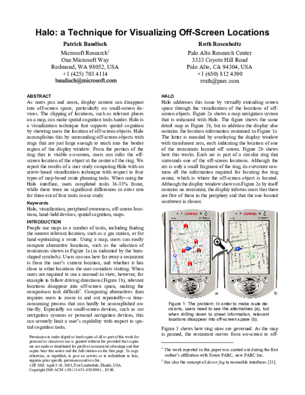
Halo addresses this issue by virtually extending screen
space through the visualization of the locations of offscreen objects. Figure 2a shows a map navigation system
that is enhanced with Halo. The figure shows the same
detail map as Figure 1b, but in addition the display also
contains the location information contained in Figure 1a.
The latter is encoded by overlaying the display window
with translucent arcs, each indicating the location of one
of the restaurants located off screen. Figure 2b shows
how this works. Each arc is part of a circular ring that
surrounds one of the off-screen locations. Although the
arc is only a small fragment of the ring, its curvature contains all the information required for locating the ring
center, which is where the off-screen object is located.
Although the display window shown in Figure 2a by itself
contains no restaurant, the display informs users that there
are five of them in the periphery and that the one located
southwest is closest.
Keywords
Halo, visualization, peripheral awareness, off-screen locations, hand-held devices, spatial cognition, maps.
blutwurst
INTRODUCTION
People use maps in a number of tasks, including finding
the nearest relevant location, such as a gas station, or for
hand-optimizing a route. Using a map, users can easily
compare alternative locations, such as the selection of
restaurants shown in Figure 1a (as indicated by the barnshaped symbols). Users can see how far away a restaurant
is from the user’s current location, and whether it lies
close to other locations the user considers visiting. When
users are required to use a zoomed-in view, however, for
example to follow driving directions (Figure 1b), relevant
locations disappear into off-screen space, making the
comparison task difficult2. Comparing alternatives then
requires users to zoom in and out repeatedly—a timeconsuming process that can hardly be accomplished onthe-fly. Especially on small-screen devices, such as car
navigation systems or personal navigation devices, this
can severely limit a user’s capability with respect to spatial cognition tasks.
Permission to make digital or hard copies of all or part of this work for
personal or classroom use is granted without fee provided that copies
are not made or distributed for profit or commercial advantage and that
copies bear this notice and the full citation on the first page. To copy
otherwise, or republish, to post on servers or to redistribute to lists,
requires prior specific permission and/or a fee.
CHI 2003, April 5-10, 2003, Fort Lauderdale, Florida, USA.
Copyright 2003 ACM 1-58113-453-3/02/0004…$5.00.
+
a
b
Figure 1: The problem: In order to make route decisions, users need to see the alternatives (a), but
when drilling down to street information, relevant
locations disappear into off-screen space (b). 12
Figure 3 shows how ring sizes are governed. As the map
is panned, the restaurant moves from on-screen to off1
The work reported in this paper was carried out during the first
author’s affiliation with Xerox PARC, now PARC Inc.
2
See also the concept of desert fog in zoomable interfaces [13].
�screen. As the restaurant icon reaches the border region of
the display window, a ring grows under the icon. As the
restaurant moves further off-screen, ring radiuses are recomputed dynamically, so that the ring is always just big
enough to reach into the border region of the display window while never occluding the display’s central region.
Several visualization techniques have been proposed for
viewing large documents such as maps with limited
screen resources. Multi-window arrangements, such as
overview-plus-detail visualizations [16, 8], simultaneously display multiple views of the same map. However,
the different scales of the individual views make it more
difficult for users to integrate map information into a single consistent spatial mental model and require users to
spend additional time reorienting when switching between views [3].
Focus-plus-context visualization techniques, e.g. fisheye
views [11, 6], use only a single view onto the document,
so that split attention is avoided. However, these techniques introduce distortion, which interferes with any task
that requires precise judgments about scale or distance.
a
b
Figure 2: (a) Enhancing the map from Figure 1
with Halo shows where in off-screen space the five
restaurants are located. (b) How it works: each offscreen location is located in the center of a ring
that reaches into the display window.
Another track of work has evolved around visualization
techniques pointing into off-screen space. Figure 4 shows
two everyday-life examples that use arrows to point to an
off-screen highway and to off-screen game characters.
Similar examples can be found in Pad++ [4] and in collaborative virtual environments, where lines emerging
from a user’s face help others see what the user is looking
at [10]. By visualizing only selected off-screen content
and by overlaying the visualization onto other display
content, these “arrow-based” visualizations are very compact (see [12, 8] for additional research on semitransparent overlays). Their main limitation is that arrows convey
only direction information, so that map navigation tasks
would require arrows to be annotated with distances.
a
b
Figure 3: As this location is panned out of the display window, a ring emerges from its center. The
ring grows as the location is panned further away.
In the remainder of this paper, we discuss related work,
present the concept and the design choices behind Halo,
present our findings resulting from interviews with users
of personal navigation devices, and present a user study
comparing Halo with a more traditional arrow-based visualization style. We conclude with a discussion of the
benefits and limitations of our visualization technique.
RELATED WORK IN VISUALIZATION TECHNIQUES
A substantial amount of research has been done on navigation aids, such as techniques for displaying driving [2]
or walking directions [7]. While for following driving
directions essentially any interface with an arrow was
found to be sufficient [9], the contextual information required for route planning is more often supported using
maps [14], e.g. for museum guides [1].
Figure 4: Related work: (a) The arrow on this map
points to an unseen highway. (b) The arrows on
the right point to football players off screen (© Nintendo ‘89).
Halo combines many of the advantages of the approaches
listed above. It offers a single non-distorted view that
allows users to inspect detail information without losing
context. Unlike arrow-based visualizations, Halo does not
require additional distance annotation; arcs provide full
information about the location of off-screen objects, not
only their direction. This eliminates the need for a scale
indicator; the distance information encoded in the arcs
always refers to the scale of the current scene. This allows
users to carry out distance computations visually, which,
as we show in the evaluation section of this paper, can
improve user performance significantly.
CONCEPT AND DESIGN DECISIONS BEHIND HALO
The concept behind Halo derives from techniques well
known in cinematography and theatre [5]. In cinematog-
�raphy, conventions used to imply off-screen space include
the use of exit and entry points (character exiting or entering through one of these points), point-of-view (character
on-screen looking somewhere off-screen), and partially
out of the frame (part of an on-screen prop protrudes into
off-screen space) [15]. In partially out of the frame, viewers recognize the prop as being only a portion of the
whole object, which implies that the rest of the object has
to be in off-screen space.
The main difference between Halo and arrow-based techniques can be explained using this classification. Arrowsbased techniques implement a point-of-view technique,
which can convey only directional information. Halo uses
the partially out of the frame technique, and by “attaching” the off-screen location to the prop, the prop conveys
the full off-screen location information.
The prop has to fulfill two requirements. First, to allow
viewers to mentally fill-in the missing off-screen parts, it
has to be an object that viewers know and recognize. Second, the object has to display features that allow viewers
to understand its position in space well enough to know
the location of the attached target. The ring shape used by
Halo fulfills both requirements. A ring is a familiar shape,
and furthermore it fulfills the second requirement in an
extraordinary way, since a ring can be reconstructed from
any fragment. This tremendous redundancy makes rings
robust against various types of mutilation, such as cropping at the window border or partial occlusion by other
rings.
Furthermore, humans are efficient at searching for lines
of higher curvature among lines of lesser curvature [18].
Thus the rings provide an advantage in searching for
closer off-screen locations. This can be expected to have
a positive impact on task completion time for many tasks
striving for path length minimization, such as the search
for the closest gas station on a map.
edge. Second, to minimize occlusion of window content
and overlap between auras, we replaced the disks with
rings. Third, we inverted the color scheme resulting in
dark halos on a light background in order to better accommodate typical map material, which used a light
background.
The concept of fading arcs representing more distant locations was implemented by using translucency. Halo
renders the short arcs that represent nearby locations as
nearly opaque. Longer arcs representing more distant
location are rendered with increasing translucency, which
also compensates for the additional visual weight that
their additional length would otherwise cause.
Within the framework set by the streetlamp metaphor, we
made a series of additional design decisions with the goal
of maximizing the visualization of location, particularly
the indication of distance, which is a central theme in
Halo. The design described in the following subsections
introduces a third visual cue for distance, arc length.
Intrusion border and arc length
In order to limit the interference of arcs with display content, Halo restricts arcs to the periphery of the display.
Only the space outside the intrusion boundary (Figure 5)
is shared between arcs and content; the space inside the
intrusion boundary is reserved exclusively for content.
intrusion border
handle
space for arcs…
Halo implements a modified streetlamp metaphor
Our original concept for Halo was to represent off-screen
locations as abstract “streetlamps” that cast their light
onto the ground/map. This metaphor allowed us to derive
four important properties for Halo. First, a streetlamp
creates an aura, a large artifact which allows observers to
infer the lamp’s existence even if it is not in view. Second, the aura created on the map is round, resulting in the
benefits discussed above. Third, light overlays itself onto
objects without occluding them; overlapping auras from
multiple lamps aggregate nicely by adding up light intensities. Forth, the fading of the aura with distance provides
an additional visual cue about the distance of the streetlamp. An intense aura indicates a lamp located nearby; a
weaker aura indicates a more distant lamp.
Our first prototype implemented this metaphor literally by
using light auras on a dark background. The final design,
(Figure 2) has undergone three modifications. First, in
order to make it easier to perceive the halo curvature, we
replaced the smooth transition at aura edges with a sharp
and for corner arcs
Figure 5: Halo preference dialog. By scaling the
intrusion border (horizontal drag), users assigns
space to arcs. Rounding corners (vertical drag)
gives extra space to corner arcs.
The shape of the intrusion boundary was designed such
that arc length would serve as another indicator for distance, in addition to curvature and opacity. Ideally, a
longer arc would indicate that the represented object is
further away than an object represented by a shorter arc.
On a circular screen, as, for example, on a watch-type
device, this is easily accomplished by using a circular
�intrusion border. Here, arc length depends only on distance to the location, and, as Figure 6a illustrates, two
arcs representing the same distance on such a device have
the same arc length.
fall below a certain rank-specific relevance threshold. For
tasks that require users to visit all targets, Halo allows
showing all targets by merging arcs into multi-arcs using
bottom-up clustering.
Figure 7: Overlapping arcs merge into double arc.
Design variables available for content visualization
a
b
Figure 6: (a) On a circular display, arcs representing the same distance have the same length.
(b) On a rectangular display, that is not always the
case, because arcs in corners may be cropped.
On a non-circular display window, achieving correspondence between arc length and distance to the represented
location requires additional attention. With a rectangular
intrusion boundary, arcs cropped at a corner of the display window are shorter than arcs of comparable intrusion depth along an edge (Figure 6b). The accurate solution, i.e. computing intrusion depth on a per-arc basis as a
function of the desired arc length, can make arcs intrude
deeply into the display window, which conflicts with the
notion of a space reserved for content. Halo therefore
maintains the concept of an intrusion border limiting arc
intrusion, but uses a rounded boundary (see Figure 5) to
give extra intrusion depth and thus length to corner arcs.
Making Halo scale to large numbers of locations
Arcs mapping to similar positions on the intrusion border
may overlap. In general, arcs are highly robust against
overlap, but there are two cases where it can become an
issue.
First, arcs of strongly collocated locations will yield arcs
with large amounts of overlap along the entire length of
the arc. Halo handles this by merging strongly overlapping arcs into a single multi-arc (Figure 7). Multi-arcs are
created by rendering 2-3 thinner, concentric arcs, centered
at their average location. Groups of four or more locations are indicated by a thick double ring. As the user
pans towards a cluster, arc overlap will decrease, so that
targets that are not exactly collocated will become individually accessible.
Second, scenarios involving a large number of off-screen
locations can get cluttered, since the number of intersections between arcs grows quadratically with the number
of arcs. For tasks where locations represent alternatives,
Halo allows suppressing the rendering of locations that
Halo uses arc shape, arc length, and opacity for conveying location information. This means that a wide range of
design variables, such as color, texture, and arc thickness,
remain available for communicating additional properties
of the respective off-screen locations, such as a restaurant’s Zagat’s rating. Applications designers may, for
example, choose to overload such a relevance value to arc
opacity (with the notion that relevance may compensate
for distance), map it to arc thickness, or map it to color
properties, such as hue.
In the next two sections, we move on to a preliminary
field study and an experimental evaluation of Halo.
INTERVIEWS WITH NAVIGATION DEVICE USERS
In order to define realistic tasks for our user study, we
conducted a preliminary field study. We interviewed 8
users who used five different personal navigation devices:
6 users of GPS devices and 2 users of personal digital
assistants (PDAs) running map software. Participants
were male researchers from three research labs who volunteered their participation. Each interview lasted between 10 and 40 minutes. We used an informal interview
procedure covering the device, the application subjects
used, and the subjects’ tasks. In four cases, we obtained
demonstrations of actual usage of the device. We also
asked about specific problems with existing technology
and suggestions for improvement. A summary of our results follows:
Driving directions: Two participants use Garmin eMap
personal GPS navigation devices for driving directions
(www.garmin.com/manuals/etrex_vis.pdf). They plan
routes using their desktop computer, e.g. using Microsoft
Streets & Trips, upload the results into the eMap device,
and then follow the turn-by-turn directions. Car compass: One participant uses his Magellan GPS device as a
compass, because, as he explains, compasses do not work
in cars. Finding home: One participant uses his Garmin
eTrex Summit GPS device to find his way back to the car
when cross-country skiing or hiking. The device tells him
how far he is away from his car, allowing him to return
on time. It also shows him which direction to go. Data
collection: Two participants use their eMap and eTrex
GPS devices to generate location data for their research
project, but do not interact with the devices directly. Map
planning: Two participants use their PDAs (no GPS support) to find locations while in the city. The iPAQ Pocket
�PC user runs a pocket version of Microsoft MapPoint.
The Palm Pilot user runs Vindigo, a subscription service
that features restaurants as well as up-to-date content,
such as movie theaters schedules. Vindigo allows visualizing locations on a map.
Only the PDA users used their devices for making route
decisions on the fly. The GPS device users found the
screens too small (160x120 b/w pixels on the eMap) and
screen redraw too slow (up to several seconds). Applying
on-the-fly changes to routes on the GPS devices would be
possible but would require a copilot. When deriving tasks
for our experimental comparison, this gave extra weight
to the two PDA users, although tasks and experiences of
all eight users were considered.
Deriving tasks for the experimental comparison
Based on the interviews, we devised four experimental
tasks that involved spatial cognition. Inspired by the hiker
using his GPS device for returning to his car, we included
a task where users would estimate the location and distance of off-screen locations. The second task was modeled after the iPAQ user who used his device for finding
nearby restaurants. The iPAQ user also inspired the third
task, namely organizing multiple locations into a single
traversal. The forth and last task was modeled after the
desire of the Palm user to see traffic conditions integrated
into the route planning process. The two PDA users and
one of the driving direction users mentioned the need to
zoom frequently, so we included maps of variable scales
in the experiment. We did not include a task involving
users following directions, since it did not involve a significant amount of spatial cognition. We will describe all
four tasks in detail in the following section.
size. The laptop computer screen was a 12” screen run at
1024 x 768 pixels, 105 dpi resolution. Users made selections required by the tasks using an external mouse.
The Halo and the Arrow interfaces differed with respect
to their way of indicating the location of off-screen locations. The Halo interfaces used red arcs for that purpose,
as described in this paper. Instead of the arcs, the Arrow
interface visualized off-screen locations by using arrows
pointing along a line from the center of the screen to the
off-screen locations and lined up with the border of the
display window (see Figure 8a). Arrows were of the same
color and opacity as the arcs of the Halo interface. Unlike
the arcs, arrows were annotated with a three-digit number
indicating the distance of the off-screen location from the
display border. In order to allow users to interpret the
number, there was a scale indicator at the bottom right
inside the display window.
The Halo interface differed in two ways from that described in previous sections. First, to provide a clearer
comparison of the arc and arrow cues to off-screen location, the fading of arcs was disabled, so that all arcs were
of the same opacity. Second, in order to prevent users
from obtaining the requested information through navigation, zooming and panning were disabled. Individual
maps used scales ranging from 110m to 300m per cm on
the screen. In order to provide users with a visual cue for
the current zoom factor, a map was used as the backdrop,
which scaled with the zoom. No other task information
was available from the map. During the study, off-screen
locations were never close enough to each other to require
the use of the multi-arcs described earlier.
Based on the results of our field interviews, we now had
realistic tasks that would support a fair experimental comparison between different approaches to displaying
contextual location information on a handheld device.
USER STUDY: HALO VS. ARROWS
In our user study, we compared Halo with an interface
using an arrow-based visualization. Users had to complete four tasks. The main goal of this study was to determine which interface would allow users to complete
their task fastest.
Interfaces/apparatus
Figure 8 shows the Arrow interface and the Halo interface
used in the study. Both interfaces were designed for a
Compaq iPAQ Pocket PC, which was emulated on the
screen of a desktop computer. Emulation was necessary
because for one task subjects were required to select locations outside of the iPAQ. For the study, we reimplemented an earlier Java version of Halo in Macromedia Flash™, extended it with features required for the
study, and inserted functions logging the user’s selections, task completion times, and error rates. The Flash
version was also used to create the screenshots in this
paper and the video figure. The emulated iPAQ screen
measured 3” x 4”, roughly 33% bigger than its real-life
a
b
Figure 8: (a) The Arrow interface and (b) the Halo
interface, both showing the same map. Which of
the 5 off-screen restaurants is “closest” to the car?
Tasks
Users had to complete four tasks. Figure 9 shows example maps for each task. The users were instructed, “Complete each map as quickly as possible while maintaining
reasonable accuracy.” Distances in the task were ‘as the
crow flies’, not distances along streets depicted in the map.
�The “Locate” task: The user’s task was to click in the
off-screen space at the expected location of the off-screen
targets indicated by each of the five red arrows/arcs
(Figure 9a). Users were allowed to locate targets in any
order; the system automatically picked the closest match.
The “Closest” task: Each map contained a blue car icon
and five red arrows/arcs representing restaurants
(Figure 9b). The user’s task was to click on the arrow/arc
corresponding to the off-screen location closest to the car.
The “Traverse” task: Each map contained a blue car
icon and five target indicators. Targets could be either
off-screen, indicated by red arrows/arcs, or on-screen
(Figure 9c). The user’s task was to select all five targets
in order, so as to form the shortest delivery path, beginning at the car.
The “Avoid” task: The user’s task, as “ambulance dispatcher,” was to select the hospital farthest from traffic
jams, thus most likely to be accessible to an incoming
ambulance. Each map contained indicators of five on- or
off-screen traffic jams, and three blue cross-shaped icons
representing hospitals (Figure 9d).
(a) locate
(b) closest
Users were interviewed upon completion of the tasks. The
overall session took around 30 minutes.
Hypotheses
Our first hypothesis was that subjects would complete
each task faster with the Halo interface than with the arrow-based interface. This hypothesis was based on the
assumption that Halo arcs would allow for a faster perception of the represented locations than the textual annotation used by the arrow-based interface, and in particular
that the gestalt of Halo arcs would help subjects perceive
multiple locations at a glance. This, we expected, would
help subjects form a spatial model, which would enable
easier distance comparisons. Our second hypothesis was
that subjects would experience an increase in task speed
without an increase in error rate. Our third hypothesis was
that higher efficiency would also result in higher subjective satisfaction with the Halo interface.
Results
Task completion time: Table 1 summarizes the average
time subjects required to complete a map, for each task
and interface. Confirming our first hypothesis, subjects
achieved better task completion times in all four tasks
when using the Halo interface. In the Locate task, task
completion was 16% faster when subjects used the Halo
interface. In the Closest task the difference was 33%, in
the Traverse task 18%, and in the Avoidance task 16%.
These results were significant, as discussed in more detail
below.
Task
Locate
Closest
Traverse
Avoid
(c) traverse
(d) avoid
Figure 9: Examples of maps used in the four tasks
Procedure
12 users participated in the study, including the second
author of this paper, unpracticed with the use of the interface and tasks. There was no significant or observable
difference between the performance of the second author
and other users in the study and the author is excluded
from any discussion of user preferences. We used a
within-subject experimental design, i.e., each subject carried out all four tasks on both interfaces. In order to avoid
sequence effects, task order, and interface order on a particular task, were counterbalanced between subjects.
Users received verbal instruction and four training maps
for each interface, followed by eight timed maps. Upon
completing each task, they answered questions about their
interface preference for that task, and their impression of
how confusing/clear the interfaces were. Upon concluding all tasks, users were asked to rate difficulty for each
task, and to specify their overall interface preference.
Arrow interface
20.1 (7.3)
Halo interface
16.8 (6.7)
9.9 (10.1)
6.6 (5.3)
20.6 (14.1)
16.8 (8.7)
9.2 (4.7)
7.7 (5.8)
Table 1: Average task completion times in seconds (and standard deviations)
We evaluated these differences in completion time using
a repeated-measures ANOVA for each task. In each case,
our model included factors of interface style (arcs/arrows), subject, map, order (arrows-first, arcs-first), and
interaction effects between interface style and each of the
other main factors. We used a conservative criterion for
significance due to the large number of tests involved.
Unless otherwise stated, all significant effects are significant at the p<.001 level. Due to space constraints, we
present here only effects of interest, i.e. those involving
interface type. Where appropriate, ANOVA’s were performed on log response time. We also assumed binomially distributed data for percent correct data, and
Gamma distributed data where appropriate for distance
error data.
As mentioned above, the main effects of interface were
significant for the Locate (F(1,141=21.50), Closest
(F(1,140=54.85), and Avoid (F(1,140=18.18) tasks, and
marginally significant for the Traverse task
�(F(1,140)=10.28, p=0.0017). We did find significant subject x interface interactions for the Closest (F(9,140)=
4.01) and Traverse (F(9,140=3.75) tasks. Closer examination revealed that in both cases, the interactions were the
result of 2 out of 12 subjects (a different 2 for the 2 tasks)
performing faster with the arrows than with the arcs,
while all other subjects showed the opposite pattern. This
interaction does not greatly affect our interpretation of the
main effects.
From subject response, the higher cognitive load for localizing arrow targets seemed to be the major factor influencing the Halo interface performance advantage over
the arrow-based interface, with 7/11 subjects volunteering
that arrows “required too much math.” Furthermore, two
subjects volunteered that while some work was required
for both interfaces to get a sense of the configuration of
all targets, with the Halo interface this configuration
would persist, which made tasks like the Traverse and
Avoid tasks, where subjects had to acquire a mental
model of the space, much easier.
Error rate: Table 2 shows the error for each of the four
tasks. Due to the different nature of the four tasks, error
was computed differently for each task. For the Closest
and the Avoid tasks, which required subjects to choose
among a small number of choices, we analyzed their percent correct performance. For the Locate task, we measured error as the Euclidian distance between the subject’s
location estimate and the actual location of the off-screen
location. For the Traverse task, we used the difference in
length between the traversal subjects chose and the optimal traversal for the respective map. The average total
distance in the Locate task was 98 pixels, and the average
optimal distance in the Traverse task was 1156 pixels.
For the Locate task, the ANOVA did find a significant
main effect of interface on error (F(1,1039)=14.34), although the difference in error, the accuracy of the Halo
interface was 5 pixels worse in average, was comparably
small. For the Closest, the Traverse, and the Avoid tasks,
Table 2 shows a reduction in error with the Halo interface, but none of these differences were significant (Traverse: F(1,166)=0.55, p=.54; Closest: F(1,154) = 0.05,
p=.18; Avoid: F(1,154)=0.12, p=.27). This confirms our
second hypothesis that faster task completion with the
Halo interface would not come at the expense of error, for
all tasks except the Locate task.
Task
Arrow interface
Halo interface
Locate
23.5 pixels (21.6)
28.4 pixels (33.8)
22% (42%)
21% (41%)
97.4 pixels (94.7)
81.0 pixels (96.7)
15% (35%)
14% (34%)
Closest
Traverse
Avoid
Table 2: Error rate (and standard deviations).
Dependence of error on distance: For the Locate task, we
found, for both interfaces, a clear linear correspondence
between distance and error, as well as a significant inter-
action between interface and distance (F(1,1039)=
114.58). Regression analysis yielded the relationships:
Error(pixels) = 6.6 + 0.17*dist for arrows; and Error(pixels) = -6.4 + 0.37*dist for arcs. Since for Halo the
incremental change in curvature gets smaller with growing radius, the distance awareness provided decreases
with distance, and the error for arcs increases faster with
distance than the error for arrows (p<.001).
Dependence of error on direction: We analyzed whether
error depended on whether arcs were cropped at the corner of the display window. We found subjects to have
twice as much error, on average, when the arc crossed a
corner (M=52.3 pixels, SD=44.4) than when the arc lay
along one side of the display (M=23.3 pixels, SD=28.7)
(F(1,511)=41.6).
Distance error vs. direction error: To better understand
the strengths and weaknesses of the two interface styles,
we separated radial distance errors from direction errors,
with direction error measured perpendicular to radial distance. This showed that the higher error in the locate task
came mainly from the distance error. Subjects had significantly more bias towards underestimating distance with
the arcs (M= -19.0 pixels, SD=38) than with the arrows
(M= -0.6 pixels, SD=30) (F(1,1074)=81.80). There was
no significant difference between arcs and arrows in direction errors (F(1,1022)=1.70, p=.81, M(arcs)=5.9,
SD=9.4, M(arrows)=6.6, SD=7.5). These results are in
line with our expectations, given our knowledge of the
interface.
Subjective preference: For all four tasks, the majority of
subjects who expressed a clear preference (see Table 3)
preferred the Halo interface, which confirms our third
hypothesis that improved efficiency would translate into
preference. Overall, 6/11 subjects preferred the Halo interface, compared to 3/11 for the Arrow interface, with
2/11 having no overall preference.
Task
Arrow interface
Halo interface
Locate
2
8
Closest
3
6
Traverse
1
7
Avoid
2
4
Table 3: Number of subjects who expressed a
clear preference for the respective interface. Remaining of 11 subjects expressed no preference.
Two subjects, one of whom preferred arrows and the
other of whom had no preference, reported that they liked
arrows because they could “just read the numbers… they
just tell me what to do—I don’t need to guess.”
Discussion
Overall, our user study confirmed our hypotheses and
provided evidence for Halo’s usefulness in tasks involving spatial reasoning. Only our hypothesis regarding the
error rate for the locate task was not borne out—the Halo
interface did result in lower location accuracy than the
�Arrow interface. As our analysis showed, the difference
in accuracy was caused almost exclusively by subjects
underestimating distances when using the Halo interface.
Looking for an explanation, the comment of one subject
seems relevant, who mentioned that the arc felt more like
being part of an oval, rather than as part of a ring—which
would be a valid explanation for the biased perception of
distance. While this effect requires more detailed examination, we plan to address the issue by adapting Halo’s
geometric model to the mental model of the users. This
means replacing the rings used in the current version of
Halo with ovals, the parameters of which will be determined by the biases measured in the user study.
The other issue that needs to be addressed is subjective
satisfaction. Despite the superiority with respect to task
completion time, not all subjects preferred the Halo interface. Based on subjects’ comments during the experiment, it seems that the perceived accuracy of the Halo
interface may have been the reason for this. 6 subjects
reported either that they felt they were more accurate with
arrows, or they were uncertain of their accuracy with the
arcs. We feel that this effect may partially be explained by
the fact that interface panning and zooming was disabled
in the experiment, so that subjects never got a chance to
verify their model of off-screen geometry by panning the
involved locations onto the screen. We expect some of
this insecurity to go away with practice, particularly with
the visual feedback that users get through panning and
zooming.
CONCLUSIONS
In this paper, we presented Halo, a visualization technique providing users with location awareness of offscreen objects. Halo provides a single non-distorted view
of a document, overlaid with location information for the
off-screen locations. Unlike arrow-based visualizations,
Halo does not require explicit distance annotation; the
distance information is encoded in the arcs themselves
and directly incorporates the scale of the scene.
We have presented a user study evaluating Halo in comparison to an arrow-based visualization technique. Tasks
were picked based on the results of a field study, also
briefly presented in this paper. Halo led to significant
timesaving (16% to 33%) in the four experimental tasks,
as well as higher subjective satisfaction.
In future work, we plan to explore the application of Halo
in the area of real-time tasks, such as simulations or
highly interactive games where Halo arcs will be used to
continuously update users about the location of moving
objects in the user’s periphery.
Acknowledgments
Halo is an outgrowth of our work with Polle Zellweger,
Jock Mackinlay, Lance Good, and Mark Stefik on City
Lights techniques for providing awareness of and support
for navigation to off-screen objects. Thanks also to Scott
Minneman and Allison Woodruff for their comments on
earlier versions of Halo.
REFERENCES
1. Abowd, G.A., Atkeson, C.G., Hong, J., Long, S.,
Kooper, R., Pinkerton, M. Cyberguide: a mobile context-aware tour guide. ACM Wireless Networks 3:421–
433, 1997.
2. Agrawala, M.and Stolte, C. Rendering effective route
maps: improving usability through generalization. In
Proc. Siggraph’01, pp. 241–249.
3. Baudisch, P., Good, N., Bellotti, V., Schraedley, P.
Keeping Things in Context: A Comparative Evaluation of Focus Plus Context Screens, Overviews, and
Zooming, In Proc. CHI 2002, pp. 259–266.
4. Bederson, B. B., and Hollan, J.D. Pad++: A zooming
graphical interface for exploring alternate interface
physics. In Proc. UIST’ 94, pp. 17–26.
5. Burch, N. 1983. Theory of Film Practice, London:
Praeger Publishers Inc.
6. Carpendale, M.S.T., Montagnese, C. A. Framework
for Unifying Presentation Space. In Proc. UIST’01, pp
61–70.
7. Chewar, C. M., McCrickard, D.S. Dynamic route descriptions: tradeoffs by usage goals and user characteristics. In Proc. Smart Graphics ’02, pp 71-78.
8. Cox, D., Chugh, J., Gutwin, C., and Greenberg, S.
(1998). The Usability of Transparent Overview Layers. In Proc. CHI ’98, pp. 301–302.
9. Ekman, I., Lankoski, P. What should it do? Key issues
in navigation interface design for small screen devices. CHI’02 Extended Abstracts, pp. 622–623.
10. Fraser, M., Benford, S., Hindmarsh, J., and Heath, C.
Supporting awareness and interaction through collaborative virtual interfaces. In Proc. UIST'99, pp. 27–36.
11. Furnas, G. Generalized fisheye views, in Proc.
CHI ‘86, pp. 16–23.
12. Harrison, B.L., Kurtenbach, G., Vicente, K.J. An Experimental Evaluation of Transparent User Interface
Tools and Information Content Evaluation. In Proc.
UIST ’95, pp.81–90.
13. Jul, S. and Furnas, G. Critical zones in desert fog.
Aids to Multiscale Navigation In Proc. UIST 99,
pp.97–106.
14. Levine, M.; Marchon, I. and Hanley, G. The Placement and Misplacement of You-Are-Here Maps. Environment and Behavior 16(2):139–157, 1984.
15. Marsh T. and Wright, P. Using cinematography conventions to inform guidelines for the design and
evaluation of virtual off-screen space. In AAAI 2000
Spring Symp. Ser. Smart Graphics, pp. 123-127, 2000.
16. Plaisant, C., Carr, D., & Shneiderman, B. ImageBrowser Taxonomy and Guidelines for Designers,
IEEE Software, 12(2):21–32, 1995.
17. Rosenholtz, R. Search asymmetries? What search
asymmetries? Perception & Psychophysics 63(3):
476–489.
18. Treisman, A. and Gormican, S. Feature analysis in
early vision: Evidence from search asymmetries. Psychological Review, 95(1):15–48.
�
 Patrick Baudisch