[go: up one dir, main page]

Page MenuHomePhabricator

MPIC: Determine user flow between instrument and experiment forms
Open, HighPublic

Description

T370880

Description

With the incorporation of experiments in MPIC, we need to decide how users will access either the instrument form or the experiment form.

Initial proposal suggests a preliminary first step in a multi-step form process wherein the user is asked to choose between 2 actions:

  • configure an instrument
  • configure an A/B test

Alternatively these forms could be accessed from the home page (Catalog view) with prominent buttons indicating each action thereby bypassing the preliminary form altogether.

Other alternatives?

Acceptance Criteria

  • Decision is made and documented by Product Manager + U/X Designer
  • Engineering ticket for new user flow is updated with this decision T373475
Event Timeline

Hello there, @cjming, @VirginiaPoundstone and @Sfaci! Sharing some flow design options to collect feedback here too.
The following mocks provide alternative points of entry to the experiment and instrument forms from the home/catalog page. Which of the options sounds more optimal, and we'd like to validate with users?

OptionDescription & open questions
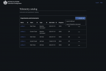
Option 1 – Menu button:
image.png (1×2 px, 181 KB)
The table's heading provides a "+Create new" (final copy pending) menu button that allows users to select the type of artifact they need to create. The corresponding form would be loaded immediately upon selection. This is a very simple alternative, but we need to really nail the copy to make the action clear and let users anticipate the options/flow.
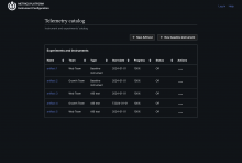
Option 2 – Independent buttons:
image.png (1×2 px, 173 KB)
A bit more rudimentary option, where the actions to configure a new A/B test or baseline instrument are displayed above the table (to keep them visible in case it displays numerous items)
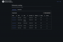
Option 3 – Tabs:
image.png (1×2 px, 173 KB)
A probably more scalable (?), yet also more costly option that we could maybe consider in the future. Experiments and Instruments are organized into two separate pages, accessible via navigation tabs. This option is a bit opinionated, and aims to clarify the following: are MPIC users able to create either instruments OR experiments (e.g., A/B test, but also multivariant, cohort analysis in the future)? Or is everything they create actually an instrument used to either collect baseline data or to instrument experiments of (for now) the A/B test type?

Thanks for reviewing! Comments, suggestions and alternative proposals welcome 🙏🏻

It's difficult to choose one! I think all of them are really good mocks!

Anyway, after thinking a bit, I would say that the last one (Option 3 - Tabs) is closer to the idea that I think we are already working on. We are already considering separate endpoints for baseline instruments and experiments so it would make sense to use different views (tabs in this case) to show them (if we want to use a common catalog view, we should revisit that and keep a common endpoint to get everything we have about baseline instruments + experiments).

And, as you mentioned, it's more scalable. I think that, sooner or later, we would talk about a way to filter by experiments or baseline instruments. And I think that, as we move forward, it could be interesting to customize catalog view for baseline instruments or experiments. Maybe showing different details depending on whether it's a baseline instrument or a experiment.

Nice work on this @Sarai-WMF.

I think option one is the best short term solution and option 3 would be a great long term solution.

Option one is a clear line of decision making without being overwhelming. It does mean the decision is two clicks deep, but I think slowing this down a bit is useful at this stage. We won't have power users yet.