[go: up one dir, main page]

Page MenuHomePhabricator

Style markers for show nearby feature
Closed, ResolvedPublic8 Estimated Story Points

Description

Background

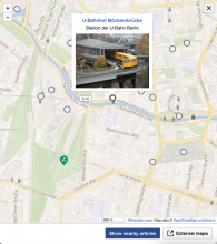
Markers added by the show nearby feature will overlay any annotations in Kartographer maps created by users. They need to be styled in a way that there is no chance that will look the same as a user-created marker, but they should also look different to signal that they are a different category of markers. Following the pattern set by the iOS places tab, the markers will be circular instead of teardrop shaped. Styling general follows the neutral normal button patterns, see figma for details.

Requirements

Specifications

~ Specs are located in the figma file

Example mock - markers.png (732×649 px, 586 KB)

Event Timeline

There are a very large number of changes, so older changes are hidden. Show Older Changes

Change 829045 had a related patch set uploaded (by Thiemo Kreuz (WMDE); author: Thiemo Kreuz (WMDE)):

[mediawiki/extensions/Kartographer@master] Style nearby markers as gray circles

https://gerrit.wikimedia.org/r/829045

thiemowmde set the point value for this task to 8.

Change 828548 had a related patch set uploaded (by Thiemo Kreuz (WMDE); author: Thiemo Kreuz (WMDE)):

[mediawiki/extensions/Kartographer@master] Render markers from the article's GeoJSON always on top

https://gerrit.wikimedia.org/r/828548

Change 829045 merged by jenkins-bot:

[mediawiki/extensions/Kartographer@master] Style nearby markers as gray circles

https://gerrit.wikimedia.org/r/829045

awight subscribed.

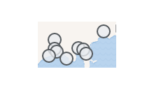
Code for review has a nice transparency effect, we'll merge it and discuss:

image.png (66×112 px, 5 KB)

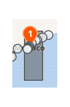
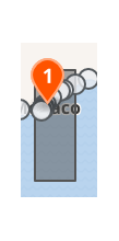
Here are options we were discussing for,
a) Marker tip sometimes behind the nearby circles:

image.png (141×92 px, 7 KB)

b) Inline markers always entirely above nearby circles:

image.png (141×70 px, 6 KB)

Change 829180 had a related patch set uploaded (by Thiemo Kreuz (WMDE); author: Thiemo Kreuz (WMDE)):

[mediawiki/extensions/Kartographer@master] Fix nearby popupAnchor being way off center

https://gerrit.wikimedia.org/r/829180

Code for review has a nice transparency effect, we'll merge it and discuss

After this came up in story time I explored this and decided explicitly against it because I think it can come across as disabled. Would prefer to follow the specs as is. Otherwise it's looking good!

Here are options we were discussing for,

I'm not sure I fully understand the two different options here. Is this about when the two different types of markers have the same coordinate?

Here are options we were discussing for,

I'm not sure I fully understand the two different options here. Is this about when the two different types of markers have the same coordinate?

The question was whether we want to show the nearby markers on a different layer, "above" the rest of the annotations, or show the mapframe annotations above the nearby markers, or exclusively show one layer or the other.

Change 829814 had a related patch set uploaded (by Awight; author: Awight):

[mediawiki/extensions/Kartographer@master] Make nearby markers opaque

https://gerrit.wikimedia.org/r/829814

Change 829814 merged by jenkins-bot:

[mediawiki/extensions/Kartographer@master] Make nearby markers opaque

https://gerrit.wikimedia.org/r/829814

Change 829836 had a related patch set uploaded (by Thiemo Kreuz (WMDE); author: Thiemo Kreuz (WMDE)):

[mediawiki/extensions/Kartographer@master] Remove not needed XML header from new nearby SVG icons

https://gerrit.wikimedia.org/r/829836

Change 829836 merged by jenkins-bot:

[mediawiki/extensions/Kartographer@master] Remove not needed XML header from new nearby SVG icons

https://gerrit.wikimedia.org/r/829836

The question was whether we want to show the nearby markers on a different layer, "above" the rest of the annotations, or show the mapframe annotations above the nearby markers, or exclusively show one layer or the other.

Ah makes sense, thanks for clarifying!

Discussed with Lena and we have a decision on this. For the MVP we will switch to showing exclusively one layer or the other (so turning on show nearby, hides all user-added annotation). This way, it resolves a lot of the problems and we can get the MVP in front of users sooner and collect feedback. Then we will evaluate if/how we would want to switch to overlapping post-MVP.

I can create a separate ticket for this, since it's not really related to styling the markers.

Re-opening because focus/selected styling was not complete. Pulling into sprint, but this does not need to block deployment if it isn't done in time

Can the points be re-estimated for the remaining work only?

I'm afraid there is not enough information. The designs are all prepared in the code. Some are just not used at the moment. My assumption was that we start using them when we implement the features that need these styles, but that would be done in other tickets.

  • I assume being "focused" is when the tab key is used to navigate to each nearby marker. This is already possible, it seems.
    • The current default styling for this is a blue rectangle around the marker. That seems to match the specs in Figma. What's missing?
    • If there is anything to change, should the focus styling for the big user-provided markers be changed as well do make it consistent?
  • What does "active/selected" mean in this context? Is this when I tab to one of the markers and press enter to open a popup?
    • I'm not sure a concept for this even exists in the code. The markers are effectively little images. A click on one of these images opens a popup. There is no concept of "selecting" an image. We could add it, but I'm not sure what the benefit is? What can the user do with this selection?
    • When does the "selection" go away? The same time the popup closes?
    • Does this only apply to keyboard navigation, or mouse navigation as well?
    • Again, doesn't this mean we need to make the big user-provided markers behave the same?
    • Should it be possible to select markers that don't have a popup?

Change 838176 had a related patch set uploaded (by Thiemo Kreuz (WMDE); author: Thiemo Kreuz (WMDE)):

[mediawiki/extensions/Kartographer@master] Visualize :focus state on nearby markers

https://gerrit.wikimedia.org/r/838176

If the focused (or hovered) marker is behind other markers, should it be pushed to the top layer, and pop down again once the condition ends? (I think this could be implemented by adding a z-index to the style.)

Change 838176 merged by jenkins-bot:

[mediawiki/extensions/Kartographer@master] Visualize :focus state on nearby markers

https://gerrit.wikimedia.org/r/838176

Change 839501 had a related patch set uploaded (by Thiemo Kreuz (WMDE); author: Thiemo Kreuz (WMDE)):

[mediawiki/extensions/Kartographer@master] Bring focussed nearby marker to the front

https://gerrit.wikimedia.org/r/839501

If the focused (or hovered) marker is behind other markers, should it be pushed to the top layer […]

Love it! Done in https://gerrit.wikimedia.org/r/839501. However, only on focus. Doing the same on hover can have really weird and confusing effects, e.g. flicker.

Change 839501 merged by jenkins-bot:

[mediawiki/extensions/Kartographer@master] Bring focussed nearby marker to the front

https://gerrit.wikimedia.org/r/839501

After playing with this, I would like to see a blue square around the focused nearby marker, the dotted black lines are too subtle for my eyes. (Focused Maki marker pins also use this thin, black, dotted rectangle.)

image.png (87×115 px, 14 KB)

The tab order is apparently random, probably the order in which the results came back from the search server. I'd suggest a LTR (or RTL to match content direction) tab order.

Change 828548 abandoned by Thiemo Kreuz (WMDE):

[mediawiki/extensions/Kartographer@master] Render markers from the article's GeoJSON always on top

Reason:

https://gerrit.wikimedia.org/r/828548

To be fixed: The border is too thick when tabbing to a marker, should be medium.

Change 875359 had a related patch set uploaded (by Thiemo Kreuz (WMDE); author: Thiemo Kreuz (WMDE)):

[mediawiki/extensions/Kartographer@master] Nearby: Fix marker icon styles on focus and active

https://gerrit.wikimedia.org/r/875359

Change 875359 merged by jenkins-bot:

[mediawiki/extensions/Kartographer@master] Nearby: Fix marker icon styles on focus and active

https://gerrit.wikimedia.org/r/875359

Still to do:

  • Blue rectangle is different in Firefox. Should follow OOUI style.
  • Bonus: Rectangle for the big pins should look the same.
  • Bonus: z-index feature on tab also for the big pins.

Change 876193 had a related patch set uploaded (by Awight; author: Awight):

[mediawiki/extensions/Kartographer@master] Style focused map markers on Firefox

https://gerrit.wikimedia.org/r/876193

The focus rectangle of the teardrop markers has a big area below the marker. Is that intended?

Screenshot from 2023-01-06 16-00-52.png (294×556 px, 180 KB)

The focus rectangle of the teardrop markers has a big area below the marker. Is that intended?

Good question for Product! I can say that the focus rectangle has always been this shape so it's not a recent regression, but +1 that it looks bad. It's an artifact of how Kartographer draws the drop shadow, and it might be possible to work around with clever CSS.

awight removed awight as the assignee of this task.Jan 9 2023, 9:23 AM
awight moved this task from Doing to Tech Review on the WMDE-TechWish-Sprint-2023-01-04 board.

Change 876193 merged by jenkins-bot:

[mediawiki/extensions/Kartographer@master] Style focused map markers on Firefox

https://gerrit.wikimedia.org/r/876193

The focus rectangle of the teardrop markers has a big area below the marker. Is that intended?

Good question for Product! I can say that the focus rectangle has always been this shape so it's not a recent regression, but +1 that it looks bad. It's an artifact of how Kartographer draws the drop shadow, and it might be possible to work around with clever CSS.

Would removing the drop shadow fix this? This is a change I had actually been planning on at one point anyway.

Would removing the drop shadow fix this? This is a change I had actually been planning on at one point anyway.

Interesting! Yes, I think that would fix it because we would be setting a smaller rectangle on all the marker-drawing stuff.

Would removing the drop shadow fix this?

Unfortunately no, it's not that easy. The canvas size of the marker .png files (i.e. the reserved space) is fixed. I made a table for the three marker sizes, see the last comment in T141750. It doesn't matter if there is a shadow or not.

In other words: It's a limitation of all the libraries we use. I don't know if more recent versions of the libraries made this more flexible. Probably not, as some of them are already unmaintained.

There are certainly ways to fix the focus rectangles client-side. I'm already working on this as part of T326530.

  • It's hard-coded in the makizushi library that creates the markers.

We've already changed the sizes in this library, there should be no problem with changing again.

Good find! But the upstream library is dead so we should feel free to fork, in fact this is probably healthier for maintainability.

  • And another time in Kartotherian where markers are rendered as part of the .png thumbnails.

We own this code as well. In each library, the code which assumes a size is generally just a number that we can change. There might be a small math adjustment to make, but I don't see any rabbit holes.

We've already changed the sizes in this library […]

I'm pretty sure what we tweaked was the size of the icons that end being layered on top of the marker base, but not the canvas size of the marker base.

As noted, I don't think it makes sense to fork entire codebases when there are other solutions. I already made a proof-of-concept, see https://gerrit.wikimedia.org/r/878131. But most of this discussion really belongs to T326530.

@ECohen_WMDE, I wonder what the reasoning is to remove the shadow? I find it really helpful. The same time it's so dim, you almost miss it. Exactly how a good shadow should be. In fact I would love to add a (very tiny) shadow to the round nearby markers to make them easier to distinguish from each other and from other graphics that are part of the base map.

Change 829180 abandoned by Thiemo Kreuz (WMDE):

[mediawiki/extensions/Kartographer@master] Fix nearby popupAnchor being way off center

Reason:

https://gerrit.wikimedia.org/r/829180