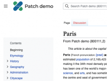
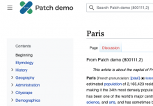
Description
Currently, in legacy Vector, the toolbar (sometimes called the tab-bar) is above the titlebar. This approach, which follows from Monobook, helps create a frame around the content, separating it from the various navigation/menus/links that surround it. In new Vector we are taking a different approach to separating the content from the navigation/menu/links and no longer have the same need as previous skins for the toolbar to be above the titlebar. So we asked the question: should the toolbar remain above the titlebar? For the following reasons we think it makes sense to flip the order, so that the titlebar is above the toolbar:
- In general we see the titlebar being useful to all users, whereas the toolbar is more relevant to experienced users and contributors. Therefore we think it makes sense to have the titlebar come first, and the toolbar below
- Specific example: the titlebar now has the language switcher in it, and we think language switching is more valuable to most people visiting the site than the items in the toolbar
- Possible future example: in the future we're hoping to add additional reader tools to the interface (such as Share, Font settings, etc.) and plan on putting them in the titlebar, next to the language switcher
- From an information architecture standpoint the links and tools in the toolbar are related to the page you are on, so it makes sense to have the title above and the related links and tools below
- From a readability standpoint it's nice to have the page title be the first thing you see
- Our mobile skin, Minerva, shows the titlebar above the toolbar, and it's generally a best practice to be consistent when possible
Possible supporting evidence:
- Timeless and Winter both place the titlebar above the toolbar
- Google Docs places the page title above the toolbar
Design
(no need to change any visual design at this stage)
Acceptance criteria
- Make feature flag for the change and disable by default
- Switch the titlebar above toolbar as per the design requirements above
- Ensure banners appear above both title and toolbar
- Ensure banners are full-width (should match the width of the site header, mock)
- On special pages if there is only one tab, hide the whole tab bar
- Create follow-up tasks for design refinements of tabs


