[go: up one dir, main page]

Page MenuHomePhabricator

Refine bracket matching styling
Closed, ResolvedPublic3 Estimated Story Points

Description

Background
After initial release on test wikis it has been confirmed that the initial dark styling of bracket matching makes it hard to see the cursor and can be distracting.

In combination with color changes being done in T271895: Update CodeMirror syntax highlighting color scheme to meet accessibility standards, the styling will be made more subtle.

Requirements

  • CSS should match the below:
color: inherit;
box-shadow: inset 0 0 1px 1px #999;
background: #eee;
font-weight: bold;
  • Confirm that 'inherit' is working and the color of the bracket remains the same when highlighted

Mock
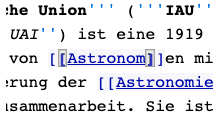
Screen Shot 2021-03-03 at 14.55.03.png (110×207 px, 13 KB)

Screen Shot 2021-03-03 at 14.58.44.png (76×233 px, 10 KB)

Event Timeline

Restricted Application added a subscriber: Aklapper. · View Herald Transcript

Atom/Sublime style:

image.png (32×93 px, 769 B)

&.CodeMirror-matchingbracket {
	color: inherit;
	border-bottom: 1px solid #000;
}

Ace/VSCode style:

image.png (29×88 px, 777 B)

&.CodeMirror-matchingbracket {
	color: inherit;
	box-shadow: inset 0 0 0 1px #ccc;
	background: #eee;
}

Change 654475 had a related patch set uploaded (by Esanders; owner: Esanders):
[mediawiki/extensions/CodeMirror@master] Muted styling for bracket matching

https://gerrit.wikimedia.org/r/654475

The color scheme was done by @ECohen_WMDE via tickets like T263410 that reach as far back as September 2020 and earlier. The inverted style for matching brackets was introduced with T254976 and refined with T261857.

While I see the argument, I would love to keep this decision within the WMDE team for now, namely @ECohen_WMDE (design) and @Lena_WMDE (PM). Especially because it's part of an overall color scheme update the WMDE-TechWish is working on.

Oops realized a couple things - the first patch demo didn't work because I accidentally got a bit overzealous unchecking extensions and unchecked vector skin. The second worked, but made me realize that patch demo doesn't work because bracket matching is only on beta. -_- I basically just wanted to try out Ed's version in action to see how it looks and feels.

Thanks @Esanders for bringing this up and collecting all the examples. And thanks @thiemowmde for looping me in. We did already adjust it from the CodeMirror default, but it was done quickly and I think there is plenty of room for improvement.

I like the subtler versions, but something that makes the wikitext editors unique is that there are so many different categories and colors already competing for your attention. Plus, we have background highlighting for nesting. On top of this wikitext, esp template source code, has so many brackets that the subtlety has a higher chance of getting lost. I'd just like to check in context with real examples. For this reason, I think I'm leaning towards the full highlight (Ace/VSCode style). Willing to also take a look at the underline though.

@thiemowmde if it's a quick change, maybe it makes sense to experiment with this a bit on either beta or test instance (whichever is faster)? Would try the underline first, then if needed try out the second alternative shown above.

I would love to keep this decision within the WMDE team for now, namely @ECohen_WMDE (design) and @Lena_WMDE (PM)

Of course, these are just suggestions.

unchecked vector skin.

:)

Plus, we have background highlighting for nesting.

What is this referring to? I know we have a light background colour for images.

Another thing worth mentioning is that the cursor colour is usually the same as the text colour, but as we are only ever highlighting one character, the browser has to choose either the colour on the left or the right. At least on my system the cursor is always black, even when the background is black, which makes the cursor harder to see (but for the blinking).

I was wondering why the patchdemo wasn't working, but I remembered that the feature is currently disabled by default behind a feature flag. Currently you can't change mediawiki config while setting up a patchdemo (unless you create a patch to change the config).

If you want to live test you could also edit your user CSS (wiki/User:myusername/Common.css), just use the following CSS:

div.CodeMirror span.CodeMirror-matchingbracket {
	color: inherit;
	border-bottom: 1px solid #000;
}
div.CodeMirror span.CodeMirror-matchingbracket {
	color: inherit;
	box-shadow: inset 0 0 0 1px #ccc;
	background: #eee;
}

With the outline version (Ace/VSCode) I used an inset border. I think this is less good than an outline border as it cramps the text quite a bit, but the problem with the outline border is that the left border can get truncated when used at the start of the line.

ECohen_WMDE claimed this task.

Thanks @thiemowmde and @Esanders !

I looked into this quite a bit, trying out various options related to styling in this ticket, and can now say with confidence that the version currently implemented on beta is actually the clearest for wikitext and complexity of syntax highlighting in templates. (Thanks for the tip about using /common.css! Was very helpful)

I copied over a german template to beta. Because of it's complexity, it's a good testing ground to make sure that the bracket matching can stand up to the many colors going on and the background highlighting. See examples of each below, with a different location highlighted each time. See how difficult it is to find for the first three styles.

Black, underlineSubtle background, with outlineDeeper background, with outlineDark background, no outline (same as test instance design)
Screen Shot 2021-01-12 at 13.17.19.png (1×1 px, 635 KB)
Screen Shot 2021-01-12 at 13.14.37.png (1×1 px, 643 KB)
Screen Shot 2021-01-12 at 13.11.59.png (1×1 px, 626 KB)
Screen Shot 2021-01-12 at 13.17.55.png (1×1 px, 661 KB)

Plus, we have background highlighting for nesting.

What is this referring to? I know we have a light background colour for images.

In addition to the images highlight, there is also a background highlight to show nested information. This gets darker, based on the level of nesting (but only goes three levels deep). This is existing and at the moment we don't have plans to touch this aspect of syntax highlighting.

I thought there might be a more elegant/subtle solution, but after looking into it, I think this context doesn't call for subtlety. I did not find any particular negative effects of the darker coloring either.

TL;DR Keep current styling on beta as-is.

Change 654475 abandoned by Thiemo Kreuz (WMDE):
[mediawiki/extensions/CodeMirror@master] Muted styling for bracket matching

Reason:
See T270926#6739392.

https://gerrit.wikimedia.org/r/654475

@ECohen_WMDE:

I agree that on a very dense template definition page, the bracket matching benefits from being stronger, however syntax highlighting is used on all pages and I suspect the vast majority of users are using it to just edit article content, so most bracket matching will be for simple wiki links. This is the use case I encountered and where I found the background change to disrupt the readability of the content.

To that end, one could use the stronger highlight based on the namespace, or the type of brackets being matched.

Some random ideas:

  • The blinking caret is browser/OS specific, as far as I understand. We should test this with different browsers/OS' then. For me (Ubuntu, Chromium) the caret is indeed very hard to see when next to the dark highlighting.
  • Using different colors per namespace can cause confusion. Users might not understand what causes the difference.
  • While the namespace is a good indicator for how complex the wikitext is, there are many exceptions. For example, you will find a mess of nested brackets in articles and on user pages as well.
  • Currently we highlight (, [ and {. But ( are typically not syntax. We could highlight them in a different color.
  • It's possible to use a different color for when the cursor touches a bracket, and when the cursor is somewhere else between a pair of brackets. This could fix the issue that the blinking text caret is almost invisible when it's next to the highlighted bracket.
  • It's possible to use a different color depending on how far apart the two brackets are.
  • It might be possible (I have not validated this yet) to highlight the other bracket in another color, i.e. have two different colors for the two brackets. The disadvantage is obviously that it looks less like a pair, but two different things.
  • We could even remove the highlighting for one of the two brackets as long as the caret touches it.

Thanks @Vito-Genovese for your helpful feedback on the meta page! We've received similar feedback on other pages as well, and are reviewing the bracket matching styling as a consequence. We'll most likely update it in conjunction with our work on the color scheme of syntax highlighting (which is also being reviewed, and the page will be updated soon). We'll update the bracket matching page as well once we have an updated version to share.

Lena_WMDE set the point value for this task to 3.Mar 3 2021, 2:33 PM

Change 654475 restored by Esanders:
[mediawiki/extensions/CodeMirror@master] Muted styling for bracket matching

https://gerrit.wikimedia.org/r/654475

Requirements
...
font-weight: bold;

Note that font weight is always reset to normal in 2017WTE, as due to the way we line up the edit surface and the highlight surface, we don't want to risk misalignment by changing the font weight (T184467, T199740). It's fine to use bold here, just be aware of this limitation when QAing.

Thanks for the heads up. I just ran into this. I'll overwrite it with another rule just aiming for the matched brackets. I could also imagine that this is reasonable, since there will be only two bold characters at once in a text due to bracket matching.

Change 668435 had a related patch set uploaded (by WMDE-Fisch; owner: WMDE-Fisch):
[mediawiki/extensions/CodeMirror@master] Refine bracket matching styling

https://gerrit.wikimedia.org/r/668435

Change 654475 abandoned by Thiemo Kreuz (WMDE):
[mediawiki/extensions/CodeMirror@master] Muted styling for bracket matching

Reason:
Now part of Ica1e301.

https://gerrit.wikimedia.org/r/654475

Thanks for the heads up. I just ran into this. I'll overwrite it with another rule just aiming for the matched brackets. I could also imagine that this is reasonable, since there will be only two bold characters at once in a text due to bracket matching.

The problem is that any amount of misalignment can cause text wrapping to change, which breaks text editing in really bad way. If there is any chance the surfaces being out by even 1px we should not do it.

For the record: In the current version of the patch we're not adding bold to the brackets in WTE2017. I changed that accordingly so that we're safe there. Also got blessings from @ECohen_WMDE.

Change 668435 merged by jenkins-bot:
[mediawiki/extensions/CodeMirror@master] Refine bracket matching styling

https://gerrit.wikimedia.org/r/668435

@ECohen_WMDE and I reviewed on the beta cluster and both think the implementation looks good.