Papers

A Brighter Vision: European Colour Printing 1450–1830, 2025
Check https://tulip88x.wixsite.com/ad--stijnman/news for the latest news about my current project... more Check https://tulip88x.wixsite.com/ad--stijnman/news for the latest news about my current project 'A Brighter Vision: European Colour Printing 1450–1830'.
The past twenty years saw a decisive change in the study of early European colour prints. Before, focus was on 16th-century chiaroscuro woodcuts and 18th-century intaglio colour prints mainly. Recent studies have disclosed a much wider area of the use of colour in European prints and printing, challenging many earlier assumptions. The present Jacoba Lugt-Klever Fellowship is aimed at compiling a monograph on the history of European colour prints, book illustrations and ephemera, working title A Brighter Vision: European Colour Printing 1450 to 1830.
Discussed will be, among many others, antecedents of European colour printing, style and function of colour prints, materials and techniques, historical terminology, and developments through the ages. The study will be supported by a generous selection of illustrations of colour printed materials covering a range of subjects, passages from primary technical sources on colour printing processes, results of technical examination of objects, and quotes from historical contemporaries.
The two-year Fellowship (2024 & 2025) is supported by the Fondation Custodia and the RKD.
 Bookmarks Related papers MentionsView impact
Latest version here:
https://tulip88x.wixsite.com/ad--stijnman/recent-publications.
A large va... more Latest version here:
https://tulip88x.wixsite.com/ad--stijnman/recent-publications.
A large variety of abbreviations and phrases given in the so-called ‘addresses’ of prints and illustrations can be found from 1500. They supply information about who was involved in the production and publishing of the work and in what manner, to whom the work was dedicated, what the year of publication was, as well as about printing privileges. These expressions are usually found in the lower margins of engravings, etchings and lithographs, less in woodcuts and wood engravings, rarely in metalcuts.
Bookmarks Related papers MentionsView impact Introductory texts and captions to exhibits for the exhibition on the use of oriental paper in Ho... more Introductory texts and captions to exhibits for the exhibition on the use of oriental paper in Holland in the 17th century, mainly by Rembrandt van Rijn and his circle; exhibition in the Rembrandt House Museum, Amsterdam, 12 June–20 September 2015. Includes technical analysis of oriental papers of Rembrandt etchings.
Bookmarks Related papers MentionsView impact
Bookmarks Related papers MentionsView impact
Bookmarks Related papers MentionsView impact The attached list is a compilation of reference materials useful in the field of art technologica... more The attached list is a compilation of reference materials useful in the field of art technological source research compiled from 2007–2013. The list does not claim to be complete or exhaustive, and is not updated anymore, but may still be informative. Mind that websites lead a fugitive life. Although these were found and checked at some point, no liability for the correctness of the URLs can be given. However, they may inspire readers to find similar sites.
Bookmarks Related papers MentionsView impact
Bookmarks Related papers MentionsView impact On 'automated' scanning and editing of a book.
Bookmarks Related papers MentionsView impact Summary of the present developements in safer procedures in printmaking (so-called non-toxic prin... more Summary of the present developements in safer procedures in printmaking (so-called non-toxic printmaking) with references from the 17th century onward.
Bookmarks Related papers MentionsView impact Conference & Seminar Organisation
How did colour printing change society in the eighteenth century? Following from the conference P... more How did colour printing change society in the eighteenth century? Following from the conference Printing Colour 1700–1830 (and free to those who register for the conference) this object study day offers a once-in-a-lifetime chance to see the objects that made history.
Bookmarks Related papers MentionsView impact Printing Colour 1700–1830
I’m delighted to announce that tickets are now on sale for the conference PRINTING COLOUR 1700-18... more I’m delighted to announce that tickets are now on sale for the conference PRINTING COLOUR 1700-1830: Discoveries, Rediscoveries and Innovations in the Long Eighteenth Century at http://bit.ly/PrintingColour2018. The conference will take place at Senate House, London, on 10-11 April 2018, followed by private views of public and private collections on 12 April 2018 in London collections (British Museum; Courtauld Institute; Rob Dixon; Roger Smith; Senate House Library; St Bride Library; Department of Typography & Graphic Communications, University of Reading; V&A; Wellcome Library). Please find details below, and please share widely. A limited number of tickets are offered for free to current students through a generous Bibliographical Society subvention.
Bookmarks Related papers MentionsView impact Articles & Book Chapters
Ordering Colours in 18th and early 19th century Europe, 2023
The present chapter follows the developments of Le Blon’s trichromatic printing as he lived and w... more The present chapter follows the developments of Le Blon’s trichromatic printing as he lived and worked in five cities: Frankfurt, Rome, Amsterdam, London and Paris. These cities respectively stand for his initial artistic training, maturing of his artistic insight, development of colour theory and its practical application in trichromatic printing, financial success with his method, and eventual dissemination of technical details of his colour printing process. For the volume and its chapters see: https://link.springer.com/book/10.1007/978-3-031-34956-0.
Bookmarks Related papers MentionsView impact Art in Print, 2013
Bookmarks Related papers MentionsView impact 
Gutenberg Jahrbuch, 2009
The identification of an unknown, unique European blockbook in the well disclosed manuscript coll... more The identification of an unknown, unique European blockbook in the well disclosed manuscript collections of the Herzog August Library in Wolfenbüttel can be called unusual at least. Blockbooks are not only rare (c.600 examples left) and therefore expensive. They are also important for our understanding of early European woodcuts, the function of blockbooks, and how blockbooks may relate to the earliest European books printed from metal type. In our case it concerns one quire of five sheets folded to ten folia, printed with woodcuts in black and further hand-coloured on eighteen of its twenty pages (not on the outer pages). The blockbook can be dated to 1457 and its production will therefore have been in parallel to the final stages of Johann Gutenberg's Latin Bible (Mainz, 1450–1455) and the Psalter published by Johann Fust and Peter Schöffer in Mainz in 1457. The blockbook was discovered during the project Virtuelles Kupferstichkabinett of the Herzog Anton Ulrich-Museum and the Herzog August Bibliothek in 2007.
Bookmarks Related papers MentionsView impact 
Nihon dō-banga: An introduction to the Japanese school of etchers, 1783–1900, 2022
Ad Stijnman, 'Nihon dō-banga: An introduction to the Japanese school of etchers, 1783–1900', in C... more Ad Stijnman, 'Nihon dō-banga: An introduction to the Japanese school of etchers, 1783–1900', in Contextual Alternate, vol. 1 (2021 [= 2022]), pp. 114–167, 21 figs.
Ukiyo-e woodcuts have been famous worldwide since the nineteenth century, but early etchings made by Japanese artists are hardly known outside of Japan. Only Shiba Kōkan's work is discussed by Western print researchers. This essay presents a survey of the Japanese school of etchers from 1783 to 1900. In that period, nearly a hundred Japanese printmakers created thousands of etchings appearing unmistakably in a style of their own. The etchings are discussed in the larger context of the introduction and use of Western printing and printmaking processes in Japan from the late sixteenth century to the late nineteenth century. The essay also examines the Dutch reference works that early Japanese etchers based their graphic techniques on, without having any direct contact with European printmakers, and looks at how they developed these techniques independently, adapting local materials to Western intaglio printmaking techniques.
Appendix 1: Collections of early Japanese etchings outside of Japan.
Appendix 2: List of early Japanese etchers.
Appendix 3: A short chronology of early Japanese etching in context.
Bookmarks Related papers MentionsView impact 
Print Quarterly, 2010
Ever since its first issue in 1984, Stradanus's print shop has adorned the cover of Print Quarter... more Ever since its first issue in 1984, Stradanus's print shop has adorned the cover of Print Quarterly. Its appearance is the hallmark of this Journal, easy to recognise on any bookshelf. More than a quarter of a century has passed; the authority of the contents of the image has never really been questioned and the print is generally seen as the oldest depiction of an intaglio print shop. The present article discusses the print in relation to its historical-technical context. Where possible, with reference to more or less contemporary sources about the same materials and tools as observed in the image. What is shown is the complete cycle of the production of an intaglio print, from the engraving of the plate, through the grinding of the ink, the inking and wiping of the plate, to the printing and finally the drying of the impressions. The audience is given a detailed overview of the activities in a sixteenth-century intaglio printmaking workshop with the various tools, machines and techniques, division of labour and working conditions; it includes the presence and activities of apprentices.
Stradanus's print is generally seen as the earliest image of an intaglio printsop. There are, however, earlier images depicting engraving tools and rolling presses, as well as engravers and plate printers at work, which are discussed in Appendix 2. In Appendix 1 is discussed what seems to be the depiction of an intaglio printshop 25 years before Stradanus's one. This is a woodcut illustration attributed to Arnold Nicolai in J. Sambucus, Emblemata et aliquot nummi antiqui operis, 3rd edn, Antwerp 1569, p. 281.
Bookmarks Related papers MentionsView impact Printing Colour 1400-1700
Bookmarks Related papers MentionsView impact
Bookmarks Related papers MentionsView impact
Bookmarks Related papers MentionsView impact Art technological source research can be divided into ‘art technology’ or knowledge concerning th... more Art technological source research can be divided into ‘art technology’ or knowledge concerning the (historical) production of works of art or craft, and ‘source research’, which is the study of sources about art technology. Both are closely related in the sense that knowledge of the one is necessary to understand the other. To learn more about a particular historical technique – and history starts yesterday – any kind of source is supportive in understanding what materials were used, and in what manner. From the opposite viewpoint, to understand one’s sources it is helpful to know about the practice of objects production. A further study of the conceptual part of the object completes the ‘art’ aspect in art technological
Bookmarks Related papers MentionsView impact 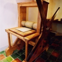
Uploads
Papers
The past twenty years saw a decisive change in the study of early European colour prints. Before, focus was on 16th-century chiaroscuro woodcuts and 18th-century intaglio colour prints mainly. Recent studies have disclosed a much wider area of the use of colour in European prints and printing, challenging many earlier assumptions. The present Jacoba Lugt-Klever Fellowship is aimed at compiling a monograph on the history of European colour prints, book illustrations and ephemera, working title A Brighter Vision: European Colour Printing 1450 to 1830.
Discussed will be, among many others, antecedents of European colour printing, style and function of colour prints, materials and techniques, historical terminology, and developments through the ages. The study will be supported by a generous selection of illustrations of colour printed materials covering a range of subjects, passages from primary technical sources on colour printing processes, results of technical examination of objects, and quotes from historical contemporaries.
The two-year Fellowship (2024 & 2025) is supported by the Fondation Custodia and the RKD.
https://tulip88x.wixsite.com/ad--stijnman/recent-publications.
A large variety of abbreviations and phrases given in the so-called ‘addresses’ of prints and illustrations can be found from 1500. They supply information about who was involved in the production and publishing of the work and in what manner, to whom the work was dedicated, what the year of publication was, as well as about printing privileges. These expressions are usually found in the lower margins of engravings, etchings and lithographs, less in woodcuts and wood engravings, rarely in metalcuts.
Conference & Seminar Organisation
Articles & Book Chapters
Ukiyo-e woodcuts have been famous worldwide since the nineteenth century, but early etchings made by Japanese artists are hardly known outside of Japan. Only Shiba Kōkan's work is discussed by Western print researchers. This essay presents a survey of the Japanese school of etchers from 1783 to 1900. In that period, nearly a hundred Japanese printmakers created thousands of etchings appearing unmistakably in a style of their own. The etchings are discussed in the larger context of the introduction and use of Western printing and printmaking processes in Japan from the late sixteenth century to the late nineteenth century. The essay also examines the Dutch reference works that early Japanese etchers based their graphic techniques on, without having any direct contact with European printmakers, and looks at how they developed these techniques independently, adapting local materials to Western intaglio printmaking techniques.
Appendix 1: Collections of early Japanese etchings outside of Japan.
Appendix 2: List of early Japanese etchers.
Appendix 3: A short chronology of early Japanese etching in context.
Stradanus's print is generally seen as the earliest image of an intaglio printsop. There are, however, earlier images depicting engraving tools and rolling presses, as well as engravers and plate printers at work, which are discussed in Appendix 2. In Appendix 1 is discussed what seems to be the depiction of an intaglio printshop 25 years before Stradanus's one. This is a woodcut illustration attributed to Arnold Nicolai in J. Sambucus, Emblemata et aliquot nummi antiqui operis, 3rd edn, Antwerp 1569, p. 281.
The past twenty years saw a decisive change in the study of early European colour prints. Before, focus was on 16th-century chiaroscuro woodcuts and 18th-century intaglio colour prints mainly. Recent studies have disclosed a much wider area of the use of colour in European prints and printing, challenging many earlier assumptions. The present Jacoba Lugt-Klever Fellowship is aimed at compiling a monograph on the history of European colour prints, book illustrations and ephemera, working title A Brighter Vision: European Colour Printing 1450 to 1830.
Discussed will be, among many others, antecedents of European colour printing, style and function of colour prints, materials and techniques, historical terminology, and developments through the ages. The study will be supported by a generous selection of illustrations of colour printed materials covering a range of subjects, passages from primary technical sources on colour printing processes, results of technical examination of objects, and quotes from historical contemporaries.
The two-year Fellowship (2024 & 2025) is supported by the Fondation Custodia and the RKD.
https://tulip88x.wixsite.com/ad--stijnman/recent-publications.
A large variety of abbreviations and phrases given in the so-called ‘addresses’ of prints and illustrations can be found from 1500. They supply information about who was involved in the production and publishing of the work and in what manner, to whom the work was dedicated, what the year of publication was, as well as about printing privileges. These expressions are usually found in the lower margins of engravings, etchings and lithographs, less in woodcuts and wood engravings, rarely in metalcuts.
Ukiyo-e woodcuts have been famous worldwide since the nineteenth century, but early etchings made by Japanese artists are hardly known outside of Japan. Only Shiba Kōkan's work is discussed by Western print researchers. This essay presents a survey of the Japanese school of etchers from 1783 to 1900. In that period, nearly a hundred Japanese printmakers created thousands of etchings appearing unmistakably in a style of their own. The etchings are discussed in the larger context of the introduction and use of Western printing and printmaking processes in Japan from the late sixteenth century to the late nineteenth century. The essay also examines the Dutch reference works that early Japanese etchers based their graphic techniques on, without having any direct contact with European printmakers, and looks at how they developed these techniques independently, adapting local materials to Western intaglio printmaking techniques.
Appendix 1: Collections of early Japanese etchings outside of Japan.
Appendix 2: List of early Japanese etchers.
Appendix 3: A short chronology of early Japanese etching in context.
Stradanus's print is generally seen as the earliest image of an intaglio printsop. There are, however, earlier images depicting engraving tools and rolling presses, as well as engravers and plate printers at work, which are discussed in Appendix 2. In Appendix 1 is discussed what seems to be the depiction of an intaglio printshop 25 years before Stradanus's one. This is a woodcut illustration attributed to Arnold Nicolai in J. Sambucus, Emblemata et aliquot nummi antiqui operis, 3rd edn, Antwerp 1569, p. 281.
‘Frankfurt Black' made of charred wine lees was often preferred above other charcoal pigments for intaglio printing in 17th to 19th centuries primary sources. As no samples of the dry pigment survive, it was experimentally recreated. Wine lees were charred according to historical instructions to determine appropriate conditions for dry pyrolysis (380°C, 300 min T). The pigment was ground with burnt oil varnishes prepared according to Abraham Bosse’s 1649 manual on etching and engraving. Reconstructed Frankfurt Black was compared to hand-ground inks made with different plant black pigments and modern bone black printing ink. Impressions were made from an etched plate and compared for their colour, contrast, clarity of lines and details. Generally, Frankfurt Black ink displayed the properties described in historical sources: deep dark colour and a soft texture. The ink resembled modern inks in print. The study illustrates how the choice and manufacture of historical ink constituen...
Jacques Callot, der mit der Échoppe ein völlig neues Radierinstrument erfand; Stefano della Bella, der es als Erster wagte, bloße Skizzen im Druck zu vervielfältigen; und Giovanni Benedetto Castiglione, der mit der Monotypie ein neues Druckverfahren entwickelte. Die Radierung und ihre drei maßgeblichen Protagonisten stehen im Zentrum dieses Bandes.
Ein Jahrhundert nach ihrer Erfindung erlebt die Radierung im 17. Jahrhundert ihre barocke Blüte. Ihren wenngleich späten Erfolg verdankt die Drucktechnik der Freiheit der Linie. Anders als in der mühsamen Manier des Kupferstichs kann die Hand des Künstlers oder der Künstlerin
die Zeichnung beim Radieren spielerisch leicht umsetzen. Die Publikation gewährt gewährt faszinierende Einblicke in die Arbeitsprozesse und Ästhetik barocker Druckgraphik.
Mit Beiträgen von Ad Stijnman, Marion Heisterberg und Stefan Morét.
§ Annotated compilation of all the colour prints (and two in b&w) produced by the workshops of Jacob Christoff Le Blon (1667–1741), inventor of trichromatic (blue/yellow/red) printing, and the prints by his first two pupils the brothers Jan L'Admiral (1699–1773) and Jacob L'Admiral Jr (1700–1770).
Contains an introduction on the developments of Le Blon's printing in three, but occasionally also four and five colours (part I, pp. xxv–ciii, figs 1–76). With a contribution by Helen Wyld on 'Jacob Christoff Le Blon's Secret for Weaving Tapestry' (part I, pp. cv–cxxi, figs 1a–13b). With ten Appendices, including Bert van de Roemer's transcription of the 'Manuscript of the diary of the visit by the Von Uffenbach brothers to Le Blon in Amsterdam in 1711' (part I, pp. cxxvi–cxxviii, fig. 77).
The twenty-three contributions represent the state of research in this still-emerging field. From the first known attempts in the West until the invention of the approach we still use today (blue-red-yellow-black/‘key’, now CMYK), it demonstrates that colour prints were not rare outliers, but essential components of many early modern book, print and visual cultures.
ICOM-CC working group Art Technological Source Research, coordinator Doris Oltrogge; 26–27 September 2019; Technische Hochschule Köln / Cologne Institute of Conservation Sciences (CICS)