Adding a utility function for plotting decision regions of classifiers #6338
Conversation
|
Hello! Is it possible to plot a decision region on a 2d slice of multidimensional problem? |
|
@podshumok I am not sure how you'd take such a slice. For the generalized linear models, you could maybe train your model on the full feature set, take 2 of the model coefficients plus bias unit and assign them to a new model that was trained on 2 feature variables? |
|
For example, build full-dimensional mesh grid with classified markers and plot two or more subspaces eg obtained by fixing all coordinates except 2 |
|
@podshumok yes, maybe a good add-on in future -- do you think something like this would be useful in practice? The original goal of this utility function was to replace all the repeated lines of code in all the documentation examples to make them more consistent and leaner. |
|
The original goal of this utility function was to replace all the
repeated lines of code in all the documentation examples to make them
more consistent and leaner.
Indeed, I am a bit afraid that if we start improving that function, we'll
soon have to maintain a plotting library.
|
| def plot_decision_regions(X, y, clf, X_highlight=None, | ||
| res=0.02, legend=1, | ||
| hide_spines=True, | ||
| markers='s^oxv<>', |
|
A related risk is that we make plotting a mysterious black box within our examples. The examples currently make the user understand what is involved in building a plot, arguably. The flipside is that it will remove some code that can be fairly indecipherable for people not very familiar with matplotlib, meshgrid contouring, obfuscations like Looking through examples with this kind of illustration, it's clear there's some amount of variation that makes some examples arguably less readable than others. Some (such as |
I agree with you here. However, I am wondering if "teaching" users "how to plot" is really within the scope of the scikit-learn examples (in contrast to matplotlib tutorials). Although, you are right, one could also see it as a distraction from the main content, and if we provide the user with such a plotting function, he/she wouldn't have to worry about learning how to use matplotlib if she/he doesn't want to. Also, we could make an documentation page to walk through this decision plot function to show people how this generally works? I think that's better than implementing it over and over again. I see it somewhat similar to e.g., the
I think even if we leave these "special" cases as they are for now, I think there are plenty examples that could be streamlined with a plotting function, maybe it would help to make the examples leaner with focus on the main part. |
Well, we aren't really teaching matplotlib, we are teaching people the
Indeed, it's all a question of tradeoff. If we go down the plotting way, |
|
@GaelVaroquaux late answer: I usually need to do multiple google searches, browse stackoverflow and then in the end bug tcaswell about how to do the plot that I want to do. My book contains much more matplotlib code than scikit-learn code, and I think the same is true for our examples. I find it makes the point of the examples much harder to read. Finally, scikit-learn is part of an iterative process for many people that do sklearn in a notebook. doing exploration without plotting functions is pretty annoying. I usually end up copy and pasting some parts of previous plots into my notebooks so that I have functions I can call to visualize coefficients or confusion matrices or learning curves etc. An alternative to having more functions in scikit-learn is creating a separate library of plotting functions. |
|
Yep, whether it's for exploratory analysis in a data mining/ML pipeline or teaching purposes (e.g., book or scikit-learn docs), I find that the matplotlib part is often burying the "main" content/message. I think that a separate lib, something like scikit-learn-plotlib or sklearnplots sounds like a good idea. Beyond simple 1D/2D/3D plots for teaching purposes (such as the decision regions of classifiers, regression fits, or clustering results), there are many other kind of plots where it would be useful to have "convenience wrapper functions." Things like silhouette plots, elbow plots, ROC curves, etc. |
|
ok, so let's not do this here, then. Btw, I have a bunch of them in my BSD-licensed book repo. They need heavy cleanup, though. |
|
@rasbt do you want to start a repo or should I? I'm still behind on reviews (only 9000 notifications to go) |
I am sold. +1 for plotting code in sklearn. It would benefit everybody Only one rule: it lives in a separate submodule (sklearn.plotting?), and Is that a good plan? |
|
Ok cool. +1 on |
|
Examples can import from that module, right? |
Whoa! And that's what they call the "finishing touch(es)"!? O.o I briefly thought about creating such a repo, but yet another side-project? :) Thanks @GaelVaroquaux , the sklearn.plotting solution sounds much nicer. |
I opened #7116 to discuss what we might consider adding. |
|
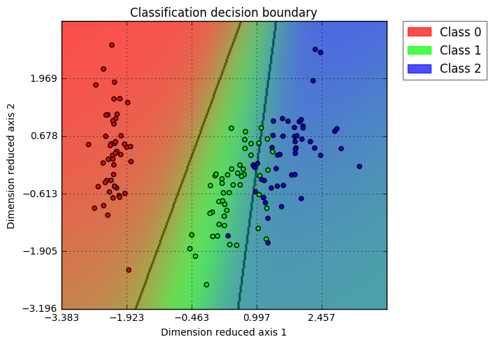
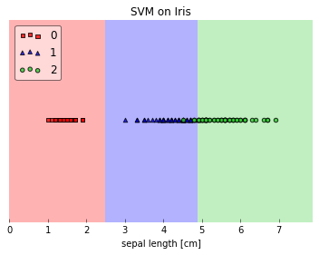
This feature looks great, looking forward to have sklearn utility function to visualize decision boundary directly. Which release will it be included in? Btw. I wrote a small function to do similar task, for high dimension data, I use PCA to do the job, maybe this could be helpful (https://github.com/PanWu/pylib/blob/master/example/01.plot_decision_boundary.ipynb ) Example for Iris dataset + Logistic regression visualization:
|
|
looks really nice. I would really help me for teaching...
|
Yeah, I think we should pick this up again soon! I make a reminder to get back to it in December when I checked off some other projects and I am back from traveling; probably will make it to the next sklearn version then (0.19)!? @PanWu Your plotting functions looks nice as well! Haven't looked at the code in detail, but I noticed that you hard-coded the colors. Would it work for an arbitrary number of class labels then? |
|
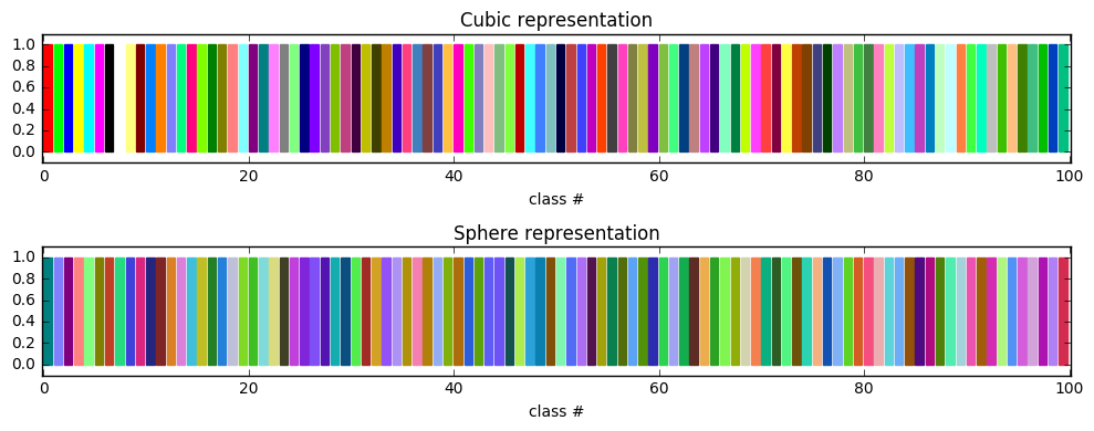
@rasbt Right, currently the color is hard coded, and it is possible to extend into arbitrary number of class labels if needed. However, need to be careful about how to define "class color", because the grid point's color is a linear combination of their class colors (based on class probability). For example, if beside the 8 basic color as following (RBG scale), |
|
@rasbt I just added the approach to generate unlimited classes, so now it works for arbitrary classes. https://github.com/PanWu/pylib/blob/master/pylib/plot.py#L125 |
|
Nice! Just wondering what would be the preferred function for scikit-learn, the |
|
Agree with @rasbt. It would be nice to have a simple UI and add "use_proba" as keyword for improved functionality. Naming side, plot_decision_boundary may not be a good function name for the general purpose since it indicates more "boundary" rather than "region". We can choose either "decision_region_plot" or "plot_decision_region" based on whether the preferred name in sklearn should start with a verb or noun. |
|
I looked through the code for I'm not sure what that illustrates. I feel that is obfuscating more than anything else. In particular the model that is passed in is discarded? |
|
I have functions for hard and soft boundaries I think. I would like a function that can easily do linear separators as a line or color regions or color by distance. The one from my book might need some polish but should be able to do that. |
|
@amueller No exactly: the model (for classification) is not modified; the grids on 2D surface is inverse transformed back to high-dimensional space, then these high-dimension grids (although sparse) are calculated probability & decision based on the classification model. These probability & decision are then used over the 2D surface to represent the model's probability & prediction. The name dr_model means: dimension reduction model (such as PCA or kernal PCA). It has both fit_transform and inverse_transform methods. This is how the 2D space represent model's result over high-dimension space. |
|
@PanWu that's an interesting way to do it. I'm not sure I would advocate this as a default solution, but maybe it's a good idea? How do you set the bandwidth in the kernel PCA? Could you maybe do a binary classification example where you have data on a 3d or 4d sphere and some data in the center, learn it with a random forest or SVM and then project it using KernelPCA or PCA? I'm not sure if there are other high-dimensional datasets we could look at - I'd like the classes to have more similar densities... Another interesting thing would be to compare a PCA projection against a LinearDiscriminantAnalysis projection when using a linear classifier and linearly separable dataset. Or maybe just use the classifier itself if it's linear? |
|
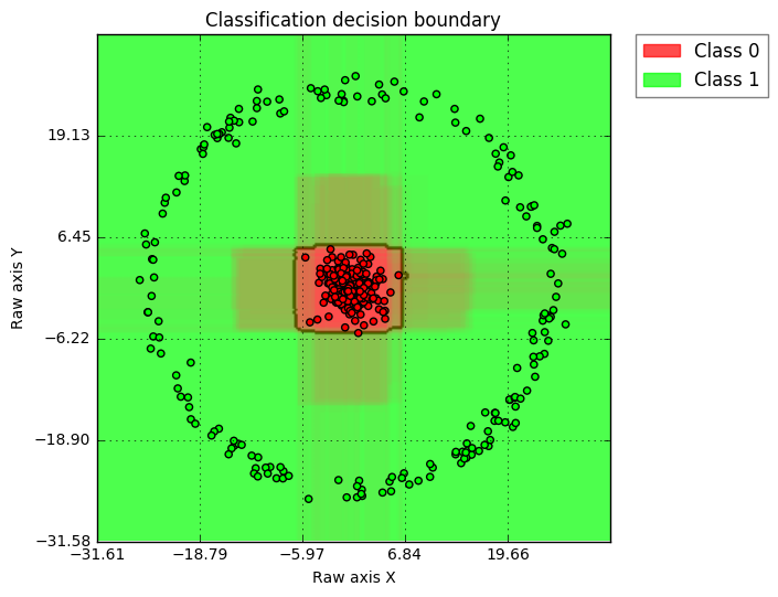
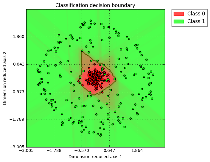
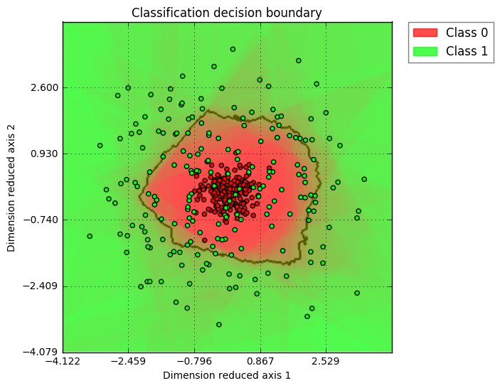
@amueller Definitely agree, I would not advocate visualizing more than 2D data as well. However, if the user really have a high dimension use case, I would like to have a simple way to help extend this function into higher dimension. With PCA, I think linearly separable cases should be fine; for non-linear cases, as long as the user understand PCA's principle (intrinsically linear), such visualization could still be helpful. Here is the example showing how a 2D, 3D, and 10D circle data (as class 1) vs. gaussian distribution around center (as class 2) looks like. I am using PCA for visualization dimension reduction and the classifier is Random Forest. (2D case, clear insights, I would advocate all users only use 2D) (3D case, interesting shape ... while one can see that decision boundary is solid, so the green points flying inside red region is suggesting such cases is due to dimension reduction visualization) (10D case, similar as 3D, just more exaggerated "green points in red region" case) Here is the code I am using: def gen_data(N=200, k=2):
np.random.seed(1)
X1 = np.random.randn(N, k) * 2.0
Y1 = np.zeros([N, 1])
X2 = np.random.rand(N, k) - 0.5
r = 25
X2f = X2 * ((r + np.random.randn(N) * 1.) / np. |
|
That's cool, though I do have my doubts about the utility of the last one. |
|
Before we keep the discussion going in this PR , I was wondering if it's worthwhile closing this PR in favor of the alternative solution proposed by @PanWu |
|
The PCA is a bit too magic for my taste to have it as default behavior. We can discuss adding a way to visualize high-dimensional decision boundaries - which I think is very important, but I don't want to jump the gun on this. The last figure in the series is still a synthetic toy dataset that is much simpler than what you'll see "in the real world" and the visualization is already pretty useless. We can try on some more real-world datasets and see how it goes, though. I couldn't make the code work unfortunately - though I didn't try that hard: Probably some python3 issues? I changed the print statements but nothing else. |
|
ah, got it. Though |
Imho, I would opt for something plain simple for scikit-learn, mainly that's intuitive to interpret for users, since the goal I had in mind was to replace the elaborate code in the documentation examples, and to have something that is model-agnostic in 2D for simple teaching purposes. Not that I am against any fancier stuff, and I think it's an interesting idea, but it's probably better suited for a scikit-visualize contrib project or so. As @GaelVaroquaux mentioned, we probably don't want to go too deep into the plotting stuff :) |
|
@rasbt yeah I agree which is why I would rather stick to something closer to your version - and a helpful error message if the data is higher-dimensional, since that's something that comes up a lot. |
|
Makes sense! Just looking at my code in mlxtend, it already should have some basic input checking, complaining if the data array has >2 features (https://github.com/rasbt/mlxtend/blob/master/mlxtend/plotting/decision_regions.py). I think that I made several changes/improvements over time compared to the PR here. So, I think I may want to remove the highlighting (circling) of test samples since it may be too much fluff for a robust, basic decsion region plotting function for scikit-learn. In any case, I will put together a fresh commit in the next few days so that you can have a look! |
|
Cool. |
|
Haha, "looking nice" is relative (still looks like as in the images at the very top of this PR), but as it is right now, it should
|
|
can you also do "soft" decision boundaries that show "predict_proba" or "decision_function"? I don't really know how to do that well for more than two classes |
|
phew, would have to think about how to implement that; currently, it wouldn't work with the way I implemented it wrt to colors and plt.contourf |
|
Agree with only having 2D case in sklearn to make sure things are stable and consistent. @rasbt , if needed, i have some functions to "support an arbitrary number of classes", feel free to leverage it for this implementation. |
And more interpretable (w.r.t. to what it actually does) :). The code that I have should also support arbitrary numbers of classes, but I will probably come back to your offer regarding the soft boundaries for predict_proba :) |
It's been a while when @amueller asked me about moving this utility function "upstream," but I finally got around it now (rasbt/mlxtend#8) ...
Although such a function probably less useful in real-world applications (since we typically have more than 1 or 2 features in our dataset), but I think it would be a nice utility for replacing the many repeated lines of codes in the tutorials and examples on the scikit-learn website.
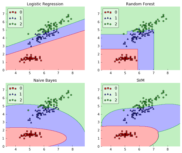
So, this is a simple matplotlib-wrapping convenience function to plot a decision surface of a classifier; it looks like this:
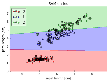
It also supports 1D decision regions (if the input array has only one feature column) and you can highlight the test datapoint, which can be quite useful for teaching (tutorial) purposes.
I am looking forward to feedback! Also, I am wondering how (or if) we implement tests for such a function?