This is a collection of science-inspired visual memes I have created. All images were created or postprocessed via keynote: sciencememes.key
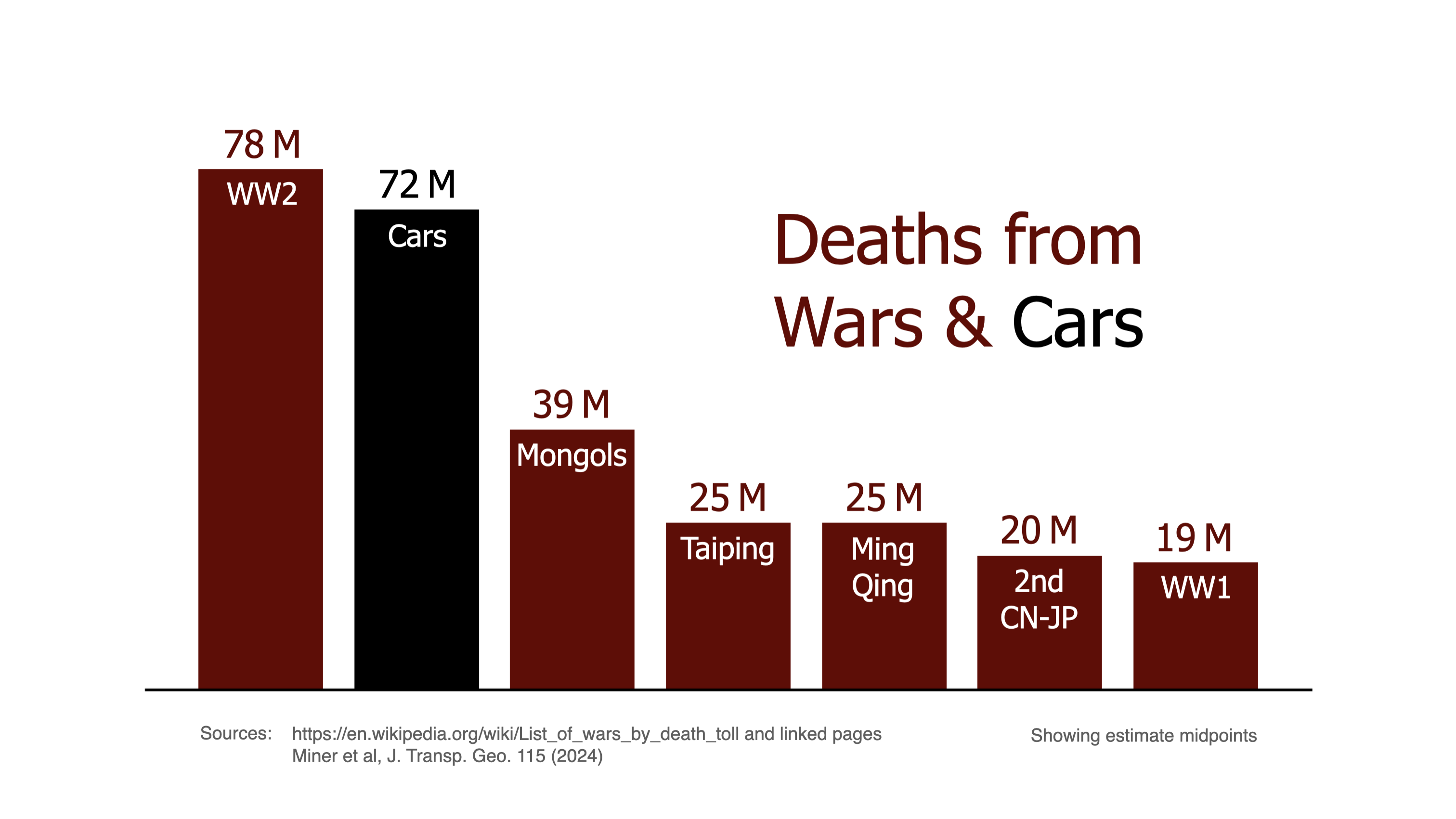
Visualization of the largest death tolls from human wars compared to cars, inspired by the great paper Car harm: A global review of automobility's harm to people and the environment. War death tolls are taken from wikipedia, the bar chart reports midpoints of estimates (for example, WW2 has 70-85M deaths, so (70+85)/2 ≈ 78). Thanks to Anastassia Vybornova for feedback.
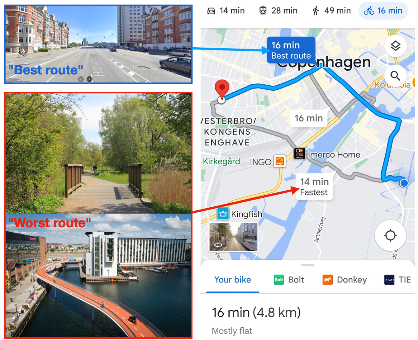
Comparison of Google maps' suggested routes for cycling.
Between the choices:
A - Fastest (14 min), Shortest (4.0 km), 30% green, 50% next to cars
B - Slowest (16 min), Longest (4.8 km), 5% green, 95% next to cars
Google maps ranks route B "best" (1st), while route A is ranked worst (3rd).
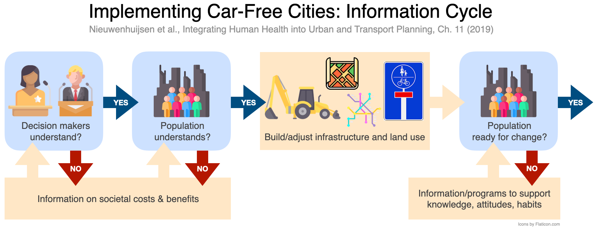
Beautification of Fig.11.2 from the book chapter Implementing Car-Free Cities: Rationale, Requirements, Barriers and Facilitators by Nieuwenhuijsen et al. The figure caption reads "Information cycle related to support for change towards car-free cities".
A visualization of designed and actual paths for cyclists on a busy Danish intersection, following the paper Computational Desire Line Analysis of Cyclists on the Dybbølsbro Intersection in Copenhagen. Source: https://github.com/SimonBreum/desirelines
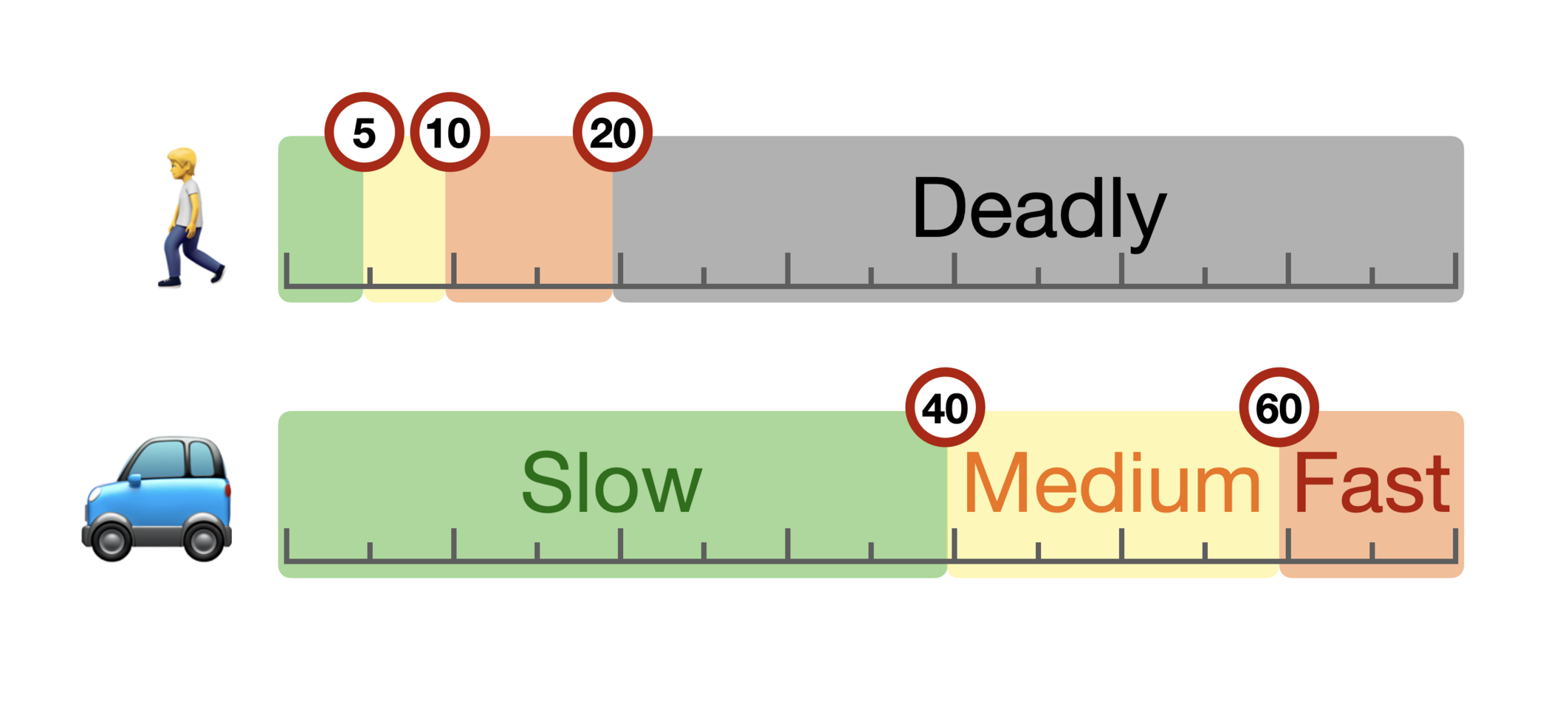
A sketch depicting two different perspectives of speed in the city. Numerical values are in km/h.
A popular visual meme created by manchildmanor.com, adapted to academia with the statement of an Ivy League Professor of how a PhD is not like real work with full pay but more of a calling.
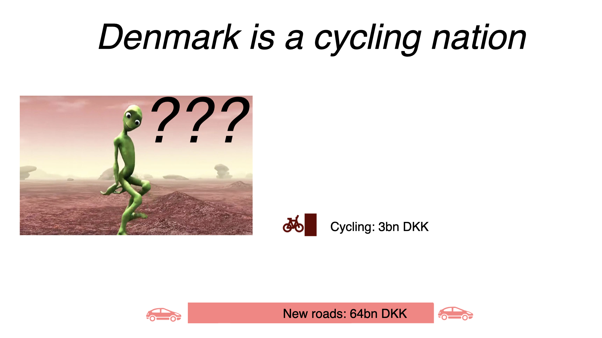
A slide from a lecture on sustainable mobility, introducing the "alien test": If an alien visits earth and gets completely confused by your statement, then probably something is wrong with it.
Application of the popular Drake meme to my 2021 Google mobility report which shows a lot of cycling but also thousands of km of air travel, ending with the title of the paper Air Travel and Urbanity: The Role of Migration, Social Networks, Airport Accessibility, and ‘Rebound’ which describes this phenomenon.
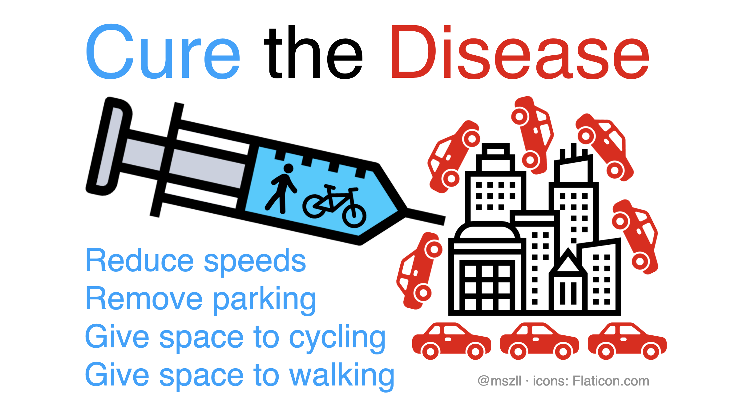
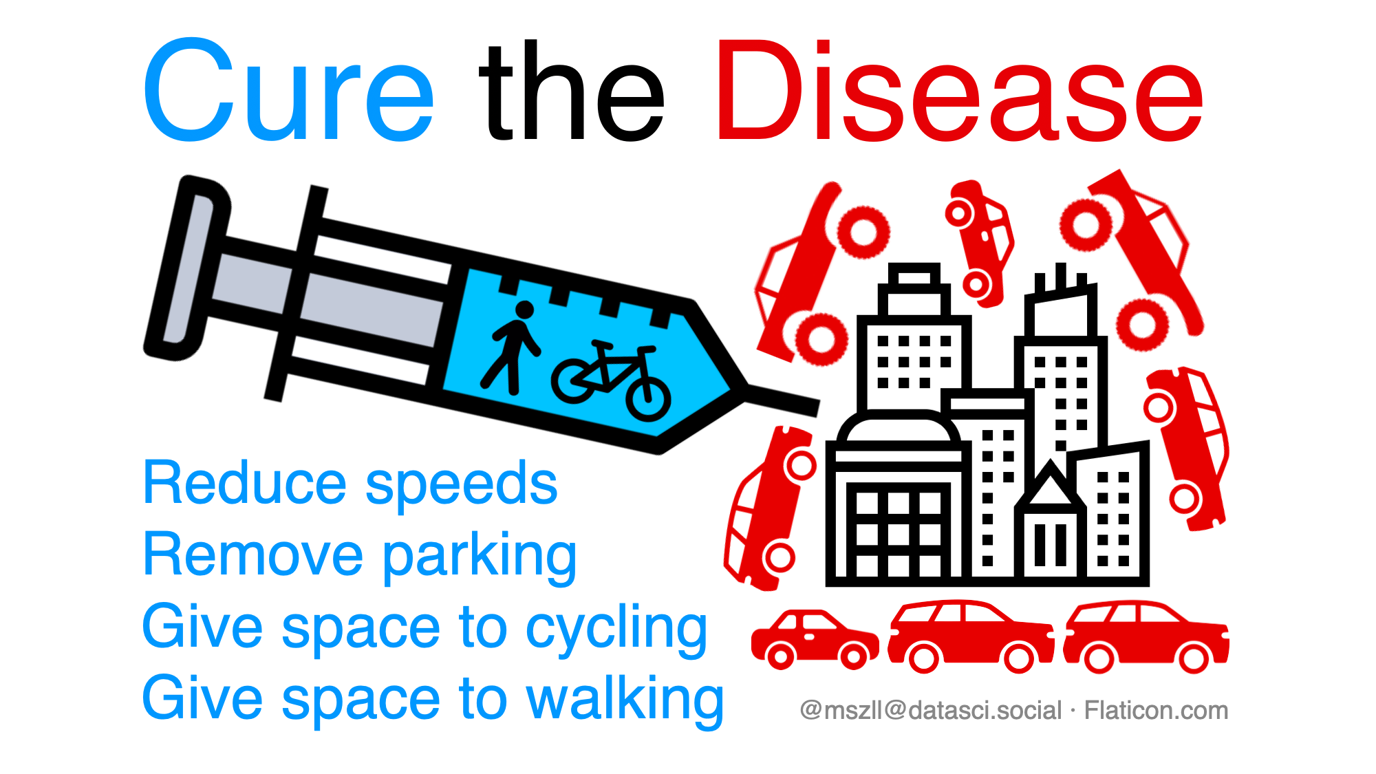
A provocative sketch depicting one of the biggest problems in cities and how to cure it.
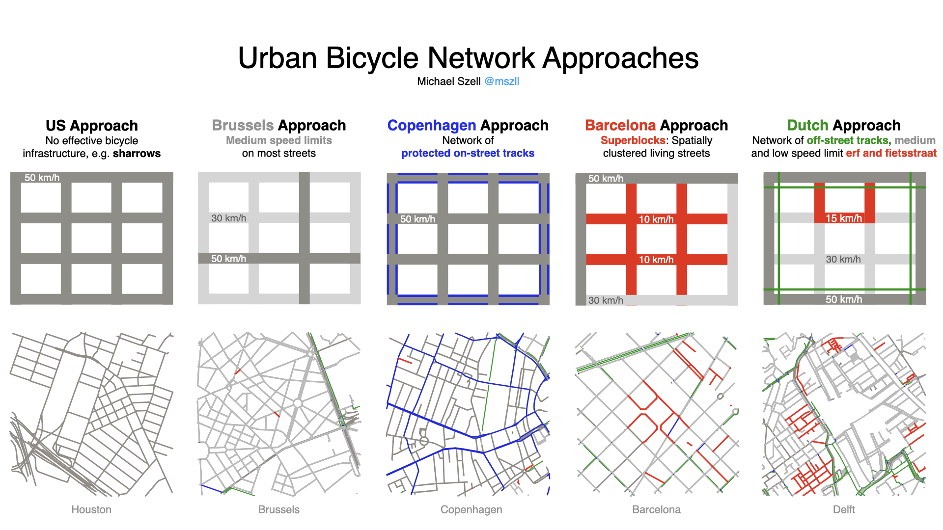
A visualization of the most distinct environments for cycling arriving from different approaches of urban planning, using real network data. Source: https://github.com/mszell/taxonomybikenw
A funny slide used in teaching Introduction to Data Science and Programming. Source: https://github.com/mszell/introdatasci
