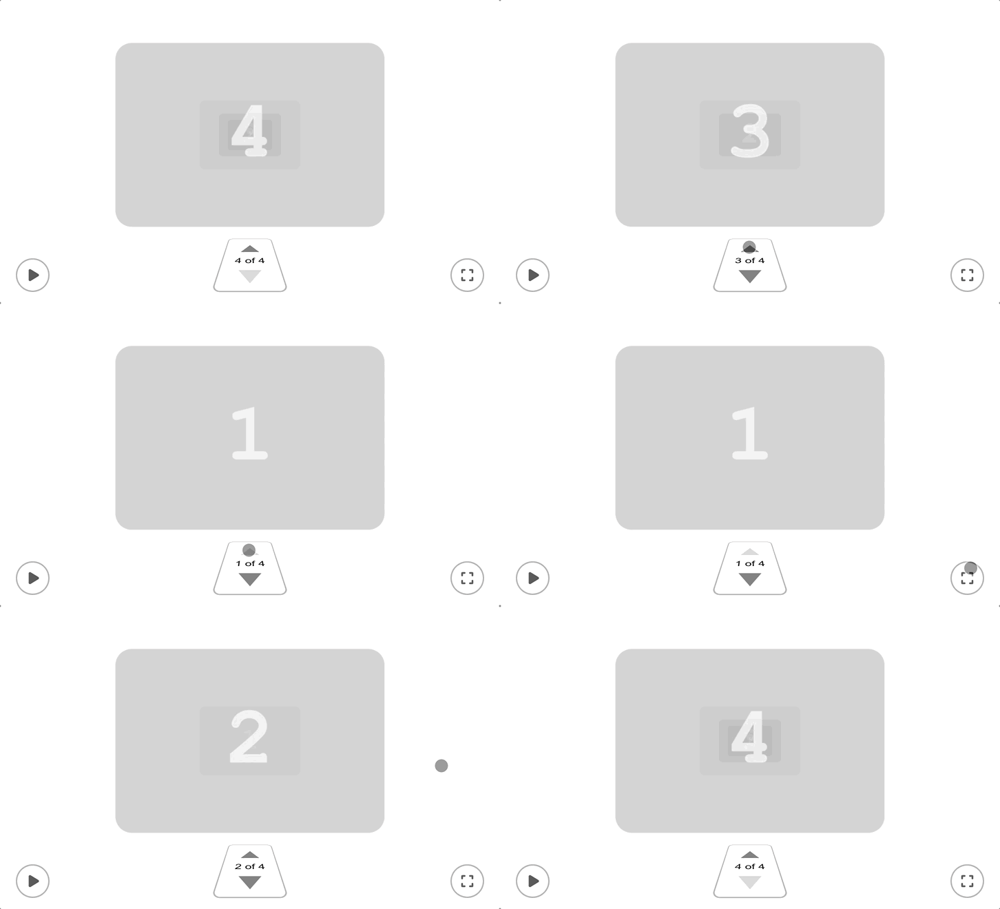
A React UI component that lets you scroll, swipe & zoom through HTML elements on the 3D z-axis
Click above to try out the demos
npm install divzImport the component and render it in your app or page, wrapping it around your list of divs or other HTML elements:
import { Divz } from "divz";

function App() {
  return (
    <Divz>
      <div>1</div>
      <div>2</div>
      <div>3</div>
      <div>4</div>
    </Divz>
  );
}https://lewhunt.github.io/divz
The demos illustrate how the component can be initialised with more props - along with images and videos inside the child divs - for a richer user experience. Demo 3 goes even further and uses a custom video component with preview images, optimised to only play video when the current item is the selected index (active):
<Divz
  autoPlay={true}
  autoPlayDuration={7000}
  isDarkMode={true}
  onIndexChange={(i) => setSelectedIndex(i)}
>
  {demo3Assets.map((item, index) => (
    <DivzVideoItem
      key={index}
      index={index}
      selectedIndex={selectedIndex}
      previewImage={item.image}
      videoSource={item.video}
    ></DivzVideoItem>
  ))}
</Divz>
Here's a quick video of Demo 2, utilising dark mode, images and basic video elements:
divz-demo2.mov
Divz was created to quickly showcase portfolio work within a pseudo-3D environment, loosely inspired by Apple's Time Machine interface which allows the user to zoom through historical Finder windows:
Apple's Time Machine was the inspiration for Divz
- Simplified Integration: Divz is designed to be responsive and easy to use, acting as a straightforward wrapper around a list of divs or other HTML elements.
- Diverse Applications: While the demos showcase its versatility as a carousel, slideshow, or gallery component, Divz opens the door to a range of other potential uses. Consider it an innovative, experimental method for navigating web content.
- Broad Device Support: Divz accommodates various navigation modes, including touch for mobile devices, cursor/trackpad for desktop users, and arrow keys for TV devices.
Under the hood, Divz performs CSS3 transforms on the core component and the child HTML elements, set dynamically with React TypeScript. The component is packaged using Vite to allow npm library integration.
| Prop | Description | Default |
|---|---|---|
autoPlay |
Set to true to autoplay a carousel sequence of any children div elements |
false |
isAutoPlayLooped |
Set to true to enable the autoPlay sequence to endlessly loop |
true |
autoPlayDuration |
Set the time interval in milliseconds for the autoPlay feature | 6000 |
showPlayButton |
Set to true to display the autoPlay toggle button |
true |
showNavButtons |
Set to true to display the up/down navigational buttons for cycling between div children |
true |
showExpandButton |
Set to true to display the 'full-screen' expand button which is used to toggle the scale of div items |
true |
showNavButtonsOnExpanded |
Set to true to display the navigational buttons when div items have been expanded |
false |
isExpanded |
Set to true to toggle the scale of div items |
false |
isDarkMode |
Set to true to set the buttons UI styling to dark mode |
false |
isSnapEnabled |
Set to true to ensure the transform animation is snap-fixed to only move between the div items |
true |
isScrollPageEnabled |
Set to true to override the preferred 'fullscreen' behaviour and enable page scrolling with scrollbar. However, page scrolling is not recommended as it may also trigger the Divz swipe interactions |
false |
selectIndex |
Set the index number to force it to instantly jump to position of a div child item. By default it will instead zoom animate to the first item. | null |
className |
Insert additional classname values for overriding the component CSS styling | null |
onIndexChange |
Called when navigation occurs and the currently selected divz item has changed index | |
onPlaying |
Called when autoPlay sequence starts or stops |
Sample media used in the demos are from various open source projects:
- Demo 2 & 3 images and videos are from Pixabay and Runway
- Demo 4 images are generated in Midjourney by Manoela Ilic
I hope this has given a good intro to the component and you get some use out of it for your own projects!
💬 Fire over a comment if you have any feedback, requests or issues 🐛
⭐ Give it a star if you like the component or want to bookmark it 🙏


