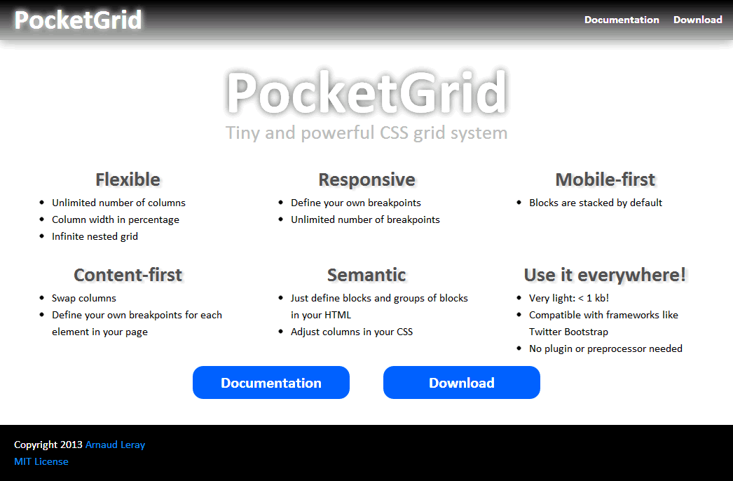
Official PocketGrid website: http://arnaudleray.github.io/pocketgrid/
PocketGrid is the smallest responsive grid system having so many features:
- Lightweight: about 0.5kB!
- Pure CSS-only (no CSS preprocessor needed)
- Fluid (by default, but you can set a fixed width or max-width if you want)
- Responsive
- Unlimited number of breakpoints (you can define your own Media Queries)
- Mobile-first compatible (block width is 100% by default)
- Content-first compatible (you can swap columns and you can define your own breakpoints for each content in your page to fine-tune and optimize your content readability: not only 'tablet' or 'smartphone' breakpoints)
- Semantic (as much as a pure CSS grid could be ;) )
- Very simple (just have to define blocks and groups of blocks)
- Unlimited number of columns (no 12 or 16 columns restrictions: blocks just require a width in percentage)
- Unlimited nested grids
- Manage consistent gutters (gutters can be defined in pixels or ems, which is better than percentage-based solutions because it allows consistent gutters even in nested grids)
- Automatic rows (when a row is full, the next blocks go to a new row without doing anything)
- No dependencies
- Compatible with CSS frameworks such as Twitter Bootstrap or Zurb Foundation (you can use the Bootstrap or Foundation components such as buttons, tabs, etc. and use the Pocket grid for other layout)
- Compatibility: IE6+, Firefox, Chrome, Safari, Opera, and mobile browsers (iPhone, iPad, Android...)
See http://arnaudleray.github.io/pocketgrid/docs/
See http://arnaudleray.github.io/pocketgrid/download/
See http://arnaudleray.github.io/pocketgrid/faq/
You can follow @PocketGrid on Twitter!
Well, first, you can use both!
Indeed, PocketGrid is compatible with any other framework such as Twitter Bootstrap or Zurb Foundation (because it does not use 'grid', 'row' or 'col' classes which are used by too many grid systems).
For example, you could use PocketGrid for your layout positioning, and use Twitter Bootstrap for styling, tabs or special components...
Moreover, PocketGrid has many nice features:
- PocketGrid is really lightweight, so you can use it in all your projects at no cost (Twitter Bootstrap is about 200x bigger, even minified!)
- Twitter Bootstrap 2's grid has only 1 breakpoint (like many grid systems), whereas with PocketGrid you can define as many breakpoints as you want!
- Twitter Bootstrap breakpoints are hard-coded and limited, whereas PocketGrid breakpoints are free and unlimited!
- Twitter Bootstrap has only 12 columns, whereas PocketGrid columns are unlimited!
- PocketGrid is one of the very few semantic grids (especially pure CSS grids!): you don't have "span4" or "small-6 large-2 columns" classes everywhere in your HTML: column size should be defined in the stylesheet, not in the HTML! That's the PocketGrid philosophy!
- Percentage sizing is more natural and more precise than using a number of columns (how can you make 5 columns in a 12 or 16-columns system? It's impossible! With PocketGrid, just put "width:20%", easy!)
- PocketGrid does not require a CSS preprocessor such as LESS or SASS (but you can use one if you want).
Note: If you want to use a complete CSS framework like Twitter Bootstrap, it's dangerous to use it for ALL your site structure because when you upgrade this framework (e.g. upgrading Bootstrap 2 to Bootstrap 3), all your layout will be broken because their grid has evolved and is not backward compatible.
Using a separate grid for your layout (such as PocketGrid!) allows you to upgrade safely your CSS framework (buttons, tabs, carousel...) without breaking your layout!
Arnaud Leray
Copyright 2013 Arnaud Leray.
Licensed under the MIT License:
http://opensource.org/licenses/MIT
Basically, you can do whatever you want as long as you include the original copyright.
