 React
React iOS
iOS Android
 Flutter
 Angular
 JavaScript
 Unity
Unity Unreal
 Node
Node Python
 Ruby
Ruby PHP
PHP Java
Java .NET
.NET Go
Go REST
RESToverride fun onCreate(savedInstanceState: Bundle?) {
super.onCreate(savedInstanceState)
setContent {
ChatTheme {
ChannelList(modifier = Modifier.fillMaxSize())
}
}
}Channel List
The ChannelList component allows you to build a paginated list of Channel items with exposed long tap and single tap actions. We provide two versions of the ChannelList component:
- Bound: This version binds itself to a
ChannelListViewModeland loads all the required data. It also connects long item tap and pagination events to theViewModel. - Stateless: This is a stateless version of the list, which doesn’t depend on a
ViewModel, and instead depends on pure state from external sources to render its UI.
You can learn more about the different component types on the Component Architecture page.
The bound version of the list uses the stateless list internally. That way, when providing the same state to either component, the behavior will be the same.
Based on the provided state, the component shows the following UI:
- Loading indicator if we’re loading the initial data.
- Empty view if loading is done but there is no data to show.
- The list of channels with pagination.
Let’s see how to show a list of channels.
Usage
To use the bound ChannelList, add it to your UI within setContent():
This is a very basic and crude example, that just shows a list of channels with pagination. Even though the state handling is set up, we recommend passing in action handlers or a ChannelListViewModel instance and consuming the internal state, to react to single and long item taps.
The snippet above will generate the following UI.
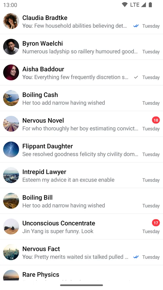 |
|---|
In order to fully utilize the Channel items, let’s see how to handle actions and state from the ViewModel.
Handling Actions
If you’ve chosen the bound version of the ChannelList component, we recommend either providing your own instance of the ViewModel, or overriding default actions to react to state changes. To support that, the ChannelList signature exposes the following parameters:
@Composable
fun ChannelList(
    viewModel: ChannelListViewModel = viewModel(
        factory = ... // Our default factory
    ),
    onLastItemReached: () -> Unit = { viewModel.loadMore() },
    onChannelClick: (Channel) -> Unit = {},
    onChannelLongClick: (Channel) -> Unit = { viewModel.selectChannel(it) },
    onSearchResultClick: (Message) -> Unit = {},
    ... // Content Slots
)viewModel: The instance of theChannelListViewModelthat this component reads data from and sends events to. Pass in your own instance if you want more control over your business logic, such as changingChannelfilters or sort order in runtime.onLastItemReached: Handler when the user reaches the last item in the list to trigger pagination. You don’t need to override this if you’re using the defaultviewModel, but if you’re using a custom one, you can add custom behavior.onChannelClick: Handler when the user taps on an item. Useful for starting theMessagesScreen.onChannelLongClick: Handler when the user long taps on an item. By default, this updates state in theviewModel, which you can read to show custom UI andChannelactions if you’re using a customViewModelinstance. Override if you’re using the defaultviewModeland you want to change the behavior.onSearchResultClick: Handler when the user taps on a search result item. Useful for starting theMessagesScreenwith the selected message.
You may need to pass a custom ChatEventHandlerFactory to the ViewModel to make sure the list is updated properly. Check ChannelListUpdates section to learn more.
Here’s an example of using the default ViewModel, but overriding the behavior:
override fun onCreate(savedInstanceState: Bundle?) {
    super.onCreate(savedInstanceState)

    setContent {
        ChatTheme {
            // Custom state holder
            var selectedChannel by remember { mutableStateOf<Channel?>(null) }

            Box(modifier = Modifier.fillMaxSize()) {
                ChannelList(
                    modifier = Modifier.fillMaxSize(),
                    onChannelLongClick = { // Custom long tap handler
                        selectedChannel = it
                    },
                    onChannelClick = {
                        // Start the MessagesScreen
                    },
                    onSearchResultClick = {
                        // Start the MessagesScreen with the selected message
                    }
                )

                if (selectedChannel != null) {
                    // Show custom UI
                }
            }
        }
    }
}
In the example above, we created a selectedChannel state holder, which we use to show some custom UI if the data is not null. We update the state when the user long taps on an item.
We also provide a custom onChannelClick handler, to open the MessagesScreen with the selected item. This will produce the same UI, but with user-defined actions.
Finally we provide a custom onSearchResultClick handler, to open the MessagesScreen with the selected message.
Alternatively, you can override the default ViewModel and read the internal state:
val listViewModel: ChannelListViewModel by viewModels { ChannelViewModelFactory() }

override fun onCreate(savedInstanceState: Bundle?) {
    super.onCreate(savedInstanceState)

    setContent {
        ChatTheme {
            Box(modifier = Modifier.fillMaxSize()) {
                ChannelList(
                    modifier = Modifier.fillMaxSize(),
                    viewModel = listViewModel, // Passing in our ViewModel
                    onChannelClick = {
                        // Start the MessagesScreen
                    },
                    onSearchResultClick = {
                        // Start the MessagesScreen with the selected message
                    },
                )

                if (listViewModel.selectedChannel != null) {
                    // Show custom UI
                }
            }
        }
    }
}
The behavior will be the same and you gain more control over the ViewModel.
We recommend that you create an instance of our ViewModel if you’re thinking of using our predefined state and operations. If you’re looking into a more low-level solution, with more control, you can use the stateless version of our components.
Controlling the scroll state
You can control the scroll state of the channel list by providing a lazyListState parameter, like in the example below:
@Composable
fun ChannelList(
    ..., // State
    lazyListState: LazyListState = rememberLazyListState(),
    ... // Actions & Content Slots
)lazyListState: The scroll state of the list. While not a handler, you can use it to control the scroll and trigger custom scroll actions.
To customize this state you can simply pass your own instance as a parameter:
 val lazyListState = rememberLazyListState()

ChannelList(
    // State
    lazyListState = lazyListState
    // Actions & Content Slots
)
Customization
If you’re looking to customize the UI of the ChannelList, there are a few ways you can do so, as per the signature:
@Composable
fun ChannelList(
    // State and action handlers
    modifier: Modifier = Modifier,
    contentPadding: PaddingValues = PaddingValues(...),
    loadingContent: @Composable () -> Unit = { ... },
    emptyContent: @Composable () -> Unit = { ... },
    emptySearchContent: @Composable (String) -> Unit = { ... },
    helperContent: @Composable BoxScope.() -> Unit = { ... },
    loadingMoreContent: @Composable () -> Unit = { ... },
    channelContent: @Composable (ItemState.ChannelItemState) -> Unit = { ... },
    searchResultContent: @Composable (ItemState.SearchResultItemState) -> Unit = { ... },
    divider: @Composable () -> Unit = { ... },
)modifier: The modifier for the root component. You can apply a background, elevation, padding, shape, touch handlers and much more.contentPadding: Padding values to be applied to the channel list surrounding the content inside.loadingContent: Customizable composable that allows you to override the default loading indicator when loading the initial data set.emptyContent: Customizable composable that allows you to override the empty state, when there are no channels available.emptySearchContent: Customizable composable that allows you to override the empty state, when there are no channels matching the search query.helperContent: Composable that represents helper content for the channel list. Empty by default, but can be used, for example, to display back to top floating action button.loadingMoreContent: Composable that represents the loading more content, when we’re loading the next page.channelContent: Customizable composable that allows you to fully override the UI and behavior of channel items. This will be applied to each item in the list, and you’ll gain access to theChannelinside the lambda when building your custom UI.searchResultContent: Customizable composable that allows you to fully override the UI and behavior of search result items. This will be applied to each item in the list, and you’ll gain access to theMessageinside the lambda when building your custom UI.divider: Customizable composable that allows you to override the item divider.
Here’s a simple example for building your own channel item, by overriding the channelContent parameter:
val user by listViewModel.user.collectAsState() // Fetch user

ChannelList(
    ..., // Set up state
    channelContent = { // Customize the channel items
        Row(
            modifier = Modifier
                .padding(8.dp)
                .fillMaxWidth(),
            verticalAlignment = Alignment.CenterVertically
        ) {
            ChannelAvatar(
                modifier = Modifier.size(40.dp),
                channel = it.channel,
                currentUser = user
            )

            Spacer(modifier = Modifier.width(8.dp))

            Text(
                text = ChatTheme.channelNameFormatter.formatChannelName(it.channel, user),
                style = ChatTheme.typography.bodyBold,
                maxLines = 1,
            )
        }
    }
)
The snippet above will generate the following UI:
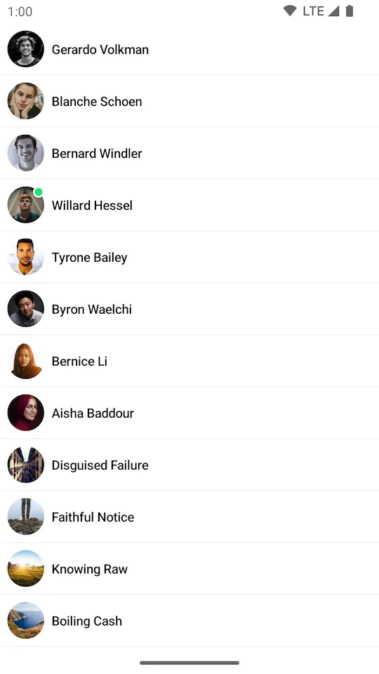 |
|---|
As you can see, the items now show just the image and the channel name. You can customize the items to any extent, whatever your design specification might require.
And you can customize the emptyContent and the loadingContent to your needs if you need custom UI there.