Descender

In typography and handwriting, a descender is the portion of a letter that extends below the baseline of a font.
For example, in the letter y, the descender is the "tail", or that portion of the diagonal line which lies below the v created by the two lines converging. In the letter p, it is the stem reaching down past the ɒ.
In most fonts, descenders are reserved for lowercase characters such as g, j, q, p, y, and sometimes f. Some fonts, however, also use descenders for some numerals (typically 3, 4, 5, 7, and 9). Such numerals are called old-style numerals. (Some italic fonts, such as Computer Modern italic, put a descender on the numeral 4 but not on any other numerals. Such fonts are not considered old-style.) Some fonts also use descenders for the tails on a few uppercase letters such as J and Q.[1]
The parts of characters that extend above the x-height of a font are called ascenders.[2]
Descenders are often reduced in small-print typefaces for uses such as newspapers, directories or pocket Bibles to fit more text on a page. More radically, on 20 May 1802 Philip Rusher of Banbury patented a new Patent Type with eliminated descenders and shortened ascenders.[3][4][5][6] The type did not prove successful, nor did another use in 1852.[7][8] The Art Nouveau display typeface Hobo and headline typeface Permanent Headline which also eliminate descenders have both been somewhat popular since.[9]
Some early computer displays (for example, the Compukit UK101) and printers (for example, the Commodore 4022[10]) restricted the vertical spacing of characters so that there was no space for correct display of descenders. Instead, characters with descenders were displaced vertically upwards so that the bottom of the descender was aligned with the baseline. Contemporary systems that did not have this restriction were described as supporting true descenders.

For broader context, see Typeface anatomy.
Analogues in Thai script
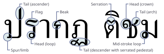
[edit]Some type designers have observed the “tails” of some Thai glyphs to be analogues to the descenders. (e.g. ฤ) [11][12] Other authors have also mentioned pedestals/feet to be analogues to the descenders. (e.g. ฎ, ฏ, ญ and ฐ)[13][14]

References
[edit]- ^ Mcclam, Erin (2007-09-16). "Typeface designers mix art, engineering". USA Today. Retrieved 2013-04-25.
- ^ Snider, Lesa (2013-04-23). "Typography for all: Demystifying text for high-impact messages". Macworld. Retrieved 2013-04-25.
- ^ English Patents of Inventions, Specifications. H.M. Stationery Office. 1856. pp. 14–15.
- ^ Goudy, Frederic (1 January 1977). Typologia: Studies in Type Design & Type Making, with Comments on the Invention of Typography, the First Types, Legibility, and Fine Printing. University of California Press. pp. 141–142. ISBN 978-0-520-03308-5.
- ^ Johnson, Samuel (1804). Rasselas, Prince of Abissinia. By Dr. Johnson. Printed with Patent Types in a Manner Never Before Attempted. Rusher's Edition. Banbury: P. Rusher. Retrieved 11 August 2021.
- ^ Johnston, Alastair (21 March 2012). "Weird And Wonderful Typography - Yet Still Illegible". Smashing Magazine. Retrieved 11 August 2021.
- ^ William White (of Shutford.) (1852). A Complete Guide to the Mystery and Management of Bees;. Simpkin, Marshall, and Company; and Hamilton, Adams, and Company: Oxford; H. Slatter: Reading; Rusher and Johnson: Banbury; J. G. Rusher.
- ^ John Cheney and His Descendants: Printers in Banbury Since 1767. Banbury. 1936. pp. 26–31.
{{cite book}}: CS1 maint: location missing publisher (link) - ^ Devroye, Luc. "Karlgeorg Hoefer". Type Design Information. Retrieved 17 June 2016.
- ^ "Commodore 4022 Printer". The Centre For Computing History.
- ^ Virunhaphol, Farida (2017). Designing Khom Thai Letterforms for Accessibility (doctoral thesis). University of Huddersfield. pp. 38–67.
- ^ Rachapoom Punsongserm (2012). "ข้อสังเกตในการใช้แบบตัวพิมพ์ไทยเสมือนโรมัน: เอกลักษณ์และความชัดเจนที่หายไป" [Viewpoint of Using a Roman-like Typeface: Disappearance of Singularity and Legibility]. Manutsayasat Wichakan (in Thai). 19 (1): 113–145. ISSN 2673-0502.
- ^ Gunkloy, Sirin (2020). Tiga: A Latin-Thai type family for news media (PDF) (post-graduate dissertation). École supérieure d'art et de design d'Amiens. pp. 6–37. Retrieved 22 May 2020.
- ^ Punsongserm, Rachapoom; Sunaga, Shoji; Ihara, Hisayasu (28 February 2017). "Thai Typefaces (Part 1): Assumption on Visibility and Legibility Problems". Archives of Design Research. 30 (1): 5–23. doi:10.15187/adr.2017.02.30.1.5.
External links
[edit] The dictionary definition of descender at Wiktionary