Designing the Patterns Day site
Patterns Day is not one of Clearleft’s slick’n’smooth conferences like dConstruct or UX London. It’s more of a spit’n’sawdust affair, like Responsive Day Out.
You can probably tell from looking at the Patterns Day website that it wasn’t made by a crack team of designers and developers—it’s something I threw together over the course of a few days. I had a lot of fun doing it.
I like designing in the browser. That’s how I ended up designing Resilient Web Design, The Session, and Huffduffer back in the day. But there’s always the initial problem of the blank page. I mean, I had content to work with (the information about the event), but I had no design direction.
My designery colleagues at Clearleft were all busy on client projects so I couldn’t ask any of them to design a website, but I thought perhaps they’d enjoy a little time-limited side exercise in producing ideas for a design direction. Initially I was thinking they could all get together for a couple of hours, lock themselves in a room, and bash out some ideas as though it were a mini hack farm. Coordinating calendars proved too tricky for that. So Jon came up with an alternative: a baton relay.
Remember Layer Tennis? I once did the commentary for a Layer Tennis match and it was a riot—simultaneously terrifying and rewarding.
Anyway, Jon suggested something kind of like that, but instead of a file being batted back and forth between two designers, the file would passed along from designer to designer. Each designer gets one art board in a Sketch file. You get to see what the previous designers have done, leaving you to either riff on that or strike off in a new direction.
The only material I supplied was an early draft of text for the website, some photos of the first confirmed speakers, and some photos I took of repeating tiles when I was in Porto (patterns, see?). I made it clear that I wasn’t looking for pages or layouts—I was interested in colour, typography, texture and “feel.” Style tiles, yes; comps, no.
Jon
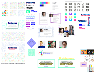
Jon kicks things off and immediately sets the tone with bright, vibrant colours. You can already see some elements that made it into the final site like the tiling background image of shapes, and the green-bordered text block. There are some interesting logo ideas in there too, some of them riffing on LEGO, others riffing on illustrations from Christopher Alexander’s book, A Pattern Language. Then there’s the typeface: Avenir Next. I like it.
James G
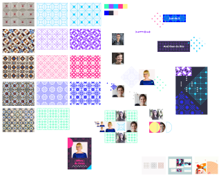
Jimmy G is up next. He concentrates on the tiles idea. You can see some of the original photos from Porto in the art board, alongside his abstracted versions. I think they look great, and I tried really hard to incorporate them into the site, but I couldn’t quite get them to sit with the other design elements. Looking at them now, I still want to get them into the site …maybe I’ll tinker with the speaker portraits to get something more like what James shows here.
Ed
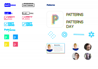
Ed picks up the baton and immediately iterates through a bunch of logo ideas. There’s something about the overlapping text that I like, but I’m not sure it fits for this particular site. I really like the effect of the multiple borders though. With a bit more time, I’d like to work this into the site.
James B
Batesy is the final participant. He has some other nice ideas in there, like the really subtle tiling background that also made its way into the final site (but I’ll pass on the completely illegible text on the block of bright green). James works through two very different ideas for the logo. One of them feels a bit too busy and chaotic for me, but the other one …I like it a lot.
I immediately start thinking “Hmm …how could I make this work in a responsive way?” This is exactly the impetus I needed. At this point I start diving into CSS. Not only did I have some design direction, I’m champing at the bit to play with some of these ideas. The exercise was a success!
Feel free to poke around the Patterns Day site. And while you’re there, pick up a ticket for the event too.


