1. Introduction
This section is not normative.
Shapes define arbitrary geometries that can be used as CSS values. This specification defines properties to control the geometry of an element’s float area. The shape-outside property uses shape values to define the float area for a float.
Note: Future levels of CSS Shapes will allow use of shapes on elements other than floats. Other CSS modules can make use of shapes as well, such as CSS Masking [CSS-MASKING] and CSS Exclusions [CSS3-EXCLUSIONS].
Note: If a user agent implements both CSS Shapes and CSS Exclusions, the shape-outside property defines the exclusion area for an exclusion.
Note: A future level of CSS Shapes will define a shape-inside property, which will define a shape to wrap content within the element.
1.1. Module Interactions
This module extends the float features defined in [CSS2] chapter 9.
1.2. Values
This specification follows the CSS property definition conventions from [CSS2] using the value definition syntax from [CSS-VALUES-3]. Value types not defined in this specification are defined in CSS Values & Units [CSS-VALUES-3]. Combination with other CSS modules may expand the definitions of these value types.
In addition to the property-specific values listed in their definitions, all properties defined in this specification also accept the CSS-wide keywords as their property value. For readability they have not been repeated explicitly.
1.3. Animated Values
It is expected that CSS will include ways to animate transitions between styles. In anticipation of that, this module includes a line "Animatable" for each property, which specifies whether and how values of the property can be animated.
1.4. Terminology
Wrap
This specification uses the term wrap to refer to flowing content around the sides of a float area, defined in [CSS2] chapter 9. Content wraps around the right side of a left-floated box, and content wraps around the left side of a right-floated box. One result of this wrapping is that line boxes next to a float are shortened as necessary to avoid intersections with the float area.
Float area
The area used for wrapping content around a float element. The rules for float behavior use the sides of the float area to determine where content flows. By default, the float area is the float element’s margin box (note this can be different than the float area produced by the margin-box value, which includes border-radius curvature). This specification’s shape-outside property can be used to define an arbitrary, non-rectangular float area.
2. Relation to the box model and float behavior
While the boundaries used for wrapping inline flow content outside a float can be defined using shapes, the actual box model does not change. If the element has specified margins, borders or padding they will be computed and rendered according to the [CSS3BOX] module. Also, float positioning and stacking are not affected by defining a float area with a shape.
When a shape is used to define a float area, the shape is clipped to the float’s margin box. In other words, a shape can only ever reduce a float area, not increase it. A reduced float area may have no effect on some line boxes that would normally be affected by the float. If a shape does not enclose any area, the shape’s edges are still used to define the float area.
A float area defined by a shape may reduce the normal float area on all sides, but this does not allow content to wrap on both sides of a float. Left floats with a shape-outside still only allow content wrapping on the right side, and right floats only allow wrapping on the left.
In the following example
the left and right floating img elements
specify a triangular shape
using the shape-outside property.
<img class="left" src="hand.svg"/>
<img class="right" src="hand.svg"/>
<p>
  Sometimes a web page’s text content appears to be
  funneling your attention towards a spot on the page
  to drive you to follow a particular link. Sometimes
  you don’t notice.
</p>

<style type="text/css">
  .left {
    shape-outside: polygon(0 0, 100% 100%, 0 100%);
    float: left;
    width: 40%;
    height: 12ex;
    transform: scaleX(-1);
  }

  .right {
    shape-outside: polygon(100% 0, 100% 100%, 0 100%);
    float: right;
    width: 40%;
    height: 12ex;
  }

  p {
    text-align: center;
  }
</style>

Since shapes are clipped to the float’s margin box, adding this shape to the left float above would result in the same rendering.
shape-outside: polygon(0 0, 500% 500%, 0 500%);
A shape that does not enclose any area still has edges that contribute to the float area.
This inset shape is a vertical line positioned at the midpoint of the reference box. This midpoint edge is used as the edge of the float area for wrapping content.
shape-outside: inset(0% 50% 0% 50%);
If inset values add up to more than the width, CSS Backgrounds 3 § 4.5 Overlapping Curves rules are used to determine the edges of the rectangle. This shape results in a vertical edge 25% from the left side of the reference box.
shape-outside: inset(0% 150% 50% 0%);
If the shape is only a horizontal line, then it is an empty float area and has no effect on wrapping. Note that in this example shape-margin must be 0px (otherwise the line would expand to enclose an area).
shape-outside: inset(50% 0% 0% 50%);
shape-margin: 0px;
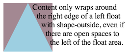
A shape-outside can create open areas on both the left and right of a float area. Content still wraps only on one side of a float in this case. In the picture, the shape is rendered in blue, and the content area outside the shape in mauve.
shape-outside: polygon(50px 0px, 100px 100px, 0px 100px);
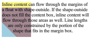
The following styling creates a shape much smaller than the float’s content area, and adds a margin-top to the float. In the picture, the shape is rendered in blue, the content area outside the shape in mauve, and the margin area of the float box in yellow. The inline content only wraps around the shape, and otherwise overlays the rest of the float margin box.
.float-left {
  shape-outside: polygon(0% 50%, 50% 100%, 0 100%);
  float: left;
  width: 100px;
  height: 100px;
  margin-top: 20px;
}
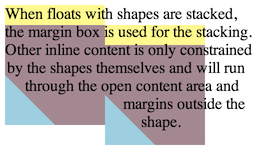
The next picture shows a possible result if two of these floats were stacked next to each other. Note that the floats are positioned using their margin boxes, not the float area.
3. Basic Shapes
The <basic-shape> type can be specified using basic shape functions. When using this syntax to define shapes, the reference box is defined by each property that uses <basic-shape> values. The coordinate system for the shape has its origin on the top-left corner of the reference box with the x-axis running to the right and the y-axis running downwards. All the lengths expressed in percentages are resolved from the used dimensions of the reference box.
3.1. Supported Shapes
The following shapes are supported. All <basic-shape> values use functional notation and are defined here using the Value Definition Syntax.
- inset() = inset( <length-percentage>{1,4} [ round <'border-radius'> ]? )
-
Defines an inset rectangle
via insets from each edge of the reference box.
If less than four <length-percentage> values are provided, the omitted values default in the same way as the margin shorthand: an omitted second or third value defaults to the first, and an omitted fourth value defaults to the second.
The four <length-percentage>s define the position of the top, right, bottom, and left edges of a rectangle, respectively, as insets from the corresponding edges of the reference box.
A pair of insets in either dimension that add up to more than the used dimension (such as left and right insets of 75% apiece) use the CSS Backgrounds 3 § 4.5 Overlapping Curves rules to proportionally reduce the inset effect to 100%.
For example, specifying inset(75% 0 50% 0) has the top+bottom edges summing to 125% of the reference box’s height. They’re proportionaly reduced to sum to 100%, identical to specifying inset(60% 0 40% 0).The optional <'border-radius'> argument(s) define rounded corners for the rectangle using the border-radius shorthand syntax.
- xywh() = xywh( <length-percentage>{2} <length-percentage [0,∞]>{2} [ round <'border-radius'> ]? )
-
Defines a rectangle
via offsets from the top and left edge of the reference box,
and a specified width and height.
The four <length-percentage>s define, respectively, the inset from the left edge of the reference box, the inset from the top edge of the reference box, the width of the rectangle, and the height of the rectangle.
Note: This syntax is inspired by the
viewBoxattribute from SVG.The optional <'border-radius'> argument(s) define rounded corners for the inset rectangle using the border-radius shorthand syntax.
- rect() = rect( [ <length-percentage> | auto ]{4} [ round <'border-radius'> ]? )
-
Defines a rectangle
via insets from the top and left edges of the reference box.
The four <length-percentage>s define the position of the top, right, bottom, and left edges of a rectangle, respectively, as insets from the top edge of the reference box (for the first and third values) or the left edge of the reference box (for the second and fourth values).
An auto value makes the edge of the box coincide with the corresponding edge of the reference box: it’s equivalent to 0% as the first (top) or fourth (left) value, and equivalent to 100% as the second (right) or third (bottom) value.
The second (right) and third (bottom) values are floored by the fourth (left) and second (top) values, respectively.
For example, specifying rect(10px 0 0 20px) would place the bottom edge higher than the top edge, and the right edge further left than the left edge, so both are corrected to not cross over the other edge, identical to specifying rect(10px 20px 10px 20px).Note: This syntax is similar, but not quite identical, to the legacy rect() function used solely by the clip property.
The optional <'border-radius'> argument(s) define rounded corners for the rectangle using the border-radius shorthand syntax.)
- circle() = circle( <shape-radius>? [ at <position> ]? )
-
- The shape-radius argument represents r, the radius
of the circle.
Negative values are invalid.
A percentage value here
is resolved from the used width and height
of the reference box as
sqrt(width2+height2)/sqrt(2). - The position argument defines the center of the circle. This defaults to center if omitted.
- The shape-radius argument represents r, the radius
of the circle.
Negative values are invalid.
A percentage value here
is resolved from the used width and height
of the reference box as
- ellipse() = ellipse( [ <shape-radius>{2} ]? [ at <position> ]? )
-
- The shape-radius arguments represent rx and ry, the x-axis and y-axis radii of the ellipse, in that order. Negative values for either radius are invalid. Percentage values here are resolved against the used width (for the rx value) and the used height (for the ry value) of the reference box.
- The position argument defines the center of the ellipse. This defaults to center if omitted.
- polygon() = polygon( <'fill-rule'>? , [<length-percentage> <length-percentage>]# )
-
- <'fill-rule'> - The filling rule used to determine the interior of the polygon. See fill-rule property in SVG for details. Possible values are nonzero or evenodd. Default value when omitted is nonzero.
- Each pair argument in the list represents xi and yi - the x and y axis coordinates of the i-th vertex of the polygon.
The UA must close a polygon by connecting the last vertex with the first vertex of the list.
- path() = path( [<'fill-rule'>,]? <string> )
-
- <'fill-rule'> - The filling rule used to determine the interior of the path. See fill-rule property in SVG for details. Possible values are nonzero or evenodd. Default value when omitted is nonzero.
- The <string> represents an SVG Path data string. A path data string that does not conform to the to the grammar and parsing rules of SVG 1.1, or that does conform but defines an empty path, is invalid and causes the entire path() to be invalid. The initial position is defined by the first “move to” argument in the path string. For the initial direction follow SVG 1.1.
The UA must close a path with an implicit closepath command ("z" or "Z") if it is not present in the string for properties that require a closed loop (such as shape-outside and clip-path).
The arguments not defined above are defined as follows:
- <shape-radius> = <length-percentage [0,∞]> | closest-side | farthest-side
-
Defines a radius for a circle or ellipse. If omitted it defaults to closest-side.
- closest-side uses the length from the center of the shape to the closest side of the reference box. For circles, this is the closest side in any dimension. For ellipses, this is the closest side in the radius dimension.
- farthest-side uses the length from the center of the shape to the farthest side of the reference box. For circles, this is the farthest side in any dimension. For ellipses, this is the farthest side in the radius dimension.
Additionally, the three rectangular shape functions are grouped into a production for convenience:
<basic-shape-rect> = <inset()> | <rect()> | <xywh()>
3.2. Computed Values of Basic Shapes
The values in a <basic-shape> function are computed as specified, with these exceptions:
- Omitted values are included and compute to their defaults.
- A <position> value in circle() or ellipse() is computed as a pair of offsets (horizontal then vertical) from the top left origin, each given as a <length-percentage>.
- A <'border-radius'> value in a <basic-shape-rect> function is computed as an expanded list of all eight <length-percentage> values.
-
All <basic-shape-rect> functions compute to the equivalent inset() function.
Note: Given rect(t r b l), the equivalent function is inset(t calc(100% - r) calc(100% - b) l). Given xywh(x y w h), the equivalent function is inset(y calc(x + w) calc(y + h) x).
3.3. Serialization of Basic Shapes
To serialize the <basic-shape> functions, serialize as per their individual grammars, in the order the grammars are written in, avoiding calc() expressions where possible, avoiding calc() transformations, omitting components when possible without changing the meaning, joining space-separated tokens with a single space, and following each serialized comma with a single space.
Since <position> keywords stand in for percentages, keywords without an offset turn into percentages.
circle(at left bottom)

serializes as "circle(at 0% 100%)"
Omitting components means that some default values do not show up in the serialization. But since <position> always uses the 2- or 4-value form, a default <position> is not omitted.
circle(closest-side at center)

serializes as "circle(at 50% 50%)"
Using grammar order means that <position> values always give horizontal components first, then vertical.
circle(at bottom left)

serializes as "circle(at 0% 100%)"
Avoiding calc() expressions means that some <position> values that could be simplified to the 2-value form must be serialized in 4-value form instead.
circle(at right 5px bottom 10px)

serializes as "circle(at right 5px bottom 10px)"

not as "circle(at calc(100% - 5px) calc(100% - 10px))"
Avoiding calc() transformations means that if a specified (or computed) calc() must stay in calc() form, it will be used as-is, not reformulated with a different origin or reduced.
bottom calc(10% + 5px)

serializes as "bottom calc(10% + 5px)"

not as "top calc(90% - 5px)" or "calc(90% - 5px)"
Preferring 0% over a zero length comes up when you must supply an omitted offset.
circle(at right 5px top)

serializes as "circle(at right 5px top 0%)"
Preferring left and top origins means that some percentage offsets will normalize to those origins (when calc can be avoided).
circle(at right 5% top 0px)

serializes as "circle(at 95% 0%)"
3.4. Interpolation of Basic Shapes
For interpolating between one basic shape and a second, the rules below are applied. The values in the shape functions interpolate by computed value. The list values interpolate as length, percentage, or calc where possible. If list values are not one of those types but are identical (such as finding nonzero in the same list position in both lists) those values do interpolate.
- Both shapes must use the same reference box.
- If both shapes are the same type, that type is ellipse() or circle(), and none of the radii use the closest-side or farthest-side keywords, interpolate between each value in the shape functions.
- If both shapes are of type inset(), interpolate between each value in the shape functions.
- If both shapes are of type polygon(), both polygons have the same number of vertices, and use the same <'fill-rule'>, interpolate between each value in the shape functions.
- In all other cases no interpolation is specified.
4. Shapes from Image
Another way of defining shapes is by specifying a source <image> whose alpha channel is used to compute the shape. The shape is computed to be the path or paths that enclose the area(s) where the opacity of the specified image is greater than the shape-image-threshold value. The absence of any pixels with an alpha value greater than the specified threshold results in an empty float area that will not affect wrapping. If the shape-image-threshold is not specified, the initial value to be considered is 0.0.
The image is sized and positioned as if it were a replaced element whose specified width and height are the same as the element’s used content box size.
For animated raster image formats (such as GIF), the first frame of the animation sequence is used.
An image is floating to the left of a paragraph. The image shows the 3D version of the CSS logo over a transparent background. The logo has a shadow using an alpha-channel.
The image defines its float area through the shape-outside property.
  <p>
    <img id="CSSlogo" src="CSS-logo1s.png"/>
    blah blah blah blah...
  </p>

  <style>
    #CSSlogo {
      float: left;
      shape-outside: attr(src url);
      shape-image-threshold: 0.1;
    }
  </style>
The shape-outside property re-uses the url from the src attribute of the img element.
It is perfectly possible to display an image and use a different image for its float area.
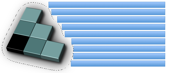
In the figure below, the alpha-channel threshold is represented by the dotted line around the CSS logo.
It’s then possible to affect where the lines of the paragraph start in three ways:
- Modifying the alpha channel in the image
- Changing the value of the shape-image-threshold property
- Changing the value of the shape-margin property (see example 8)
5. Shapes from Box Values
Shapes can be defined by reference to edges in the CSS Box Model. These edges include border-radius curvature [CSS3BG] from the used border-radius values. The <shape-box> value extends the <box> value to include margin-box. Its syntax is:
<shape-box> = <box> | margin-box
The definitions of the values are:
The margin-box value defines the shape
enclosed by the outside margin edge.
The corner radii of this shape are determined
by the corresponding border-radius and margin values.
If the ratio of border-radius/margin is 1 or more,
or margin is negative or zero,
then the margin box corner radius is max(border-radius + margin, 0).
If the ratio of border-radius/margin is less than 1,
and margin is positive,
then the margin box corner radius is border-radius + margin * (1 + (ratio-1)^3).
The border-box value defines the shape enclosed by the outside border edge. This shape follows all of the normal border radius shaping rules for the outside of the border.
The padding-box value defines the shape enclosed by the outside padding edge. This shape follows all of the normal border radius shaping rules for the inside of the border.
The content-box value defines the shape
enclosed by the outside content edge.
Each corner radius of this box
is the larger of 0
or border-radius - border-width - padding.
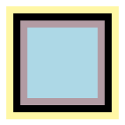
Given the 100px square below with 10px padding, border and margins, the box values define these shapes:
- margin-box: the shape containing all of the yellow pixels
- border-box: the shape containing all of the black pixels
- padding-box: the shape containing all of the mauve pixels
- content-box: the shape containing all of the blue pixels
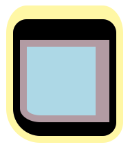
And the same definitions apply to a more complex example with the same 100px square, but with these border, padding and margin properties:
  border-radius: 20px 20px 20px 40px;
  border-width: 30px 10px 20px 10px;
  padding: 10px 20px 10px 10px;
  margin: 20px 10px 10px 10px;
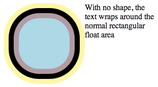
The difference between normal float wrapping and wrapping around the shape defined by the margin-box value is that the margin-box shape includes corner shaping. Take the 100px square with 10px padding, border and margins, but with a border-radius of 60px. If you make a left float out of it, content normally wraps in this manner:
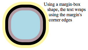
If you add a margin-box shape to the float, then content wraps around the rounded margin-box corners.
shape-outside: margin-box;
6. Declaring Shapes
Shapes are declared with the shape-outside property, with possible modifications from the shape-margin property. The shape defined by the shape-outside and shape-margin properties changes the geometry of a float element’s float area.
6.1. Float Area Shape: the shape-outside property
| Name: | shape-outside |
|---|---|
| Value: | none | [ <basic-shape> || <shape-box> ] | <image> |
| Initial: | none |
| Applies to: | floats |
| Inherited: | no |
| Percentages: | n/a |
| Computed value: | as defined for <basic-shape> (with <shape-box> following, if supplied); else the computed <image>; else the keyword as specified |
| Canonical order: | per grammar |
| Animation type: | as defined for <basic-shape>, otherwise discrete |
The values of this property have the following meanings:
- none
- The float area is unaffected.
- <shape-box>
- If one of these values is specified by itself the shape is computed based on one of margin-box, border-box, padding-box or content-box which use their respective boxes including curvature from border-radius, similar to background-clip [CSS3BG].
- <basic-shape>
- The shape is computed based on the values of one of inset(), circle(), ellipse() or polygon(). If a <shape-box> is also supplied, this defines the reference box for the <basic-shape> function. If <shape-box> is not supplied, then the reference box defaults to margin-box.
- <image>
-
The shape is extracted
and computed based
on the alpha channel
of the specified <image> as defined by shape-image-threshold.
User agents must use the CORS protocol defined by the [FETCH] specification for all URLs in a shape-outside value. When fetching, user agents must use "Anonymous" mode, set the referrer source to the stylesheet’s URL and set the origin to the URL of the containing document. If this results in network errors such that there is no valid fallback image, the effect is as if the value none had been specified.
6.2. Choosing Image Pixels: the shape-image-threshold property
The shape-image-threshold defines the alpha channel threshold used to extract the shape using an image. A value of 0.5 means that the shape will enclose all the pixels that are more than 50% opaque.
| Name: | shape-image-threshold |
|---|---|
| Value: | <alpha-value> |
| Initial: | 0 |
| Applies to: | floats |
| Inherited: | no |
| Percentages: | n/a |
| Computed value: | specified number, clamped to the range [0,1] |
| Canonical order: | per grammar |
| Animation type: | by computed value |
The values of this property have the following meanings:
- <number>
- Sets the threshold used for extracting a shape from an image. The shape is defined by the pixels whose alpha value is greater than the threshold. A threshold value outside the range 0.0 (fully transparent) to 1.0 (fully opaque) will be clamped to this range.
Note: A future level of CSS Shapes may define a switch to use the luminance data from an image instead of the alpha data. When this happens, shape-image-threshold will be extended to apply its threshold to either alpha or luminance, depending on the switch state.
6.3. Expanding a Shape: the shape-margin property
The shape-margin property adds a margin to a shape-outside. This defines a new shape that is the smallest contour (in the shrink-wrap sense) that includes all the points that are the shape-margin distance outward in the perpendicular direction from a point on the underlying shape. This includes any edge or line sections from the underlying shape. Note that at points where a perpendicular is not defined (e.g. sharp points or line ends) take all points on the circle centered at the point and with a radius of shape-margin. This property takes only non-negative values.
| Name: | shape-margin |
|---|---|
| Value: | <length-percentage> |
| Initial: | 0 |
| Applies to: | floats |
| Inherited: | no |
| Percentages: | refer to the inline size of the containing block |
| Computed value: | computed <length-percentage> value |
| Canonical order: | per grammar |
| Animation type: | by computed value |
- <length-percentage>
- Sets the margin of the shape to the specified value.
Note: Adding a shape-margin does NOT allow a float area to extend outside a float’s margin box. Extra margin may need to be applied along with shape-margin to avoid clipping.
A shape-margin creating an offset from a polygonal shape-outside. The lighter blue area shows the shape in a 100x100px float, and the darker blue area shows the 10px offset.
  .float {
      width: 100px;
      height: 100px;
    shape-outside: polygon(10px 10px, 90px 50px, 40px 50px, 90px 90px, 10px 90px);
    shape-margin: 10px;
  }
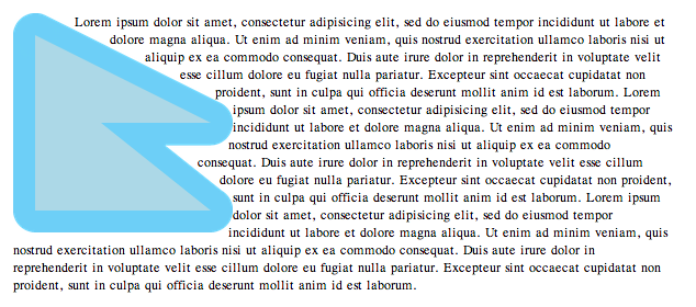
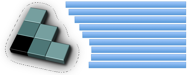
If shape-margin is added to the CSS logo from example 6, the line boxes wrapping around the shape are shortened further. In case the image’s alpha channel runs up to the right edge of the image, some extra margin-right should be applied to ensure the shape is not clipped by the margin box.
  #CSSlogo {
    shape-margin: 35px;
    margin-right: 35px;
  }
7. Privacy Considerations
No privacy concerns have been raised against this specification.
8. Security Considerations
Since the <image> value of shape-outside can expose some image data in a new way, use is limited to images with CORS approval.
Acknowledgments
This specification is made possible by input from Tab Atkins Jr., Amelia Bellamy-Royds, Andrei Bucur, Alexandru Chiculita, Boris Chiou, Emilio Cobos Álvarez, Elika Etemad, Arron Eicholz, Sylvain Galineau, Daniel Glazman, Arno Gourdol, Zoltan Horvath, Chris Jones, Bem Jones-Bey, Ian Kilpatrick, Ting-Yu Lin, Eric Meyer, Marcus Mielke, Alex Mogilevsky, Hans Muller, Mihnea Ovidenie, Virgil Palanciuc, Robert Sanderson, Dirk Schulze, Jen Simmons, Peter Sorotokin, Bear Travis, Eugene Veselov, Brad Werth, Stephen Zilles and the CSS Working Group members.
Change Log
Since March 20th 2014
- Clarified shape-margin computed value
- Clarified serialization of default position values, for issue #402
- Clarified empty circles and ellipses for issue #850
- Dropped the "Media:" entry from propdef tables, as with all CSS modules
- Updated box model references from CSS 2 to CSS Box Model 3
- Updated Computed Value and Animation Type in propdef tables
- Clarified computed value of shape-outside property, for issue #4042
- Clarified that shape-image-threshold can take a percentage value, like any alpha value, for issue #4102
- Moved path() back from level 2
- Added handling of negative margins for margin-box, for issue #675
- Removed special-case serialization of position values, for issue #2301
- Added clarifications to shape-margin examples
- Added margin=0 case for margin-box shape, for issue #675
- Changed rules about degenerate shapes to use shape edges, for issue #2375
- Clarified that invalid path strings make the path() invalid, for issue #392
- Rewrote definition of inset rectangles, added auto value, added examples
- Clarified computed value of basic shape rect functions
- Assorted markup fixes, including use of range notation and exporting defined terms for use in other specifications
- Split Privacy and Security considerations into separate sections
Since February 11th 2014
- Replaced divs with images in the first example
- Add 0px to last serialization example
Since December 3rd 2013
- Updated computed value and serialization of basic shapes
- Added a margin-box example
- Change auto to none for shape-outside
- Defined shape-box instead of redefining box
- Clarified that shape from image may produce more than one path
Since June 20th 2013
- Added shape from box value section
- Updated basic-shape interpolation
- Allow negative insets, disallow negative radii
- Changed relevant to reference
- Remove box-sizing dependency, add relevant box keywords
- Changed circle() and ellipse() to use radial gradient syntax
- Postponed rectangle() to level 2
- Clarified shape-from-image sizing and positioning
- Change inset-rectangle() to inset()
- Future-proof shape-image-threshold to possibly apply to luminance
- Added CORS fetching to shape-outside URLs
- Changed shape-outside value from <uri> to <image>
- Remove 'percentages based on auto-sizing resolve to 0'
- Change initial value of shape-image-threshold to 0.0
- Change float positioning to be unaffected by shape-outside
- Shapes on floats clipped to float’s margin box
Since May 3rd 2012
- Postpone shapes from SVG elements to a future Shapes level
- Postpone shape-inside to a future Shapes level
- split exclusions from shapes into separate modules
- added inset-rectangle() to basic shapes
- Changed shape-inside overflow diagrams to show exclusion behavior
- Changed shape-inside to contribute to the wrapping context
- Defined exclusion edges relative to wrapping content’s writing mode
- Made use of start, end, before and after consistent
- Added interpolation for basic shapes
- Changed basic shapes to depend on box specified with box-sizing
- Added overflow behavior for shape-inside.
- Added wrap-flow:minimum.
- Clarified processing model.
- Changed wrap-margin and wrap-padding to shape-margin and shape-padding.
- Removed wrap shorthand.
Since December 13th 2011
- Clarified processing model.
- Clarified interaction with floats.
- Clarified that an exclusion element establishes a new block formatting context.