[go: up one dir, main page]

Next Issue
Volume 10, July
Previous Issue
Volume 10, May


Atmosphere, Volume 10, Issue 6 (June 2019) – 57 articles

Cover Story (view full-size image): 
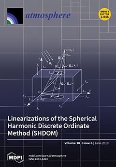
To accurately process the high spatial resolution data coming from satellite spectrometers, it is important to account for three-dimensional effects caused by cloud inhomogeneities. Retrieval algorithms require the partial derivatives of the outgoing radiances with respect to some atmospheric parameters of interest. Models with such capabilities are called linearized. In our paper, linearizations of the three-dimensional radiative transfer model SHDOM by means of a forward and a forward–adjoint approach are presented. SHDOM is specialized for derivative calculations and radiative transfer problems involving the spherical harmonics and discrete ordinate methods as well as adaptive grid splitting, while practical formulas for computing the derivatives are derived. The accuracies and efficiencies of the proposed methods are analyzed for several problems. View this paper.
  • Issues are regarded as officially published after their release is announced to the table of contents alert mailing list.
  • You may sign up for e-mail alerts to receive table of contents of newly released issues.
  • PDF is the official format for papers published in both, html and pdf forms. To view the papers in pdf format, click on the "PDF Full-text" link, and use the free Adobe Reader to open them.
Order results
Result details
Section
Select all
Export citation of selected articles as:
17 pages, 3420 KiB  
Article
Occurrence and Coupling of Heat and Ozone Events and Their Relation to Mortality Rates in Berlin, Germany, between 2000 and 2014
by Alexander Krug, Daniel Fenner, Achim Holtmann and Dieter Scherer
Atmosphere 2019, 10(6), 348; https://doi.org/10.3390/atmos10060348 - 25 Jun 2019
Cited by 14 | Viewed by 4719
Abstract
Episodes of hot weather and poor air quality pose significant consequences for public health. In this study, these episodes are addressed by applying the observational data of daily air temperature and ozone concentrations in an event-based risk assessment approach in order to detect [...] Read more.
Episodes of hot weather and poor air quality pose significant consequences for public health. In this study, these episodes are addressed by applying the observational data of daily air temperature and ozone concentrations in an event-based risk assessment approach in order to detect individual heat and ozone events, as well as events of their co-occurrence in Berlin, Germany, in the years 2000 to 2014. Various threshold values are explored so as to identify these events and to search for the appropriate regressions between the threshold exceedances and mortality rates. The events are further analyzed in terms of their event-specific mortality rates and their temporal occurrences. The results reveal that at least 40% of all heat events during the study period are accompanied by increased ozone concentrations in Berlin, particularly the most intense and longest heat events. While ozone events alone are only weakly associated with increased mortality rates, elevated ozone concentrations during heat events are found to amplify mortality rates. We conclude that elevated air temperatures during heat events are one major driver for increased mortality rates in Berlin, but simultaneously occurring elevated ozone concentrations act as an additional stressor, leading to an increased risk for the regional population. Full article
(This article belongs to the Section Biometeorology and Bioclimatology)
Show Figures

Figure 1

Figure 1
<p>Study area and locations of observation sites of air temperature (Tempelhof) and ozone concentrations (Wedding, urban station #1; Neukölln, urban station #2; Marienfelde, suburban station #1; Grunewald, suburban station #2; Buch, suburban station #3; Friedrichshagen, suburban station #4; and Frohnau, suburban station #5) in Berlin. Land cover based on CORINE 2012, v18.5. The black line marks the administrative border of the city.</p>
Full article ">Figure 2
<p>Schematic overview of possible threshold (Thr) exceedances (top row). The resulting heat events (HE) and ozone events (OE) are labeled. The classified event types that were used in the analyses were defined as single heat events (HEs), single ozone events (OEs), coupled heat events (HEc), and coupled ozone events (OEc).</p>
Full article ">Figure 3
<p>Regressions between the mean mortality rates (MR; <span class="html-italic">y</span>-axis) during HE from 2000 to 2014 in Berlin, and event magnitudes (<span class="html-italic">x</span>-axis) for selected thresholds values. (<b>a</b>) T<sub>mean</sub> &gt; 20 °C (five lag days); (<b>b</b>) T<sub>mean</sub> &gt; 22 °C (four lag days); (<b>c</b>) T<sub>mean</sub> &gt; 24 °C (six lag days).</p>
Full article ">Figure 4
<p>Comparison of the explained variance (<span class="html-italic">r</span><sup>2</sup>) for all of the statistically highly significant (<span class="html-italic">p</span> &lt; 0.01) regression models and for different ozone observation sites. The <span class="html-italic">x</span>-axis displays the model-specific threshold values.</p>
Full article ">Figure 5
<p>Regressions between mean mortality rates (MRs; <span class="html-italic">y</span>-axis) during OE from 2000 to 2014 in Berlin, and event magnitudes (<span class="html-italic">x</span>-axis) for selected thresholds, based on observations at site Wedding (urban station #1). (<b>a</b>) Maximum daily eight-hourly average ozone concentration (MDA8) &gt; 90 µg m<sup>−3</sup> (zero lag days); (<b>b</b>) MDA8 &gt; 100 µg m<sup>−3</sup> (zero lag days); (<b>c</b>) MDA8 &gt; 105 µg m<sup>−3</sup> (one lag day).</p>
Full article ">Figure 6
<p>Comparison of HEs (yellow bars) and HEc (purple bars) with T<sub>mean</sub> as the predictor variable (<span class="html-italic">x</span>-axis) for daily mortality rates (<span class="html-italic">y</span>-axis) for different threshold combinations ((<b>a</b>) T<sub>mean</sub> &gt; 20 °C, MDA8 &gt;90 µg m<sup>−3</sup>; (<b>b</b>) T<sub>mean</sub> &gt; 20 °C, MDA8 &gt; 100 µg m<sup>−3</sup>; (<b>c</b>) T<sub>mean</sub> &gt; 20 °C, MDA8 &gt; 105 µg m<sup>−3</sup>; (<b>d</b>) T<sub>mean</sub> &gt; 22 °C, MDA8 &gt; 90 µg m<sup>−3</sup>; (<b>e</b>) T<sub>mean</sub> &gt; 22 °C, MDA8 &gt; 100 µg m<sup>−3</sup>; (<b>f</b>) T<sub>mean</sub> &gt; 22 °C, MDA8 &gt; 105 µg m<sup>−3</sup>; (<b>g</b>) T<sub>mean</sub> &gt; 24 °C, MDA8 &gt; 90 µg m<sup>−3</sup>; (<b>h</b>) T<sub>mean</sub> &gt; 24 °C, MDA8 &gt; 100 µg m<sup>−3</sup>; (<b>i</b>) T<sub>mean</sub> &gt; 24 °C, MDA8 &gt; 105 µg m<sup>−3</sup>). Separate regression lines (based on individual events) for HEs and HEc are shown if significant (<span class="html-italic">p</span> &lt; 0.05). Events are grouped into classes of similar event magnitudes (boxes, top <span class="html-italic">x</span>-axis). The edges of each box reflect the 25th and 75th percentile, median values are given as solid lines, and whiskers are the minimum and maximum values, respectively. Less than five events per class are shown as dots. The number of events (<span class="html-italic">n</span>) is displayed above each box. Significant different means (Mann–Whitney U-test) between HEs and HEc are signed at <span class="html-italic">p</span> &lt; 0.05 per class for <span class="html-italic">n</span> ≥ 5; n. s. denotes not significant differences.</p>
Full article ">Figure 7
<p>Comparison of OEs (green bars) and OEc (purple bars) with MDA8 as a predictor variable (<span class="html-italic">x</span>-axis) for the daily mortality rates (<span class="html-italic">y</span>-axis) for different threshold combinations ((<b>a</b>) T<sub>mean</sub> &gt; 20 °C, MDA8 &gt; 90 µg m<sup>−3</sup>; (<b>b</b>) T<sub>mean</sub> &gt; 20 °C, MDA8 &gt; 100 µg m<sup>−3</sup>; (<b>c</b>) T<sub>mean</sub> &gt; 20 °C, MDA8 &gt; 105 µg m<sup>−3</sup>; (<b>d</b>) T<sub>mean</sub> &gt; 22 °C, MDA8 &gt; 90 µg m<sup>−3</sup>; (<b>e</b>) T<sub>mean</sub> &gt; 22 °C, MDA8 &gt; 100 µg m<sup>−3</sup>; (<b>f</b>) T<sub>mean</sub> &gt; 22 °C, MDA8 &gt; 105 µg m<sup>−3</sup>; (<b>g</b>) T<sub>mean</sub> &gt; 24 °C, MDA8 &gt; 90 µg m<sup>−3</sup>; (<b>h</b>) T<sub>mean</sub> &gt; 24 °C, MDA8 &gt; 100 µg m<sup>−3</sup>; (<b>i</b>) T<sub>mean</sub> &gt; 24 °C, MDA8 &gt; 105 µg m<sup>−3</sup>). Separate regression lines (based on individual events) for OEs and OEc are shown if significant (<span class="html-italic">p</span> &lt; 0.05). Events are grouped into classes of similar event magnitudes (boxes, top <span class="html-italic">x</span>-axis). The edges of each box reflect the 25th and 75th percentile, median values are given as solid lines, and whiskers are the minimum and maximum values, respectively. Less than five events per class are shown as dots. The number of events (<span class="html-italic">n</span>) is displayed above each box. Significant different means (Mann–Whitney U-test) between OEs and OEc are signed as <span class="html-italic">p</span> &lt; 0.05 per class for <span class="html-italic">n</span> ≥ 5; n. s. denotes not significant differences.</p>
Full article ">Figure 8
<p>Temporal occurrences of HEs (T<sub>mean</sub> &gt; 22 °C, orange), OEs (MDA8 &gt; 100 µg m<sup>−3</sup>, green), and corresponding coupled events (HEc/OEc, purple) in Berlin from 2000 to 2014. Overlapping days of HEs and OEs that are not classified as coupled events are marked in olive-green.</p>
Full article ">Figure 9
<p>Stacked bars for the number of events per length of HEs (T<sub>mean</sub> &gt; 22 °C, orange), OEs (MDA8 &gt; 100 µg m<sup>−3</sup>, green), and corresponding coupled events (HEc/OEc, purple) in Berlin from 2000 to 2014.</p>
Full article ">
25 pages, 967 KiB  
Article
Accurate Characterization of Land Cover in Urban Environments: Determining the Importance of Including Obscured Impervious Surfaces in Urban Heat Island Models
by Paul Coseo and Larissa Larsen
Atmosphere 2019, 10(6), 347; https://doi.org/10.3390/atmos10060347 - 25 Jun 2019
Cited by 19 | Viewed by 3845
Abstract
Urban heat islands (UHI) increase summer temperatures and can threaten human well-being during extreme heat events. Since urbanization plays a key role in UHI development, accurate quantification of land cover types is critical to their identification. This study examines how quantifying land cover [...] Read more.
Urban heat islands (UHI) increase summer temperatures and can threaten human well-being during extreme heat events. Since urbanization plays a key role in UHI development, accurate quantification of land cover types is critical to their identification. This study examines how quantifying land cover types using both two- and three-dimensional approaches to land cover quantification affects an UHI model’s explanatory power. Two-dimensional approaches treat tree canopies as a land cover, whereas three-dimensional approaches document the land cover areas obscured under tree canopies. We compare how accurately the two approaches explain elevated air temperatures in Chicago, Illinois. Our results show on average 14.1% of impervious surface areas went undocumented using a two-dimensional approach. The most common concealed impervious surfaces were sidewalks, driveways, and parking lots (+6.2%), followed by roads (+6.1%). Yet, the three-dimensional approach did not improve the explanatory power of a UHI model substantially. At 2 a.m., the adjusted R2 increased from 0.64 for a two-dimensional analysis to 0.68 for a three-dimensional analysis. We found that the less time consuming two-dimensional quantification of land covers was sufficient to predict neighborhood UHIs. As climate change exacerbates UHI, more cities will map urban hotspots and this research increases our understanding of alternative approaches. Full article
(This article belongs to the Special Issue Effects of Urban Areas on Climate Change Conditions)
Show Figures

Figure 1

Figure 1
<p>Graphic depicting areas of impervious pavement, sidewalk, and roof surfaces concealed by tree canopy. The areas shaded in red go undocumented by two-dimensional approach. Not to scale, for illustration only. Source: Google Earth, 2019. Illustration: by authors.</p>
Full article ">Figure 2
<p>Map illustrating the city of Chicago limits, the eight study neighborhoods, Midway Airport, and the heterogeneous distribution of elevated surface temperatures from a City of Chicago Department of the Environment 2006 study. <span class="html-italic">Data source: City of Chicago Department of Environment GIS database, accessed February 1, 2010</span> [<a href="#B57-atmosphere-10-00347" class="html-bibr">57</a>] <span class="html-italic">Illustration: by authors and modified from Coseo &amp; Larsen</span> [<a href="#B4-atmosphere-10-00347" class="html-bibr">4</a>].</p>
Full article ">
17 pages, 7803 KiB  
Article
Assessing the Potential Highest Storm Tide Hazard in Taiwan Based on 40-Year Historical Typhoon Surge Hindcasting
by Yi-Chiang Yu, Hongey Chen, Hung-Ju Shih, Chih-Hsin Chang, Shih-Chun Hsiao, Wei-Bo Chen, Yung-Ming Chen, Wen-Ray Su and Lee-Yaw Lin
Atmosphere 2019, 10(6), 346; https://doi.org/10.3390/atmos10060346 - 25 Jun 2019
Cited by 35 | Viewed by 5167
Abstract
Typhoon-induced storm surges are catastrophic disasters in coastal areas worldwide, although typhoon surges are not extremely high in Taiwan. However, the rising water level around an estuary could be a block that obstructs the flow of water away from the estuary and indirectly [...] Read more.
Typhoon-induced storm surges are catastrophic disasters in coastal areas worldwide, although typhoon surges are not extremely high in Taiwan. However, the rising water level around an estuary could be a block that obstructs the flow of water away from the estuary and indirectly forms an overflow in the middle or lower reaches of a river if the occurrence of the highest storm surge (HSS) coincides with the highest astronomical tide (HAT). Therefore, assessing the highest storm tide (HST, a combination of the HSS and HAT) hazard level along the coast of Taiwan is particularly important to an early warning of riverine inundation. This study hindcasted the storm surges of 122 historical typhoon events from 1979 to 2018 using a high-resolution, unstructured-grid, surge-wave fully coupled model and a hybrid typhoon wind model. The long-term recording measurements at 28 tide-measuring stations around Taiwan were used to analyze the HAT characteristics. The hindcasted HSSs of each typhoon category (the Central Weather Bureau of Taiwan classified typhoon events into nine categories according to the typhoon’s track) were extracted and superposed on the HATs to produce the individual potential HST hazard maps. Each map was classified into six hazard levels (I to VI). Finally, a comprehensive potential HST hazard map was created based on the superposition of the HSSs from 122 typhoon events and HATs. Full article
(This article belongs to the Special Issue Storm Surge Modeling – Capturing the Wind)
Show Figures

Figure 1

Figure 1
<p>Nine categories classified by the Central Weather Bureau of Taiwan based on typhoon tracks.</p>
Full article ">Figure 2
<p>Tracks of historical typhoon events (blue lines) for each category during the period from 1979 to 2018. <b>(a</b>) category 1, (<b>b</b>) category 2, (<b>c</b>) category 3, (<b>d</b>) category 4, (<b>e</b>) category 5, (<b>f</b>) category 6, (<b>g</b>) category 7, (<b>h</b>) category 8 and (<b>i</b>) category 9.</p>
Full article ">Figure 3
<p>Distribution of the tide-measuring stations along the coastal waters of Taiwan.</p>
Full article ">Figure 4
<p>(<b>a</b>) Location, (<b>b</b>) unstructured grid and (<b>c</b>) bathymetry of the computational domain.</p>
Full article ">Figure 4 Cont.
<p>(<b>a</b>) Location, (<b>b</b>) unstructured grid and (<b>c</b>) bathymetry of the computational domain.</p>
Full article ">Figure 5
<p>The distribution of the highest astronomical tides (HATs) along the coast of Taiwan.</p>
Full article ">Figure 6
<p>Storm surge and track of Typhoon Dujuan (2015) (<b>a</b>) with and (<b>b</b>) without a wave effect; (<b>c</b>) the wave setup distribution and (<b>d</b>) the comparison in the time series of the storm surge with and without a wave effect at point A (as shown in <a href="#atmosphere-10-00346-f006" class="html-fig">Figure 6</a>a).</p>
Full article ">Figure 6 Cont.
<p>Storm surge and track of Typhoon Dujuan (2015) (<b>a</b>) with and (<b>b</b>) without a wave effect; (<b>c</b>) the wave setup distribution and (<b>d</b>) the comparison in the time series of the storm surge with and without a wave effect at point A (as shown in <a href="#atmosphere-10-00346-f006" class="html-fig">Figure 6</a>a).</p>
Full article ">Figure 7
<p>Model-data comparison for the sea-surface elevation at the (<b>a</b>) Wushi (No. 8), (<b>b</b>) Suao (No. 11), (<b>c</b>) Hualien (No. 14) and (d) Houbihu (No. 28) tide-measuring stations during Typhoons Meranti (Sep. 12–15), Malakas (Sep. 15–18) and Megi (Sep. 25–28) in 2016(<b>d</b>).</p>
Full article ">Figure 8
<p>The highest storm surge (HSS) distributions for C1–C9. (<b>a</b>) category 1, (<b>b</b>) category 2, (<b>c</b>) category 3, (<b>d</b>) category 4, (<b>e</b>) category 5, (<b>f</b>) category 6, (<b>g</b>) category 7, (<b>h</b>) category 8 and (<b>i</b>) category 9.</p>
Full article ">Figure 8 Cont.
<p>The highest storm surge (HSS) distributions for C1–C9. (<b>a</b>) category 1, (<b>b</b>) category 2, (<b>c</b>) category 3, (<b>d</b>) category 4, (<b>e</b>) category 5, (<b>f</b>) category 6, (<b>g</b>) category 7, (<b>h</b>) category 8 and (<b>i</b>) category 9.</p>
Full article ">Figure 9
<p>A comprehensive highest storm surge (HSS) distribution.</p>
Full article ">Figure 10
<p>The potential highest storm tide (HST) hazard maps for C1–C9. (<b>a</b>) category 1, (<b>b</b>) category 2, (<b>c</b>) category 3, (<b>d</b>) category 4, (<b>e</b>) category 5, (<b>f</b>) category 6, (<b>g</b>) category 7, (<b>h</b>) category 8 and (<b>i</b>) category 9.</p>
Full article ">Figure 11
<p>A comprehensive potential highest storm tide (HST) hazard map.</p>
Full article ">Figure 12
<p>Length of the coastline and percentage of the total coastline corresponding to each hazard level for the comprehensive potential highest storm tide (HST) hazard map.</p>
Full article ">Figure 13
<p>Measured highest storm tides (HST) hazard map.</p>
Full article ">
17 pages, 4155 KiB  
Article
Transport Pathways and Potential Source Regions of PM2.5 on the West Coast of Bohai Bay during 2009–2018
by Tianyi Hao, Ziying Cai, Shucheng Chen, Suqin Han, Qing Yao and Wenyan Fan
Atmosphere 2019, 10(6), 345; https://doi.org/10.3390/atmos10060345 - 25 Jun 2019
Cited by 26 | Viewed by 3897
Abstract
Mass concentration data for particulate matter with an aerodynamic diameter less than or equal to 2.50 μm (PM2.5) combined with backward trajectory cluster analysis, potential source contribution function (PSCF), and concentration weighted trajectory (CWT) methods were used to investigate the transport [...] Read more.
Mass concentration data for particulate matter with an aerodynamic diameter less than or equal to 2.50 μm (PM2.5) combined with backward trajectory cluster analysis, potential source contribution function (PSCF), and concentration weighted trajectory (CWT) methods were used to investigate the transport pathways and potential source regions of PM2.5 on the west coast of Bohai Bay from 2009 to 2018. Two pathways responsible for the transportation of high PM2.5 levels were identified, namely a southerly pathway and a northwesterly pathway. The southerly pathway represented the major transport pathway of PM2.5 for all seasons. As a regional transport pathway, it had the greatest impact in winter, followed by autumn. The southerly transport pathway passed over the Shandong and Hebei provinces before reaching Tianjin: Air masses were transported within the boundary layer (below 925 hPa), representing a slow-moving air flow. The northwesterly pathway mostly occurred in winter and autumn and passed over desert and semidesert regions in Outer Mongolia, the sand lands of Inner Mongolia, and Hebei. The air masses associated with the northwesterly pathway represented fast-moving airflows responsible for long-range transportation of PM2.5. Two potential source regions that contributed to high PM2.5 loadings on the west coast of Bohai Bay were identified, “southerly source regions” and “northwesterly source regions”. The southerly source regions, with weighted CWT (WCWT) values in winter greater than 140.00 μg/m3, were anthropogenic source regions, including southern Hebei, western Shandong, eastern Henan, northern Anhui, and northern Jiangsu. The northwesterly source regions, with WCWT values in winter of 80.00–140.00 μg/m3, were natural source regions, encompassing central Inner Mongolia and southern Mongolia. In addition, the southerly transport pathway passed though anthropogenic source regions, while the northwesterly transport pathway passed though natural source regions. The impacts of anthropogenic source regions on PM2.5 loadings on the west coast of Bohai Bay were greater than those of natural source regions. Full article
(This article belongs to the Section Air Quality)
Show Figures

Figure 1

Figure 1
<p>Location of the study area (the red star represents the west coast of Bohai Bay).</p>
Full article ">Figure 2
<p>Seasonal and annual variations of particulate matter with an aerodynamic diameter less than or equal to 2.50 μm (PM<sub>2.5</sub>) concentrations. The circles show seasonal mean values together with the 95th, 75th, 50th, 25th, and 5th percentiles. The numbers on the top of the figures represent the annual mean values.</p>
Full article ">Figure 3
<p>Cluster-mean back trajectories of (<b>a</b>) winter, (<b>b</b>) spring, (<b>c</b>) summer and (<b>d</b>) autumn from 2009 to 2018. The dots on the trajectories represent time nodes (24 h, 48 h, 72 h). The percentage represents the ratio of the number of back trajectories in each cluster to the total number of back trajectories. The black star represents Tianjin.</p>
Full article ">Figure 4
<p>Air pressure profiles of the backward trajectories in (<b>a</b>) winter, (<b>b</b>) spring, (<b>c</b>) summer and (<b>d</b>) autumn.</p>
Full article ">Figure 5
<p>Box plots of PM<sub>2.5</sub> concentrations associated with six trajectory clusters on a seasonal basis. The red circles indicate the arithmetic mean. The red dashed lines represent the Chinese national class II standard of PM<sub>2.5</sub> daily mean concentrations.</p>
Full article ">Figure 6
<p>Wind roses with PM<sub>2.5</sub> concentrations in (<b>a</b>) winter, (<b>b</b>) spring, (<b>c</b>) summer and (<b>d</b>) autumn durng 2009–2018.</p>
Full article ">Figure 7
<p>Weighted potential source contribution function (PSCF) maps of PM<sub>2.5</sub> in (<b>a</b>) winter, (<b>b</b>) spring, (<b>c</b>) summer and (<b>d</b>) autumn during 2009–2018. The black star represents Tianjin.</p>
Full article ">Figure 8
<p>Weighted concentration weighted trajectory (CWT) map of PM<sub>2.5</sub> in (<b>a</b>) winter, (<b>b</b>) spring, (<b>c</b>) summer and (<b>d</b>) autumn during 2009–2018. The black star represents Tianjin.</p>
Full article ">Figure 9
<p>Spatial distributions of anthropogenic emissions of PM<sub>2.5</sub> for China in 2016. The black star represents Tianjin.</p>
Full article ">Figure 10
<p>Schematic diagram of transport pathways and potential sources of PM<sub>2.5</sub> (red arrow: Transport pathway in all seasons; blue arrow: Transport pathway only in winter, autumn, and spring; I: Major source; II: Secondary source).</p>
Full article ">
25 pages, 9844 KiB  
Article
Development and Evaluation of a WRF-Based Mesoscale Numerical Weather Prediction System in Northwestern China
by Tiejun Zhang, Yaohui Li, Haixia Duan, Yuanpu Liu, Dingwen Zeng, Cailing Zhao, Chongshui Gong, Ganlin Zhou, Linlin Song and Pengcheng Yan
Atmosphere 2019, 10(6), 344; https://doi.org/10.3390/atmos10060344 - 25 Jun 2019
Cited by 7 | Viewed by 5041
Abstract
Based on the U.S. Weather Research and Forecasting (WRF) numerical model, this study has developed the Northwest Mesoscale Numerical Prediction Service and Experimental System (NW-MNPS). Surface and sounding data assimilation has been introduced for this system. Effects of model vertical layers and land-use [...] Read more.
Based on the U.S. Weather Research and Forecasting (WRF) numerical model, this study has developed the Northwest Mesoscale Numerical Prediction Service and Experimental System (NW-MNPS). Surface and sounding data assimilation has been introduced for this system. Effects of model vertical layers and land-use data replacement have been assessed. A year-long forecast validation and analysis have been performed. The following results have been obtained: (1) Data assimilation can improve the performance of regional numerical forecasting. (2) Compared to simulations with 40 vertical layers, simulations with 55 vertical layers are more accurate. The average absolute error and root-mean-square error of the 48 h surface element forecast decrease. The analysis of threat score (TS) and equitable threat score (ETS) shows that there are higher TS and ETS values for various precipitation intense levels, in particular for heavy rainfall when comparing a 55-vertical-layer test with a 40-vertical-layer test. (3) Updating the database to include vegetation coverage can more accurately reflect actual surface conditions. The updated land-use data reduce prediction errors in all domains of the NW-MNPS. Full article
(This article belongs to the Section Meteorology)
Show Figures

Figure 1

Figure 1
<p>Map of the nested domains in the study. The grid spacings for D01, D02 and D03 are 27 km, 9 km, and 3 km, respectively. The dots in D03 represent the station names mentioned in this article. A: Dingxi, B: Linxia, C: Gannan, D: Tianshui, E: Longnan, F: Pingliang, G: Qingyang, H: Shanxi.</p>
Full article ">Figure 2
<p>Northwest Mesoscale Numerical Prediction Service and Experimental System (NW-MNPS) running flow chart.</p>
Full article ">Figure 3
<p>Comparison of different land-use data distributions in the simulation area USGS (<b>left</b>) and new land-use (<b>right</b>).</p>
Full article ">Figure 4
<p>The error (<b>a</b>,<b>c</b>) and the absolute error (<b>b</b>,<b>d</b>) of the temperature prediction for different nested regions changed with the forecast.</p>
Full article ">Figure 5
<p>The error (<b>a</b>,<b>c</b>) and the absolute error (<b>b</b>,<b>d</b>) of the simulated temperature.</p>
Full article ">Figure 6
<p>The error (<b>a</b>,<b>c</b>) and the absolute error (<b>b</b>,<b>d</b>) of the wind prediction for different nested regions changed with the forecast.</p>
Full article ">Figure 7
<p>The error (<b>a</b>,<b>c</b>) and the absolute error (<b>b</b>,<b>d</b>) of the simulated wind speed.</p>
Full article ">Figure 8
<p>Forty layers (<b>a</b>) and 55 layers (<b>b</b>) of vertical stratification.</p>
Full article ">Figure 9
<p>The mean absolute error (MAE) of the ground elements in three rain-event case studies. (RH: relative humidity; SPFH: specific humidity; TMP: temperature at 2 m; UGRD: Wind component in the latitudinal direction at 10 m (ground); VGRD: Wind component in the meridional directionat 10 m (ground)).</p>
Full article ">Figure 10
<p>The correlation coefficient of ground elements in three rain-event case studies.</p>
Full article ">Figure 11
<p>The mean error (ME) of high-altitude elements in three weather processes (T: temperature; WSPD: wind speed; Q: specific humidity; RH: relative humidity).</p>
Full article ">Figure 12
<p>Equitable threat score (ETS) scores for three precipitation events.</p>
Full article ">Figure 13
<p>Sounding stations (<b>a</b>) and ground stations distribution (<b>b</b>) in China.</p>
Full article ">Figure 14
<p>Precipitation on 8–9 July 2015 for 24 h (<b>a</b>) Observation, (<b>b</b>) NODA, (<b>c</b>) AWS, (<b>d</b>) SOUNDING, (<b>e</b>) AWS + SOUNDING.</p>
Full article ">Figure 15
<p>Threat score (TS) score on 8–9 July 2015.</p>
Full article ">Figure 16
<p>Time series for each forecasted variable using different data assimilation methods, on 8–9 July 2015.</p>
Full article ">Figure 17
<p>Absolute error of each element on 8–9 July 2015.</p>
Full article ">Figure 18
<p>The ground element error, the absolute error, and the root-mean-square error with the forecast aging change, (<b>a</b>) 2 m temperature, (<b>b</b>) 10 m wind speed, (<b>c</b>) 2 m relative humidity.</p>
Full article ">Figure 19
<p>High-altitude element prediction average error, absolute error, and root-mean-square error with height vertical profile.</p>
Full article ">Figure 20
<p>Precipitation forecast score.</p>
Full article ">Figure 21
<p>Average error and root-mean-square error of temperature, relative humidity, and wind speed at surface and 500 hPa.</p>
Full article ">Figure 22
<p>TS score changes over 24 h prediction of (<b>a</b>) light rain, (<b>b</b>) moderate rain, and (<b>c</b>) heavy rain.</p>
Full article ">
20 pages, 4996 KiB  
Article
The Linkage of the Precipitation in the Selenga River Basin to Midsummer Atmospheric Blocking
by Olga Yu. Antokhina, Pavel N. Antokhin, Yuliya V. Martynova and Vladimir I. Mordvinov
Atmosphere 2019, 10(6), 343; https://doi.org/10.3390/atmos10060343 - 24 Jun 2019
Cited by 6 | Viewed by 3625
Abstract
The linkage between atmospheric blocking (blocking frequency, BF) and total monthly July precipitation in the Selenga River Basin, the main tributary of Lake Baikal, for the period 1979–2016 was investigated. Based on empirical orthogonal functions (EOF) analysis, two dominant modes of precipitation over [...] Read more.
The linkage between atmospheric blocking (blocking frequency, BF) and total monthly July precipitation in the Selenga River Basin, the main tributary of Lake Baikal, for the period 1979–2016 was investigated. Based on empirical orthogonal functions (EOF) analysis, two dominant modes of precipitation over the Selenga River Basin were extracted. The first EOF mode (EOF 1) is related to precipitation fluctuations mainly in the Mongolian part of Selenga; the second EOF mode (EOF 2)—in the Russian part of Selenga. Based on two different modes obtained, the total amount of precipitation individually for the Russian and Mongolian part of Selenga was calculated. Correlation analysis has demonstrated that precipitation over the Mongolian part of the Selenga Basin is positively correlated to blocking over Eastern Siberia/Mongolia (80–120° E, ESM-BF). Precipitation over the Russian part of the Selenga Basin is positively correlated to blocking over the Urals-Western Siberia (50–80° E, UWS-BF) and European blocking (0–50° E, E-BF). However, the linkage is not stable, and after the mid-1990s, the obtained positive correlation became insignificant. The analysis has shown that the dominance of E or ESM-blocking in July was the primary driver of the existence of two precipitation modes over the Selenga River Basin. During 1996–2016, the negative trend of time coefficients of EOF 1 and 2 for precipitation in Selenga had been observed, which was characterized by displacement of positive precipitation anomalies outside the basin. At the same time, there was a weakening of the linkage between precipitation in the Selenga Basin and blocking frequency. We have revealed two wave-like modes over Northern Eurasia and the subtropical part of Eurasia corresponding to E, ESM-blocks in 1979–1995 and 1996–2016. The change of the Northern and subtropical wave modes is one of the causes for the weakening of the linkage between atmospheric blocking and precipitation in the Selenga Basin and as a consequence decreased precipitation in the Russian and Mongolian part of Selenga during 1979–2016. Full article
(This article belongs to the Special Issue Atmospheric and Ocean Optics: Atmospheric Physics)
Show Figures

Figure 1

Figure 1
<p>Lake Baikal Basin (solid red and solid black lines). Selenga River Basin (solid red line). State boundary between Russia and Mongolia (dashed gray line).</p>
Full article ">Figure 2
<p>Correlation coefficients between time coefficients of the EOF 1 (<b>a</b>), 2 (<b>b</b>) of precipitation over the Selenga Basin and normalized precipitation over Eastern Siberia and Mongolia for 1979–2016. The solid black line and dashed line areas indicate the 90% confidence level the positive and negative coefficients of correlation, respectively. The hatched area shows the Selenga Basin.</p>
Full article ">Figure 3
<p>Time coefficient of the first EOF (PC 1) and total precipitation in the Mongolian part of the Selenga River Basin (TMPS) (<b>a</b>), time coefficient of the second EOF (PC 2) and total precipitation in the Russian part of the Selenga River Basin (TRPS) (<b>b</b>). Thin and thick black lines show the linear trends (sig.: confidence levels at which the linear trend is significant, <span class="html-italic">p</span>-test).</p>
Full article ">Figure 4
<p>Interannual changes in the ESM-blocking frequency (ESM-BF) and TMPS.</p>
Full article ">Figure 5
<p>Scatterplots of the ESM-BF and TMPS for 1979–1995 (<b>a</b>), and 1996–2010 (<b>b</b>). The black line denotes linear regression between the two quantities found by the least-squares fit, and R<sup>2</sup> is shown at the bottom right.</p>
Full article ">Figure 6
<p>Interannual changes in E-blocking frequency (E-BF) and TRPS (<b>a</b>), and UWS-blocking frequency (UWS-BF) and TRPS (<b>b</b>).</p>
Full article ">Figure 7
<p>Scatterplots of the E-, UWS -BF, and TRPS for 1979–1995 (<b>a</b>,<b>c</b>), 1996–2016 (<b>b</b>,<b>d</b>). The solid line denotes the linear regression between two quantities found by the least-squares fit, and R<sup>2</sup> is shown at the bottom right.</p>
Full article ">Figure 8
<p>Correlation coefficients of E (<b>a</b>), UWS (<b>b</b>), ESM-BF (<b>c</b>) and normalized precipitation for 1979–1995. The solid black line and dashed line areas indicate the 90% confidence level the positive and negative coefficients of correlation, respectively. The hatched area shows the Selenga Basin.</p>
Full article ">Figure 9
<p>Correlation coefficients of E (<b>a</b>), UWS (<b>b</b>), ESM-BF (<b>c</b>) and normalized precipitation for 1996–2016. The description is the same as <a href="#atmosphere-10-00343-f008" class="html-fig">Figure 8</a>.</p>
Full article ">Figure 10
<p>Interannual changes in E-BF and ESM-BF.</p>
Full article ">Figure 11
<p>Correlation coefficients between TRPS and geopotential height at 500 hPa (Z500) for 1979–1995 (<b>a</b>) and 1996–2016 (<b>b</b>). The description is the same as in <a href="#atmosphere-10-00343-f008" class="html-fig">Figure 8</a>.</p>
Full article ">Figure 12
<p>Correlation coefficients of E -BF, and Z500 (<b>a</b>,<b>c</b>) and E -BF, and v-component of wind at 850 hPa (V850) (<b>b</b>,<b>d</b>) for 1979–1995 (<b>a</b>,<b>b</b>) and 1996–2016 (<b>c</b>,<b>d</b>). The description is the same as in <a href="#atmosphere-10-00343-f008" class="html-fig">Figure 8</a>.</p>
Full article ">Figure 13
<p>Correlation coefficients of E-BF and v-component of wind at 250 hPa (V250) for 1979–1995 (<b>a</b>) and 1996–2016 (<b>b</b>). The description is the same as in <a href="#atmosphere-10-00343-f008" class="html-fig">Figure 8</a>.</p>
Full article ">Figure 14
<p>Correlation coefficients of ESM-BF and Z500 for 1979–1995 (<b>a</b>) and 1995–1996 (<b>b</b>). The description is the same as in <a href="#atmosphere-10-00343-f008" class="html-fig">Figure 8</a>.</p>
Full article ">Figure 15
<p>Correlation coefficients of TMPS and Z500 for 1979–1995 (<b>a</b>) and 1996–2016 (<b>b</b>). The description is the same as in <a href="#atmosphere-10-00343-f008" class="html-fig">Figure 8</a>.</p>
Full article ">Figure 16
<p>Correlation coefficients of ESM-blocks and V250 for 1979–1995 (<b>a</b>) and 1996–2016 (<b>b</b>). The description is the same as in <a href="#atmosphere-10-00343-f008" class="html-fig">Figure 8</a>.</p>
Full article ">
12 pages, 4715 KiB  
Article
Broad-Band Transmission Characteristics of Polarizations in Foggy Environments
by Tianwei Hu, Fei Shen, Kaipeng Wang, Kai Guo, Xiao Liu, Feng Wang, Zhiyong Peng, Yuemeng Cui, Rui Sun, Zhizhong Ding, Jun Gao and Zhongyi Guo
Atmosphere 2019, 10(6), 342; https://doi.org/10.3390/atmos10060342 - 24 Jun 2019
Cited by 23 | Viewed by 3912
Abstract
Based on the Monte Carlo (MC) algorithm, we simulate the evolutions of different types of the polarized lights in the broad-band range from visible to infrared in foggy environments. Here, we have constructed two scattering systems to simulate the transmission characteristics of the [...] Read more.
Based on the Monte Carlo (MC) algorithm, we simulate the evolutions of different types of the polarized lights in the broad-band range from visible to infrared in foggy environments. Here, we have constructed two scattering systems to simulate the transmission characteristics of the polarized lights: (1) A monodisperse system based on five types of particles with the sizes of 0.5, 1.0, 2.5, 4, and 5 µm, respectively; (2) a polydisperse system based on scattering particles with a mean value (size) of 2.0 μm. Our simulation results show that linearly polarized light (LPL) and circularly polarized light (CPL) exhibit different advantages in different wavelengths and different scattering systems. The polarization maintenances (PM) of the degree of circular polarizations (DoCPs) are better than those of the degree of linear polarizations (DoLPs) for most incident wavelengths. CPL is not superior to LPL in the strong-absorption wavelengths of 3.0µm, 6.0µm, and long infrared. Here, when the wavelength is closer to the particle sizes in a system, the influence on propagating polarizations will be more obvious. However, the difference in the degree of polarization (DoP) between the resulting CPL and LPL is positive at these points, which means the penetrating ability of CPL is superior to that of LPL in these scattering systems. We have also simulated the extinction efficiency Qext and the scattering index ratio Qratio as functions of both wavelength and particle size for analyzing polarization’s transmission characteristics. Our work paves the way of selecting the optimal incident wavelengths and polarizations for concrete scattering systems. Full article
(This article belongs to the Section Aerosols)
Show Figures

Figure 1

Figure 1
<p>The schematic of the Monte Carlo (MC) transport model.</p>
Full article ">Figure 2
<p>The transmitting degree of polarization (DoP) of linearly polarized light (LPL) and circularly polarized light (CPL) in foggy scattering environments with a particle size of 1 µm (visibility value: V = 800 m) as the function of transmission length for different incident wavelengths: (<b>a</b>) Visible, (<b>b</b>) near-infrared, (<b>c</b>) mid-infrared, and (<b>d</b>) long-infrared band.</p>
Full article ">Figure 3
<p>The transmitting DoP difference of CPL and LPL in the constructed foggy scattering environments with a particle size of 1 µm as the function of transmission length for different incident wavelengths.</p>
Full article ">Figure 4
<p>Two-dimensional intensity distributions of the scattering lights at the wavelength of 1 µm after different transmission lengths of (<b>a</b>), 800 m, (<b>b</b>) 1500 m, (<b>c</b>) 3000 m, and (<b>d</b>) 5000 m.</p>
Full article ">Figure 5
<p>(<b>a</b>) The complex refractive index (RI) of water fog in the wavelength range of 0.4–12 µm. (<b>b</b>) The normalized intensity power of 1 µm particle size as the function of transmission length from visible to infrared (0.55 µm, 0.95 µm, 2.8 µm, 4.1 µm, 6.2 µm, and 12.0 µm).</p>
Full article ">Figure 6
<p>After transmitting 2000 m, the resulting (<b>a</b>) DoP and (<b>b</b>) <math display="inline"><semantics> <mrow> <mo>Δ</mo> <mi>D</mi> <mi>o</mi> <mi>P</mi> </mrow> </semantics></math> as the function of particle sizes of 0.5 µm, 1.0 µm, 2.5 µm, 4.0 µm, and 5.0 µm in the wavelengths of 0.55 µm, 0.95 µm, 2.4 µm, 4.1 µm, and 5.3 µm, respectively.</p>
Full article ">Figure 7
<p>(<b>a</b>) The selected six-particle-size distribution (<span class="html-italic">n(r)</span>: Here, <math display="inline"><semantics> <mrow> <msub> <mi>R</mi> <mrow> <mi>m</mi> <mi>e</mi> <mi>a</mi> <mi>n</mi> </mrow> </msub> <mo>=</mo> <mn>2.0</mn> </mrow> </semantics></math> μm) with standard deviations of 0.1 μm, 0.3 μm, and 0.5 μm, respectively. The resulting two-dimensional (<b>b1</b>) degree of linear polarization (DoLP) and (<b>c1</b>) degree of circular polarization (DoCP) distributions with a standard deviation of 0 μm. (<b>b2</b>) DoLP and(<b>c2</b>) DoCP distributions with a standard deviation of 0.5 μm. Also shown are the resulting (<b>d1</b>) DoLP and (<b>d2</b>) DoCP values after transmitting 2000 m for different incident wavelengths.</p>
Full article ">Figure 8
<p>(<b>a</b>) The extinction efficiency <math display="inline"><semantics> <mrow> <msub> <mi>Q</mi> <mrow> <mi>e</mi> <mi>x</mi> <mi>t</mi> </mrow> </msub> </mrow> </semantics></math> and (<b>b</b>) scattering index ratio <math display="inline"><semantics> <mrow> <msub> <mi>Q</mi> <mrow> <mi>r</mi> <mi>a</mi> <mi>t</mi> <mi>i</mi> <mi>o</mi> </mrow> </msub> </mrow> </semantics></math>. as a function of wavelength and particle size.</p>
Full article ">
20 pages, 5029 KiB  
Article
Using eXtreme Gradient BOOSTing to Predict Changes in Tropical Cyclone Intensity over the Western North Pacific
by Qingwen Jin, Xiangtao Fan, Jian Liu, Zhuxin Xue and Hongdeng Jian
Atmosphere 2019, 10(6), 341; https://doi.org/10.3390/atmos10060341 - 22 Jun 2019
Cited by 20 | Viewed by 3847
Abstract
Coastal cities in China are frequently hit by tropical cyclones (TCs), which result in tremendous loss of life and property. Even though the capability of numerical weather prediction models to forecast and track TCs has considerably improved in recent years, forecasting the intensity [...] Read more.
Coastal cities in China are frequently hit by tropical cyclones (TCs), which result in tremendous loss of life and property. Even though the capability of numerical weather prediction models to forecast and track TCs has considerably improved in recent years, forecasting the intensity of a TC is still very difficult; thus, it is necessary to improve the accuracy of TC intensity prediction. To this end, we established a series of predictors using the Best Track TC dataset to predict the intensity of TCs in the Western North Pacific with an eXtreme Gradient BOOSTing (XGBOOST) model. The climatology and persistence factors, environmental factors, brainstorm features, intensity categories, and TC months are considered inputs for the models while the output is the TC intensity. The performance of the XGBOOST model was tested for very strong TCs such as Hato (2017), Rammasum (2014), Mujiage (2015), and Hagupit (2014). The results obtained show that the combination of inputs chosen were the optimal predictors for TC intensification with lead times of 6, 12, 18, and 24 h. Furthermore, the mean absolute error (MAE) of the XGBOOST model was much smaller than the MAEs of a back propagation neural network (BPNN) used to predict TC intensity. The MAEs of the forecasts with 6, 12, 18, and 24 h lead times for the test samples used were 1.61, 2.44, 3.10, and 3.70 m/s, respectively, for the XGBOOST model. The results indicate that the XGBOOST model developed in this study can be used to improve TC intensity forecast accuracy and can be considered a better alternative to conventional operational forecast models for TC intensity prediction. Full article
(This article belongs to the Section Meteorology)
Show Figures

Figure 1

Figure 1
<p>Flow-process diagram.</p>
Full article ">Figure 2
<p>Correlation coefficient of the A, B, and C models in the testing phases. CC: correlation coefficient.</p>
Full article ">Figure 3
<p>Mean absolute prediction errors of the TC intensity at 6, 12, 18, and 24 h lead times. MAE: mean absolute error.</p>
Full article ">Figure 4
<p>Observed and predicted sequence values of TC intensity with the 6 h lead time for (<b>a</b>) Hato, (<b>b</b>) Rammasum, (<b>c</b>) Mujiage, and (<b>d</b>) Hagupit, respectively. The following color coding is used: red (observation), blue (A1, 6 h lead time), purple (A2, 6 h lead time), orange (B1, 6 h lead time), black (B2, 6 h lead time), green (C1, 6 h lead time), and brown (C2, 6 h lead time).</p>
Full article ">Figure 5
<p>Observed and predicted sequence values of TC intensity with a 12 h lead time for (<b>a</b>) Hato, (<b>b</b>) Rammasum, (<b>c</b>) Mujiage, and (<b>d</b>) Hagupit, respectively. The following color coding is used: red (observation), blue (A1, 12 h lead time), purple (A2, 12 h lead time), orange (B1, 12 h lead time), black (B2, 12 h lead time), green (C1, 12 h lead time), and brown (C2, 12 h lead time).</p>
Full article ">Figure 6
<p>Observed and predicted sequence values of TC intensity with an 18-h lead time for (<b>a</b>) Hato, (<b>b</b>) Rammasum, (<b>c</b>) Mujiage, and (<b>d</b>) Hagupit, respectively. The following color coding is used: red (observation), blue (A1, 18 h lead time), purple (A2, 18 h lead time), orange (B1, 18 h lead time), black (B2, 18 h lead time), green (C1, 18 h lead time), and brown (C2, 18 h lead time).</p>
Full article ">Figure 7
<p>Observed and predicted sequence values of TC intensity with 24 h lead time for (<b>a</b>) Hato, (<b>b</b>) Rammasum, (<b>c</b>) Mujiage, and (<b>d</b>) Hagupit, respectively. The following color coding is used: red (observation), blue (A1, 24 h lead time), purple (A2, 24 h lead time), orange (B1, 24 h lead time), black (B2, 24 h lead time), green (C1, 24 h lead time), and brown (C2, 24 h lead time).</p>
Full article ">Figure 8
<p>TC intensity predictions with (<b>a</b>) 6 h lead time; (<b>b</b>) 12 h lead time; (<b>c</b>) 18 h lead time; and (<b>d</b>) 24 h lead time. The abscissa and the ordinate represent the correlation coefficient and normalized root mean square error, respectively.</p>
Full article ">
21 pages, 7088 KiB  
Article
Spatiotemporal Variability of Actual Evapotranspiration and the Dominant Climatic Factors in the Pearl River Basin, China
by Weizhi Gao, Zhaoli Wang and Guoru Huang
Atmosphere 2019, 10(6), 340; https://doi.org/10.3390/atmos10060340 - 22 Jun 2019
Cited by 9 | Viewed by 3184
Abstract
Evapotranspiration is a vital component of the land surface process, thus, a more accurate estimate of evapotranspiration is of great significance to agricultural production, research on climate change, and other activities. In order to explore the spatiotemporal variation of evapotranspiration under global climate [...] Read more.
Evapotranspiration is a vital component of the land surface process, thus, a more accurate estimate of evapotranspiration is of great significance to agricultural production, research on climate change, and other activities. In order to explore the spatiotemporal variation of evapotranspiration under global climate change in the Pearl River Basin (PRB), in China, this study conducted a simulation of actual evapotranspiration (ETa) during 1960–2014 based on the variable infiltration capacity (VIC) model with a high spatial resolution of 0.05°. The nonparametric Mann–Kendall (M–K) test and partial correlation analysis were used to examine the trends of ETa. The dominant climatic factors impacting on ETa were also examined. The results reveal that the annual ETa across the whole basin exhibited a slight but not significant increasing trend during the 1960–2014 period, whereas a significant decreasing trend was found during the 1960–1992 period. At the seasonal scale, the ETa showed a significant upward trend in summer and a significant downward trend in autumn. At the spatial scale, the ETa generally showed a decreasing, but not significant, trend in the middle and upper stream of the PRB, while in the downstream areas, especially in the Pearl River Delta and Dongjiang River Basin, it exhibited a significant increasing trend. The variation of the ETa was mainly associated with sunshine hours and average air pressure. The negative trend of the ETa in the PRB before 1992 may be due to the significant decrease in sunshine hours, while the increasing trend of the ETa after 1992 may be due to the recovery of sunshine hours and the significant decrease of air pressure. Additionally, we found that the “paradox” phenomenon detected by ETa mainly existed in the middle-upper area of the PRB during the period of 1960–1992. Full article
(This article belongs to the Special Issue Evapotranspiration Observation and Prediction: Uncertainty Analysis)
Show Figures

Figure 1

Figure 1
<p>General location of the Pearl River Basin and the sub-regions. Notes: 1: Nanpan River; 2: Beipan River; 3: Hongshui River; 4: Liujiang River; 5: Youjiang River; 6: Zuojiang River and the main stream of the Yujiang River; 7: Hegui River; 8: Qianxun River and Xijiang River; 9: Upstream of the Dakengkou sub-region in the Beijiang River; 10: Downstream of the Dakengkou sub-region in the Beijiang River; 11: Upstream of the Qiujiangkou sub-region in the Dongjiang River; 12: Downstream of the Qiujiangkou sub-region in the Dongjiang River; 13: Pearl River Delta.</p>
Full article ">Figure 2
<p>Calibration and validation results of the VIC model.</p>
Full article ">Figure 3
<p>Annual ETa of the Pearl River Basin during 1960–2014 (α = 0.05).</p>
Full article ">Figure 4
<p>Distribution of the annual average ETa in the Pearl River Basin during 1960–2014. The name of the sub-regions refer to those in <a href="#atmosphere-10-00340-f001" class="html-fig">Figure 1</a>.</p>
Full article ">Figure 5
<p>The M–K test results of the annual ETa during 1960–2014 in the Pearl River Basin. UF represents the statistics of forward sequence, UB the statistics of backward sequence.</p>
Full article ">Figure 6
<p>Spatial distribution of the trends of the annual ETa identified by the M–K test. (<b>a</b>) M–K values; (<b>b</b>) Change rate of the ETa. The name of the sub-regions refers to those in <a href="#atmosphere-10-00340-f001" class="html-fig">Figure 1</a>.</p>
Full article ">Figure 7
<p>Variation trends (α = 0.05) of the ten climatic factors in the Pearl River Basin.</p>
Full article ">
14 pages, 3776 KiB  
Article
Hurricane Boundary Layer Height Relative to Storm Motion from GPS Dropsonde Composites
by Yifang Ren, Jun A. Zhang, Stephen R. Guimond and Xiang Wang
Atmosphere 2019, 10(6), 339; https://doi.org/10.3390/atmos10060339 - 21 Jun 2019
Cited by 14 | Viewed by 4176
Abstract
This study investigates the asymmetric distribution of hurricane boundary layer height scales in a storm-motion-relative framework using global positioning system (GPS) dropsonde observations. Data from a total of 1916 dropsondes collected within four times the radius of maximum wind speed of 37 named [...] Read more.
This study investigates the asymmetric distribution of hurricane boundary layer height scales in a storm-motion-relative framework using global positioning system (GPS) dropsonde observations. Data from a total of 1916 dropsondes collected within four times the radius of maximum wind speed of 37 named hurricanes over the Atlantic basin from 1998 to 2015 are analyzed in the composite framework. Motion-relative quadrant mean composite analyses show that both the kinematic and thermodynamic boundary layer height scales tend to increase with increasing radius in all four motion-relative quadrants. It is also found that the thermodynamic mixed layer depth and height of maximum tangential wind speed are within the inflow layer in all motion-relative quadrants. The inflow layer depth and height of the maximum tangential wind are both found to be deeper in the two front quadrants, and they are largest in the right-front quadrant. The difference in the thermodynamic mixed layer depth between the front and back quadrants is smaller than that in the kinematic boundary layer height. The thermodynamic mixed layer is shallowest in the right-rear quadrant, which may be due to the cold wake phenomena. The boundary layer height derived using the critical Richardson number ( R i c ) method shows a similar front-back asymmetry as the kinematic boundary layer height. Full article
(This article belongs to the Special Issue Lower Atmosphere Meteorology)
Show Figures

Figure 1

Figure 1
<p>Storm-relative two-dimensional distribution of dropsonde surface observation locations. Cross- and along-track positions are normalized by the radius of maximum wind at the time of observation. The arrow indicates the storm motion direction.</p>
Full article ">Figure 2
<p>Radial distribution of dropsonde counts per bin as a function of normalized distance by radius of maximum wind speed (RMW).</p>
Full article ">Figure 3
<p>Frequency distribution of dropsondes according to the corresponding (<b>a</b>) storm intensity, (<b>b</b>) radius of maximum wind speed (RMW), (<b>c</b>) storm speed, and (<b>d</b>) storm direction rotated clockwise with 0° pointing to the north.</p>
Full article ">Figure 4
<p>Composite analysis result of the relative tangential wind velocity as a function of altitude and the normalized radius to the storm center for the four quadrants relative to the motion direction. The panels show the left-front (<b>a</b>), right-front (<b>b</b>), left-rear (<b>c</b>) and right-rear (<b>d</b>) quadrants. The white dashed line in each panel depicts the height of the maximum tangential wind speed varying with radius.</p>
Full article ">Figure 5
<p>Same as in <a href="#atmosphere-10-00339-f004" class="html-fig">Figure 4</a> but the results are for the relative radial wind velocity as a function of altitude and the normalized radius to the storm center for the four quadrants relative to the shear direction. The panels show the left-front (<b>a</b>), right-front (<b>b</b>), left-rear (<b>c</b>) and right-rear (<b>d</b>) quadrants. The white line in each panel represents the height of 10% peak inflow.</p>
Full article ">Figure 6
<p>Same as in <a href="#atmosphere-10-00339-f004" class="html-fig">Figure 4</a> but the results show the lapse rate of the virtual potential temperature. The panels show the left-front (<b>a</b>), right-front (<b>b</b>), left-rear (<b>c</b>) and right-rear (<b>d</b>) quadrants. The thick white line denotes the contour. The contour denotes the constant contour of <math display="inline"><semantics> <mrow> <mi>d</mi> <msub> <mi>θ</mi> <mi>v</mi> </msub> <mo>/</mo> <mi>d</mi> <mi>z</mi> <mo>=</mo> <mn>3</mn> </mrow> </semantics></math> K km<sup>−1.</sup></p>
Full article ">Figure 7
<p>Same as in <a href="#atmosphere-10-00339-f004" class="html-fig">Figure 4</a> but the results are for the Richardson numbers as a function of altitude and the normalized radius to the storm center. The panels show the left-front (<b>a</b>), right-front (<b>b</b>), left-rear (<b>c</b>) and right-rear (<b>d</b>) quadrants. The white line shows the contour of 0.25.</p>
Full article ">Figure 8
<p>Schematic diagram of the characteristic height scales of the hurricane boundary layer for the four quadrants relative to the storm motion. The height scales are based on the composite analysis of the dropsonde data. <span class="html-italic">h<span class="html-italic">i</span></span><sub>nflow</sub> is the inflow layer depth (cyan dotted line); z<sub>i</sub> is the mixed layer depth (green dashed line); <span class="html-italic">h</span><sub>vtmax</sub> is the height of the maximum tangential wind speed (blue solid line) and; h<sub>Ric</sub> is the height of the bulk Richardson number value of 0.25.</p>
Full article ">
17 pages, 4995 KiB  
Article
Analysis of a Haze Event over Nanjing, China Based on Multi-Source Data
by Yiyang Zhang, Jing Wang and Lingbing Bu
Atmosphere 2019, 10(6), 338; https://doi.org/10.3390/atmos10060338 - 20 Jun 2019
Cited by 11 | Viewed by 3179
Abstract
We analyzed a June 2018 Nanjing, China haze event using ground-based and spaceborne sensors, combined with sounding and HYSPLIT backward trajectory data, with the ground-based and spaceborne sensor data exhibiting good consistency. Water vapor content showed significant positive correlation with AOD (aerosol optical [...] Read more.
We analyzed a June 2018 Nanjing, China haze event using ground-based and spaceborne sensors, combined with sounding and HYSPLIT backward trajectory data, with the ground-based and spaceborne sensor data exhibiting good consistency. Water vapor content showed significant positive correlation with AOD (aerosol optical depth), and AOD measured in urban and industrial areas was much higher compared to other similar zones. The afternoon convection caused the aerosol uplift during the haze event. Higher aerosol concentration was detected below 2 km. Due to the summer afternoon convective movement, pollutants at high altitude were dominated by small particles, while the overall pollutant mix was dominated by mixed aerosols. During a stable period over June 11–18, a single, near-surface inversion layer, and occasional two inversion layers, stopped pollutant dispersal, with only very stable ocean air mass transport in the southeast direction available. The Air Quality Index drop which took place during June 28–30 was caused by two inversion layers, combined with the immigration of pollutants from inland air masses. Full article
(This article belongs to the Special Issue Remote Sensing of Aerosols)
Show Figures

Figure 1

Figure 1
<p>Nanjing administrative divisions.</p>
Full article ">Figure 2
<p>The track map for CALIPSO transiting Nanjing.</p>
Full article ">Figure 3
<p>Nanjing air quality index (AQI) time evolution during the haze event.</p>
Full article ">Figure 4
<p>Sequential variations in AOD and water content, based on sun photometer data.</p>
Full article ">Figure 5
<p>MODIS Level1B data retrieval of aerosol algorithm.</p>
Full article ">Figure 6
<p>The 550 nm band AOD distribution for the Nanjing area during the haze event.</p>
Full article ">Figure 7
<p>June 29 extinction coefficient over time.</p>
Full article ">Figure 8
<p>June 29 AE over time in Nanjing.</p>
Full article ">Figure 9
<p>AOD time evolution during June 29.</p>
Full article ">Figure 10
<p>The vertical profile of aerosol characteristics, at 13:27 on June 29. (<b>a</b>) profile of extinction coefficient; (<b>b</b>) profile of polarization ratio; and (<b>c</b>) profile of color ratio.</p>
Full article ">Figure 11
<p>The feature type of aerosols.</p>
Full article ">Figure 12
<p>Nanjing station upper air sounding temperature stratification curves, for 08:00 and 20:00, on June 11–18.</p>
Full article ">Figure 13
<p>Nanjing station upper air sounding temperature stratification curves, at 08:00 and 20:00 on June 28–30.</p>
Full article ">Figure 14
<p>The 72 h HYSPLIT backward trajectory over Nanjing.</p>
Full article ">
17 pages, 7828 KiB  
Article
A NOx Emission Model Incorporating Temperature for Heavy-Duty Diesel Vehicles with Urea-SCR Systems Based on Field Operating Modes
by Xin Wang, Guohua Song, Yizheng Wu, Lei Yu and Zhiqiang Zhai
Atmosphere 2019, 10(6), 337; https://doi.org/10.3390/atmos10060337 - 20 Jun 2019
Cited by 21 | Viewed by 5352
Abstract
The selective catalytic reduction (SCR) is the most commonly used technique for decreasing the emissions of nitrogen oxides (NOx) from heavy-duty diesel vehicles (HDDVs). However, the same injection strategy in the SCR system shows significant variations in NOx emissions even at the same [...] Read more.
The selective catalytic reduction (SCR) is the most commonly used technique for decreasing the emissions of nitrogen oxides (NOx) from heavy-duty diesel vehicles (HDDVs). However, the same injection strategy in the SCR system shows significant variations in NOx emissions even at the same operating mode. This kind of heterogeneity poses challenges to the development of emission inventories and to the assessment of emission reductions. Existing studies indicate that these differences are related to the exhaust temperature. In this study, an emission model is established for different source types of HDDVs based on the real-time data of operating modes. Firstly, the initial NOx emission rates (ERs) model is established using the field vehicle emission data. Secondly, a temperature model of the vehicle exhaust based on the vehicle specific power (VSP) and the heat loss coefficient is established by analyzing the influencing factors of the NOx conversion efficiency. Thirdly, the models of NOx emissions and the urea consumption are developed based on the chemical reaction in the SCR system. Finally, the NOx emissions are compared with the real-world emissions and the estimations by the proposed model and the Motor Vehicle Emission Simulator (MOVES). This indicates that the relative error by the proposed method is 12.5% lower than those calculated by MOVES. The characteristics of NOx emissions under different operating modes are analyzed through the proposed model. The results indicate that the NOx conversion rate of heavy-duty diesel trucks (HDDTs) is 39.2% higher than that of urban diesel transit buses (UDTBs). Full article
(This article belongs to the Special Issue Traffic-Related Emissions)
Show Figures

Figure 1

Figure 1
<p>Field trajectories of an urban transit bus and a heavy-duty truck.</p>
Full article ">Figure 2
<p>NOx conversion rate of a heavy-duty truck at different temperatures. (NH<sub>3</sub>/NOx = 1, Space velocity = 20,000 h<sup>−1</sup>) [<a href="#B17-atmosphere-10-00337" class="html-bibr">17</a>].</p>
Full article ">Figure 3
<p>The NOx emission rates from different source types of heavy-duty diesel vehicles (HDDVs) at the inlet and outlet of the selective catalytic reduction (SCR) system. (<b>a</b>) NOx emission rates of a heavy-duty diesel truck (HDDT) at the inlet and outlet in the SCR system. (<b>b</b>) NOx emission rates of a transit bus at the inlet and outlet in the SCR system. [<a href="#B27-atmosphere-10-00337" class="html-bibr">27</a>]</p>
Full article ">Figure 3 Cont.
<p>The NOx emission rates from different source types of heavy-duty diesel vehicles (HDDVs) at the inlet and outlet of the selective catalytic reduction (SCR) system. (<b>a</b>) NOx emission rates of a heavy-duty diesel truck (HDDT) at the inlet and outlet in the SCR system. (<b>b</b>) NOx emission rates of a transit bus at the inlet and outlet in the SCR system. [<a href="#B27-atmosphere-10-00337" class="html-bibr">27</a>]</p>
Full article ">Figure 4
<p>Comparison between field temperature and predicted temperature.</p>
Full article ">Figure 5
<p>Analysis of relationship between field temperature and predicted temperature for two vehicles (with 95% confidence intervals).</p>
Full article ">Figure 6
<p>Comparison of predicted, Motor Vehicle Emission Simulator (MOVES) and field NOx emission.</p>
Full article ">Figure 7
<p>Comparison of NOx emission factors for transit buses in different operating modes.</p>
Full article ">Figure 8
<p>Comparison of speed, temperature, NOx conversion rate and NOx emission of transit buses in different operating modes. (<b>a</b>) Urban transit buses; (<b>b</b>) Suburban transit buses.</p>
Full article ">Figure 9
<p>Comparison of NOx emission factors of HDDTs in different operating modes.</p>
Full article ">Figure 10
<p>Comparison of speed, temperature, NOx conversion rate and NOx emissions of HDDTs in different operating modes. (<b>a</b>) Operating in restricted access; (<b>b</b>) Operating in unrestricted access.</p>
Full article ">Figure 10 Cont.
<p>Comparison of speed, temperature, NOx conversion rate and NOx emissions of HDDTs in different operating modes. (<b>a</b>) Operating in restricted access; (<b>b</b>) Operating in unrestricted access.</p>
Full article ">Figure 11
<p>Comparison of the NOx conversion rate between the transit buses and HDDTs under different operating modes.</p>
Full article ">
15 pages, 2496 KiB  
Article
Multifractal Detrended Fluctuation Analysis of Temperature Reanalysis Data over Greece
by Kostas Philippopoulos, Nikolaos Kalamaras, Chris G. Tzanis, Despina Deligiorgi and Ioannis Koutsogiannis
Atmosphere 2019, 10(6), 336; https://doi.org/10.3390/atmos10060336 - 20 Jun 2019
Cited by 25 | Viewed by 4949
Abstract
The Multifractal Detrended Fluctuation Analysis (MF-DFA) is used to examine the scaling behavior and the multifractal characteristics of the mean daily temperature time series of the ERA-Interim reanalysis data for a domain centered over Greece. The results showed that the time series from [...] Read more.
The Multifractal Detrended Fluctuation Analysis (MF-DFA) is used to examine the scaling behavior and the multifractal characteristics of the mean daily temperature time series of the ERA-Interim reanalysis data for a domain centered over Greece. The results showed that the time series from all grid points exhibit the same behavior: they have a positive long-term correlation and their multifractal structure is insensitive to local fluctuations with a large magnitude. Special emphasis was given to the spatial distribution of the main characteristics of the multifractal spectrum: the value of the Hölder exponent, the spectral width, the asymmetry, and the truncation type of the spectra. The most interesting finding is that the spatial distribution of almost all spectral parameters is decisively determined by the land–sea distribution. The results could be useful in climate research for examining the reproducibility of the nonlinear dynamics of reanalysis datasets and model outputs. Full article
(This article belongs to the Section Meteorology)
Show Figures

Figure 1

Figure 1
<p>The area of study and the ERA-Interim reanalysis grid points.</p>
Full article ">Figure 2
<p>Original time series (<b>a</b>), deseasonalized time series (<b>b</b>), log-log plot of <span class="html-italic">F</span><sub><span class="html-italic">q</span></sub>(<span class="html-italic">s</span>) versus <span class="html-italic">s</span> (<b>c</b>), multifractal spectrum <span class="html-italic">f</span>(<span class="html-italic">α</span>) versus <span class="html-italic">α</span> for the nearest grid point to Athens (38.25° N, 24.00° E) (<b>d</b>) and generalized Hurst exponent <span class="html-italic">h</span>(<span class="html-italic">q</span>) versus <span class="html-italic">q</span> plot (<b>e</b>)</p>
Full article ">Figure 3
<p>Original time series (<b>a</b>), deseasonalized time series (<b>b</b>), log-log plot of <span class="html-italic">F</span><sub><span class="html-italic">q</span></sub>(<span class="html-italic">s</span>) versus <span class="html-italic">s</span> (<b>c</b>), multifractal spectrum <span class="html-italic">f</span>(<span class="html-italic">α</span>) versus <span class="html-italic">α</span> for the nearest grid point to Kastoria (40.50° N, 21.00° E) (<b>d</b>) and generalized Hurst exponent <span class="html-italic">h</span>(<span class="html-italic">q</span>) versus <span class="html-italic">q</span> plot (<b>e</b>).</p>
Full article ">Figure 4
<p>Log-log plots of F<sub>2</sub>(s) for two grid points located over land (Land1: 39.75° N, 21.75° E, Land2: 37.50° N, 22.50°E) and for two points located over sea (Sea1: 35.25° N, 27.75° E, Sea2: 36.75° N, 21.00° E) along with the linear fit equations and the corresponding coefficient of determination <span class="html-italic">R<sup>2</sup></span> values.</p>
Full article ">Figure 5
<p>Multifractal spectral parameters distributions for <span class="html-italic">a<sub>0</sub></span> (<b>a</b>), spectral width (<b>b</b>), asymmetry parameter (<b>c</b>), and truncation type (<b>d</b>).</p>
Full article ">Figure 6
<p>Multifractal spectra for the original (right) and for the shuffled (left) time series. The plots are for the closest to Thessaloniki grid point (40.50° N, 23.25° E).</p>
Full article ">Figure 7
<p>Spatial distribution of <span class="html-italic">a</span><sub>0</sub> (<b>a</b>), spectral width (<b>b</b>), asymmetry parameter (<b>c</b>), truncation type (<b>d</b>) where (LL: green squares, L: orange squares, S: blue squares, and R: red squares), and <span class="html-italic">h</span>(2) (<b>e</b>).</p>
Full article ">
21 pages, 6195 KiB  
Article
SST Indexes in the Tropical South Atlantic for Forecasting Rainy Seasons in Northeast Brazil
by Gbèkpo Aubains Hounsou-Gbo, Jacques Servain, Moacyr Araujo, Guy Caniaux, Bernard Bourlès, Diogenes Fontenele and Eduardo Sávio P. R. Martins
Atmosphere 2019, 10(6), 335; https://doi.org/10.3390/atmos10060335 - 19 Jun 2019
Cited by 12 | Viewed by 5596
Abstract
May-to-July and February-to-April represent peak rainy seasons in two sub-regions of Northeast Brazil (NEB): Eastern NEB and Northern NEB respectively. In this paper, we identify key oceanic indexes in the tropical South Atlantic for driving these two rainy seasons. In Eastern NEB, the [...] Read more.
May-to-July and February-to-April represent peak rainy seasons in two sub-regions of Northeast Brazil (NEB): Eastern NEB and Northern NEB respectively. In this paper, we identify key oceanic indexes in the tropical South Atlantic for driving these two rainy seasons. In Eastern NEB, the May-to-July rainfall anomalies present a positive relationship with the previous boreal winter sea surface temperature anomalies (SSTA) in the southeast tropical Atlantic (20°–10° S; 10° W–5° E). This positive relationship, which spread westward along the southern branch of the South Equatorial Current, is associated with northwesterly surface wind anomalies. A warmer sea surface temperature in the southwestern Atlantic warm pool increases the moisture flux convergence, as well as its ascending motion and, hence, the rainfall along the adjacent coastal region. For the Northern NEB, another positive relationship is observed between the February-to-April rainfall anomalies and the SSTA of the previous boreal summer in the Atlantic Niño region (3° S–3° N; 20° W–0°). The negative remote relationship noticeable between the Northern NEB rainfall and the concomitant Pacific Niño/Niña follows cold/warm events occurring during the previous boreal summer in the eastern equatorial Atlantic. The southeastern tropical Atlantic and Atlantic Niño SSTA indexes may, then, be useful to predict seasonal rainfall over the Eastern and Northern NEB, respectively, for about a 6 month leading period. The ability of both southeastern tropical Atlantic and Atlantic Niño SSTA indexes to forecast the Eastern and Northern NEB rainfall, with about a 6 month lead time, is improved when these indexes are respectively combined with the Niño3 (5° S–5° N; 150°–90° W) and the northeast subtropical Atlantic (20° N–35° N, 45° W–20° W), mainly from the 1970’s climate shift. Full article
(This article belongs to the Special Issue Tropical Atlantic Variability)
Show Figures

Figure 1

Figure 1
<p>Climatologies (2000–2015) of surface wind convergence (from Quick Scatterometer (QuikSCAT) and Advanced Scatterometer (ASCAT), 10<sup>−6</sup> s<sup>−1</sup>, shaded) and sea surface temperature (SST; from Objectively Analyzed Air-Sea Fluxes Project- OAFlux, °C, contour) in (<b>a</b>) February-to-April (FMA) and (<b>b</b>) May-to-July (MJJ), which respectively, correspond to the Northern Northeast Brazil (Northern NEB; black box in (<b>a</b>)) and Eastern Northeast Brazil (Eastern NEB; black box in (<b>b</b>)) rainy seasons. The oceanic red box in (<b>b</b>) corresponds to the region used to define the southern intertropical convergence zone (SITCZ) index. (<b>c</b>) Climatological evolution of Northern NEB (red line; 2°–8° S; 37°–50° W) and Eastern NEB (blue line; 5°–11° S; 34.5°–37° W) rainfall (from Global Precipitation Climatology Centre (GPCC), mm month<sup>−1</sup>); ITCZ position at 30° W (2° S–12° N; red dotted line) and SITCZ index (10<sup>−6</sup> s<sup>−1</sup>; blue dotted line; 3°–10° S; 25°–35° W) for the period of 2000-2015. ITCZ position and SITCZ have been estimated using the high horizontal resolution (0.25 °) QuikSCAT and ASCAT winds data.</p>
Full article ">Figure 2
<p>Distributions of the lagged linear correlation/regression (mm month<sup>−1</sup>/°C) of the gridded SST (from OAFlux) anomalies in (<b>a</b>) November-December-January(−1) (NDJ(−1)) and (<b>b</b>) MJJ(0) with the rainfall anomalies in Eastern NEB (magenta box) during MJJ(0) for the period 1960–2015. The vectors represent the linear regression (mm month<sup>−1</sup>/m s<sup>−1</sup>) of the surface wind vectors (u and v; from NCEP) anomalies, with the rainfall anomalies in Eastern NEB. The correlations that are significant at the 95% confidence level, according to the <span class="html-italic">t</span>-test, are plotted for both SST and wind. Contours indicate regions of correlation higher than +0.5 (solid black line) for SSTA. The diagonal band in <a href="#atmosphere-10-00335-f002" class="html-fig">Figure 2</a>a indicates the pathway of the northwestward propagation of SSTA. Longitude–time diagrams of the composites of standardized SSTA for: (<b>c</b>) WET years, (<b>d</b>) DRY years and (<b>e</b>) difference WET–DRY years for the period 1960–2015. The SSTA are averaged along the latitude of the diagonal band in <a href="#atmosphere-10-00335-f002" class="html-fig">Figure 2</a>a. Contours represent values significant at a 95% confidence level using the <span class="html-italic">t</span>-test. The vertical black lines (at 35° W) in (<b>b</b>–<b>d</b>) indicate the eastern limit of the Eastern NEB.</p>
Full article ">Figure 3
<p>(<b>a</b>–<b>c</b>) the Same as in <a href="#atmosphere-10-00335-f002" class="html-fig">Figure 2</a> (<b>c</b>–<b>e</b>), but for the gridded vertically integrated moisture flux convergence (MFC) anomalies (mm month<sup>−1</sup>/10<sup>6</sup> kg m<sup>−2</sup> s<sup>−1</sup>).</p>
Full article ">Figure 4
<p>Distribution of the lagged linear correlation/regression of the gridded (<b>a</b>) SST (shaded; °C/°C) and surface wind (vectors; m s<sup>−1</sup>/°C) anomalies (<b>b</b>) 500 hPa vertical velocity (shaded; Pa s<sup>−1</sup>/°C; negative values indicate upward motion) and the sea level pressure (contours, significant correlation only) anomalies within the entire tropical Atlantic in MJJ with SSTA inside southeastern tropical Atlantic (SETA; 10° S–20° S, 10° W–5° E; oceanic black box) in NDJ for all the years (56 years) from 1960 to 2015. Only the correlations that are significant at a 95% confidence level, according to the <span class="html-italic">t</span>-test, are plotted for all variables. Contours in (<b>a</b>) indicate regions of correlation higher than +0.5 for SSTA.</p>
Full article ">Figure 5
<p>Distributions of lagged linear correlation/regression (mm month<sup>−1</sup>/°C) of the gridded SSTA in: (<b>a</b>) JAS(−1) and (<b>b</b>) FMA(0) with rainfall anomalies in Northern NEB (red box) during FMA(0) for the period 1960–2015. The vectors represent the linear regression (mm month<sup>−1</sup>/m s<sup>−1</sup>) of the gridded surface wind vectors (u and v) with rainfall anomalies in Northern NEB. The significant correlations at a 95% confidence level, according to the <span class="html-italic">t</span>-test, are plotted for both SST and wind. Contours indicate regions of correlation higher than +0.5 (solid black line) and lower than −0.5 (solid gray line). Longitude–time diagrams of the composites of standardized SSTA for: (<b>c</b>) WET years, (<b>d</b>) DRY years, and (<b>e</b>) difference WET–DRY years for the period 1960–2015. The SSTA are averaged between 60° W–15° E. Values in <a href="#atmosphere-10-00335-f005" class="html-fig">Figure 5</a>d are shown where the difference is significant at a 95% confidence level using the <span class="html-italic">t</span>-test. (<b>f</b>) Running correlation of 25 year (centered) windows between JAS(−1) Atlantic Niño (ATL3) SSTA and FMA(0) Northern NEB rainfall anomalies. Dots indicate correlation significant at a 95% confidence level according to the <span class="html-italic">t</span>-test.</p>
Full article ">Figure 6
<p>Latitude–time diagram of lagged linear correlation/regression between the rainfall anomalies in Northern NEB during FMA(0) and (<b>a</b>) SSTA (mm month<sup>−1</sup>/°C) (<b>b</b>) surface wind speed anomalies (mm month<sup>−1</sup>/m s<sup>−1</sup>) for the period 1980–2015. The SST and wind speed anomalies are averaged between 60° W–15° E. Values shown are significant at the 95% confidence level using the <span class="html-italic">t</span>-test. Contours indicate regions of correlation higher than +0.5 (solid line) and lower than −0.5 (dotted line) for (<b>a</b>,<b>b</b>).</p>
Full article ">Figure 7
<p>Distribution of the lagged linear correlation/regression of the gridded (<b>a</b>) SST (°C/°C, shaded) and surface wind (u and v, m s<sup>−1</sup>/°C, vectors) anomalies (<b>b</b>) velocity potential at 200 hPa (shaded) and stream function at 200 hPa (contours) anomalies over the global ocean in FMA(0) with SSTA inside ATL3 (oceanic black box) in JAS(−1) for all the years (36 years) during 1980–2015. The correlations that are significant at a 95% confidence level, according to the <span class="html-italic">t</span>-test, are plotted for both SST and wind. Contours indicate regions of correlation higher than +0.5 for SST (<b>a</b>). The continental black box indicates the Northern NEB region.</p>
Full article ">Figure 8
<p>Seasonal evolution of the lagged linear correlation coefficient between (<b>a</b>) MJJ rainfall anomalies in Eastern NEB and the SETA (red line), the NINO3 (green line), the tropical South Atlantic (TSA, 20° S–0°; 40° W–15° E, red dashed line), and the tropical North Atlantic (TNA, 0°–20° N; 60°–15° W, blue dashed line) SSTA for the period 1980–2015, (<b>b</b>) FMA rainfall anomalies in Northern NEB and the ATL3 (red line), the NINO3 (green line), the Atlantic dipole (blue line; tropical North Atlantic—tropical South Atlantic (TNA-TSA)), the TSA (red dashed line), and the TNA (blue dashed line) SSTA for the period 1980–2015. Correlations higher than ± 0.32 are significant at a 95% confidence level, according to the <span class="html-italic">t</span>-test, for (<b>a</b>,<b>b</b>).</p>
Full article ">
19 pages, 5767 KiB  
Article
A New Approach for Generating Human Biometeorological Information Based on Gridded High-Resolution Data (Basic Data of Test-Reference-Years)
by Irmela C. Schlegel and Andreas Matzarakis
Atmosphere 2019, 10(6), 334; https://doi.org/10.3390/atmos10060334 - 19 Jun 2019
Cited by 2 | Viewed by 3216
Abstract
The assessment of human-biometeorological information requires appropriate preparation of data and suitable visualisation of results. Human-biometeorological information can be valuable for tourists and visitors, but also for citizens looking for information about their neighbourhood or a new residence. Cities or health resorts can [...] Read more.
The assessment of human-biometeorological information requires appropriate preparation of data and suitable visualisation of results. Human-biometeorological information can be valuable for tourists and visitors, but also for citizens looking for information about their neighbourhood or a new residence. Cities or health resorts can also promote their climate conditions for health rehabilitation. To derive this human-biometeorological information in a unified, comprehensive, and comprehensible form, a tool was developed. The input information contains the coordinates of a place and/or area of interest, and the time period of data chosen by the user. For meteorological data, the basic dataset of Test-Reference-Years from the German Meteorological Service is used, containing hourly meteorological data for the time period from 1995 to 2012, covering Germany with a spatial resolution of 1 km². Based on the Perceived Temperature as a thermal index, days with heat stress and cold stimulus are identified. In this process, the effects of short-term human acclimatisation on the thermal environment are considered by using a variable threshold value based on the thermal conditions of the last 30 days. The results of the tool’s application consist of several frequency diagrams, the Climate-Tourism/Transfer-Information-Scheme, a diagram of heat waves, and maps of the area of interest, displaying the spatial distribution of heat stress and cold stimulus. As an example, the (bio-)meteorological conditions of the region of southern Baden around Freiburg and the Black Forest, including the health resort, Hinterzarten, are analysed. Full article
(This article belongs to the Special Issue Natural Hazards―Lessons from The Past and Contemporary Challenges)
Show Figures

Figure 1

Figure 1
<p>The calculations procedure of the tool for a Point or Area of Interest in eight steps. T<sub>a</sub>, air temperature; RH, relative humidity; v, wind speed; G, global radiation; CC, cloud cover; T<sub>mrt</sub>, mean radiant temperature; PT, Perceived Temperature; CTIS, Climate-Tourism/Transfer-Information-Scheme.</p>
Full article ">Figure 2
<p>Spatial distribution of cold stimulus within the study area of southern Baden averaged over the time period 1995–2012: (<b>a</b>) cold stimulus days without consideration of acclimatisation effects (CS days) and (<b>b</b>) CS days with acclimatisation effects (CS<sub>ACC</sub> days).</p>
Full article ">Figure 3
<p>Spatial distribution of heat stress within the study area of southern Baden averaged over the time period 1995–2012: (<b>a</b>) heat stress days without consideration of acclimatisation effects (HS days) and (<b>b</b>) HS days with acclimatisation effects (HS<sub>ACC</sub> days).</p>
Full article ">Figure 4
<p>Spatial distribution of the mean difference between HS days (heat stress without acclimatisation effect) and HS<sub>ACC</sub> days (heat stress acclimatisation effect) during the time period 1995–2012. Negative differences (dark grey) imply an increase in days with heat stress due to the acclimatisation effect, and positive differences (light grey) imply a decrease in days with heat stress.</p>
Full article ">Figure 5
<p>Spatial distribution of nightly heat stress expressed with the mean number of warm nights with Ta, min 18-6 CET ≥ 14 °C within the study area of southern Baden over the time period 1995–2012. The calculation was conducted without consideration of acclimatisation effects.</p>
Full article ">Figure 6
<p>Frequency diagram of the Perceived Temperature of the city of Freiburg, extracted from the area of interest of southern Baden, averaged over the time period 1995–2012 (6–18 UTC).</p>
Full article ">Figure 7
<p>CTIS of the city of Freiburg, extracted from the AOI of southern Baden, averaged over the time period 1995–2012 (6–18 UTC).</p>
Full article ">Figure 8
<p>Consecutive number of days with heat stress for Freiburg during the time period 1995–2012: (<b>a</b>) without acclimatisation effects and (<b>b</b>) with acclimatisation effects. Grey bars depict the total number of HS respectively HS<sub>ACC</sub> days of the year.</p>
Full article ">Figure 9
<p>The CTIS of Hinterzarten, extracted from the AOI of southern Baden, averaged over the time period 1995–2012.</p>
Full article ">
14 pages, 3190 KiB  
Article
MODIS Cloud Detection Evaluation Using CALIOP over Polluted Eastern China
by Saichun Tan, Xiao Zhang and Guangyu Shi
Atmosphere 2019, 10(6), 333; https://doi.org/10.3390/atmos10060333 - 19 Jun 2019
Cited by 7 | Viewed by 3455
Abstract
Haze pollution has frequently occurred in winter over Eastern China in recent years. Over Eastern China, Moderate Resolution Imaging Spectroradiometer (MODIS) cloud detection data were compared with the Cloud–Aerosol Lidar with Orthogonal Polarization (CALIOP) for three years (2013–2016) for three kinds of underlying [...] Read more.
Haze pollution has frequently occurred in winter over Eastern China in recent years. Over Eastern China, Moderate Resolution Imaging Spectroradiometer (MODIS) cloud detection data were compared with the Cloud–Aerosol Lidar with Orthogonal Polarization (CALIOP) for three years (2013–2016) for three kinds of underlying surface types (dark, bright, and water). We found that MODIS and CALIOP agree most of the time (82% on average), but discrepancies occurred at low CALIOP cloud optical thickness (COT < 0.4) and low MODIS cloud top height (CTH < 1.5 km). In spring and summer, the CALIOP cloud fraction was higher by more than 0.1 than MODIS due to MODIS’s incapability of observing clouds with a lower COT. The discrepancy increased significantly with a decrease in MODIS CTH and an increase in aerosol optical depth (AOD, about 2–4 times), and MODIS observed more clouds that were undetected by CALIOP over PM2.5 > 75 μg m−3 regions in autumn and particularly in winter, suggesting that polluted weather over Eastern China may contaminate MODIS cloud detections because MODIS will misclassify a heavy aerosol layer as cloudy under intense haze conditions. Besides aerosols, the high solar zenith angle (SZA) in winter also affects MODIS cloud detection, and the ratio of MODIS cloud pixel numbers to CALIOP cloud-free pixel numbers at a high SZA increased a great deal (about 4–21 times) relative to that at low SZA for the three surfaces. As a result of the effects of aerosol and SZA, MODIS cloud fraction was 0.08 higher than CALIOP, and MODIS CTH was more than 2 km lower than CALIOP CTH in winter. As for the cloud phases and types, the results showed that most of the discrepancies could be attributed to water clouds and low clouds (cumulus and stratocumulus), which is consistent with most of the discrepancies at low MODIS CTH. Full article
(This article belongs to the Special Issue Advances in Atmospheric Lidar Remote Sensing)
Show Figures

Figure 1

Figure 1
<p>The research region of Eastern China. Green, yellow, and blue backgrounds show dark, bright, and water surfaces on May 29, 2015, respectively. Red dots are environmental monitoring stations.</p>
Full article ">Figure 2
<p>The histogram of total pixel numbers of consistent and non-consistent Moderate Resolution Imaging Spectroradiometer (MODIS) and Cloud–Aerosol Lidar with Orthogonal Polarization (CALIOP) cloud detection over dark, bright, and water surfaces along with (<b>a</b>) MODIS cloud top height (CTH); (<b>b</b>) MODIS cloud optical thickness (COT); (<b>c</b>) CALIOP CTH; (<b>d</b>) CALIOP cloud base height (CBH); (<b>e</b>) CALIOP cloud thickness; and (<b>f</b>) CALIOP COT. Gray and purple groups are consistent and non-consistent observations, respectively. Numbers shown on each panel are total pixel numbers.</p>
Full article ">Figure 3
<p>The r_MODalone as a function of solar zenith angle (SZA) and MODIS cloud top height (CTH) over (<b>a</b>) dark, (<b>b</b>) bright, and (<b>c</b>) water surfaces, and the r_CALalone as a function of SZA and CALIOP CTH over (<b>d</b>) dark, (<b>e</b>) bright, and (<b>f</b>) water surfaces.</p>
Full article ">Figure 4
<p>Dependence of r_MODcloud_CALfree on aerosol optical depth (AOD) and solar zenith angle (SZA) over (<b>a</b>) dark; (<b>b</b>) bright; and (<b>c</b>) water surfaces.</p>
Full article ">Figure 5
<p>Variations in r_MODcloud_CALfree with (<b>a</b>) AOD and (<b>b</b>) SZA, and (<b>c</b>) variations in r_CALcloud_MODfree with COT.</p>
Full article ">Figure 6
<p>(<b>a</b>) The proportion of MODIS cloud phases (water cloud, ice cloud, and undetermined-phase cloud); (<b>b</b>–<b>d</b>) The proportion of water, ice, and undetermined-phase clouds over dark, bright, and water surfaces, respectively. Solid lines show the consistent proportion observed by both MODIS and CALIOP, and dashed lines show the non-consistent proportion observed by MODIS alone.</p>
Full article ">Figure 7
<p>The variation of the proportion of consistent (solid lines) and non-consistent (dashed lines) MODIS and CALIOP cloud detection data with AOD for different cloud types over (<b>a</b>) dark, (<b>b</b>) bright, and (<b>c</b>) water surfaces, respectively, and the variation of r_MODcloud_CALfree for each cloud type with AOD over (<b>d</b>) dark, (<b>e</b>) bright, and (<b>f</b>) water surfaces, respectively.</p>
Full article ">Figure 8
<p>The variation of the proportion of consistent (solid lines) and non-consistent (dashed lines) MODIS and CALIOP cloud detection with SZA for different cloud types over (<b>a</b>) dark, (<b>b</b>) bright, and (<b>c</b>) water surfaces, respectively, and the variation of r_MODcloud_CALfree for each cloud type with SZA over (<b>d</b>) dark, (<b>e</b>) bright, and (<b>f</b>) water surfaces, respectively.</p>
Full article ">Figure 9
<p>Annual and seasonal averages of (<b>a</b>) CALIOP cloud fraction (CF); (<b>b</b>) MODIS CF; (<b>c</b>) the CF difference between MODIS and CALIOP; (<b>d</b>) PM<sub>2.5</sub> (μg m<sup>−</sup><sup>3</sup>); (<b>e</b>) AOD; (<b>f</b>) SZA; and (<b>g</b>) COT. Each row shows different parameters, and each column shows different seasons. Locations 1–5 in (<b>a</b>) Annual show Beijing and Tianjin cities, and Hebei, Shandong, and Henan provinces.</p>
Full article ">
14 pages, 5449 KiB  
Article
Emissions Characteristics of Hazardous Air Pollutants from the Incineration of Sacrificial Offerings
by Shihao Zhang, Lianhong Zhong, Xi Chen, Yanan Liu, Xiaoman Zhai, Yifeng Xue, Wei Wang, Jie Liu and Kangli Xu
Atmosphere 2019, 10(6), 332; https://doi.org/10.3390/atmos10060332 - 18 Jun 2019
Cited by 10 | Viewed by 4477
Abstract
The incineration of sacrificial offerings generates numerous hazardous air pollutants, including particulate matter (PM), CO, SO2, NOx and non-methane hydrocarbons (NMHC), which has significant effects on the environment and human health. However, due to the concealment of sacrificial offerings incineration, [...] Read more.
The incineration of sacrificial offerings generates numerous hazardous air pollutants, including particulate matter (PM), CO, SO2, NOx and non-methane hydrocarbons (NMHC), which has significant effects on the environment and human health. However, due to the concealment of sacrificial offerings incineration, the emission of such pollutants has not received sufficient attention. Relevant quantification of the emission, emission factors and pollution control measures for this pollution source are lacking. To address these problems, herein, we quantified the particulate matter and its chemical composition and the emission levels of gaseous pollutants, including SO2, NOx, NMHC and CO, by performing incineration experiments of four typical sacrificial offerings (Joss paper, Funeral wreath, Taoist paper art and Yuanbao paper), and obtained the emission factors and emission characteristics for the incineration of sacrificial offerings. Therefore, this study lays the foundation and provides support for establishing an emission inventory of the air pollutants from the incineration of sacrificial offerings and introducing corresponding pollution control measures. The results show that the emission concentrations of CO and total suspended particulate (TSP) from the incineration of sacrificial offerings greatly exceed the emission standard, with averages of 621.4 mg m−3 and 142.9 mg m−3 at 11% oxygen content, respectively. The average emission factors of SO2, NOx, NMHC, CO, PM10 and PM2.5 for the incineration of the four offerings are (0.47 ± 0.17) kg t−1, (2.46 ± 0.35) kg t−1, (5.78 ± 2.41) kg t−1, (32.40 ± 8.80) kg t−1, (4.23 ± 0.71) kg t−1 and (2.62 ± 0.48) kg t−1, respectively, among which the emission intensities of NMHC and CO are relatively high. Among the different types of sacrificial offerings, the overall average emission factor of air pollutants generated from the incineration of Yuanbao paper is the highest, which is mainly due to the low burning efficiency and the coating material. For the chemical composition of the particulate matters, ions, OC, EC and metal elements account for proportions of the PM2.5 at (23.55 ± 10.37) %, (29.74 ± 9.95) %, (14.83 ± 6.55) % and (13.45 ± 4.88) %, respectively, indicating that the organic pollution is severe Full article
Show Figures

Graphical abstract

Graphical abstract
Full article ">Figure 1
<p>Sites of the incinerator for sacrificial offerings.</p>
Full article ">Figure 2
<p>Four types of sacrificial offerings used in the experiment.</p>
Full article ">Figure 3
<p>Pollutant-monitoring platform for the incineration of sacrificial offerings.</p>
Full article ">Figure 4
<p>Emission concentration variations of the gaseous pollutants from the incineration of the four sacrificial offerings: (<b>a</b>) Joss paper; (<b>b</b>) Funeral wreath; (<b>c</b>) Taoist paper art; (<b>d</b>) Yuanbao paper.</p>
Full article ">Figure 5
<p>Average emission concentrations of pollutants from the incineration of the four sacrificial offerings.</p>
Full article ">Figure 6
<p>Emission factors of hazardous air pollutants from the incineration of sacrificial offerings.</p>
Full article ">Figure 7
<p>Percentages of chemical components in PM<sub>2.5</sub> generated from the incineration of sacrificial offerings: (<b>a</b>) Joss paper; (<b>b</b>) Funeral wreath; (<b>c</b>) Taoist paper art; (<b>d</b>) Yuanbao paper.</p>
Full article ">Figure 8
<p>Concentrations of EC and OC in PM<sub>2.5</sub> generated from the incineration of sacrificial offerings.</p>
Full article ">Figure 9
<p>Concentrations and percentages of water-soluble ions in PM<sub>2.5</sub> generated from the incineration of sacrificial offerings.</p>
Full article ">Figure 10
<p>Concentrations of elements in the PM<sub>2.5</sub> generated from the incineration of sacrificial offerings.</p>
Full article ">
11 pages, 1187 KiB  
Article
Assessing the Wet Deposition Mechanism of Benzo(a)pyrene in the Atmosphere by MF-DCCA
by Chunqiong Liu, Kai Shi, Jian Liang and Hongliang Huang
Atmosphere 2019, 10(6), 331; https://doi.org/10.3390/atmos10060331 - 18 Jun 2019
Cited by 4 | Viewed by 2498
Abstract
Based on the 19 year observation from 1998 to 2016 at the Tsuan Wan and Central/Western District monitoring stations in Hong Kong, the aim of this paper was to assess the wet deposition pathway of Benzo(a)pyrene (BaP) on a large time-scale. In order [...] Read more.
Based on the 19 year observation from 1998 to 2016 at the Tsuan Wan and Central/Western District monitoring stations in Hong Kong, the aim of this paper was to assess the wet deposition pathway of Benzo(a)pyrene (BaP) on a large time-scale. In order to achieve this goal, multi-fractal detrended cross-correlation analysis (MF-DCCA) was used to characterize the long-term cross-correlations behaviors and multi-fractal temporal scaling properties between BaP (or PM2.5) and precipitation. The results showed that the relationships between BaP and precipitation (or PM2.5) displayed long-term cross-correlation at the time-scale ranging from one month to one year; no cross-correlation between each other was observed in longer temporal scaling regimes (greater than one year). These results correspond to the atmospheric circulation of the Asian monsoon system and are explained in detail. Similar dynamic processes of the wet deposition of BaP and PM2.5 suggested that the main removal process of atmospheric BaP was rainfall deposits of PM2.5-bound BaP. Furthermore, cross-correlations between BaP (or PM2.5) and precipitation at the long time-scale have a multi-fractal nature and long-term persistent power-law decaying behavior. The temporal evolutions of the multi-fractality were investigated by the approach of a sliding window. Based on the evolution curves of multi-fractal parameters, the wet deposition pathway of PM2.5-bound BaP is discussed. Finally, the contribution degree of wet deposition to PM2.5-bound BaP was derived from the coefficient of determination. It was demonstrated that about 45% and 60% of atmospheric BaP removal can be attributed to the wet deposition pathway of PM2.5-bound BaP for the Tsuan Wan and Central/Western District areas, respectively. The findings in this paper are of great significance for further study on the removal mechanism of atmospheric BaP in the future. The MF-DCCA method provides a novel approach to assessing the geochemical cycle dynamics of BaP. Full article
(This article belongs to the Section Air Quality)
Show Figures

Figure 1

Figure 1
<p>The regular monitoring data from January 1998 to December 2016.</p>
Full article ">Figure 2
<p>Detrended cross-correlation analysisplot for Tsuen Wan and the Central/Western District.</p>
Full article ">Figure 3
<p>MF-DCCA plot of precipitation–PM<sub>2.5</sub> and precipitation–BaP for the two monitoring sites.</p>
Full article ">Figure 4
<p>The temporal distribution of Δ<span class="html-italic">h</span> between BaP–precipitation and PM<sub>2.5</sub>–precipitation for the two sites, based on the sliding window technique.</p>
Full article ">Figure 5
<p>The correlation coefficient between Δ<span class="html-italic">h</span> (PM<sub>2.5</sub>–precipitation) and Δ<span class="html-italic">h</span> (BaP–precipitation).</p>
Full article ">
17 pages, 3270 KiB  
Article
Pollution Events at the High-Altitude Mountain Site Zugspitze-Schneefernerhaus (2670 m a.s.l.), Germany
by Homa Ghasemifard, Felix R. Vogel, Ye Yuan, Marvin Luepke, Jia Chen, Ludwig Ries, Michael Leuchner, Christian Schunk, Sanam Noreen Vardag and Annette Menzel
Atmosphere 2019, 10(6), 330; https://doi.org/10.3390/atmos10060330 - 18 Jun 2019
Cited by 12 | Viewed by 5021
Abstract
Within the CO2 time series measured at the Environmental Research Station Schneefernerhaus (UFS), Germany, as part of the Global Atmospheric Watch (GAW) program, pollution episodes are traced back to local and regional emissions, identified by δ13C(CO2) as well [...] Read more.
Within the CO2 time series measured at the Environmental Research Station Schneefernerhaus (UFS), Germany, as part of the Global Atmospheric Watch (GAW) program, pollution episodes are traced back to local and regional emissions, identified by δ13C(CO2) as well as ratios of CO and CH4 to CO2 mixing ratios. Seven episodes of sudden enhancements in the tropospheric CO2 mixing ratio are identified in the measurements of mixing/isotopic ratios during five winter months from October 2012 to February 2013. The short-term CO2 variations are closely correlated with changes in CO and CH4 mixing ratios, achieving mean values of 6.0 ± 0.2 ppb/ppm for CO/CO2 and 6.0 ± 0.1 ppb/ppm for CH4/CO2. The estimated isotopic signature of CO2 sources (δs) ranges between −35‰ and −24‰, with higher values indicating contributions from coal combustion or wood burning, and lower values being the result of natural gas or gasoline. Moving Keeling plots with site-specific data selection criteria are applied to detect these pollution events. Furthermore, the HYSPLIT trajectory model is utilized to identify the trajectories during periods with CO2 peak events. Short trajectories are found covering Western and Central Europe, while clean air masses flow from the Atlantic Ocean and the Arctic Ocean. Full article
Show Figures

Figure 1

Figure 1
<p>Source signature determination using the Keeling plot. (<b>a</b>) The CO<sub>2</sub> mixing ratio (solid line) and δ<sup>13</sup>C (dashed line) of event E7, and (<b>b</b>) the Keeling plot for the entire event as shown in (<b>a</b>). The y-intercept and coefficient of determination R<sup>2</sup> of the fitted linear regressions following Equation (3) are given in (<b>b</b>).</p>
Full article ">Figure 2
<p>Temporal variation of the mixing ratios of CO<sub>2</sub>, CO, and CH<sub>4</sub>, as well as the stable carbon isotope ratio of atmospheric CO<sub>2</sub> (δ<sup>13</sup>C), for five months at the Environmental Research Station Schneefernerhaus (UFS). The arrows point to the studied episodes labeled E1–E7. The shaded areas indicate distinct pollution events (the first event actually contains separate two events, but due to the short period between them the shaded area is shown as a single event).</p>
Full article ">Figure 3
<p>Intercepts of Keeling plots (δ<sub>s</sub>) during the individual pollution events. (<b>a</b>) Results of the classical Keeling plot method. Black circles indicate the intercept and the error bars show the error of the intercept. (<b>b</b>) Results of moving the Keeling plot method depicted as box plots. The whiskers of the boxplots indicate the minimum and maximum values, the lower and upper boundaries of the boxes are the 25th- and 75th-percentiles, and the horizontal lines inside boxes represent medians.</p>
Full article ">Figure 4
<p>Linear regressions of the hourly mean mixing ratios of CO and CO<sub>2</sub> for the five pollution events E3–E7 (CO data not available for E1 and E2). The slope and coefficient of determination R<sup>2</sup> are given. The shaded areas around the regression lines represent the range in which the true regression line lies at a certain level of confidence (95% in the plot). The slope of the regressions corresponds to CO/CO<sub>2</sub> emission ratios.</p>
Full article ">Figure 5
<p>Linear regressions of hourly mean mixing ratios of CH<sub>4</sub> and CO<sub>2</sub> for four pollution events (CH<sub>4</sub> data not available for E1, E2, and E6). The slope and coefficient of determination R<sup>2</sup> are given. The shaded areas around the regressions line represent the range in which the true regression line lies at a certain level of confidence (95% in the plot). The slope of the regressions corresponds to CH<sub>4</sub>/CO<sub>2</sub> emission ratios.</p>
Full article ">Figure 6
<p>HYSPLIT backward trajectories (1-h interval) of air masses reaching the UFS during pollution events E1 and E2. The three plots are 24 h before the events (left panel), E1 and E2 combined during the events (middle panel), and 24 h after the events (right panel). The color of the trajectories shows the respective height above ground level (m).</p>
Full article ">Figure 7
<p>Potential source contribution function (PSCF) plot of CO<sub>2</sub>. The color of the maps shows the respective probabilities. For each event (E3 to E7), three plots are shown including 24 h before the event, during the event, and 24 h after the event (left, center, and right, respectively). Blue to purple colors (0 ≤ P<sub>ij</sub> ≤ 1) identify regions from which elevated CO<sub>2</sub> potentially originated. Black circles show the position of the UFS study site.</p>
Full article ">
2 pages, 143 KiB  
Editorial
Large-Scale Atmospheric Circulation Variability and Its Climate Impacts
by Bin Yu and Anthony R. Lupo
Atmosphere 2019, 10(6), 329; https://doi.org/10.3390/atmos10060329 - 18 Jun 2019
Cited by 6 | Viewed by 2977
Abstract
This special issue collects original and review articles on large-scale atmospheric circulation variability and its climate impacts [...] Full article
15 pages, 3554 KiB  
Article
Feasibility of the Inverse-Dispersion Model for Quantifying Drydock Emissions
by Bhaskar Kura and Abhinay Jilla
Atmosphere 2019, 10(6), 328; https://doi.org/10.3390/atmos10060328 - 17 Jun 2019
Cited by 4 | Viewed by 2923
Abstract
Important processes within the shipbuilding and ship repair industry include metal cutting, welding, surface preparation, and painting. When dealing with ship repair, ships are brought into drydocks to carry out necessary repairs. Typical repairs include but are not limited to dry or wet [...] Read more.
Important processes within the shipbuilding and ship repair industry include metal cutting, welding, surface preparation, and painting. When dealing with ship repair, ships are brought into drydocks to carry out necessary repairs. Typical repairs include but are not limited to dry or wet abrasive blasting for removing the old paint and rust followed by repainting of the external hull. Also, the painting of superstructure is carried out as necessary. Additionally, many metal cutting and welding operations are carried out. Air pollutant emissions generated from repair operations carried out within drydock are challenging to quantify, particularly if some of these repair activities do not have reliable emission factors. This paper investigates the feasibility of the inverse dispersion model for quantifying drydock emissions in a shipyard environment. The authors use a well-established Gaussian dispersion model that is used as a regulatory model in the United States and many other countries in a two-step process using a code developed in MATLAB: (1) Source-to-Receptor modeling to compute ambient concentrations using assumed emissions from various sources and meteorological conditions, and (2) The utilization of the computed ambient concentrations at various receptors to compute emissions at those sources (assumed in the first step) using the inverse Gaussian code developed. Full article
(This article belongs to the Section Air Quality)
Show Figures

Figure 1

Figure 1
<p>Gaussian dispersion model [<a href="#B26-atmosphere-10-00328" class="html-bibr">26</a>].</p>
Full article ">Figure 2
<p>The best shipyard–A hypothetical layout for demonstration.</p>
Full article ">Figure 3
<p>The Best Shipyard case with the grid superimposed in MATLAB. The triangles and circles depict sources and receptors respectively.</p>
Full article ">Figure 4
<p>Grid showing ten Sources and 70 receptors as generated in MATLAB.</p>
Full article ">Figure 5
<p>(<b>a</b>) One source in each of the three drydocks vs. (<b>b</b>) nine sources in each of the three drydocks.</p>
Full article ">Figure 6
<p>Source-receptor geometry for nine sources at each drydock and a total of 27 sources at the facility.</p>
Full article ">Figure 7
<p>New source-receptor grid with the three drydocks.</p>
Full article ">
15 pages, 4017 KiB  
Article
Atmospheric Forcing of Coastal Upwelling in the Southern Baltic Sea Basin
by Ewa Bednorz, Marek Półrolniczak, Bartosz Czernecki and Arkadiusz M. Tomczyk
Atmosphere 2019, 10(6), 327; https://doi.org/10.3390/atmos10060327 - 17 Jun 2019
Cited by 9 | Viewed by 2962
Abstract
This study analyzes the atmospheric forcing of upwelling occurrence along differently oriented coastlines of the southern Baltic Sea basin. The mean daily sea surface temperature (SST) data from the summer seasons (June–August) of the years 1982–2017 made the basis for the detection of [...] Read more.
This study analyzes the atmospheric forcing of upwelling occurrence along differently oriented coastlines of the southern Baltic Sea basin. The mean daily sea surface temperature (SST) data from the summer seasons (June–August) of the years 1982–2017 made the basis for the detection of upwelling cases. For the atmospheric part of the analysis, monthly indices of four macroscale circulation patterns were used: North Atlantic Oscillation (NAO), Scandinavian (SCAND), East Atlantic (EA) and East Atlantic/Western Russia (EATL/WRUS). In order to identify the local airflows and wind conditions, zonal and meridional regional circulation indices were constructed and introduced to the analysis. Within the southern Baltic Sea basin, upwelling occurs most frequently along the zonally oriented southern coasts of Sweden, and least frequently along the southern (Polish) and eastern (Lithuanian-Latvian) coasts. Among the macroscale circulation patterns, the SCAND has the strongest impact on the horizontal flow of surface sea waters in the southern Baltic, which triggers upwelling. The summer NAO and EA appeared to have a weak effect on upwelling occurrence, and EATL/WRUS have the smallest impact. Local circulation indices allowed us to recognize the atmospheric control of upwelling frequency better than the indices of the macroscale patterns. Anomalies in upwelling frequency are their highest at the positive/negative phase of the zonal circulation, particularly along the southern and eastern coast of the southern Baltic Sea basin. Full article
(This article belongs to the Section Meteorology)
Show Figures

Figure 1

Figure 1
<p>Area of the study with pixels taken into consideration computing sea surface temperature (SST) differences (<b>a</b>); main upwelling regions in the Baltic Sea (redrawn from Bychkova et al. [<a href="#B20-atmosphere-10-00327" class="html-bibr">20</a>]) (<b>b</b>).</p>
Full article ">Figure 2
<p>Examples of sea surface temperature (SST) distribution showing upwelling in different regions of southern Baltic Sea based on the NOAA OI SST V2 dataset.</p>
Full article ">Figure 3
<p>The loading patterns for the four macroscale circulation patterns for July. The plotted value at each grid point represents the temporal correlation between the monthly standardized height anomalies at that point and the teleconnection pattern time series [<a href="#B33-atmosphere-10-00327" class="html-bibr">33</a>].</p>
Full article ">Figure 4
<p>Grid-points used to calculate zonal (blue and grey dots) and meridional (red and grey dots) circulation indices.</p>
Full article ">Figure 5
<p>Seasonal (June–August) number of days with upwelling in different coastal regions.</p>
Full article ">Figure 6
<p>Anomalies of upwelling frequency in positive (+) and negative (−) phases of macroscale circulation patterns.</p>
Full article ">Figure 7
<p>Anomalies of upwelling frequency in positive (+) and negative (−) phases of zonal (Z) and meridional (M) circulation.</p>
Full article ">Figure A1
<p>Anomalies of SLP in positive (left) and negative (right) phase of macroscale circulation patterns based at the first (negative phase) and the third (positive phase) quartile.</p>
Full article ">Figure A2
<p>Anomalies of SLP in positive (left) and negative (right) phase of zonal (Z) and meridional (M) local circulation pattern based on the first (negative phase) and the third (positive phase) quartile.</p>
Full article ">
22 pages, 6843 KiB  
Article
CFD Simulation of the Wind Field in Jinjiang City Using a Building Data Generalization Method
by Mengxi Li, Xinfa Qiu, Juanjun Shen, Jinqin Xu, Bo Feng, Yongjian He, Guoping Shi and Xiaochen Zhu
Atmosphere 2019, 10(6), 326; https://doi.org/10.3390/atmos10060326 - 16 Jun 2019
Cited by 17 | Viewed by 6270
Abstract
The urban wind environment is an important element of urban microclimates and plays an important role in the quality of the urban environment. The computational fluid dynamics (CFD) simulation method is an important means for urban wind field research. However, CFD simulation has [...] Read more.
The urban wind environment is an important element of urban microclimates and plays an important role in the quality of the urban environment. The computational fluid dynamics (CFD) simulation method is an important means for urban wind field research. However, CFD simulation has high requirements for computer hardware and software. In this paper, based on geographic information system (GIS) technology, a new building data generalization method was developed to solve the problems of a huge amount of data and calculations in urban-scale CFD wind field simulations. Using Fluent software and high-precision urban building geographic information data with elevation attributes, the method was applied to Jinjiang City, Fujian Province, China. A CFD simulation of the wind field of Jinjiang City was implemented, and detailed, intuitive wind field information was obtained, which were compared with the measured data. The results show that the building data generalization method could effectively improve the efficiency of the city's overall wind field CFD simulation. The simulated wind speed was significantly correlated with the measured data, but it was overestimated. The simulated wind direction was consistent with the measured data of most stations. The simulation results were reasonable and could provide reference for application and subsequent research. Full article
(This article belongs to the Section Biometeorology and Bioclimatology)
Show Figures

Figure 1

Figure 1
<p>Wind rose diagram of Jinjiang City in January, April, July and October.</p>
Full article ">Figure 2
<p>The spatial distribution of buildings in Jinjiang and the position of the comparison stations.</p>
Full article ">Figure 3
<p>Building data generalization flow chart.</p>
Full article ">Figure 4
<p>Computational domain.</p>
Full article ">Figure 5
<p>Simulated wind speed at the random points: (<b>a</b>) Case 1; (<b>b</b>) Case 2 and (<b>c</b>) Case 3.</p>
Full article ">Figure 6
<p>Comparison of building features before and after generalization: (<b>a</b>) Building features before generalization and (<b>b</b>) building features after generalization.</p>
Full article ">Figure 7
<p>Comparison of the quantities of buildings before and after generalization.</p>
Full article ">Figure 8
<p>Simulation wind speed of typical wind fields in Jinjiang: (<b>a</b>) 2 m height, NE case; (<b>b</b>) 10 m height, NE case; (<b>c</b>) 2 m height, SW case and (<b>d</b>) 10 m height, SW case.</p>
Full article ">Figure 9
<p>Simulation wind speed and static pressure of the NE case in Jinjiang at 10 m height (partial enlargement): (<b>a</b>) Simulation wind speed and (<b>b</b>) simulation static pressure; the grey blocks represent buildings.</p>
Full article ">Figure 10
<p>Simulated wind vector of a vertical section: Partial enlargement; the section in the figure is the Y-direction section, which was located in the northeast of the city.</p>
Full article ">Figure 11
<p>Typical wind field regression scatter plot: (<b>a</b>) NE case and (<b>b</b>) SW case.</p>
Full article ">Figure 12
<p>Comparison between simulated and measured wind directions at the meteorological stations: (<b>a</b>) NE case and (<b>b</b>) SW case; the arrow is pointing to the direction that the wind blows.</p>
Full article ">
21 pages, 9694 KiB  
Article
Radar-Based Automatic Identification and Quantification of Weak Echo Regions for Hail Nowcasting
by Junzhi Shi, Ping Wang, Di Wang and Huizhen Jia
Atmosphere 2019, 10(6), 325; https://doi.org/10.3390/atmos10060325 - 14 Jun 2019
Cited by 12 | Viewed by 4087
Abstract
The identification of some radar reflectivity signatures plays a vital role in severe thunderstorm nowcasting. A weak echo region is one of the signatures that could indicate updraft, which is a fundamental condition for hail production. However, this signature is underutilized in automatic [...] Read more.
The identification of some radar reflectivity signatures plays a vital role in severe thunderstorm nowcasting. A weak echo region is one of the signatures that could indicate updraft, which is a fundamental condition for hail production. However, this signature is underutilized in automatic forecasting systems due to the lack of a reliable detection method and the uncertain relationships between different weak echo regions and hail-producing thunderstorms. In this paper, three algorithms related to weak echo regions are proposed. The first is a quasi-real-time weak echo region morphology identification algorithm using the radar echo bottom height image. The second is an automatic vertical cross-section-making algorithm. It provides a convenient tool for automatically determining the location of a vertical cross-section that exhibits a visible weak echo region to help forecasters assess the vertical structures of thunderstorms with less time consumption. The last is a weak echo region quantification algorithm mainly used for hail nowcasting. It could generate a parameter describing the scale of a weak echo region to distinguish hail and no-hail thunderstorms. Evaluation with real data of the Tianjin radar indicates that the critical success index of the weak echo region identification algorithm is 0.61. Statistics on these data also show that when the weak echo region parameters generated by the quantification algorithm are in a particular range, more than 85% of the convective cells produced hail. Full article
(This article belongs to the Special Issue Weather Radar Observations of Severe Storms)
Show Figures

Figure 1

Figure 1
<p>Schematic diagram of weak echo region formation in (<b>a</b>) vertical cross-section and (<b>b</b>) plan view. Grayscale indicates reflectivity. In (<b>b</b>), the grayscale image represents low-level echoes, and the dashed-dotted line represents the contour line of high-level echoes. The solid line in (<b>b</b>) is the cross-section line. This figure is adapted from [<a href="#B13-atmosphere-10-00325" class="html-bibr">13</a>].</p>
Full article ">Figure 2
<p>(<b>a</b>) General view of study area. (<b>b</b>) Zoomed view of the study area with the Tianjin radar and manual observation stations. The yellow circle shows the scanning range of the Tianjin radar.</p>
Full article ">Figure 3
<p>Flowchart describing the weak echo region (WER) detection algorithm.</p>
Full article ">Figure 4
<p>Schematic diagram of estimating <math display="inline"><semantics> <msub> <mi mathvariant="normal">Z</mi> <mi>T</mi> </msub> </semantics></math> dB<span class="html-italic">Z</span> echo bottom height <math display="inline"><semantics> <msub> <mi>H</mi> <mrow> <mi>e</mi> <mi>b</mi> </mrow> </msub> </semantics></math> at a pixel.</p>
Full article ">Figure 5
<p>Schematic diagram of the WER detection algorithm. HEBHR, high echo bottom height region; HEBGR, high echo bottom gradient region.</p>
Full article ">Figure 6
<p>Examples of WER lookalikes.</p>
Full article ">Figure 7
<p>Schematic diagram of filtering candidate results using a tight low-level reflectivity gradient region. (<b>a</b>) Dividing the convective cell image into eight parts with equal angles. (<b>b</b>) Rule to screen candidate results. In (a), the grayscale image represents low-level echoes. In (b), the solid-line contour is the reserved results, and the dashed-line contours are filtered-out results.</p>
Full article ">Figure 8
<p>Schematic diagram of two volumes <math display="inline"><semantics> <msub> <mi>V</mi> <mi>we</mi> </msub> </semantics></math> and <math display="inline"><semantics> <msub> <mi>V</mi> <mi>oh</mi> </msub> </semantics></math> in cross-section view.</p>
Full article ">Figure 9
<p>Schematic diagram of using height threshold <math display="inline"><semantics> <msub> <mi>h</mi> <mi>T</mi> </msub> </semantics></math> to eliminate the influences of different minimum detectable heights on estimating volumes.</p>
Full article ">Figure 10
<p>Box plot of (<b>a</b>,<b>c</b>) <math display="inline"><semantics> <msub> <mi>V</mi> <mrow> <mi>we</mi> <mo>,</mo> <msub> <mi>R</mi> <mi>T</mi> </msub> </mrow> </msub> </semantics></math>, and (<b>b</b>,<b>d</b>) <math display="inline"><semantics> <msub> <mi>V</mi> <mrow> <mi>oh</mi> <mo>,</mo> <msub> <mi>R</mi> <mi>T</mi> </msub> </mrow> </msub> </semantics></math> with different reflectivity thresholds <math display="inline"><semantics> <msub> <mi>R</mi> <mi>T</mi> </msub> </semantics></math>. Result comparison of (<b>a</b>,<b>b</b>) all cells in the sample set and (<b>c</b>,<b>d</b>) cells with WERs.</p>
Full article ">Figure 11
<p>Normalized coefficients for the linear discriminant analysis model.</p>
Full article ">Figure 12
<p>Comparison of WER parameters. (<b>a</b>) Probability density function of the WER parameter. (<b>b</b>) Proportion of hail and no-hail samples when the WER parameter changes. The dotted line indicates the interclass mean of linear discriminant analysis.</p>
Full article ">Figure 13
<p>Cell movements of two example cases. The local time of several time steps is marked.</p>
Full article ">Figure 14
<p>Composite reflectivity images (above) and vertical cross-section images generated automatically by the algorithm (below) of cells at each time step of Case 1 (10 June 2014). Images are superpixel-interpolated. In each composite reflectivity image, the black line is the cross-section line, and white and black contours are the locations of overhang echoes and tilted wall echoes, respectively. In each cross-section image, horizontal pink and blue lines refer to the melting layer and −20 degree layer, respectively.</p>
Full article ">Figure 15
<p>Changes of <math display="inline"><semantics> <msub> <mi>V</mi> <mrow> <mi>we</mi> <mo>,</mo> <msub> <mi>R</mi> <mi>T</mi> </msub> </mrow> </msub> </semantics></math> over time steps of Case 1 (10 June 2014).</p>
Full article ">Figure 16
<p>Composite reflectivity images (above) and vertical cross-section images generated automatically by the algorithm (below) of cells at each time step of Case 2 (27 July 2015). Images are superpixel-interpolated. In each composite reflectivity image, the black line is the cross-section line, and white and black contours are the locations of overhang echoes and tilted wall echoes, respectively. In each cross-section image, horizontal pink and blue lines refer to the melting layer and −20 degree layer, respectively.</p>
Full article ">Figure 17
<p>Changes of <math display="inline"><semantics> <msub> <mi>V</mi> <mrow> <mi>we</mi> <mo>,</mo> <msub> <mi>R</mi> <mi>T</mi> </msub> </mrow> </msub> </semantics></math> over time steps of Case 2 (27 July 2015).</p>
Full article ">
20 pages, 6177 KiB  
Article
An Assessment of Coordinate Rotation Methods in Sonic Anemometer Measurements of Turbulent Fluxes over Complex Mountainous Terrain
by Alessio Golzio, Irene Maria Bollati and Silvia Ferrarese
Atmosphere 2019, 10(6), 324; https://doi.org/10.3390/atmos10060324 - 13 Jun 2019
Cited by 14 | Viewed by 3879
Abstract
The measurement of turbulent fluxes in the atmospheric boundary layer is usually performed using fast anemometers and the Eddy Covariance technique. This method has been applied here and investigated in a complex mountainous terrain. A field campaign has recently been conducted at Alpe [...] Read more.
The measurement of turbulent fluxes in the atmospheric boundary layer is usually performed using fast anemometers and the Eddy Covariance technique. This method has been applied here and investigated in a complex mountainous terrain. A field campaign has recently been conducted at Alpe Veglia (the Central-Western Italian Alps, 1746 m a.s.l.) where both standard and micrometeorological data were collected. The measured values obtained from an ultrasonic anemometer were analysed using a filtering procedure and three different coordinate rotation procedures: Double (DR), Triple Rotation (TR) and Planar Fit (PF) on moving temporal windows of 30 and 60 min. A quality assessment was performed on the sensible heat and momentum fluxes and the results show that the measured turbulent fluxes at Alpe Veglia were of a medium-high quality level and rarely passed the stationary flow test. A comparison of the three coordinate procedures, using quality assessment and sensible heat flux standard deviations, revealed that DR and TR were comparable, with significant differences, mainly under low-wind conditions. The PF method failed to satisfy the physical requirement for the multiple planarity of the flow, due to the complexity of the mountainous terrain. Full article
(This article belongs to the Special Issue Turbulence in Atmospheric Boundary Layers)
Show Figures

Figure 1

Figure 1
<p>Position of Alpe Veglia in North Western Italy (<b>A</b>), and details from a topographic map of Alpe Veglia (<b>B</b>), ©Federal Office of Topography Swisstopo. The Alpe Veglia Station (red point) is located in the centre of the Alpe Veglia plain. Mt. Leone is visible in the bottom-left corner and the entrance canyon is visible in the right.</p>
Full article ">Figure 2
<p>The 5 m tall station mast, with the ultrasonic anemometer and radiometer on the top. The snow-meter, wind vane, cup anemometer and thermometer are on the lateral arms and the barometer is behind the photovoltaic panel. The Cornù hamlet is in the background.</p>
Full article ">Figure 3
<p>Graphical representation of the data quality classification with nesting sets. As the data pass a control stage, its quality class is upgraded towards the centre of the figure.</p>
Full article ">Figure 4
<p>Short-wave incoming radiation (<b>a</b>), air temperature (<b>b</b>), wind speed with gusts (<b>c</b>) and wind direction (<b>d</b>) measured at the Alpe Veglia Station. The data refer to 15 min averages of one minute data. There are three timelines between the plots representing: (1) clear sky days (CSD, light blue); (2) rainy days (blue) and (3) snowy days (green).</p>
Full article ">Figure 5
<p>Standard deviation of the sensible heat flux after applying DR, calculated using Equation (<a href="#FD22-atmosphere-10-00324" class="html-disp-formula">22</a>) for 30 min temporal windows (<math display="inline"><semantics> <msub> <mi>σ</mi> <mi>SH</mi> </msub> </semantics></math> 30 min) or 60 min temporal windows (<math display="inline"><semantics> <msub> <mi>σ</mi> <mi>SH</mi> </msub> </semantics></math> 60 min), considering the snow depth (green line) and cumulated rain (blue line). Similar results were obtained for TR and PF.</p>
Full article ">Figure 6
<p>Alpe Veglia Station wind rose obtained from the 15 min averaged wind speed and direction data. The sector amplitude is 10° and the direction indicates from where the wind blows.</p>
Full article ">Figure 7
<p>Sensible heat flux of a typical clear-sky day (24 October 2018) after DR or TR. This data was classified as <span class="html-italic">high A</span>.</p>
Full article ">Figure 8
<p>Distribution of the <math display="inline"><semantics> <mi>ϕ</mi> </semantics></math> third rotation angle of the 30 and 60 min windows.</p>
Full article ">Figure 9
<p>Time evolution of the <math display="inline"><semantics> <mi>ϕ</mi> </semantics></math> third rotation angle for the 30 and 60 min windows.</p>
Full article ">Figure 10
<p>Azimuthal distribution of the tilt of the 10° wide-sector mean velocity vector above the horizontal plane. The red line was computed with planar fit coefficients and represents the ideal detected plane. The velocity vector direction (clockwise from North) indicates the direction towards which the wind blows.</p>
Full article ">Figure 11
<p>Standard deviations calculated after Stiperski and Rotach [<a href="#B19-atmosphere-10-00324" class="html-bibr">19</a>] on half-hour window data for the sensible heat flux. All the non “zero-quality” data were used.</p>
Full article ">Figure 12
<p>Standard deviations calculated after Stiperski and Rotach on one hour window data for the sensible heat flux. All the non “zero-quality” data were used.</p>
Full article ">
23 pages, 2613 KiB  
Article
Black Carbon and Particulate Matter Concentrations in Eastern Mediterranean Urban Conditions: An Assessment Based on Integrated Stationary and Mobile Observations
by Tareq Hussein, Shatha Suleiman Ali Saleh, Vanessa N. dos Santos, Huthaifah Abdullah and Brandon E. Boor
Atmosphere 2019, 10(6), 323; https://doi.org/10.3390/atmos10060323 - 13 Jun 2019
Cited by 16 | Viewed by 5455
Abstract
There is a paucity of comprehensive air quality data from urban areas in the Middle East. In this study, portable instrumentation was used to measure size-fractioned aerosol number, mass, and black carbon concentrations in Amman and Zarqa, Jordan. Submicron particle number concentrations at [...] Read more.
There is a paucity of comprehensive air quality data from urban areas in the Middle East. In this study, portable instrumentation was used to measure size-fractioned aerosol number, mass, and black carbon concentrations in Amman and Zarqa, Jordan. Submicron particle number concentrations at stationary urban background sites in Amman and Zarqa exhibited a characteristic diurnal pattern, with the highest concentrations during traffic rush hours (2–5 × 104 cm−3 in Amman and 2–7 × 104 cm−3 in Zarqa). Super-micron particle number concentrations varied considerably in Amman (1–10 cm−3). Mobile measurements identified spatial variations and local hotspots in aerosol levels within both cities. Walking paths around the University of Jordan campus showed increasing concentrations with proximity to main roads with mean values of 8 × 104 cm−3, 87 µg/m3, 62 µg/m3, and 7.7 µg/m3 for submicron, PM10, PM2.5, and black carbon (BC), respectively. Walking paths in the Amman city center showed moderately high concentrations (mean 105 cm−3, 120 µg/m3, 85 µg/m3, and 8.1 µg/m3 for submicron aerosols, PM10, PM2.5, and black carbon, respectively). Similar levels were found along walking paths in the Zarqa city center. On-road measurements showed high submicron concentrations (>105 cm−3). The lowest submicron concentration (<104 cm−3) was observed near a remote site outside of the cities. Full article
(This article belongs to the Special Issue Ambient Aerosol Measurements in Different Environments)
Show Figures

Graphical abstract

Graphical abstract
Full article ">Figure 1
<p>Workday diurnal patterns of submicron particle number concentrations (PN<sub>1–0.01</sub>) measured at the reference urban background sites during the pre-campaigns: (<b>a</b>) the campus of the University of Jordan and (<b>b</b>) Ma’asom in Zarqa.</p>
Full article ">Figure 2
<p>Super-micron particle number concentrations (PN<sub>10–1</sub>) measured at the reference urban background (campus of the University of Jordan) and compared to that measured with the mobile measurement campaigns.</p>
Full article ">Figure 3
<p>Submicron particle number concentrations (PN<sub>1–0.01</sub>) measured during mobile campaigns on May 29th and continued on May 30th. The results are plotted along with the diurnal pattern observed at the reference urban background (campus of the University of Jordan).</p>
Full article ">Figure 4
<p>Submicron particle number concentrations (PN<sub>1–0.01</sub>) measured during mobile campaigns on (<b>a</b>) June 1st and (<b>b</b>) June 2nd. The results are plotted along with the diurnal patterns observed at the reference urban background (campus of the University of Jordan).</p>
Full article ">Figure 5
<p>Submicron particle number concentrations (PN<sub>1–0.01</sub>) measured during walking mobile campaign in Zarqa city center on June 3rd. The results are plotted along with the diurnal pattern observed at the reference urban background (Ma’asom in Zarqa).</p>
Full article ">
19 pages, 7968 KiB  
Article
Explosive Cyclogenesis around the Korean Peninsula in May 2016 from a Potential Vorticity Perspective: Case Study and Numerical Simulations
by Ki-Young Heo, Kyung-Ja Ha and Taemin Ha
Atmosphere 2019, 10(6), 322; https://doi.org/10.3390/atmos10060322 - 12 Jun 2019
Cited by 8 | Viewed by 5130
Abstract
An explosive cyclone event that occurred near the Korean Peninsula in early May 2016 is simulated using the Weather Research and Forecasting (WRF) model to examine the developmental mechanisms of the explosive cyclone. After confirming that the WRF model reproduces the synoptic environments [...] Read more.
An explosive cyclone event that occurred near the Korean Peninsula in early May 2016 is simulated using the Weather Research and Forecasting (WRF) model to examine the developmental mechanisms of the explosive cyclone. After confirming that the WRF model reproduces the synoptic environments and main features of the event well, the favorable environmental conditions for the rapid development of the cyclone are analyzed, and the explosive development mechanisms of the cyclone are investigated with perturbation potential vorticity (PV) fields. The piecewise PV inversion method is used to identify the dynamically relevant meteorological fields associated with each perturbation PV anomaly. The rapid deepening of the surface cyclone was influenced by both adiabatic (an upper tropospheric PV anomaly) and diabatic (a low-level PV anomaly associated with condensational heating) processes, while the baroclinic processes in the lower troposphere had the smallest contribution. In the explosive phase of the cyclone life cycle, the diabatically generated PV anomalies associated with condensational heating induced by the ascending air in the warm conveyor belt are the most important factors for the initial intensity of the cyclone. The upper-level forcing is the most important factor in the evolution of the cyclone’s track, but it is of secondary importance for the initial strong deepening. Full article
(This article belongs to the Special Issue Weather and Climate Extremes: Current Developments)
Show Figures

Figure 1

Figure 1
<p>Track and central sea level pressure of the explosive cyclone case. The black dashed line and the blue, red, and black solid lines indicate the track and center of the observed cyclone for the initial, developing, mature, and decaying stages, respectively.</p>
Full article ">Figure 2
<p>COMS-1 (<b>a</b>) infrared and (<b>b</b>) water vapor satellite images at 1200 UTC 2 May 2016. The images in (<b>c</b>,<b>d</b>) are the same as (<b>a</b>,<b>b</b>) except for being at 0000 UTC 3 May 2016. The images in (<b>e</b>,<b>f</b>) are the same as (<b>a</b>,<b>b</b>) except for being at 1200 UTC 3 May 2016.</p>
Full article ">Figure 3
<p>The boxes with black dashed lines indicate the outer (D01) and inner (D02) domains of the Weather Research and Forecasting (WRF) simulation used in this study. The simulated centers of the surface cyclone are also shown in the domain (red line).</p>
Full article ">Figure 4
<p>Geopotential height at 500 hPa (unit: gpm) (left panels) and the sea level pressure (unit: hPa) of the initial conditions for the experiments (contour) and control simulation (shading) (right panels). (<b>a</b>,<b>b</b>) Removal of the upper-level perturbation potential vorticity (PV); (<b>c</b>,<b>d</b>) removal of the moist interior PV; (<b>e</b>,<b>f</b>) removal of the lower boundary PV; and (<b>g</b>,<b>h</b>) removal of the remaining interior PV.</p>
Full article ">Figure 5
<p>Simulated geopotential height at the 500 hPa level (blue solid line, unit: gpm, interval: 60 gpm), the potential temperature at 850 hPa (red dashed line: unit: °C; interval: 5 °C), and the sea level pressure (dashed line: unit: hPa; interval: 4 hPa) in the results of the control simulation: (<b>a</b>) 1200 UTC 2 May 2016, (<b>b</b>) 0000 UTC 3 May, (<b>c</b>) 1200 UTC 3 May, and (<b>d</b>) 0000 UTC 4 May.</p>
Full article ">Figure 6
<p>Simulated potential vorticity distributions on the 320-K isentropic surface (unit: PVU = 1.0 × 10<sup>−6</sup> m<sup>2</sup> s<sup>−1</sup> K kg<sup>−1</sup>) from the results of the control simulation: (<b>a</b>) 1200 UTC 2 May 2016, (<b>b</b>) 0000 UTC 3 May, (<b>c</b>) 1200 UTC 3 May, and (<b>d</b>) 0000 UTC 4 May.</p>
Full article ">Figure 7
<p>Simulated longitude–height cross sections of the potential vorticity (color, unit: PVU = 1.0 × 10<sup>−6</sup> m<sup>2</sup> s<sup>−1</sup> K kg<sup>−1</sup>) and relative humidity (red contours every 10% above 70%) from the results of the control simulation (<b>a</b>) along 37.7° N at 1200 UTC 2 May 2016, (<b>b</b>) along 40.5° N at 0000 UTC 3 May, (<b>c</b>) along 42.2° N at 1200 UTC 3 May, and (<b>d</b>) along 41.4° N at 0000 UTC 4 May. The white contour indicates 1.6 PVU. The latitudinal position is based on the location of the cyclone center, as depicted with a star.</p>
Full article ">Figure 8
<p>(<b>a</b>) Time series of the central sea level pressure of the surface cyclone for the CTL, RUP, RMP, RLP, and RRP simulations and (<b>b</b>) the deepening rate (hPa/3 h) of the surface cyclone for the simulations.</p>
Full article ">Figure 9
<p>Simulated tracks and centers of the surface cyclones from the CTL, removal of the upper-level perturbation PV (RUP), removal of the moist interior PV (RMP), removal of the sea level pressure (RLP), and removal of the remaining interior PV (RRP) simulations.</p>
Full article ">Figure 10
<p>Simulated 300 hPa PV (shaded, unit: PVU), 500 hPa geopotential height (black contour; unit: gpm; interval: 60 gpm), and sea level pressure (green solid line; unit: hPa; interval: 4 hPa) in the RUP simulation at (<b>a</b>) 1200 UTC 2 May 2016, (<b>b</b>) 0000 UTC 3 May, (<b>c</b>) 1200 UTC 3 May, and (<b>d</b>) 0000 UTC 4 May. The images in (<b>e</b>–<b>h</b>) are the same as (<b>a</b>–<b>d</b>) for the DUP simulation.</p>
Full article ">Figure 11
<p>(<b>a</b>) Time series of the central sea level pressure of the surface cyclone for the CTL, DUP, and DMP simulations and (<b>b</b>) time series of the deepening rate (hPa/3 h) of the surface cyclone for the simulations.</p>
Full article ">Figure 12
<p>Simulated 300 hPa PV (shaded; unit: PVU), 500 hPa geopotential height (black contour; unit: gpm; interval: 60 gpm), and sea level pressure (red solid line; unit: hPa; interval: 4 hPa) in the RMP simulation at (<b>a</b>) 1200 UTC 2 May 2016, (<b>b</b>) 0000 UTC 3 May, (<b>c</b>) 1200 UTC 3 May, and (<b>d</b>) 0000 UTC 4 May. The images in (<b>e</b>–<b>h</b>) are the same as (<b>a</b>–<b>d</b>) for the DMP simulation.</p>
Full article ">
15 pages, 2287 KiB  
Article
Precipitation Evolution over Belgium by 2100 and Sensitivity to Convective Schemes Using the Regional Climate Model MAR
by Sébastien Doutreloup, Christoph Kittel, Coraline Wyard, Alexandre Belleflamme, Charles Amory, Michel Erpicum and Xavier Fettweis
Atmosphere 2019, 10(6), 321; https://doi.org/10.3390/atmos10060321 - 12 Jun 2019
Cited by 4 | Viewed by 3744
Abstract
The first aim of this study is to determine if changes in precipitation and more specifically in convective precipitation are projected in a warmer climate over Belgium. The second aim is to evaluate if these changes are dependent on the convective scheme used. [...] Read more.
The first aim of this study is to determine if changes in precipitation and more specifically in convective precipitation are projected in a warmer climate over Belgium. The second aim is to evaluate if these changes are dependent on the convective scheme used. For this purpose, the regional climate model Modèle Atmosphérique Régional (MAR) was forced by two general circulation models (NorESM1-M and MIROC5) with five convective schemes (namely: two versions of the Bechtold schemes, the Betts–Miller–Janjić scheme, the Kain–Fritsch scheme, and the modified Tiedtke scheme) in order to assess changes in future precipitation quantities/distributions and associated uncertainties. In a warmer climate (using RCP8.5), our model simulates a small increase of convective precipitation, but lower than the anomalies and the interannual variability over the current climate, since all MAR experiments simulate a stronger warming in the upper troposphere than in the lower atmospheric layers, favoring more stable conditions. No change is also projected in extreme precipitation nor in the ratio of convective precipitation. While MAR is more sensitive to the convective scheme when forced by GCMs than when forced by ERA-Interim over the current climate, projected changes from all MAR experiments compare well. Full article
(This article belongs to the Special Issue Precipitation and Climate Change: Accomplishments and Challenges)
Show Figures

Figure 1

Figure 1
<p>Model elevation of the study area (in meters). The dotted black lines represent the 100-m and 300-m elevation; the blue lines represent the main rivers in our studied area, and the country (in red letters) borders are shown by solid black lines.</p>
Full article ">Figure 2
<p>(Top) ERA-Interim: Mean annual precipitation (in mm/year) over 1987–2017 simulated by Modèle Atmosphérique Régional (MAR) forced by ERA-Interim for the five convective schemes. (Middle) PRESENT: Anomalies (in mm/year) between the mean annual precipitation over 1987–2017 simulated by MAR forced by MIROC5 and NorESM1-M compared to MAR-ERA for the five convective schemes. (Bottom) FUTURE: Future changes (in mm/year) between the mean annual precipitation over 2070–2100 simulated by MAR forced by MIROC5 and by NorESM1-M compared to MAR forced by MIROC5 and by NorESM1-M over 1987–2017 for the five convective schemes. Cross-hatched pixels indicate that anomalies are statistically insignificant with respect to the interannual variability of the reference field. MAR-STD represents the results of MAR using the standard version of the convective scheme (based on the former version of the MESO-NH model); MAR-MES uses a new version of the convective scheme from the MESO-NH model; MAR-BMJ uses the Betts–Miller–Janjić convective scheme; MAR-KFS uses the Kain–Fritsch convective scheme while MAR-NTK uses the modified Tiedtke convective scheme.</p>
Full article ">Figure 3
<p>Same as <a href="#atmosphere-10-00321-f002" class="html-fig">Figure 2</a>, but for the 95th percentile of daily precipitation in mm/day.</p>
Full article ">Figure 4
<p>Same as <a href="#atmosphere-10-00321-f002" class="html-fig">Figure 2</a>, but for the ratio between convective precipitation and total precipitation in %/year.</p>
Full article ">Figure 5
<p>Same as <a href="#atmosphere-10-00321-f002" class="html-fig">Figure 2</a>, but for the annual mean number of dry days (days without precipitation) in days/year.</p>
Full article ">Figure 6
<p>Mean present anomalies (Histo-ERA-Interim) of annual precipitation (mm/year) versus future differences (RCP8.5-Histo) of annual precipitation (mm/year) for each pixel of the Belgian domain of MAR forced by the GCMs MIROC5 (left) and NorESM1-M (right). Each color represents the MAR version depending on the convection scheme used. “Histo” and “ERA-Interim” correspond to the present-day simulation period (1987–2017) when MAR is forced by both GCMs based Historical scenarios or by the ERA-Interim reanalysis.</p>
Full article ">Figure 7
<p>Annual precipitation anomalies (in mm/year) between the future period 2070–2100 and the present period 1987–2017 from MIROC5 (left) and NorESM1-M (right). Cross-hatched pixels indicate that values are statistically insignificant.</p>
Full article ">Figure 8
<p>Anomalies of annual mean vertical temperature profiles (in °C) between all MAR experiments and the MAR-STD experiment between the surface and 7000 m above the surface. The vertical profiles are here averaged over Belgium.</p>
Full article ">Figure 9
<p>Projected evolution (2070–2100) of the mean annual temperature profiles for MIROC5 (<b>A</b>) and NorESM1-M (<b>C</b>) in °C and of the specific humidity profile for MIROC5 (<b>B</b>) and NorESM1-M (<b>D</b>) in g/kg with regard to the present climate (1987–2017) and averaged over the study domain.</p>
Full article ">
13 pages, 5823 KiB  
Article
OPERA the Radar Project
by Elena Saltikoff, Günther Haase, Laurent Delobbe, Nicolas Gaussiat, Maud Martet, Daniel Idziorek, Hidde Leijnse, Petr Novák, Maryna Lukach and Klaus Stephan
Atmosphere 2019, 10(6), 320; https://doi.org/10.3390/atmos10060320 - 12 Jun 2019
Cited by 49 | Viewed by 8690
Abstract
The Operational Program on the Exchange of Weather Radar Information (OPERA) has co-ordinated radar co-operation among national weather services in Europe for more than 20 years. It has introduced its own, manufacturer-independent data model, runs its own data center, and produces Pan-European radar [...] Read more.
The Operational Program on the Exchange of Weather Radar Information (OPERA) has co-ordinated radar co-operation among national weather services in Europe for more than 20 years. It has introduced its own, manufacturer-independent data model, runs its own data center, and produces Pan-European radar composites. The applications using this data vary from data assimilation to flood warnings and the monitoring of animal migration. It has used several approaches to provide a homogeneous combination of disparate raw data and to indicate the reliability of its products. In particular, if a pixel shows no precipitation, it is important to know if that pixel is dry or if the measurement was missing. Full article
(This article belongs to the Special Issue Advances in Applications of Weather Radar Data)
Show Figures

Figure 1

Figure 1
<p>Location and type of radars included in the Operational Program for Exchange of Weather Radar Information (OPERA) composite.</p>
Full article ">Figure 2
<p>Frequency of <span class="html-italic">nodata</span> values in (<b>a</b>) 2012 and (<b>b</b>) 2018.</p>
Full article ">Figure 3
<p>Annual precipitation in (<b>a</b>) 2012 and (<b>b</b>) 2018.</p>
Full article ">Figure 4
<p>Frequency of undetect values in (<b>a</b>) January–November 2015 and (<b>b</b>) January–November 2016.</p>
Full article ">Figure 5
<p>Frequency of precipitation over 0.1 mm/h in (<b>a</b>) 2012 and (<b>b</b>) 2018.</p>
Full article ">Figure 6
<p>Number of days in December 2017 where the precipitation intensity in any of the composites was greater than 0.0 mm/h (<b>left</b>). Daily precipitation intensity bias (OPERA–MESAN), normalized by the number of days, where the precipitation intensity in any of the composites was greater than 0.0 mm/h (<b>right</b>).</p>
Full article ">Figure 7
<p>Monthly average daily precipitation intensity bias (OPERA–MESAN) over the OPERA composite domain.</p>
Full article ">Figure 8
<p>OPERA composite at 12 UTC on 12 November 2018 (<b>left</b>) and the corresponding weather map (<b>right</b>, courtesy of the Finnish Meteorological Institute).</p>
Full article ">
17 pages, 2807 KiB  
Article
Evaluation of Moist Static Energy in a Simulated Tropical Cyclone
by Lijun Yu, Shuhui Wu and Zhanhong Ma
Atmosphere 2019, 10(6), 319; https://doi.org/10.3390/atmos10060319 - 12 Jun 2019
Cited by 5 | Viewed by 4826 | Correction
Abstract
The characteristics of moist static energy (MSE) and its budget in a simulated tropical cyclone (TC) are examined in this study. Results demonstrate that MSE in a TC system is enhanced as the storm strengthens, primarily because of two mechanisms: upward transfer of [...] Read more.
The characteristics of moist static energy (MSE) and its budget in a simulated tropical cyclone (TC) are examined in this study. Results demonstrate that MSE in a TC system is enhanced as the storm strengthens, primarily because of two mechanisms: upward transfer of surface heat fluxes and subsequent warming of the upper troposphere. An inspection of the interchangeable approximation between MSE and equivalent potential temperature (θe) suggests that although MSE is capable of capturing overall structures of θe, some important features will still be distorted, specifically the low-MSE pool outside the eyewall. In this low-MSE region, from the budget analysis, the discharge of MSE in the boundary layer may even surpass the recharge of MSE from the ocean. Unlike the volume-averaged MSE, the mass-weighted MSE in a fixed volume following the TC shows no apparent increase as the TC intensifies, because the atmosphere becomes continually thinner accompanying the warming of the storm. By calculating a mass-weighted volume MSE budget, the TC system is found to export MSE throughout its lifetime, since the radial outflow overwhelms the radial inflow. Moreover, the more intensified the TC is, the more export of MSE there tends to be. The input of MSE by surface heat fluxes is roughly balanced by the combined effects of radiation and lateral export, wherein a great majority of the imported MSE is reduced by radiation, while the export of MSE from the TC system to the environment accounts for only a small portion. Full article
(This article belongs to the Section Meteorology)
Show Figures

Figure 1

Figure 1
<p>Time evolution of (<b>a</b>) minimum sea level pressure (hPa) and (<b>b</b>) maximum azimuthal mean wind speed at lowest model level (m s<sup>−1</sup>). The figure incorporates the same information as <a href="#atmosphere-10-00319-f001" class="html-fig">Figure 1</a>a in Ma et al. (2015) [<a href="#B26-atmosphere-10-00319" class="html-bibr">26</a>].</p>
Full article ">Figure 2
<p>Height-radius cross-sections of azimuthal mean (<b>a</b>) tangential winds (m s<sup>−1</sup>), (<b>b</b>) radial winds (m s<sup>−1</sup>), (<b>c</b>) vertical winds (m s<sup>−1</sup>), and (<b>d</b>) potential temperature anomalies (K) averaged between 108 and 120 h. The panels (<b>a</b>–<b>c</b>) incorporate the information in <a href="#atmosphere-10-00319-f001" class="html-fig">Figure 1</a>b of Ma et al. (2015) [<a href="#B26-atmosphere-10-00319" class="html-bibr">26</a>], but are vertically extended to 20 km since an integration from model bottom to model top (~20 km) is used in the following budget analysis.</p>
Full article ">Figure 3
<p>As in <a href="#atmosphere-10-00319-f002" class="html-fig">Figure 2</a>, but for (<b>a</b>) MSE normalized by cp (K), (<b>b</b>) equivalent potential temperature (K) defined by Bolton (1980), (<b>c</b>) equivalent potential temperature (K) defined by Rotunno and Emanuel (1987), and (<b>d</b>) equivalent potential temperature difference (K) between definitions of Bolton (1980) and Rotunno and Emanuel (1987). The panels (<b>a</b>,<b>b</b>) incorporate the information in <a href="#atmosphere-10-00319-f002" class="html-fig">Figure 2</a> of Ma et al. (2015) [<a href="#B26-atmosphere-10-00319" class="html-bibr">26</a>], but are vertically extended to 20 km since an integration from model bottom to model top (~20 km) is used in the following budget analysis.</p>
Full article ">Figure 4
<p>Plan views of temporally averaged boundary-layer (<b>a</b>) MSE normalized by <span class="html-italic">c<sub>p</sub></span> (K), (<b>b</b>) equivalent potential temperature (K) defined by Bolton [<a href="#B35-atmosphere-10-00319" class="html-bibr">35</a>], (<b>c</b>) equivalent potential temperature (K) defined by Rotunno and Emanuel [<a href="#B36-atmosphere-10-00319" class="html-bibr">36</a>], and (<b>d</b>) temporal mean simulated maximum radar reflectivity (dBZ) between 108 h and 120 h. Vertical averaging for (<b>a</b>–<b>c</b>) is taken over the lowest 1 km. The cold pool of MSE with values smaller than 343 K is also superimposed on (<b>d</b>) by white lines at intervals of 1 K.</p>
Full article ">Figure 5
<p>Time series of azimuthal and radial mean (<b>a</b>) MSE normalized by <span class="html-italic">c<sub>p</sub></span> (K) at contours of 5 K, (<b>b</b>) ratio of internal energy (IE) to MSE at contours of 0.05, (<b>c</b>) ratio of potential energy (PE) to MSE at contours of 0.05, and (<b>d</b>) ratio of latent energy (LE) to MSE in the storm eye at contours of 0.05. Radial average is taken within a radius of 10 km from the storm center.</p>
Full article ">Figure 6
<p>Time evolution of azimuthal and radial mean ratio of (<b>a</b>) IE to MSE in the upper troposphere (height of approximately 14 km), and (<b>b</b>) LE to MSE in the boundary layer (height of approximately 1 km).</p>
Full article ">Figure 7
<p>Radial distributions of (<b>a</b>) lhs and (<b>b</b>) rhs terms comprising boundary-layer MSE budget averaged between 108 and 120 h. Vertical integral is taken from the surface to 1 km altitude.</p>
Full article ">Figure 8
<p>As in <a href="#atmosphere-10-00319-f007" class="html-fig">Figure 7</a>, but for the upper-troposphere MSE budget for (<b>a</b>) lhs and (<b>b</b>) rhs terms. Vertical integral is taken from 10 km to the top of the model atmosphere.</p>
Full article ">Figure 9
<p>Radial distributions of lhs terms comprising whole-layer MSE budget averaged between 108 and 120 h. Vertical integral is taken over the whole atmosphere layer.</p>
Full article ">Figure 10
<p>Time evolution of volume-averaged, mass-weighted MSE (10<sup>5</sup> W m<sup>−3</sup>) and volume-averaged air density (kg m<sup>−3</sup>).</p>
Full article ">Figure 11
<p>Time evolution of all terms comprising volume-integrated, mass-weighted MSE budget.</p>
Full article ">Figure 12
<p>Schematic diagram of in and out of MSE over the tropical cyclone (TC) region. Values shown for terms are averaged after 24 h of integration from volume-integrated, mass-weighted MSE budget and normalized by adjusting the values of surface enthalpy fluxes to 100 W m<sup>−2</sup>.</p>
Full article ">
Previous Issue
Next Issue
Back to TopTop