HrefHunt!
I hesitate to post this month’s roundup - I can hear the link cowboys circling and these links have become just too precious to me. But I can’t just keep them self-isolated - they are getting restless and they want to meet all of you hungry clickers out there. So go ahead: click! click! It’s time to click these!
I know the loss of chameleon is felt by many of you. None of this will make up for that.
-
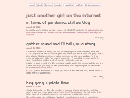
the digital diarist Alicia Neptune’s home page. (On Neocities!) Check out this page of short stories read aloud. She also has an extensive page of thoughts and links related to getting through the pandemic. This site goes pretty deep - there is a sizable directory here. I love it.
-
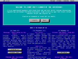
jOS v1.0 Paging simone.computer. Personal home page as a BBS. Even loads as if it was teletext.
-
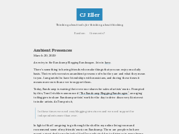
CJ Eller Fantastic articles from the Community Manager at write.as. He has a very cool experiment using are.na to do blog chatting. This is not a hoax.
-
Tatiana Mac Beautiful home page by a designer - kind of a snapshot of the 2010s design that was equal parts academic journal and Mac user interface. Really grateful for bold colors and the layout of her blog. (Built with 11ty.)

-
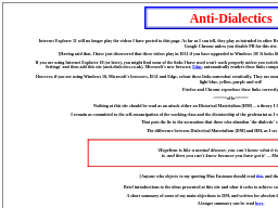
Rosa Lichtenstein Discovered by h0p3 - massive dump of essays and photos, all Marxism-related. I haven’t scratched the surface of this, but any connection of h0p3’s is of interest.
-
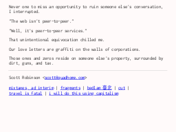
quad Home page of Scott Robinson. The minimalist mixtape pages are amazing. You’re all going to want pages like these.
-
helveticascenario.dev GIF and pixel things.
-
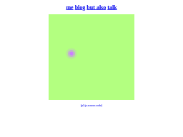
BSCLUB Adorable personal website from Jake Fee. Each of the blog entries is a miniature project - many have form fields that let you participate. Had no idea the marquee tag still functions.
-
Sarah Drasner’s bomb site Very impressive personal directory dressed with SVG animations. I really like the two column layout - right column more dense with text, the left column for focus.

-
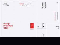
Nick Jones Ok, come on. SPIRAL SCROLLING?? Whenever I see these warnings about inducing vertigo or frantic colors, I get excited. This design is very unusual because it is somehow muted and wild simultaneously.
-
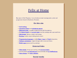
Felix at Home Home page for Felix Pleşoianu. Personal collections of writing and webcomics and such. I love pages like the history hoard. This site is at least ten years old. It uses the same drop shadows that I can’t stop using.
-
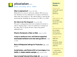
pikseladam This is tcgumus, who joined us for the Fraidycat Funtime stream. Great job getting Webmentions going!
-
everything A digital experience! (Discovered by tcgumus above.)
-
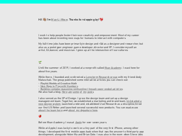
May-Li Khoe Love this! A single page home page that is just packed with everything. This reminds me of when old people would publish home pages from Microsoft Word. They still should. Great colors, May-Li.
-
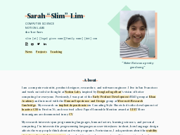
slim.computer Sarah Lim - nice, chill, pastel page. Nice domain. Works on Notion and it shows.
-
fionn dot computer I don’t know what this is yet.
-
Henry Desroches Rad monochrome + serifs.

-
Nitin R Gupta Just love his logo. With the green parallelogram. That’s all it takes to get in hrefhunt. But that’s a lot actually. A logo like this is once in a lifetime.

-
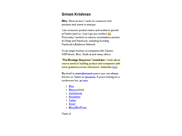
Sriram Krishnan Somewhat minimalist page and blog. Love the collection of internal memos. Personal collections like this are like miniature rabbitholes.
-
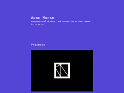
Mrmrs Changes colors and fonts when you reload.
-
These aren’t the access_tokens you’re looking for Seems like a blog of little exploits around the web with a strangely innocuous design.

-
vishnuprem Keybase alternative.
-
maique madeira Slick photos. I admire Maique’s (pronounced ‘mike’?) eye.

-
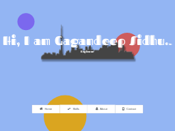
Think out of box I like this home page. It is reminiscent of Broderbund Print Shop.
-
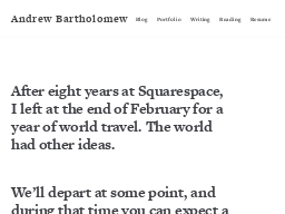
Andrew Bartholomew Left work to travel for a year right before the virus hit. Now it’s time for photos of isolated life in Rhode Island.
-
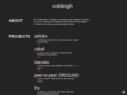
Alexander Cobleigh Wanted us to know there are some new articles up. I’m okay if the link cowboys want to check this one out.
-
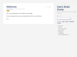
Dan’s Brain Dump Personal TiddlyWiki from Daniel Robinson. Disqus comments are integrated into the wiki pages. There is also some impressive formatting that I didn’t know TW was capable of. Take a look.
-
Robert Vinluan Designer website done in Jekyll. This has a big list of personal sites on the about page. And a very nice blog also done in Jekyll.

-
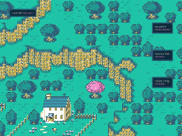
this place, all are mr. saturn Haha, ok. This might be href.cool material. Also see mintlodica.
-
kb.fyi Nice, minimalist 2010s “under construction” page.

-
the virtual studio of jason li This is an older version of the designer’s home page. But I highlight this because it was done in Twine!

-
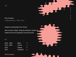
Ross Zurowski Minimalist design with trippy effect. Has an article about the dweb.
-
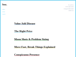
boz. A minimalist blog, but colorful - with serifed fonts instead of monospace. See, this can absolutely work.
-
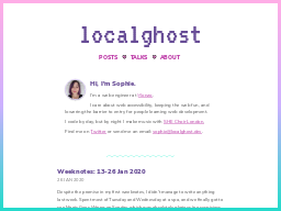
localghost Similar to the above, but pinker with wavy lines. Does the Weeknotes thing - which I think is great - it’s a weekly directory.
-
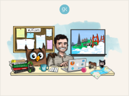
Gregory Koberger Very detailed illustrated home page. The highlight for me is the “where I’ve lived” window - cool way of doing a timeline.
-
Soonho Kwon Clean layout full of animated GIFs for the projects.

-
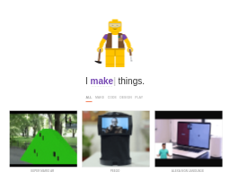
Hi, I’m Abishek Wonderful GIFs and projects - I imagine you’ve seen this one around. Some of the projects have been on Hackaday and such.
-
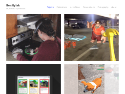
Ben Hylak Ok, wow - I’m running across a lot of projects + GIFs sites this time! This one has a lot of food-sensing stuff tho.
-
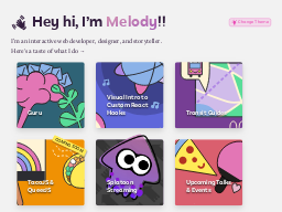
Made by Melody Really tight for a personal blog. Interesting that draft articles get posted with a “COMING SOON” banner.
-
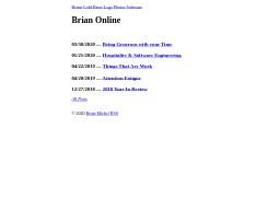
Brian Online Basic unstyled blog with essays and photos. I hope his last name really is Online.
-
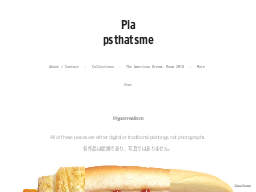
Pia Sawhney Hyperrealist gummi bears. I like the page of GIFs. Time-lapse paintings.
-
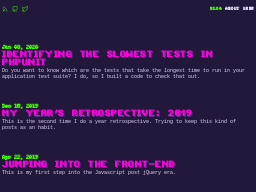
David Llop Purple and green blog from out of Catalonia. Mostly purple.
Href Hunt Archives
-
January 2020: Just random personal pages - 24 of them I came across.
-
November 2019: 22 personal and pro sites from linked lists on the blogs I follow.
-
May 2019: 15 personal sites from Twitter etc.
-
April 2019: 24 personal sites from Hacker News. Four or five wild designs. One Google parody that’s quite good.
-
February 2019: 15 neat personal sites, plucked from HN and Twitter.
-
November 2018: A few sites from tweets and Pinboard. 10 blogs and web pages.
-
September 2018: Plundering graphic design forums and Reddit. 19 home pages and portfolios.
-
August 2018: A whole lot of stuff from Hacker News. 59 home pages and blogs.
-
July 2018: The first attempt. 1 home page, 1 podcast and 11 blogs.
