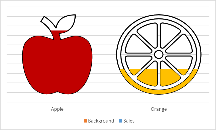
Infographics are the best option to capture user attention and effectively convey the information.
We explain step by step how to create a simple infographic for displaying sales of Apples and Oranges with a background Grey image.
Implementation:
Follow the below steps to implement the infographics of the sales data:
Step 1: Open Excel.
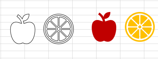
Step 2: Go to Insert >> Icons.

Step 3: Select Apple and Orange then press Insert

Step 4: Select both icons, Fill White color and Black outline.
Step 5: Duplicate both icons and change fill color.
- Select Apple Icon, Fill “Dark red” color
- Select Orange Icon, Fill Orange color
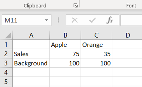
Step 6: Prepare sample data table as below with background series (Actual data are in row 2).
Step 7: Select the data table and insert Clustered Column.
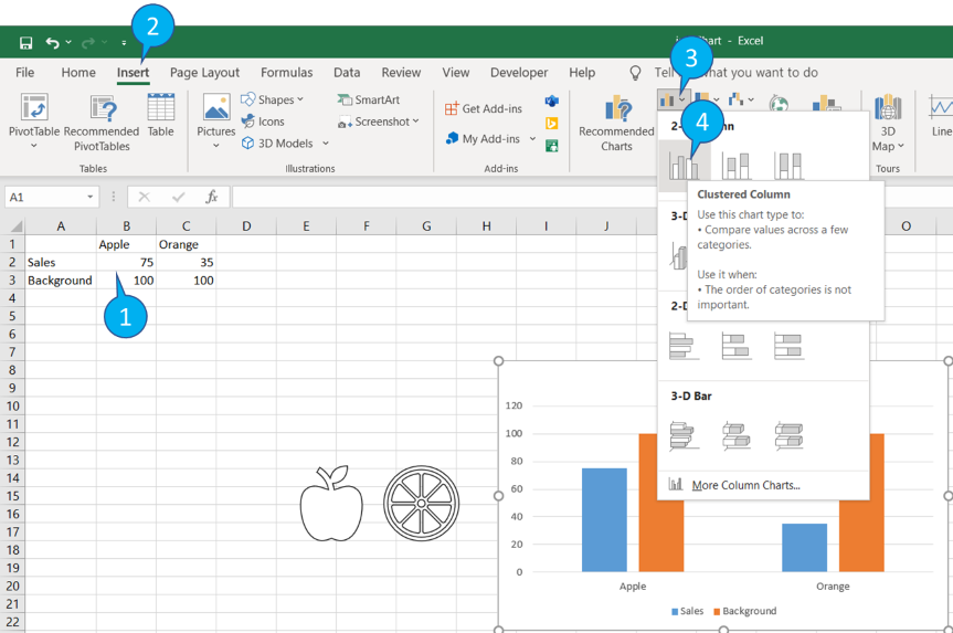
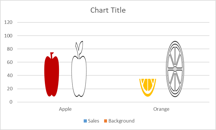
Step 8: Now we have four bars in the Graph and respective four icons.
Step 9: To Copy the icon image to the bar.
- Copy red apple icon: Select respective (first) bar in graph and right click, Press “Format Data Point”
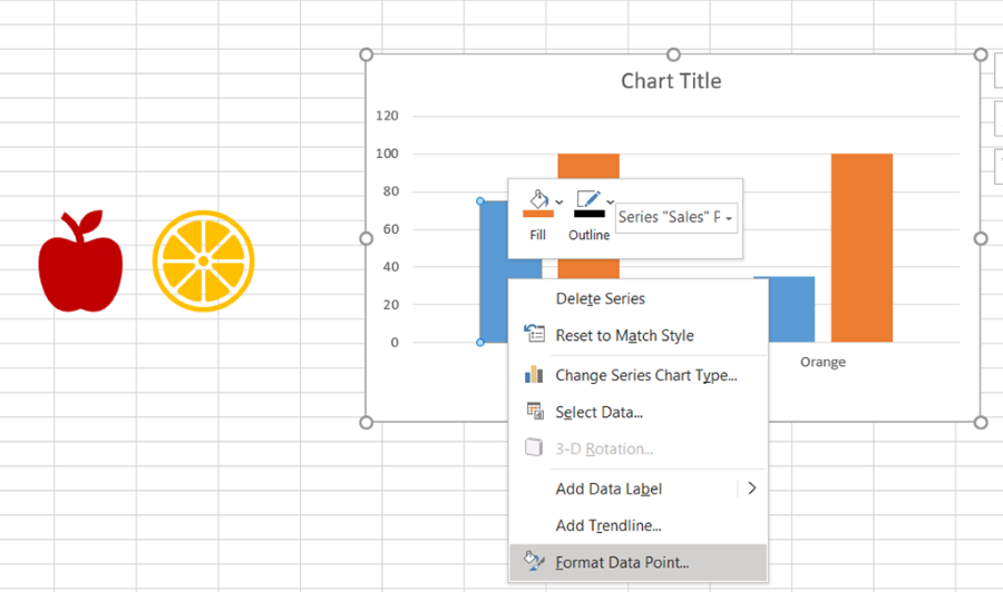
Step 10: In the “Format data point”.
- Select “Fill & Line” (1); Select “Picture and texture fill” (2); Click Clipboard (3); Select “Stack and Scale with” (4); set 100 to Units/Picture (5)

Step 11: Follow step 9 and 10 to fill all other three bars.
- Black apple icon for second bar.
- Orange colored orange icon for third bar.
- Black orange icon for fourth bar.
Step 12: Select Vertical axis, Right click and click “Format axis”.
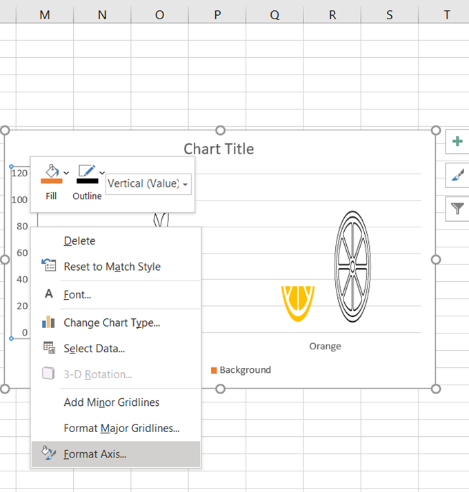
Step 13: Select “Axis Options” >> Set minimum to 0 and Maximum to 100.

Step 14: Delete “Vertical Axis” and Chart title.
Step 15: Select “Background” series in graph. Right click and Select “Format Data Series”.

Step 16: In the “Format data series”.
- Select “Series options” (1); Set 100 to Series Overlap(2) and 0 to Gap width (3)

Step 17: Select “Background” series in graph. Right click and Select “Select Data”

Step 18: Select “Sales” in Select Source Dialog box, and Press “Move down” – to send background series to back.

Output: