A Primer to Correspondence Analysis (© Gianmarco Alberti 2009)
_____________________________________________________________________________________
Correspondence Analysis (CA) is a method of data analysis for representing tabular data graphically
(Greenacre 2007: 1). Its graphical display potential is aimed to discover latent structure of the data and to facilitate
complex data interpretation.
CA has been object of attention by archaeologist since it operate on data matrix.
It is common in archaeological practice to build up, for several purposes, tables where some contexts (e.g.,
tombs, huts, pits) are generally arranged in rows and their contents (e.g., vessels, bronze, pins, daggers, weights) in
columns, while the table’s cells contain counts. This kind of practical arrangement of data is usually called contingency
table. If we define contexts as objects and their contents as variables (for they do vary from a context to another), is can
be said that a contingency table allows to display the joint distribution of variables between the objects. By this way, it
is possible to make comparisons between objects, as far as their similarity in terms of variables is concerned.
Now, let us consider a simple example: see tab.1.
tab.1
Graves
1
2
3
4
5
Types
Tot
A
68
136
41
690
78
B
37
95
0
181
165
C
8
3
3
26
19
1013
478
59
Tot
113
234
44
897
262
1550
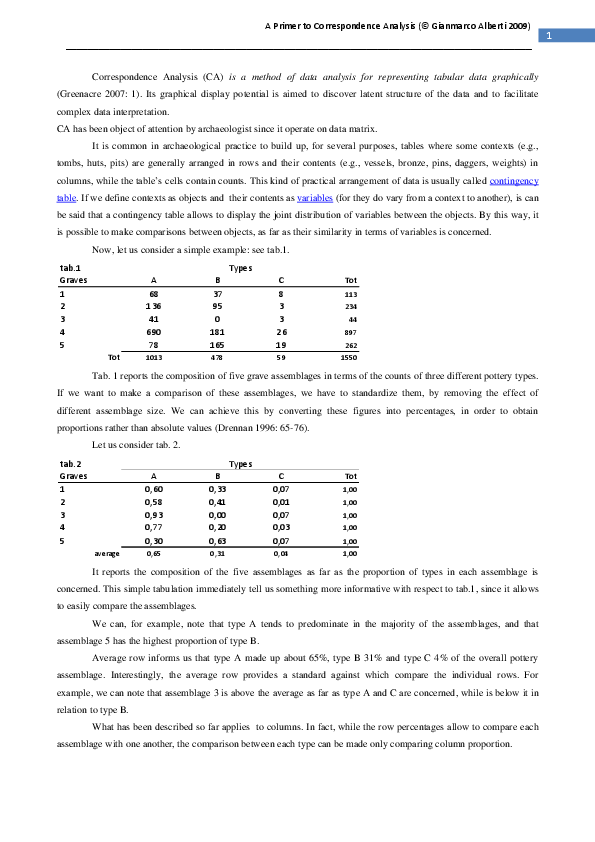
Tab. 1 reports the composition of five grave assemblages in terms of the counts of three different pottery types.
If we want to make a comparison of these assemblages, we have to standardize them, by removing the effect of
different assemblage size. We can achieve this by converting these figures into percentages, in order to obtain
proportions rather than absolute values (Drennan 1996: 65-76).
Let us consider tab. 2.
tab.2
Graves
1
2
3
4
5
Types
average
A
0,60
0,58
0,93
0,77
0,30
B
0,33
0,41
0,00
0,20
0,63
C
0,07
0,01
0,07
0,03
0,07
0,65
0,31
0,04
Tot
1,00
1,00
1,00
1,00
1,00
1,00
It reports the composition of the five assemblages as far as the proportion of types in each assemblage is
concerned. This simple tabulation immediately tell us something more informative with respect to tab.1, since it allows
to easily compare the assemblages.
We can, for example, note that type A tends to predominate in the majority of the assemblages, and that
assemblage 5 has the highest proportion of type B.
Average row informs us that type A made up about 65%, type B 31% and type C 4% of the overall pottery
assemblage. Interestingly, the average row provides a standard against which compare the individual rows. For
example, we can note that assemblage 3 is above the average as far as type A and C are concerned, while is below it in
relation to type B.
What has been described so far applies to columns. In fact, while the row percentages allow to compare each
assemblage with one another, the comparison between each type can be made only comparing column proportion.
1
�A Primer to Correspondence Analysis (© Gianmarco Alberti 2009)
_____________________________________________________________________________________
Let us consider tab.3.
tab.3
Graves
1
2
3
4
5
Types
Tot
A
0,07
0,13
0,04
0,68
0,08
B
0,08
0,20
0,00
0,38
0,35
C
0,14
0,05
0,05
0,44
0,32
average
1,00
1,00
1,00
1,00
0,07
0,15
0,03
0,58
0,17
Tab.3 tells us how the types are distributed between the assemblages. From this table it can be seen, for
example, that the majority of type A occurs in assemblage 4, while types B and C occur with large proportion in
assemblages 4 and 5.
In this case as well, the column average provides ground for comparisons. We can see that about 58% of the
overall pottery types belong to assemblage 4. By the same token, it can be seen that the 68% of type A in assemblage 4
is well above the average, while its frequency in assemblages 1 and 2 is below it.
By combining the information provided by tab. 2 and 3 (row and column proportions), we can obtain a good
picture summarizing in a more structured way the information of the original contingency table (tab.1).
For example, we are now in the position to know that assemblage 1 is made up for the 60% of type A, for 33% of type
B and for 7% of type C. We know that its 60% of type A is above the average, and so on. But we also know that, seen
from the perspective of the distribution of type A between the assemblages, assemblage 1 has only about the 7% of that
type. In other words, the 68 pots of type A found in assemblage 1 correspond to the 60% of the types present in it, but
only to 7% of the overall distribution of that type between the five assemblages. From this last standpoint, type A
occurs more frequently in assemblage 4.
As far as CA terminology is concerned, row, column and average proportions are called (as we will see later)
respectively row, column and average profile.
Let us take this discussion a step forward.
Since we are dealing here with three variables, we can graphically display the information provided by the
original contingency table (tab.1) in a tripolar or ternary graph (fig.1). The calculation laying behind the drawing of this
graph are the same done to convert tab.1 in tab.2, that is switching the original absolute values with row proportion (tab.
2). So we can think of this graph as taking its values from tab. 2.
Each side of the triangle represents a percentage scale, so
A
that the assemblages can be plotted according to the values
90
80
70
60
of their profiles in relation to the sides of the triangle. Each
3 10
assemblage is represented by a dot, as well as the average.
20
4
30
Average
2 1
An assemblage that would have only type A (that is, 100%
40
50
40
30
of type A) would lay at the vertex A. The same applies for
50
an assemblage that would have, say, only type B or C, and
60
they would consequently lay at vertex B or C respectively.
70
5
90
10
90
B
Fig. 1
In the case under discussion, the points representing the
80
20
80
70
60
50
40
30
20
assemblages are spread inside the triangle according to
their different row profile percentages. Note, moreover,
10
C
that some assemblages are closer than other to the average.
2
�A Primer to Correspondence Analysis (© Gianmarco Alberti 2009)
_____________________________________________________________________________________
Well. This kind of graphical display is satisfactory enough as long as we are dealing with three variables. With
three variables we are in the position to visualize the data by means of a triangle (tripolar graph), that is in a bidimensional space. Note that the dimensions needed to represent the data with three variables are one less than the
number of variables (n) involved. In this case n=3, so number of dimensions=2.
It is clear that as long as the number of variables becomes higher, the number of dimensions needed increase
proportionally as well. With four variables we need a tridimensional space for depict the data; by the same token,
objects defined by, say, twenty variables need a space with 19 dimension to be graphically displayed.
As stressed at the opening of this primer, CA provides the very possibility to represent in a low-dimensional
space complex tabular data.
The possibility to do it relies on what we touched upon before, that is the difference of the individual
assemblages and type profiles (or, in a more general terminology, row and column profiles) from the average.
With this concept we are going to enter the very core of the CA analysis.
As a general statement, it can be said that CA allows to represent tabular data in a graphical way (as noted at
the start of this primer) and that CA is a generalization of a simple graphical concept, namely the scatterplot
(Greenacre 2007: 1), the latter being a representation of data as set of points with respect to two perpendicular axes.
This means that CA can represent our tabular data as point in a low-dimensional space.
At this point one may wonder what kind of values does CA take into account in order to graphically display
tabular data and, consequently, what is responsible of the eventual spread of points in the scatterplot?
The answer is embedded in what we state just a couple of lines above: the difference of the individual row and
column profiles from the average.
On this respect, let us return to the simple example of tab. 1 above. If there were no difference between the
assemblage as far as their types proportion is concerned, we would expect that the profile of each row would be more or
less the same as the average profile, and would differ from it only due to random sampling variation. Under this
assumption, we would expect them to be split up in the same proportions as the average.
Let us consider tab.4.
tab.4
Graves
1
Types
2
3
4
observed
A
68
B
37
C
8
expected
73,8
34,9
0,2
observed
136
95
3
expected
152,9
72,2
8,9
observed
41
0
3
expected
28,8
13,6
1,6
observed
690
181
26
expected
685,2
276,6
34,1
observed
78
165
19
expected
171,2
80,8
10,0
Tot
1013
478
59
average
0,65
0,31
0,04
5
Tot
row mass
113
0,07
234
0,15
44
0,03
897
0,58
262
0,17
1550
It is similar to tab.1, but it add some extra information regarding what we are dealing with right now.
Each assemblage row (as in tab.1) reports the absolute observed values, that is the counts of pottery types in each
assemblage. Under each assemblage row the expected values are reported , that is the values that one would expect if
each assemblage was split up in the same proportions as the average. To the right some values are reported, referred to
as row mass: these values give the idea of how big is each row profile in relation to the total. For example, assemblage 1
3
�A Primer to Correspondence Analysis (© Gianmarco Alberti 2009)
_____________________________________________________________________________________
make up the 7% of the overall assemblage (113/1550=0,07 or 7%); assemblage 2 the 15% (234/1550=0,15 or 15%) and
so on. It can be seen that assemblage 4 has a bigger impact on the overall assemblage, making up the 58% of the total.
It is clear that the observed frequencies differ from the expected ones. The point is to understand to what extent
these differences are large enough to be statistically “true”, that is that they are so large that it is unlikely they occurred
by chance alone.
For this purpose we can perform the
2
test (Drennan 1996: 187-191; Shennan 1997: 104-115), that will return
a value; the larger is this value, the more discrepant the observed and expected frequencies are and, therefore, the less is
likely that such a discrepancy occurred by chance.
The formula of this test is given below:
2
=∑
Taking data from tab.4, the chi-square calculation will be:
=
,
,
,
,
,
,
+ the corresponding terms for other assemblages
The value returned by the test will be equal to 235.1 that, for 8 degree of freedom, is highly significant. This means that
there is much variation in the table and it is highly unlikely that this variation occurred by chance alone.
The interest of CA for the chi-square relies in its ability to measure the heterogeneity of the row profiles (but of
the column profile as well, as it also applies to column profile), to measure how much variance there is in the data table,
and to give a measure of the distance of row profiles from the average.
To do so, the chi-square formula must be re-expressed in order to take into account the row profiles and the
row totals. The above formula can be rewritten as follows:
,
=113
,
,
,
,
,
,
,
,
+ the corresponding terms for other assemblages
or, more in general, each tem in this calculation is of the form
row total x
In other words, we take the formula of the chi-square calculation and for each term substitute the observed and
expected frequencies with the observed and expected row profile (in this case, taken from the tab.2, as you can see).
Each term, moreover, has been multiplied by the corresponding row total.
Now, we make another little modification, and we divide each term of the above formula by the table grand
total (or, in other words, by the sample size n). In our case (see. tab.4) this value is 1550.
So, let us re-express the above formula:
,
=
,
,
,
,
,
Note that the value
,
,
,
,
,
,
,
,
,
,
,
+ the corresponding terms for other assemblages
that is
,
,
,
,
,
,
,
,
,
,
,
+ the corresponding terms for other assemblages
that is
+ the corresponding terms for other assemblages (A)
turns up to correspond to the individual row mass, as stated before in relation to tab.4.
4
�A Primer to Correspondence Analysis (© Gianmarco Alberti 2009)
_____________________________________________________________________________________
The quantity
is called total inertia or, simply, inertia in CA. As stated by Greenacre (2007: 28), it is a
measure of how much variance is in the table and does not depend on the sample size. It turns up to correspond to the
statistics (Shennan 1997: 115-116).
It has to be noted, moreover, that in the formula of the inertia (above labeled with A) each of the five terms of
the formula (one for each row of the table [tab.2], that is, one for each assemblage in our simple example) is the row
-distance; and we are about to
mass multiplied by a quantity that we are about to discover to be the square of the
discover, moreover, that this distance is a measure of the distance of each row profile from the average profile. We are
going to discover, moreover, that this distance is a “modified” version of the Euclidean distance.
Let us explain in short what is the Euclidean distance (example straight from Shennan 1997: 223-224). Let us
imagine that we have two vessels (i and j) defined on the basis of two variables: x=measurement of rim diameter, y=
measurement of the height. We could display our vessels in a scattergram: see fig. 2.
In this example, the Euclidean distance is a measure of
the similarity between the two vessels as defined by the
two variables. It implies the finding of the straight-line
distance between the two point representing the vessels,
and presupposes the use of the Pythagoras’ theorem.
In this case, the distance will be:
If there are more variables, then we have to add in extra
terms (that is, the square differences into brackets), one
for every variables.
When two point are in the same place, the item are
identical (and vice versa), and clearly the distance will
be 0.
Fig. 2
Now let us return back to the
-distance. If we would compute the Euclidean distance between, say,
assemblage 1 profile and the average profile, the formula would be as follows:
Euclidean distance =
,
,
,
If we divide each term by each correspondent value of the average, we get the
-distance =
It is evident that
,
,
,
,
,
,
,
,
-distance:
,
,
,
,
-distance is a weighted Euclidean distance, for it rescales the Euclidean distance using a
scaling factor in the denominator that correspond to the expected profile elements. In this example, the
-distance
provides a measure of the distance between assemblage 1 profile and the average profile.
If we take a look at the formula of the inertia (above labeled as A), we will see that the quantity in square
brackets is exactly the square of the
-distance of each individual row profile, multiplied by the mass of each row.
As consequence of this quite long reasoning, we are in the position to say that to find the inertia of the table we
have to calculate, for each row, the row mass and multiply this by the square of the row
and add up the results.
-distance from the average,
5
�A Primer to Correspondence Analysis (© Gianmarco Alberti 2009)
_____________________________________________________________________________________
By means of this long reasoning, and taking a look to the formula of inertia (above, A), we are able to know:
-how much variation there is in the table, that is the total amount of departure from the average (the total inertia or
inertia);
-the
-distance of each individual row profile from the average profile;
- that the inertia will be high when row profiles have large deviation from the average; conversely, it will be low when
they are close to the average;
-that those rows which contribute the most to the inertia will be those which have the largest departures from the
average and the largest mass.
It has to be noted that what we described so far applies to the column profile as well.
By the way, it has to be noted that if we multiply the total inertia by n (which is the table grand total or, in
other words, the sample size), we end up with the
statistic for our table, that could be useful by itself (Drennan 1996:
187-191; Shennan 1997: 104-115; Greenacre 2007: 74).
After having understand the concepts of row and column profiles, average profile, dimensions needed to
graphically display them,
-distance of row/column profiles from the average profile and total inertia, our discussion
jumps directly to the visualization of the data of tab.1 by means of CA. Some other rather complex technical aspects
should be mentioned in between, but I prefer to refer the reader to Greenacre’s Chapters 5-8 (Greenacre 2007: 33-65). I
shall limit myself to highlight the key concepts underlying the understanding of the CA scatterplots, and to explain how
what we touched upon so far is involved in such visual display.
Let us see what the CA scatterplot of tab.1 looks like. See fig.3
0,48
C
0,4
0,32
3
Axis 2
0,24
0,16
1
0,08
5
-0,64
-0,48
-0,32 A 4
-0,16
0,16
0,32
0,48
0,64
B
-0,08
-0,16
2
Axis 1
Fig. 3
The scatterplot represents the data in a low-dimensional space, defined by orthogonal axes. In this case, we are
representing the data by means of Axis 1 (horizontal) and 2 (vertical). These axes account for part of the total inertia in
the table: the first axis usually accounts for the greatest part of the inertia, the remainder being accounted for by other
6
�A Primer to Correspondence Analysis (© Gianmarco Alberti 2009)
_____________________________________________________________________________________
axes. In this case, axis 1 accounts for the 94,5% of the total inertia, while axis 2 accounts for the remaining 5,5%.
Overall, CA is well representing the amount of variance of our data. By the way, these statistics are provided by any
software dealing with CA.
To well understand the spread of points in the space defined by the CA axes, we have just to recall what we
talked about above, that is the concept of
-distance and row/column profiles.
The points, as clearly showed by their labels, represent the profiles of row and columns. The point of
intersection between the two axes represents the average; consequently, the spread of the points in the bi-dimensional
space is related to the
-distance of each row and column profile from the average profile. It has to be stressed that, in
order to be graphically displayed in such a bi-dimensional space, the
-distance has been transformed into Euclidean
distance (for more details see Greenacre 2007: 33-40). In other words, the straight-line distance between the point of
intersection and row/column profile points relates to their
-distance from the average.
How can we read the scatterplot? (for more details see Shennan 1997: 320-341; Greenacre 2007: 65-80)
It informs us that, as far as the horizontal dimension is concerned (axis 1), it is possible to distinguish between
row profiles (in our archaeological example graves) with relative high proportion of type A (to keep on with our
archaeological example), like grave 3 and 4, and graves with relative high proportion of types B and C, like grave 1, 2,
and 5. It is possible to note that each group is variegated as far as the vertical dimension is concerned (axis 2). Axis 2
opposes grave 3 and 4 on the one hand, grave 1,5 and 2 on the other hand. But it must be kept in mind that the axis 2
only accounts for about the 6% of the inertia, so the main trend in the data is represented by the axis 1.
If we take a look at tab. 2 and 3 we can readily understand the graphical display of our data with CA.
It can be seen, in fact, that grave 3 and 4 are above the average as far as the proportion of type A within their
respective assemblage is concerned (tab.2); on the other hand, grave 1, 2 and 5 are below the average as the proportion
of type A within their respective assemblage is concerned, but they are above the average as far as the proportion
(within each respective assemblage) of type B and C is concerned. This causes grave 3 and 4 to be displayed far apart
from the group 1, 2, 5. It has to be noted, moreover, that grave 3 and 4 are far apart in relation to axis 2: this happens
because of the relative higher proportion of type A in grave 4 rather than in 3, as far as the distribution of that type
between assemblage is concerned (see tab.3). The same can be said for the separation (in relation to the vertical axis)
between grave 1 (with its relative higher proportion of type C) and grave 2 (with its relative higher proportion of type
B).
Even from this simple example it is clearly evident how useful CA is to a better understanding of the structure
of a data table. In a case as the one here discussed, where we are dealing only with few variables, it could have been
possible compare the grave assemblages just eyeballing the data of tab.1-3 and comparing the profiles (row, column and
average) to each other in order to ascertain which one is more similar to the another. But this method would be not farreaching if we were dealing with several objects (in this case, graves) and several variables (in this case pottery types).
Let us now consider a slightly more complex example, where it can be taken into account a higher number of
objects and variable, in order to evaluate the help CA can give to the interpretation of a more complex data-set.
Let us consider tab.5, which is made up of 10 objects (grave assemblage) and 5 variables (pottery types). In
this example, graves are defined by the presence in them of 5 different pottery types, going from the most precious (A)
to the less precious (E).
7
�A Primer to Correspondence Analysis (© Gianmarco Alberti 2009)
_____________________________________________________________________________________
tab.5
Graves
1
2
3
4
5
6
7
8
9
10
Types
Tot
av. row profile
A
3
1
6
3
10
3
1
0
2
2
B
19
2
25
15
22
11
6
12
5
11
C
39
13
49
41
47
25
14
34
11
37
D
14
1
21
35
9
15
5
17
4
8
E
10
12
29
26
26
34
11
23
7
20
114
31
128
310
129
198
796
0,04
0,16
0,39
0,16
0,25
Tot
85
29
130
120
88
37
86
29
78
Tab.5 reports the row and column totals and the average row profile. This 10x5 table lies in a four-dimensional
space, that it in order to represent it as a scatterplot it would be necessary a space with four dimensions.
Let us see the CA scatterplot for this table (fig.4):
0,5
2
0,4
0,3
E
6
0,2
Axis 2
0,17
10
8
-0,5
-0,4
-0,3
5
-0,2
9 -0,1
0,1
0,2
0,3
0,4
C
A
3
-0,1
4
D
B
-0,2
-0,3
1
-0,4
Axis 1
Fig. 4
Each axis accounts for a part of the inertia, expressed as percentage: axis 1 47,2%, axis 2 36,7%. The total
inertia is 0,082879, hence the
statistic is 65,97 (that is 0,082879 x 796), a highly significant value for 9 x 4 =36
degrees of freedom.
Let us consider how to interpret the scattergram and what it informs us about our dataset.
It can be easily seen that the horizontal dimension (axis 1) lines up the four pottery types, with the most
precious to the left (A), the less precious far apart to the right (D); the types absolutely less precious lays far from this
group: axis 2, in fact, separates pottery type E from the group A-D.
8
�A Primer to Correspondence Analysis (© Gianmarco Alberti 2009)
_____________________________________________________________________________________
Now, let us consider the spread of row profile points in relation to the position of column profile points: it is
clear that the more a grave lays to the left, the more proportion of precious types it has; the more a grave lays to the
right, the more proportion of less precious types it will have; the more a grave lays in the upper part of the scattergram,
the more proportion of type E (the less precious of all pottery types) it will have.
Finally, it has to be noted that grave 1, 2, 9 and 10 have similar position in relation to axis 1, but have a
different spread in relation to axis 2. This means that these graves have similar position with respect to the type
categories A-D, but grave 1 has fewer proportion of type E than grave 2.
On the basis of what we have seen so far, it is possible to emphasize that CA and its graphical representation of
data-tables as a scatterplot allows us to visualize multi-dimensional data in a low-dimensional space, allowing to
explore the structure of the data, to understand the relation between objects and variables and to compare object to each
other. Naturally, the reduction of dimensionality causes some degree of loss of information, but the objective is to
restrict this loss to a minimum so that a maximum amount of information is retained (Greenacre 2007: 41).
Before passing to the next issue, that is the use of CA for seriation purposes, I would like to stress, using
Greenacre’s words, that when applicable, it is useful to test a contingency table for significant association using
test.
However, statistical significance is not a crucial requirement for justifying an inspection of the maps. CA should be
regarded as a way of re-expressing the data in pictorial form for ease of interpretation. With this objective any table of
data is worth looking at (Greenacre 2007: 80)
…to be continued
© Gianmarco Alberti
2009
9
�A Primer to Correspondence Analysis (© Gianmarco Alberti 2009)
_____________________________________________________________________________________
References:
Drennan R.D. 1996, Statistics for Archaeologist. A Commonsense Approach, New York.
Greenacre M. 2007, Correspondence Analysis in Practice, New York/London (second edition).
Shennan S. 1997, Quantifying Archaeology, Edinburgh (second edition).
Additional documentation:
Baxter M.J. 1994, Exploratory Multivariate Analysis in Archaeology, Edinburgh.
Weller S.C., Romney A.K. 1990, Metric Scaling. Correspondence Analysis, Newbury Park-London-New Delhi.
Notes:
All graphs in this primer have been made with PAST.
Fig. 2 after Shennan 1997.
Freeware Software:
For two useful free computer programs capable to perform CA (PAST, CAPCA), please visit my Personal Home Page
http://xoomer.alice.it/gianmarco.alberti and go to the page “Links”.
10
�
 Gianmarco Alberti