Solace Creek - Jumping to 3D
Hello everyone!
A lot has changed since the release of the Preview version last year. I've decided to start the project over in a different engine and in 3D. I just felt that a bunch of different elements that were important to me were just too hard to pull off in 2D the way I wanted them to feel.
Just for comparison the very first shot of the intro sequence, both in 2D and the new 3D version:


Obviously the lighting is different - but 3D gave me something important: More freedom in terms of cinematography and where to put the camera. I never imagined Solace Creek to be a cutscene-heavy game, but I felt like this gave me a lot more tools to define the tone of the game.
So I set out to recreate the contents of the 2D version with the possibilities of the 3D version which not only came with new gameplay elements but also more content or extended content such as this rather unspectacular abyss in the 2D version:


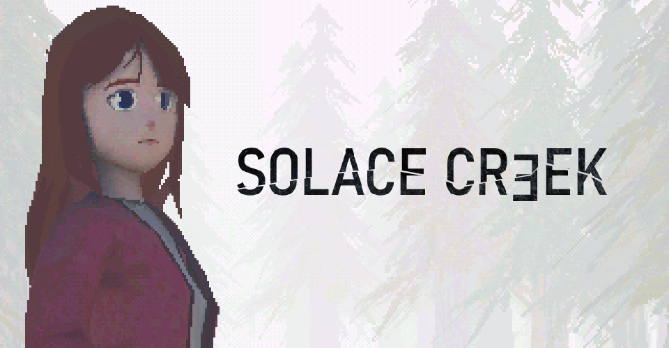
Obviously there was also a shift in artstyle. I tried to channel the retro-feel of 2D pixelart while also evoking the look and feel of the early PS1 era horror games with a lowpoly-stylized look as you can see in more detail in the screens below.
Now, I'm planning to release a new preview of the 3D version pretty soon! If you don't want to wait you can join our Patreon (link) to get early access to the playable 3D Preview which shows the first 20-30 minutes of the game!


I hope you're excited for the upcoming release! Stay tuned for more details 🖤
Solace Creek
| Status | In development |
| Author | starlit |
| Tags | 2D, Atmospheric, Horror, Pixel Art, RPG Maker |
| Languages | German, English, Italian |
More posts
- Demo 0.4.5 Release - Updated Cutscenes & Polish Version12 days ago
- Demo 0.4.4 Release - Inventory System & Italian Demo29 days ago
- Devlog - Translating Solace Creek39 days ago
- Demo 0.4.2 Release - macOS Support & Improvements68 days ago
- Demo 0.4 Release - German Version & Bugfixes75 days ago
- Solace Creek Demo Release! 🥳78 days ago
- Devlog - Wishlist & Road to the Demo!Jul 01, 2024
- Solace Creek January '24 DevlogFeb 01, 2024
- Solace Creek Preview 1.4 - Improvements & Let's PlayJan 02, 2024

Comments
Log in with itch.io to leave a comment.
I really like the 3D version, judging from the screenshot. Reminds me of the very first Alone in the Dark game (back in 1992).
Honestly, I feel this is a solid improvement
Thank you so much! 🖤
Have to say, both versions seem like they have a different vibe. The RPG Maker sort of seemed like a more grounded Silent Hill, while the 3D version has this sort of abstract, dreamlike feel. I like both, but it really does seem that the 3D version inspired you more and you did put more work into it, so it's clearly the better option here.
I'm looking forward to whatever this project ends up being once it finishes!
I think you're spot on. In the beginning of a project I'm still figuring out a lot of things direction wise. Like the tone, gameplay and things like that.
And the 2d version was definitely more grounded with some lighter dream-like elements and a more upfront story. Where the 3d version leans a bit more into the surreal dreamy elements. I also wanted to explore different ways in telling a story - not only through dialogue and cutscenes so it'll definitely have a slightly different tone and vibe :)
Thank you so much for sticking around and I can't wait for you to try out the upcoming preview version!